

01 / 03
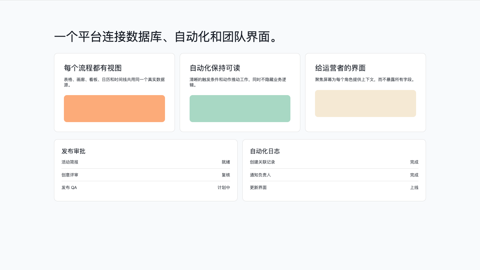
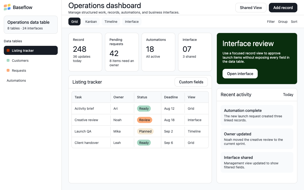

适合工作流、项目运营和轻量业务工具,白底编辑感搭配克制深色按钮和少量签名色块,清晰但不冷硬。
设计语言样张
白色画布承载说明,近黑按钮负责行动,签名色块在关键段落出现。
标题保持 Haas 的克制重量,不靠粗体制造压迫感。
表格、说明和记录内容保持紧凑,服务工作流信息密度。
白色画布先建立编辑感,品牌色只在签名卡片和产品 UI 片段中出现。
主 CTA 使用近黑底、白字、12px 圆角,不使用彩色按钮。
展示表格、视图 tab、记录卡和接口页,让页面像工作流软件。
标题使用 Haas Grotesk 的 400/500 字重,靠尺寸和留白建立层级。
coral、forest、cream 作为长页面节奏中的整块签名表面。
不要把页面做成通用彩色项目管理 dashboard。
不要使用渐变、发光、大投影或过度圆润的消费级风格。
不要让按钮使用 coral/green 等签名色,主行动应是近黑。
不要把标题加粗到 700 以上,Airtable 的 display 很克制。
不要让签名色块到处散落,它们应作为少数完整卡片出现。
---
version: alpha
name: "Airtable"
description: "Airtable 的 DESIGN.md 中文参考模板,保留原始 design token 与专业术语,覆盖 color system、typography、layout、components、motion 与 interaction states。"
language: zh-CN
sourceLanguage: en
---

## 概览
Airtable 的 marketing surface 是安静的 editorial 气质。基础氛围由 white canvas、dark ink type、慷慨 whitespace 和 near-black pill CTA 构成;直到某个 section 需要强调之前,没有元素争抢注意力。品牌张力不来自 gradient wash 或 accent wall,而来自 `{colors.signature-coral}`、`{colors.signature-forest}` 和 `{colors.surface-dark}` 的 **full-bleed signature card**,它们每隔两三个屏幕打断 long-scroll explainer page。在这些 signature band 之间,页面读起来像印刷杂志:headline、supporting copy、小型 image cluster,然后留出呼吸空间。

Type voice 使用 modest weight 的 Haas Grotesk(display 为 400,subtitle 与 button 为 500)。Display headline 从不超过 500;强调来自 size 与 color contrast,而不是 weight。Body copy 全程保持 14px / 400。Pricing surface 运行自己的方言:**Inter Display** 使用不常见的 mid-weight(475 / 575),并采用其他页面不会出现的 **pill-shaped button**(`{rounded.pill}`),这是一个刻意的 sub-system,用来表达“这个页面关乎商业精度”。

**Key Characteristics:**
- Primary CTA 使用 `{colors.primary}`(near-black ink)、white text 与 `{rounded.lg}`(12px)corner;它读起来 confident 且 final,绝不是 decorative。
- Secondary CTA 是 `{colors.canvas}` button,配 `{colors.ink}` text 和 hairline outline。两者共同形成 Airtable signature button pair。
- Hero 是 white canvas。没有 atmospheric gradient、没有 mesh、没有 background flourish。品牌强度来自干净 whitespace 中的 type 与 button。
- Brand voltage 存在于 **signature surface card**:`{colors.signature-coral}`、`{colors.signature-forest}` 和 `{colors.surface-dark}` 每隔几屏承载 full-bleed product callout。
- Demo-card grid 在 `{colors.signature-peach}`、`{colors.signature-mint}`、`{colors.signature-cream}` 等 warm pastel surface 上承载 product UI fragment。
- Section rhythm:white canvas → coral signature card → white body → cream callout band → dark navy CTA → light gray CTA banner → footer。每个 signature surface 之间都用 canvas reset。
- Border radius 有层级:primary CTA 和大型 signature card 使用 `{rounded.lg}`(12px),content card 与 demo grid 使用 `{rounded.md}`(10px),input 使用 `{rounded.sm}`(6px),icon button 使用 `{rounded.full}`。Pricing button 跳到 `{rounded.pill}`,标记自己是独立方言。
- Major band 之间的 vertical rhythm 是 `{spacing.section}`(96px),全站通用。

## Colors

### Brand & Accent
- **Primary** (`{colors.primary}` — #181d26): dominant brand color。用于 primary CTA background、h1/h2 display type 和 `{component.surface-dark}` band。不是“先 blue,再 black”;black 在整个 marketing system 中就是 primary。
- **Primary Active** (`{colors.primary-active}` — #0d1218): Primary button 的 press state。

### Surface
- **Canvas** (`{colors.canvas}` — #ffffff): 默认 page surface;每个 editorial body 的 floor。
- **Surface Soft** (`{colors.surface-soft}` — #f8fafc): Tabbed feature card 与 featured pricing tier。
- **Surface Strong** (`{colors.surface-strong}` — #e0e2e6): Footer 附近浅灰色的 “Start building with Airtable” CTA banner。
- **Surface Dark** (`{colors.surface-dark}` — #181d26): 页面中段使用的 dark navy CTA card(如 “The path to 10× every person in your organization”)。
- **Surface Dark Elevated** (`{colors.surface-dark-elevated}` — #1d1f25): Articles page hero 中 rainbow-stripe overlay 后方的 base。
- **Hairline** (`{colors.hairline}` — #dddddd): Input outline、table divider、secondary-button outline 的 1px border tone。

### Text
- **Ink** (`{colors.ink}` — #181d26): 最强 text,用于 h1/h2 display type 和 light surface 上的 primary button text。与 `{colors.primary}` 同 hex,因为它们是在 type 与 button layer 上表达的同一角色。
- **Body** (`{colors.body}` — #333840): 默认 running-text color。
- **Muted** (`{colors.muted}` — #41454d): Footer link、breadcrumb、caption。
- **Border Strong** (`{colors.border-strong}` — #9297a0): Disabled secondary button 上的 1px outline color。
- **On Primary / On Dark** (`{colors.on-primary}` — #ffffff): Primary button 与 dark surface 上的 text color。

### Signature Card Surfaces
这些 color 承载 Airtable 的 brand voltage。它们以 full-bleed、full-card surface 出现,绝不作为小元素上的 accent。
- **Coral** (`{colors.signature-coral}` — #aa2d00): Homepage 上最大的 signature card(“Production apps in prototype speed”)。Full-bleed dark coral,配 white type。
- **Forest** (`{colors.signature-forest}` — #0a2e0e): Homepage demo-grid cluster 中使用的 deep-green signature card。
- **Cream** (`{colors.signature-cream}` — #f5e9d4): Cream callout band(“The path to 10× every person in your organization”),用 soft beige surface 承载 dark type 与 product UI fragment。
- **Peach** (`{colors.signature-peach}` — #fcab79), **Mint** (`{colors.signature-mint}` — #a8d8c4), **Yellow** (`{colors.signature-yellow}` — #f4d35e), **Mustard** (`{colors.signature-mustard}` — #d9a441): Demo-card surface,用于 multi-card grid section 内的小型 product UI fragment。

### Semantic Colors
- **Link** (`{colors.link}` — #1b61c9): Inline body link 与 anchor text。Press 时变深为 `{colors.link-active}` (#1a3866)。尽管 CSS variable 名称是 `--theme_button-background-primary`,这个 color **不是** primary button color,而是 link color。
- **Info** (`{colors.info}` — #254fad) and **Info Border** (`{colors.info-border}` — #458fff): Inline info badge 与 focused-input outline。
- **Success** (`{colors.success}` — #006400) and **Success Border** (`{colors.success-border}` — #39bf45): Confirmation state。

## Typography

### Font Family
系统使用 **Haas / Haas Groot Disp**(Airtable 授权的 display + text type)。Haas Groot Disp 覆盖 display size(h1 / h2);Haas Grotesk 覆盖 24px 及以下的所有内容。Fallback stack 为 `-apple-system, BlinkMacSystemFont, "Segoe UI", Roboto, Oxygen, Ubuntu, Cantarell, "Fira Sans", "Droid Sans", "Helvetica Neue", sans-serif`。

Pricing surface 使用独立的 **Inter Display** stack,weight 为 475 / 575,这是一个刻意的 sub-system,用来传达 commercial precision。

### Hierarchy

| Token | Size | Weight | Line Height | Letter Spacing | 用途 |
|---|---|---|---|---|---|
| `{typography.display-xl}` | 48px | 500 | 1.1 | 0 | Articles page h2,第二层级 editorial headline |
| `{typography.display-lg}` | 40px | 400 | 1.2 | 0 | Homepage h1 hero |
| `{typography.display-md}` | 32px | 400 | 1.2 | 0 | Platform-page h2,feature-section headline |
| `{typography.title-lg}` | 24px | 400 | 1.35 | 0.12px | Section title |
| `{typography.title-md}` | 20px | 400 | 1.5 | 0 | Tabbed feature card 中的 sub-section title |
| `{typography.title-sm}` | 18px | 500 | 1.4 | 0 | Article-card title |
| `{typography.label-md}` | 16px | 500 | 1.4 | 0 | Demo-card title、list label |
| `{typography.button}` | 16px | 500 | 1.4 | 0 | Standard CTA button label |
| `{typography.body-md}` | 14px | 400 | 1.25 | 0 | Body copy、footer link、top-nav item |
| `{typography.caption}` | 14px | 500 | 1.35 | 0.16px | Light caption 与 meta text |
| `{typography.legal}` | 13.12px | 600 | 1.2 | 0 | Cookie/legal CTA button |
| `{typography.pricing-display}` | 44.8px | 475 | 1.1 | 0 | Pricing-page h1 |
| `{typography.pricing-section}` | 28px | 475 | 1.2 | 0 | Pricing-page section head |
| `{typography.pricing-card-title}` | 20px | 475 | 1.3 | 0 | Pricing tier card plan name |

### Principles
Haas system 在 display size 上偏好 weight 400,40px h1 **不是** bold。视觉强调交给 size、color contrast 和 signature surface card。当系统确实需要 weight 时,会转向 500(subtitle、button、article title),editorial body 中绝不使用 600 或 700。唯一真正的 bold(600)存在于 `{typography.legal}`,这说明 boldness 被保留给 terms-of-service surface,而不是 marketing。

Pricing-page sub-system 使用 `font-weight: 475` 的 Inter Display,这是 regular(400)与 medium(500)之间的 custom mid-weight,以 variable font 形式提供。

### Font Substitutes
如果 Haas Groot Disp 与 Haas Grotesk 不可用,**Inter Display**(variable)是两者最接近的开源替代;将 line-height 下调约 5%,以匹配 Haas 更紧的 cap-height。Pricing sub-system 直接使用 Inter Display。macOS / iOS 上 **system-ui** 足够;Windows 上 fallback 到 Segoe UI,这是可用但略冷的替代。

## Layout

### Spacing System
- **Base unit:** 4px(所有 spacing 都吸附到 4 的倍数)。
- **Tokens:** `{spacing.xxs}` 4px · `{spacing.xs}` 8px · `{spacing.sm}` 12px · `{spacing.md}` 16px · `{spacing.lg}` 24px · `{spacing.xl}` 32px · `{spacing.xxl}` 48px · `{spacing.section}` 96px。
- **Section padding (vertical):** `{spacing.section}`(96px)是通用 vertical rhythm 常量;每个页面的每个 major editorial band 都使用 top 96px + bottom 96px 的 internal padding。
- **Card internal padding:** Tabbed feature card 与 pricing tier card 使用 `{spacing.xl}`(32px);signature coral / forest / dark card 内部使用 `{spacing.xxl}`(48px);cream callout 与 demo-grid card 使用 `{spacing.lg}`(24px)。
- **Gutters:** 3-up grid 中 card 之间使用 `{spacing.lg}`(24px);更密集的 logo strip 与 footer column gutter 内部使用 `{spacing.md}`(16px)。

### Grid & Container
- **Max content width:** 居中约 1280px,并保留 `{spacing.xxl}`(48px)horizontal breathing room。
- **Editorial body:** 大 breakpoint 使用单一 8/12-column;mobile 折叠为 single-column。
- **Demo-card grids:** Desktop 为 3 或 4 column,tablet 为 2,mobile 为 1。Grid 内 card size 刻意不均匀,避免统一的 “spec sheet” 感。
- **Logo strip:** Desktop 中 6 个 monochrome partner logo 位于单行;mobile 上换行为 3-up。

### Whitespace Philosophy
Airtable 把 whitespace 作为主导 atmospheric tool。Hero section 在 headline + sub-headline pair 上下留出 96px+ 的纯 whitespace,且这些 whitespace 中没有装饰。Hero 刻意保持 calm:type 背后没有 gradient、没有 aurora、没有 atmospheric mesh。系统只信任 whitespace 来完成 framing。

## Elevation & Depth

| Level | Treatment | 用途 |
|---|---|---|
| Flat | 无 shadow,无 border | Body section、top nav、footer |
| Soft hairline | 1px `{colors.hairline}` border | Input、sub-nav rail、comparison-table divider、secondary button |
| Button rest | 低 alpha 的 soft drop,并带微弱 blue-tinted glow | Primary CTA button(blue tint 是 link color 的遗留,读起来像 dark button 下方的 faint accent) |
| Button focus | 较高 alpha 的 outer 2px blue ring | Primary button 的 keyboard focus state |
| Card flat | 无 shadow;依赖与 surface band 的 color contrast | Signature coral / forest / dark card、cream callout、demo-grid card |

Elevation philosophy 是 **color-block first, shadow second**。Shadow 很少;depth 交给 white canvas 与 signature surface card 之间的 contrast。Marketing system 中没有 soft-glow / atmospheric-shadow / heavy-elevation 语言。

### Decorative Depth
- **Vertical rainbow stripe** 只出现在 articles hero 上:multi-color vertical band 位于 `{colors.surface-dark-elevated}` 上。这是 single-page treatment,不是 system-wide signature。
- **Photography-as-depth** 用于 demo-card grid:每张 card 都承载真实 product UI screenshot 或 mockup,通过可读的 artifact density 而不是 decorative effect 贡献 depth。

## Shapes

### Border Radius Scale

| Token | Value | 用途 |
|---|---|---|
| `{rounded.xs}` | 2px | Cookie-consent 与 legal CTA button,system-required surface |
| `{rounded.sm}` | 6px | Text input、小型 inline button |
| `{rounded.md}` | 10px | Secondary content card、article card、cream callout |
| `{rounded.lg}` | 12px | Primary CTA button、signature surface card、tabbed feature card |
| `{rounded.pill}` | 9999px | Pricing-page CTA button(仅 sub-system) |
| `{rounded.full}` | 9999px / 50% | Circular icon button、avatar surface |

### Photography Geometry
Demo-card grid 内的 product UI screenshot 保留原生 aspect ratio(通常为 4:3 或 16:10),并裁入 `{rounded.md}` container。Hero illustration full-width bleed,不加 rounding。Article-card thumbnail 使用 16:9 与 `{rounded.md}` corner。Testimonial 中的 avatar 使用 `{rounded.full}`(perfect circle)。Pricing comparison table image 保持 rectangular,不加 rounding。

## Components

> **不记录 hover state。** 按全局 no-hover policy(Step 6),下列每个 component spec 只记录 Default 与 Active/Pressed state。Variant 作为独立 entry 存在于 `components:` front matter。

**`top-nav`** — 固定在每个页面顶部的 64px 高 white bar。Airtable wordmark 位于左侧;primary horizontal menu(Platform、Solutions、Resources、Enterprise、Pricing)以 `{typography.body-md}` 位于中左;右侧 cluster 承载 “Book Demo” outline link、“Sign up for free” `{component.button-primary}` 和 “Log In” text link。Nav 在每个页面都保持 light;Airtable 不会在 dark section 上反转 nav。

### Buttons

**`button-primary`** — Signature primary CTA。Background `{colors.primary}`(near-black)、text `{colors.on-primary}`、type `{typography.button}`、padding 16px × 24px、rounded `{rounded.lg}`(12px)。这是每个 hero 中可见的 “Get started for free” / “Sign up for free” button。它读起来 confident 且 final,不是 decorative,因此系统克制使用(每个 viewport 一个)。
- Active state:`button-primary-active` 加深到 `{colors.primary-active}` (#0d1218)。

**`button-secondary`** — White outline button(如 “Book demo”)。Background `{colors.canvas}`、text `{colors.ink}`、type `{typography.button}`、rounded `{rounded.lg}`(12px)、1px hairline outline。位于 `{component.button-primary}` 旁边,作为 “less-committed” choice。

**`button-secondary-on-dark`** — Shape 与 `{component.button-secondary}` 相同,但用于 signature coral / forest / dark surface。Background `{colors.canvas}`、text `{colors.ink}`。White button 在 dark surface 上仍保持 white,因为 marketing site 从不反转为 translucent on-dark style。

**`button-pricing-pill`** — Pricing-page CTA family。Background `{colors.canvas}`、text `{colors.pricing-ink}`、rounded `{rounded.pill}`(9999px)、padding 12px × 24px。这是 marketing system 中唯一出现 pill-shape 的地方。应把它视为 pricing sub-system signal 的一部分。

**`button-legal`** — Cookie-consent 与 legal-banner CTA。Background `{colors.link}`、text `{colors.on-primary}`、type `{typography.legal}`(13.12px / 600)、rounded `{rounded.xs}`(2px)、padding 12px × 10px。2px corner radius 与 600 weight 表达“这是 required system surface”,而不是 designed brand surface。

**`button-icon-circular`** — 40px × 40px circular button,使用 `{colors.canvas}` background、hairline border 与 `{colors.ink}` icon。用于 carousel control、“share” 和 “back” affordance。

**`text-link`** — `{colors.link}` (#1b61c9,actual link blue) 的 inline body link。默认无 underline。Type 继承 `{typography.body-md}`。

### Cards & Containers

**`hero-band`** — Full-page-width white-canvas hero。没有 surface card、border、shadow 或 atmospheric gradient;只有 headline、sub-headline 与 primary + secondary button pair 位于 96px whitespace 中。Vertical padding `{spacing.section}`(96px)。

**`signature-coral-card`** — Homepage 上大型 full-bleed coral card(“Production apps in prototype speed”)。Background `{colors.signature-coral}`(#aa2d00,dark coral / oxide red)、text `{colors.on-primary}`、rounded `{rounded.lg}`(12px)、internal padding `{spacing.xxl}`(48px)。承载 `{typography.display-md}` 的 h2、`{typography.body-md}` 的 supporting copy,以及作为 CTA 的 `{component.button-secondary-on-dark}`。

**`signature-forest-card`** — Deep green signature card(`{colors.signature-forest}` — #0a2e0e),在 homepage 上作为 coral card 的 demo-grid sibling。

**`hero-card-dark`** — Dark navy mid-page CTA card(如 “The path to 10× every person in your organization”)。Background `{colors.surface-dark}`(#181d26)、text `{colors.on-dark}`、rounded `{rounded.lg}`(12px)、internal padding `{spacing.xxl}`(48px)。它与 `{colors.primary}` 同色,因为系统将 ink 同时作为 type color 和 signature dark surface。

**`feature-card-tabbed`** — Light-cream card(如 homepage 的 “Coke / Pelosi / Conde Nast / Time Inc” tabbed feature card)。Background `{colors.surface-soft}`、rounded `{rounded.lg}`(12px)、internal padding `{spacing.xl}`(32px)。Left rail 承载 vertical-stacked tab label(`{typography.title-md}`);right pane 展示 active tab 的 content(illustration + body copy + small CTA)。

**`cream-callout-card`** — Beige callout card(`{colors.signature-cream}`)。Rounded `{rounded.md}`(10px)、internal padding `{spacing.lg}`(24px)。承载 product UI fragment 或 stat callout;比 dark/coral signature card 更柔和,但仍是刻意的 brand surface。

**`demo-grid-card`** — 用于打断每个页面节奏的 multi-card grid。Background 为 `{colors.canvas}` 或 demo-grid surface 之一(`{colors.signature-peach}`、`{colors.signature-mint}`、`{colors.signature-yellow}`、`{colors.signature-mustard}`),rounded `{rounded.md}`(10px)、internal padding `{spacing.md}`(16px)。每张 card 框住一个 product UI fragment。Card height 刻意变化,避免统一 “spec sheet” 感。

**`logo-strip`** — Horizontal monochrome partner-logo row(HBO、Netflix、Amazon、Time、Conde Nast)。Logo 以 `{colors.muted}` 渲染,surface 为 `{colors.canvas}`,vertical padding `{spacing.xl}`(32px)。Desktop 为 6 个 logo,mobile 为 3 个。

**`article-card`** — Articles page 上的 trending-stories grid。Background `{colors.canvas}`、rounded `{rounded.md}`(10px)、internal padding `{spacing.md}`(16px)。每张 card 承载 colorful illustrated thumbnail(16:9)、小型 uppercase category tag、`{typography.title-sm}` title 与 meta line。Desktop 为 3-up。

**`topic-filter-rail`** — Articles page 左侧 rail。宽 240px,`{colors.canvas}` background,`{typography.body-md}`,垂直分组的 category heading(“Marketing”、“Product”、“Project management”、“Operations”)带 sub-bullet。Active item 带小型 numeric count badge。

### Inputs & Forms

**`text-input`** — Standard text input。Background `{colors.canvas}`、text `{colors.ink}`、type `{typography.body-md}`、rounded `{rounded.sm}`(6px)、padding 12px × 16px、height 44px。1px hairline border 使用 `{colors.hairline}`。

**`text-input-focus`** — Focus state。Border 加粗或变为 `{colors.info-border}`。

### Pricing Sub-System

**`pricing-tier-card`** — Standard tier card。Background `{colors.canvas}`、text `{colors.pricing-ink}`、plan name 使用 `{typography.pricing-card-title}`、rounded `{rounded.md}`(10px)、internal padding `{spacing.xl}`(32px)。承载 plan name、`{typography.pricing-display}`(44.8px / 475)的 price block、feature checklist,以及底部 `{component.button-pricing-pill}`。

**`pricing-tier-card-featured`** — Featured tier(通常为 “Team” 或 “Business”)。Background 切换为 `{colors.surface-soft}`。没有 accent border、没有 badge;background tone shift 是唯一信号。

**`pricing-comparison-row`** — Pricing page 底部长 comparison table 的每一行。Label 在左列;checkmark 或 value 横跨 4 个 plan column。每行 12px vertical padding,行间使用 hairline divider。

### Navigation Variants

**`footer`** — Light surface(`{colors.canvas}`),desktop 为 6-column link list,覆盖 Platform / Solutions / Resources / Learn / Company subtree。Vertical padding `{spacing.section}` 分配给上方 link block 和下方 legal row。Type `{typography.body-md}`。

**`cta-band-light`** — Footer 附近浅灰色的 “Start building with Airtable” CTA strip。Background `{colors.surface-strong}`(#e0e2e6)、text `{colors.ink}`、rounded `{rounded.lg}`(12px)、padding `{spacing.xxl}`(48px)。承载 `{typography.display-md}` 的 h2 和 `{component.button-primary}`。

### Signature Components

**Articles Vertical Rainbow Stripe Hero** — Articles-page hero treatment。不同宽度的 multi-color vertical band 位于 `{colors.surface-dark-elevated}` 上。h1 + sub-head + CTA cluster 在 stripe 上方居中偏左。这是 single-page hero treatment,不是 system-wide signature;不要提升为 multi-page pattern。

## Do's and Don'ts

### Do
- 保持 `{component.button-primary}` 为 near-black。品牌 primary CTA 是 `{colors.primary}`,不是 link blue。混淆两者会把 confident hero 变得混乱。
- `{component.button-primary}` 每个 viewport 只保留给一个 primary action。系统在 brand-action layer 上刻意稀缺。
- 使用 `{component.button-secondary}`(white + hairline outline)作为 `{component.button-primary}` 的自然配对。两者共同形成 Airtable signature button row。
- 信任 whitespace 作为 hero atmosphere。Hero band 刻意 calm:没有 gradient、没有 mesh、没有 atmospheric backdrop。违背这一点会显得 off-brand。
- 使用 `{component.signature-coral-card}`、`{component.signature-forest-card}` 和 `{component.hero-card-dark}` 打破 editorial monotony。这些是品牌的 voltage moment。
- 在 grid 内保持 `{component.demo-grid-card}` 高度不均。统一高度会像 spec sheet。
- 把 pricing surface 视为独立方言:让 `{typography.pricing-display}`、`{typography.pricing-card-title}` 和 `{component.button-pricing-pill}` 保持成组。把它们与 Haas Grotesk button type 混用会破坏 sub-system voice。
- 每个 editorial band 都用 `{spacing.section}`(96px)vertical padding 锚定。

### Don't
- 不要把 `{colors.link}` (#1b61c9) 当成 primary button color。它是 link color。Primary button 是 `{colors.primary}`(#181d26,near-black)。把 link-blue 当成 brand action,是阅读 Airtable CSS variable 时最常见的错误。
- 不要给 hero 添加 gradient backdrop。Airtable 的 hero 就是 white。Mesh、aurora、spotlight gradient 都会显得像“另一个 SaaS template”,不是 Airtable。
- 不要加粗 display-weight type。`{typography.display-xl}` 与 `{typography.display-lg}` 刻意保持 weight 400 / 500;升到 700 会像 marketing-page-template。
- 不要在 pricing surface 之外使用 `{rounded.pill}`。它是 sub-system signal,不是通用 radius option。
- 不要在连续两个 band 中重复同一种 surface mode。Editorial pacing 依赖 rhythm:white → signature card → white → cream → dark → white。连续两个 white 会读成 typography blog。
- 不要添加系统未编码的 hover state styling。系统只记录 Default 与 Active/Pressed。
- 不要在已记录的 signature card palette 之外引入额外 accent color。系统的 voltage 已经使用 coral、forest、dark navy、cream、peach、mint、yellow 和 mustard。

## Responsive Behavior

### Breakpoints

| Name | Width | 关键变化 |
|---|---|---|
| Mobile | < 768px | Single-column body;top nav 折叠为 hamburger;demo-grid 降为 1-up;signature card 保持 full-bleed;logo strip 换成 2 行;footer 折叠为 single-column |
| Tablet | 768–1024px | Demo-grid 为 2-up;top nav 保持 horizontal 但收紧;cream-callout card 堆叠为 2-up;pricing comparison table 变为横向滚动 |
| Desktop | 1024–1440px | Demo-grid 为 3-up(更紧内容可 4-up);完整 top-nav 显示所有 menu item;pricing tier card 渲染为 4-across |
| Wide | > 1440px | 与 Desktop 相同但 outer breathing room 更大;max content width 上限约 1280px,页面增加 outer margin 而不是放大 type |

### Touch Targets
- `{component.button-primary}` 及其 sibling 最小渲染为 48 × 48px(16px vertical padding + 16px line-height),明显高于 WCAG AAA 的 44 × 44。
- `{component.button-icon-circular}` 精确为 40 × 40px,略低于 WCAG 推荐的 44,但居中的 icon 与 dot-radius 在视觉上补偿。
- `{component.text-input}` height 为 44px。

### Collapsing Strategy
- Top nav 在 < 768px 折叠为 hamburger;menu 打开为 full-screen sheet,而不是 dropdown。
- Card grid 通过减少 column 数量响应,而不是缩小 card。
- `{component.feature-card-tabbed}` 在 mobile 上把 tab rail 重新堆叠到 content pane 上方。
- Pricing comparison table 在 < 1024px 转为横向可滑动;四个 plan header 保持可见,body row 滚动。

### Image Behavior
- Demo-card UI screenshot 会 crop 以适配 container,而不是放大。
- Hero illustration 在 mobile 上 full-width bleed,并失去 horizontal margin。
- Signature card image(位于 coral / forest / dark card 内)压缩到 card width,不 crop。

## Iteration Guide

1. 一次只关注一个 component。直接引用它的 YAML key(`{component.button-primary}`、`{component.signature-coral-card}`)。
2. 添加新 component 时,先判断它属于哪个 sub-system:main editorial system(Haas、`{rounded.lg}`/`{rounded.md}`)还是 pricing sub-system(Inter Display、`{rounded.pill}`)。
3. 现有 component 的 variant(`-active`、`-disabled`、`-focus`)作为 `components:` 中的独立 entry,绝不作为 nested state object。
4. Prose 提到 color、radius、typography role 或 spacing value 时都使用 `{token.refs}`。Hex code 最多只在 reference 旁出现一次。
5. 绝不记录 hover。系统只记录 Default 与 Active/Pressed state。
6. 编辑后运行 `npx @google/design.md lint DESIGN.md`;`broken-ref`、`contrast-ratio` 与 `orphaned-tokens` warning 会自动标记问题。
7. 拿不准 emphasis 时:先放大 type,再加粗 type;先用 signature surface card,再用 solid accent。

## Known Gaps

- Pastel demo-grid surface(`{colors.signature-peach}`、`{colors.signature-mint}`、`{colors.signature-yellow}`、`{colors.signature-mustard}`)的准确 hex value 来自 screenshot pixel sampling 推断。部分 product launch 可能季节性替换这些 surface。
- 按全局 no-hover policy,所有 component 的 hover behavior 均未记录。
- Animation 与 transition timing 不在范围内。
- 未提取 `text-input-focus` 之外的 form validation state;input 的 error 与 success state 需要专门的 form page 才能确认。
- Pricing comparison table 的 checkmark glyph 与 column-divider width 只做结构描述,未形式化为 token。
- CSS variable `--theme_button-background-primary: #1b61c9` 存在于 `:root`,但 marketing site 任何位置都没有把它作为 primary CTA color 使用。它实际映射到 link/info color role。这里记录它,是为了后续 extraction 不再被这个误导性 variable name 绊倒。


