

01 / 03
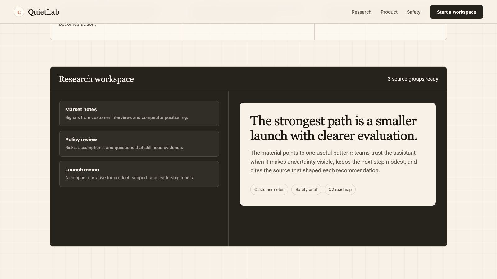
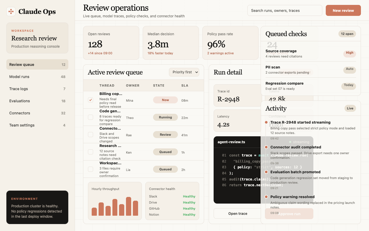

适合 AI 助手、知识产品和研究工具,气质温和克制,带一点编辑型阅读感。
设计语言样张
正文保持清晰、温和、可信,使用暖灰文本而不是冷灰科技感。
const surface = "dark product panel";
model.respond({
  tone: "warm"
}) 使用暖 cream 画布承载页面,避免冷色 SaaS 背景。
标题使用 Copernicus / Tiempos 风格 serif,表达编辑感和人文感。
coral 只用于明确行动、品牌强调和少量 callout。
深色产品面板用于代码窗口、模型展示和高信息密度区域。
不要把页面做成蓝紫科技渐变或冷 slate 系统。
不要用过强阴影制造层级,优先使用纸张底色、边框和留白。
不要把 CTA 做成 pill;Claude 的按钮是克制的 8px 圆角矩形。
不要用纯营销大字堆满页面,正文需要保持 humanist 阅读节奏。
---
version: alpha
name: "Claude"
description: "Claude 的 DESIGN.md 中文参考模板,保留原始 design token 与专业术语,覆盖 color system、typography、layout、components、motion 与 interaction states。"
language: zh-CN
sourceLanguage: en
---

## 概览
Claude.com 是 AI-product category 中最温暖、最 editorial 的 interface。基础氛围是 **tinted cream canvas**(`{colors.canvas}` — #faf9f5),明显温暖,并刻意避开其他 AI brand 常用的 cool gray-white。Headline 使用 **slab-serif display**(“Copernicus” / Tiempos Headline),weight 400,带 negative letter-spacing,并搭配 **StyreneB / Inter** body sans。这个组合感觉像 literary publication,而不是 SaaS marketing page。

Brand voltage 来自 **cream + coral pairing**:coral(`{colors.primary}` — #cc785c)是 signature Anthropic accent,用于每个 primary CTA、brand wordmark,以及 full-bleed callout card。Coral 温暖、略 muted,绝不是 cyan/blue;这是对 OpenAI cool slate、Google saturated blue、Microsoft corporate cyan 的刻意 counter-positioning。

系统有三种 surface mode,会在页面中交替出现:
1. **Cream canvas**(`{colors.canvas}`)— 默认 body floor
2. **Light cream cards**(`{colors.surface-card}`)— feature card background
3. **Dark navy product surfaces**(`{colors.surface-dark}`)— code editor mockup、model showcase card、pre-footer CTA、footer 本身

Dark surface 是 Claude 展示 product chrome 的地方:code block、terminal output、model comparison table、agentic-flow diagram。Cream-to-dark contrast 是页面 pacing rhythm。

**Key Characteristics:**
- Warm cream canvas(`{colors.canvas}` — #faf9f5)搭配 dark warm-ink text(`{colors.ink}` — #141413),这是品牌定义性的 color choice。
- Coral primary CTA(`{colors.primary}` — #cc785c)。在单个 button 上克制使用,在 full-bleed coral callout card 上慷慨使用。
- Slab-serif display headline 使用 Copernicus / Tiempos Headline,weight 400,带 negative letter-spacing。与 humanist sans body 搭配,形成 literary editorial voice。
- Dark navy product mockup card(`{colors.surface-dark}` — #181715)承载 code block、terminal panel、model comparison data;品牌用大尺寸展示 product chrome,而不是 abstract marketing illustration。
- Light cream feature card(`{colors.surface-card}` — #efe9de)略深于 canvas,用于 content-driven feature explanation。
- Anthropic radial-spike mark 是一个小型 black asterisk-like glyph(4-spoke radial),作为 brand wordmark prefix 和 content marker 出现。
- Border radius 有层级:button + input 使用 `{rounded.md}`(8px),content + product card 使用 `{rounded.lg}`(12px),hero illustration container 使用 `{rounded.xl}`(16px),badge 使用 `{rounded.pill}`。
- Section rhythm `{spacing.section}`(96px),属于 modern-SaaS standard。Internal card padding 保持慷慨,为 `{spacing.xl}`(32px)。

## Colors

### Brand & Accent
- **Coral / Primary** (`{colors.primary}` — #cc785c): Signature Anthropic warm coral。用于每个 primary CTA background、full-bleed coral callout card 和 brand wordmark accent。它是 spike-mark logo 之外最可识别的 Anthropic color。
- **Coral Active** (`{colors.primary-active}` — #a9583e): Press / hover-darker variant。
- **Coral Disabled** (`{colors.primary-disabled}` — #e6dfd8): Desaturated cream-tinted disabled state。
- **Accent Teal** (`{colors.accent-teal}` — #5db8a6): 少量用于 secondary product surface(terminal status indicator、connectors page 中的 “active connection” dot)。
- **Accent Amber** (`{colors.accent-amber}` — #e8a55a): 小型 companion warm-tone,用于 category badge 与 inline highlight。

### Surface
- **Canvas** (`{colors.canvas}` — #faf9f5): 默认 page floor。Tinted cream,温暖,并刻意不是 pure white。
- **Surface Soft** (`{colors.surface-soft}` — #f5f0e8): Section divider、very-soft band background。
- **Surface Card** (`{colors.surface-card}` — #efe9de): Feature card、content card。比 canvas 深一级。
- **Surface Cream Strong** (`{colors.surface-cream-strong}` — #e8e0d2): Strongest-cream variant,用于 selected category tab 与 emphasized section band。
- **Surface Dark** (`{colors.surface-dark}` — #181715): Code editor mockup、model showcase card、footer。主导 dark surface。
- **Surface Dark Elevated** (`{colors.surface-dark-elevated}` — #252320): Dark band 内的 elevated card(mockup 中的 settings panel)。
- **Surface Dark Soft** (`{colors.surface-dark-soft}` — #1f1e1b): 略浅的 dark,用于大型 dark card 内的 code block background。
- **Hairline** (`{colors.hairline}` — #e6dfd8): Cream surface 上的 1px border tone。与 `{colors.primary-disabled}` 同 hex;border 像 elevation step,而不是 ink line。
- **Hairline Soft** (`{colors.hairline-soft}` — #ebe6df): 同一 band 内使用的 barely-visible divider。

### Text
- **Ink** (`{colors.ink}` — #141413): 所有 headline 与 primary text。Warm dark,略偏离 pure black。
- **Body Strong** (`{colors.body-strong}` — #252523): Emphasized paragraph、lead text。
- **Body** (`{colors.body}` — #3d3d3a): 默认 running-text color。
- **Muted** (`{colors.muted}` — #6c6a64): Sub-heading、breadcrumb、footer-adjacent secondary text。
- **Muted Soft** (`{colors.muted-soft}` — #8e8b82): Caption、fine-print、copyright line。
- **On Primary** (`{colors.on-primary}` — #ffffff): Coral button 上的 text。
- **On Dark** (`{colors.on-dark}` — #faf9f5): Dark surface 上使用的 cream-tinted white,呼应 canvas tone。
- **On Dark Soft** (`{colors.on-dark-soft}` — #a09d96): Footer body text、dark mockup 中的 secondary label。

### Semantic Colors
- **Success** (`{colors.success}` — #5db872): Green status dot、“available” indicator。
- **Warning** (`{colors.warning}` — #d4a017): Warning callout(marketing surface 上少见)。
- **Error** (`{colors.error}` — #c64545): Validation error。

## Typography

### Font Family
系统使用 **Copernicus**(或 **Tiempos Headline** 替代)作为 headline 的 slab-serif display face,使用 **StyreneB**(或 **Inter** 替代)作为 body、navigation 与 UI label 的 humanist sans。**JetBrains Mono** 处理 code block。Display fallback stack 为 `Tiempos Headline, Garamond, "Times New Roman", serif`;body fallback stack 为 `Inter, -apple-system, BlinkMacSystemFont, "Segoe UI", Roboto, sans-serif`。

Display/body split 是 editorial 的:
- Copernicus serif(weight 400、negative tracking)→ h1、h2、h3、hero display
- StyreneB sans(weight 400-500)→ body、navigation、button、caption、label
- JetBrains Mono → 所有 code block 与 terminal text

### Hierarchy

| Token | Size | Weight | Line Height | Letter Spacing | 用途 |
|---|---|---|---|---|---|
| `{typography.display-xl}` | 64px | 400 | 1.05 | -1.5px | Homepage h1(“Meet your thinking partner”),Copernicus serif |
| `{typography.display-lg}` | 48px | 400 | 1.1 | -1px | Section head,Copernicus |
| `{typography.display-md}` | 36px | 400 | 1.15 | -0.5px | Sub-section head、model name,Copernicus |
| `{typography.display-sm}` | 28px | 400 | 1.2 | -0.3px | Pricing tier name、callout headline,Copernicus |
| `{typography.title-lg}` | 22px | 500 | 1.3 | 0 | Pricing plan size label,StyreneB |
| `{typography.title-md}` | 18px | 500 | 1.4 | 0 | Feature card title、intro paragraph |
| `{typography.title-sm}` | 16px | 500 | 1.4 | 0 | Connector tile title、list label |
| `{typography.body-md}` | 16px | 400 | 1.55 | 0 | Default running-text,StyreneB |
| `{typography.body-sm}` | 14px | 400 | 1.55 | 0 | Footer body、fine-print |
| `{typography.caption}` | 13px | 500 | 1.4 | 0 | Badge label、caption |
| `{typography.caption-uppercase}` | 12px | 500 | 1.4 | 1.5px | Category tag、“NEW” badge |
| `{typography.code}` | 14px | 400 | 1.6 | 0 | Code block,JetBrains Mono |
| `{typography.button}` | 14px | 500 | 1.0 | 0 | Standard button label |
| `{typography.nav-link}` | 14px | 500 | 1.4 | 0 | Top-nav menu item |

### Principles
Display size 使用 weight 400(regular),绝不 bold。Negative letter-spacing(-0.3 到 -1.5px)是必要的;没有它的 Copernicus 会显得 off-brand。Serif character 赋予 Anthropic literary、considered 的声音;切换到 sans-serif display 会让 Claude 像其他 AI tool。

Body type 在 paragraph 上保持 weight 400,在 label 与 emphasized phrase 上使用 weight 500。Sans body 是 humanist(StyreneB),绝不 geometric。Inter 因为相似的 humanist proportion 是可接受替代;Helvetica 或 Arial 过于 neutral,会破坏 warm-editorial feel。

### Font Substitutes
如果 Copernicus / Tiempos Headline 不可用,**Cormorant Garamond** weight 500 加 -0.02em letter-spacing 是最接近的开源近似。**EB Garamond** 是 fallback。对于 StyreneB,**Inter** 是最接近的匹配;两者都是为 screen reading 设计的 humanist sans。若已授权,**Söhne** 也是接近替代。

## Layout

### Spacing System
- **Base unit:** 4px。
- **Tokens:** `{spacing.xxs}` 4px · `{spacing.xs}` 8px · `{spacing.sm}` 12px · `{spacing.md}` 16px · `{spacing.lg}` 24px · `{spacing.xl}` 32px · `{spacing.xxl}` 48px · `{spacing.section}` 96px。
- **Section padding:** `{spacing.section}`(96px),modern-SaaS rhythm。
- **Card internal padding:** Feature card、pricing tier card、model comparison card 使用 `{spacing.xl}`(32px);code-window card 与 connector tile 使用 `{spacing.lg}`(24px)。
- **Callout / CTA bands:** Coral callout card 内部使用 `{spacing.xxl}`(48px);较大的 dark CTA band 内部使用 64px。

### Grid & Container
- **Max content width:** 居中约 1200px。
- **Editorial body:** 单一 12-column grid;hero 常使用 6/6 split(h1 左,illustration 右)。
- **Feature card grids:** Desktop 为 3-up,tablet 为 2-up,mobile 为 1-up。
- **Connector tile grids:** Desktop 为 4-up 或 6-up,tablet 为 2-up,mobile 为 1-up。
- **Pricing grid:** Desktop 为 3-up(常见 Free / Pro / Team / Enterprise),mobile 为 1-up。

### Whitespace Philosophy
Cream canvas + serif display + generous internal padding 创造 editorial pacing;Claude 读起来像 long-form magazine column,而不是 marketing template。Band 之间的 whitespace 统一为 96px;card 内部 whitespace 慷慨(32px),让 type 有呼吸感。

## Elevation & Depth

| Level | Treatment | 用途 |
|---|---|---|
| Flat | 无 shadow,无 border | Body section、top nav、hero band |
| Soft hairline | 1px `{colors.hairline}` border | Input、sub-nav,偶尔用于 card |
| Cream card | `{colors.surface-card}` background,无 shadow | Feature card、content card |
| Dark surface card | `{colors.surface-dark}` background,无 shadow | Code editor mockup、model showcase card |
| Subtle drop shadow | 低 alpha 的 faint shadow | Hover-elevated state(系统很少使用 `0 1px 3px rgba(20,20,19,0.08)`) |

Elevation philosophy 是 **color-block first, shadow rare**。大多数 depth 来自 cream-vs-dark surface contrast。Shadow 极少。Dark surface mockup 自带 internal product chrome(code editor scrollbar、line number、syntax highlighting),无需外部 shadow 就能增加 detail。

### Decorative Depth
- Anthropic spike-mark glyph(4-spoke radial asterisk)作为 brand wordmark 中的小型 black mark 出现,也 inline 作为 content marker。
- Code editor mockup 自带 internal depth:muted blues / oranges / grays 的 syntax-highlighted text、`{colors.muted-soft}` 的 line number、底部 `{colors.surface-dark-elevated}` 的 status bar。
- 部分 hero illustration 使用 coral 与 dark-navy stroke 在 cream 上绘制 simple line-art,minimal、带 hand-drawn feel,绝不 photorealistic。

## Shapes

### Border Radius Scale

| Token | Value | 用途 |
|---|---|---|
| `{rounded.xs}` | 4px | 保留给 badge accent 与 tiny dropdown |
| `{rounded.sm}` | 6px | Small inline button、dropdown item |
| `{rounded.md}` | 8px | Standard CTA button、text input、category tab |
| `{rounded.lg}` | 12px | Content card(feature、pricing、code-window、model-comparison) |
| `{rounded.xl}` | 16px | Hero illustration container、较大的 marquee component |
| `{rounded.pill}` | 9999px | Badge pill、“NEW” tag |
| `{rounded.full}` | 9999px / 50% | Avatar substitute、icon button |

### Photography & Illustrations
Claude 的 hero 很少使用 photography。它改用:
- Cream canvas 上 coral + dark-navy stroke 的 simple line-art illustration
- Code editor mockup(developer-focused page 上主导的 “hero” treatment)
- Dark 上带 monospace text 的 terminal output mockup
- 带 abstract geometric thumbnail 的 model comparison card(Opus / Sonnet / Haiku)

当使用 photography 时(少见,主要是 testimonial),avatar 裁切为 40px diameter 的 perfect circle。

## Components

### Top Navigation

**`top-nav`** — 固定在每页顶部的 cream nav bar。高度 64px,`{colors.canvas}` background。左侧承载 Anthropic spike-mark + “Claude” wordmark,中左为 primary horizontal menu(Product、Solutions、Use Cases、Pricing、Research、Company),右侧 cluster 包含 “Sign in” text-link 与 “Try Claude” `{component.button-primary}`(coral)。Menu item 使用 `{typography.nav-link}`(StyreneB 14px / 500)。

### Buttons

**`button-primary`** — Signature coral CTA。Background `{colors.primary}`(#cc785c)、text `{colors.on-primary}`(white)、type `{typography.button}`(StyreneB 14px / 500)、padding 12px × 20px、height 40px、rounded `{rounded.md}`(8px)。Active state `button-primary-active` 加深为 `{colors.primary-active}`(#a9583e)。

**`button-secondary`** — 带 hairline outline 的 cream button。Background `{colors.canvas}`、text `{colors.ink}`、1px hairline border,padding + height + radius 与 primary 相同。

**`button-secondary-on-dark`** — 用于 `{colors.surface-dark}` card 上。Background `{colors.surface-dark-elevated}`(#252320)、text `{colors.on-dark}`。保持 dark;系统从不在 dark surface 上反转为 light secondary。

**`button-text-link`** — Inline text button,无 background。用于 top nav 中的 “Sign in” 和 inline CTA link。

**`button-icon-circular`** — 36px circular icon button。Background `{colors.canvas}`、hairline border、ink-color icon。用于 carousel arrow、share、“view more”。

**`text-link`** — `{colors.primary}`(coral)的 inline body link。Press 时 underline;coral inline link 是系统最有辨识度的小细节之一。

### Cards & Containers

**`hero-band`** — Cream-canvas hero,使用 6-6 grid:左侧 h1 + sub-headline + button row,右侧 hero illustration card 或 product mockup card。Vertical padding `{spacing.section}`(96px)。

**`hero-illustration-card`** — 较大的 card,承载 hero 右侧 artifact;有时是 cream background 上的 coral-stroke line illustration,有时是 dark code editor mockup。Background 根据 context 使用 `{colors.canvas}` 或 `{colors.surface-dark}`,rounded `{rounded.xl}`(16px)。

**`feature-card`** — 用于 3-up feature grid。Background `{colors.surface-card}`(#efe9de,略深 cream)、rounded `{rounded.lg}`(12px)、internal padding `{spacing.xl}`(32px)。顶部承载 small icon,下面是 `{typography.title-md}` headline 和 `{typography.body-md}` body description。

**`product-mockup-card-dark`** — Dark navy card,展示真实 Claude product chrome(chat interface、code editor、agent control)。Background `{colors.surface-dark}`、rounded `{rounded.lg}`、internal padding `{spacing.xl}`(32px)。承载 `{colors.on-dark}` 的 text label,以及下方 product UI fragment。

**`code-window-card`** — Specialized dark card,展示带 line number 的 code editor、以 `{typography.code}`(JetBrains Mono)渲染的 syntax-highlighted code,有时下方还有 “Run” button 或 terminal output panel。Background `{colors.surface-dark}`,内部 code block 使用 `{colors.surface-dark-soft}`,rounded `{rounded.lg}`、padding `{spacing.lg}`(24px)。这是 Claude Code product page 的 signature visual element。

**`model-comparison-card`** — 用于 homepage “Which problem are you up against?” section,比较 Opus / Sonnet / Haiku。Background `{colors.canvas}`,带 hairline border、rounded `{rounded.lg}`、internal padding `{spacing.xl}`(32px)。承载 model name、short capability blurb,以及用于了解更多的 `{component.text-link}`。

**`pricing-tier-card`** — Standard tier card。Background `{colors.canvas}`,带 hairline border、rounded `{rounded.lg}`、padding `{spacing.xl}`(32px)。承载 `{typography.title-lg}`(StyreneB)的 plan name、`{typography.display-sm}`(Copernicus serif!)的 price、`{typography.body-md}` 的 feature checklist,以及底部 `{component.button-primary}`。

**`pricing-tier-card-featured`** — Featured tier(通常为 “Pro” 或 “Team”)。Background 翻转为 `{colors.surface-dark}`,text 反转为 `{colors.on-dark}`。Dark surface 本身就是 featured-tier signal。

**`callout-card-coral`** — Full-bleed coral card,承载 major call-to-action。Background `{colors.primary}`(#cc785c)、text `{colors.on-primary}`(white)、rounded `{rounded.lg}`、padding `{spacing.xxl}`(48px)。Coral surface 本身就是 voltage;内部 CTA 使用 inverted button style(coral 上的 cream/canvas button)。

**`connector-tile`** — 用于 connectors page 的 integration grid。Background `{colors.canvas}`,带 hairline border、rounded `{rounded.lg}`、padding 20px。每个 tile 顶部承载 logo,下面是 `{typography.title-sm}` connector name 与 short description。

### Inputs & Forms

**`text-input`** — Standard text input。Background `{colors.canvas}`、text `{colors.ink}`、type `{typography.body-md}`、rounded `{rounded.md}`(8px)、padding 10px × 14px、height 40px。1px hairline border 使用 `{colors.hairline}`。

**`text-input-focused`** — Focus state。Border 加粗或切换为 `{colors.primary}`(coral)以强调。带 3px、15% alpha coral outer ring。

**`cookie-consent-card`** — 右下角 floating dark cookie banner。Background `{colors.surface-dark}`、text `{colors.on-dark}`、rounded `{rounded.lg}`、padding `{spacing.lg}`(24px)。这是 cream page 上少数 small scale dark surface 之一。

### Tags / Badges

**`badge-pill`** — 用于 category tag 的小型 pill label。Background `{colors.surface-card}`、text `{colors.ink}`、type `{typography.caption}`(13px / 500)、rounded `{rounded.pill}`、padding 4px × 12px。

**`badge-coral`** — 用于 “NEW”、“BETA” 与 featured highlight 的 coral-fill badge。Background `{colors.primary}`、text `{colors.on-primary}`、type `{typography.caption-uppercase}`(12px / 500 / 1.5px tracking)、rounded `{rounded.pill}`、padding 4px × 12px。

### Tab / Filter

**`category-tab`** + **`category-tab-active`** — 用于 solutions / connectors page 的 sub-nav row。Inactive:transparent background、`{colors.muted}` text。Active:`{colors.surface-card}` background、`{colors.ink}` text。Padding 8px × 14px,rounded `{rounded.md}`。

### CTA / Footer

**`cta-band-coral`** — Pre-footer “Try Claude” CTA card。Full-width coral fill、white type、rounded `{rounded.lg}`、padding 64px。承载 `{typography.display-sm}` 的 h2(仍是 serif!)、sub-line,以及 cream-button CTA。

**`cta-band-dark`** — Developer-focused page 上的 alternative pre-footer band。Background `{colors.surface-dark}`、text `{colors.on-dark}`、rounded `{rounded.lg}`、padding 64px。常搭配 code-window card。

**`footer`** — 收束每个页面的 dark navy footer。Background `{colors.surface-dark}`(#181715)、text `{colors.on-dark-soft}`。Desktop 为 4-column link list,覆盖 Product / Company / Resources / Legal。Vertical padding 64px。Anthropic spike-mark + “Anthropic” wordmark 位于顶部,使用 `{colors.on-dark}`。Footer 从不 invert。

## Do's and Don'ts

### Do
- 每个页面都锚定在 cream canvas 上。Pure white 会读作“任何其他 AI tool”;warm tint 才是 brand differentiator。
- 每个 display headline 都使用 Copernicus serif,并搭配 StyreneB sans body。Display size 上的 negative letter-spacing 不可协商。
- 将 `{colors.primary}`(coral)保留给 primary CTA 和 full-bleed `{component.callout-card-coral}` moment。不要在其他 accent moment 上涂 coral。
- 使用 `{component.product-mockup-card-dark}` 与 `{component.code-window-card}` 展示真实 Claude product chrome。能展示真实 code 时,不要画 code 的 marketing illustration。
- 在 alternating band 中配对 `{component.feature-card}`(cream)与 `{component.product-mockup-card-dark}`(navy)。Cream-to-dark rhythm 是品牌 pacing mechanism。
- 使用 Anthropic spike-mark glyph 作为 brand wordmark prefix。不要在 wordmark 本身内部把 mark invert 为 white-on-dark。
- Major band 之间应用 `{spacing.section}`(96px)。

### Don't
- 不要用 cool gray 或 pure white 作为 canvas。Cream 才是品牌。
- 不要加粗 serif display weight。700 的 Copernicus 会显得 bombastic;系统保持 400。
- 不要用 cool blue 或 saturated cyan 作为 brand accent。Coral 才是 brand voltage。
- 不要到处使用 coral。Coral 在单个 element 上稀缺,只在 full-bleed coral callout card 上慷慨。
- 不要用 Inter 做 display headline。Serif character 是品牌声音。
- 不要在连续两个 band 中重复相同 surface mode。Pacing 交替为:cream → cream-card → dark-mockup → cream → coral-callout → dark-footer。
- 不要添加系统未编码的 hover state styling;primary press 时变暗,其他不变。

## Responsive Behavior

### Breakpoints

| Name | Width | 关键变化 |
|---|---|---|
| Mobile | < 768px | Hamburger nav;hero h1 64→32px;hero-illustration-card 堆叠到 content 下方;feature grid 为 1-up;connector tile 为 2-up;pricing 为 1-up;footer 4 cols → 1 |
| Tablet | 768–1024px | Top nav 保持 horizontal 但收紧;feature card 为 2-up;connector tile 为 3-up;pricing 为 2-up |
| Desktop | 1024–1440px | 完整 top-nav 显示所有 menu item;feature card 为 3-up;connector tile 为 4-up 或 6-up;pricing tier 为 3-up |
| Wide | > 1440px | 与 desktop 相同,但 outer breathing room 更大;max content width 上限 1200px |

### Touch Targets
- `{component.button-primary}` 最小为 40 × 40px。
- `{component.button-icon-circular}` 精确为 36 × 36,略低于 WCAG 44,但视觉居中。
- `{component.text-input}` height 为 40px。
- Connector tile 整张 card area 都可点击;effective tap area >> 44px。

### Collapsing Strategy
- Top nav 在 < 768px 折叠为 hamburger;menu 打开为 full-screen cream sheet。
- Hero band 的 6-6 grid 在 mobile 上折叠为 single-column:先是 h1 + sub-head + button,再是下方 illustration / mockup card。
- Feature grid 通过减少 column 响应,而不是缩小 card。
- Pricing tier card 折叠为 4 → 2 → 1;featured-tier dark surface 在每个 breakpoint 都保持视觉区分。
- Code-window card 通过允许 card 内 horizontal scroll 而不是 wrap code line,在每个 breakpoint 保持 code legibility。

### Image Behavior
- Dark mockup 内的 code block 保持 fixed font-size;mobile 上 horizontal scroll,而不是 wrapping。
- Hero illustration 按比例缩放;line-art stroke 在 mobile 上略微变细。
- Testimonial 中的 avatar photo 在每个 breakpoint 都裁切为 circle。

## Iteration Guide

1. 一次只关注一个 component。引用它的 YAML key(`{component.feature-card}`、`{component.code-window-card}`)。
2. 现有 component 的 variant(`-active`、`-disabled`、`-focused`)作为 `components:` 中的独立 entry。
3. 所有位置都使用 `{token.refs}`,不要 inline hex。
4. 绝不记录 hover。只记录 Default 与 Active/Pressed state。
5. Display headline 保持 Copernicus serif 400,并带 negative tracking。Body 保持 StyreneB / Inter 400。这个 split 不可破坏。
6. Cream + coral + dark navy 是三位一体。不要引入第四种 surface tone(不要 purple card,不要 green section)。
7. 拿不准 emphasis 时:先放大 Copernicus serif,再加粗 weight。

## Known Gaps

- Copernicus 与 StyreneB 是 Anthropic 授权字体,不能作为 public web font 使用。替代字体(serif 用 Tiempos Headline / Cormorant Garamond / EB Garamond;sans 用 Inter / Söhne)已记录在 typography section。
- Anthropic radial-spike-mark 是以 inline SVG 渲染的 brand glyph;这里未形式化为 system token。把它视为 logo asset。
- Animation 与 transition timing(chat message reveal、homepage 上 code block typewriter effect、agentic-flow diagram animation)不在范围内。
- 未提取 `{component.text-input-focused}` 之外的 form validation state;error / success state 需要 sign-up 或 feedback flow 才能确认。
- 实际 Claude product surface(claude.ai chat interface)与 marketing site 共享一些 token,但增加了很多 product-specific component(chat bubble、message tool、file upload chip、conversation history sidebar),不在此 marketing-surface document 范围内。
- 某些页面上的 “agent” / “computer use” demo card 展示 Claude 控制浏览器的动画;static screenshot 无法完整捕获 animation chrome。


