

01 / 03
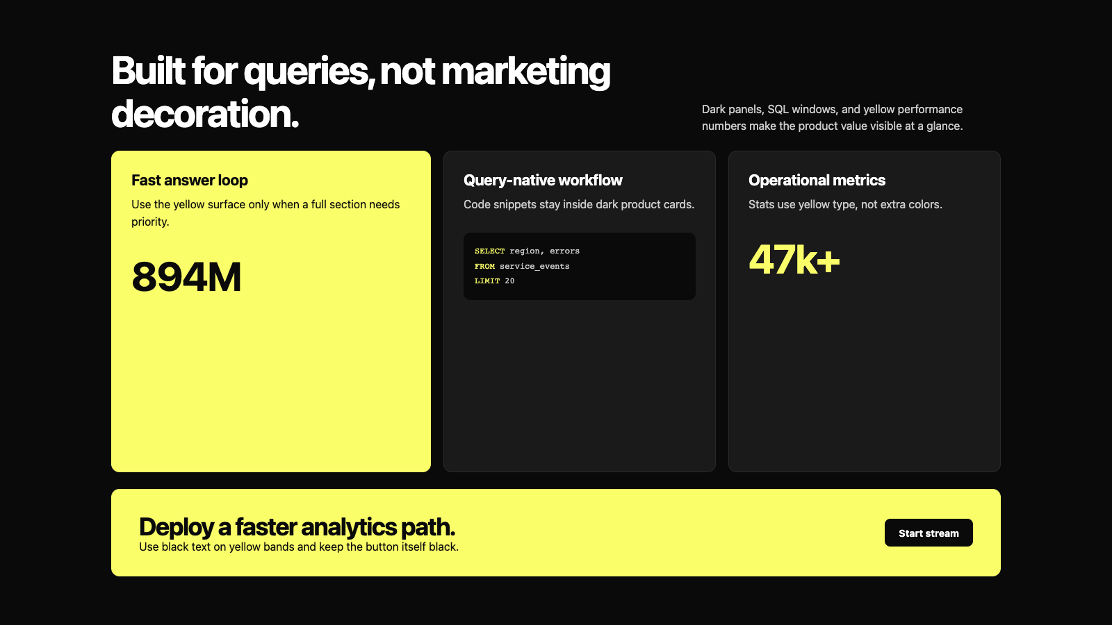
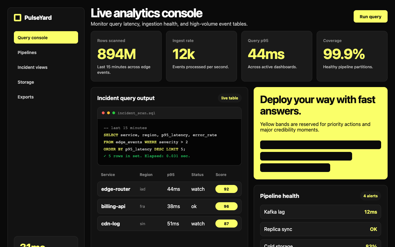

适合监控、日志分析和性能看板,近黑画布配电黄 CTA、数字和代码窗口,强调速度与工程可信。
设计语言样张
黑色画布、电黄行动点、暗色代码窗口和黄色性能数字构成 ClickHouse 的识别度。
SELECT service, latency
FROM edge_events
WHERE severity > 2;31msSQL、命令行和查询结果使用等宽字体,强化工程工具属性。
用 #0a0a0a 黑色画布承载页面,保持高对比。
电黄色只用于主 CTA、大号 stat 和整块黄色 CTA band。
显示标题使用 Inter 700,配 -1px 到 -2.5px 负字距。
核心视觉使用 SQL 代码窗口、查询结果和产品 UI 片段。
卡片保持 12px 圆角和 1px 暗色边框,不加投影。
用黄色数据数字建立可信度和性能感。
不要引入第二套品牌强调色。
不要把页面改成浅色模式或冷灰 SaaS。
不要用插画替代 SQL / 查询 / 数据产品片段。
不要把黄色滥用为正文颜色。
不要把标准按钮做成 pill,按钮圆角是 8px。
不要用阴影、玻璃拟态或渐变制造层级。
---
version: alpha
name: "Clickhouse"
description: "Clickhouse 的 DESIGN.md 中文参考模板,保留原始 design token 与专业术语,覆盖 color system、typography、layout、components、motion 与 interaction states。"
language: zh-CN
sourceLanguage: en
---

## 概览
ClickHouse 的 marketing surface 是 database / data-platform 类别里对比度最高的界面。Base atmosphere 是 **near-pure black canvas**(`{colors.canvas}` — #0a0a0a),并以 **electric yellow**(`{colors.primary}` — #faff69)作为唯一 brand voltage。Yellow 承担每个 primary CTA、每个 stat-callout number、每个 "GET STARTED" badge;在单个元素上使用克制,但在 full-bleed yellow CTA card 上使用大胆。White typography 以自信的 weight-700 sans-serif 锚定 editorial body。

Yellow + black pairing 让 ClickHouse 具有即时识别度。Snowflake 使用 cool blue gradient,Databricks 使用 red + slate,而 ClickHouse 则把所有 brand work 都压在一个 electric yellow 上。Code block、terminal output 和 product UI fragment 在每个页面中都直接嵌入 dark `{colors.surface-card}` (#1a1a1a) card。

Type voice 使用 **Inter** 的自信字重:display headline 为 700(带 -1 到 -2.5px negative letter-spacing),sub-title 和 button 为 600,body 为 400。系统没有 display-serif counter-voice;所有内容都是同一套 geometric humanist sans,通过 scale 和 weight 建立 hierarchy。

**Key Characteristics:**
- Near-pure black canvas(`{colors.canvas}` — #0a0a0a)搭配 white type。系统没有 light-mode marketing surface。
- Electric yellow primary(`{colors.primary}` — #faff69)。用于 primary CTA、大型 stat-callout number("2.8k+"、"74k+")和 full-bleed yellow CTA band。
- Inter display 使用 weight 700,sub-title + button 使用 weight 600,body 使用 weight 400。没有 serif counterpoint。
- Dark surface card(`{colors.surface-card}` — #1a1a1a)用于 feature card、code window 和 product mockup。Card 只比 canvas 稍亮,color-block contrast 很克制。
- Code block 在 `{colors.surface-card}` 内用 JetBrains Mono 渲染。SQL syntax 以 muted blue / yellow / gray 高亮。
- Yellow + sans-700 + 巨大字号的 stat number 承担 credibility moment("779+"、"2.8k+"、"47k+" community / contributor / star count)。
- Border radius 有层级:button 使用 `{rounded.md}` (8px),content card 使用 `{rounded.lg}` (12px)。除 tag badge 外不使用 pill。
- Major editorial band 之间使用 `{spacing.section}` (96px) section rhythm。

## Colors

### Brand & Accent
- **Primary (Electric Yellow)** (`{colors.primary}` — #faff69): Signature brand color。所有 primary CTA background、大型 stat-callout number、full-bleed yellow CTA card 都使用它。Yellow 就是品牌。
- **Primary Active** (`{colors.primary-active}` — #e6eb52): Press / hover-darker variant。
- **Primary Disabled** (`{colors.primary-disabled}` — #3a3a1f): Dark canvas 上的 desaturated dark-yellow。

### Surface
- **Canvas** (`{colors.canvas}` — #0a0a0a): 默认 page floor。Near-pure black。
- **Surface Soft** (`{colors.surface-soft}` — #121212): Section divider、very-soft band tint。
- **Surface Card** (`{colors.surface-card}` — #1a1a1a): Feature card、code window、product mockup、pricing tier card。
- **Surface Elevated** (`{colors.surface-elevated}` — #242424): 大型 dark card 内部的 nested card。
- **Surface Yellow Band** (`{colors.surface-yellow-band}` — #faff69): Yellow CTA card / band fill,与 primary 同 hex。
- **Hairline** (`{colors.hairline}` — #2a2a2a): Card 上的 1px border。
- **Hairline Strong** (`{colors.hairline-strong}` — #3a3a3a): Input underline 和 emphasis 使用的更重 divider。

### Text
- **Ink / On Dark** (`{colors.on-dark}` — #ffffff): 所有 headline 和 primary text。
- **Body** (`{colors.body}` — #cccccc): Default running-text color。
- **Body Strong** (`{colors.body-strong}` — #e6e6e6): Emphasized paragraph。
- **Muted** (`{colors.muted}` — #888888): Footer link、caption、breadcrumb。
- **Muted Soft** (`{colors.muted-soft}` — #5a5a5a): Tertiary text / fine print。
- **On Primary / On Yellow** (`{colors.on-primary}` / `{colors.on-yellow}` — #0a0a0a): Yellow CTA 和 yellow CTA band 上的 black text。高对比 yellow + black combo 是品牌 action signal。

### Semantic / Accent
- **Accent Emerald** (`{colors.accent-emerald}` — #22c55e): Product UI 中的 success state、"active" status indicator。
- **Accent Rose** (`{colors.accent-rose}` — #ef4444): Error state、"down" indicator。
- **Accent Blue** (`{colors.accent-blue}` — #3b82f6): Info state、code-syntax highlighting。

## Typography

### Font Family
系统中几乎所有内容都使用 **Inter**:display、body、navigation、button、caption。**JetBrains Mono** 负责 code block。Fallback stack 使用 `-apple-system, BlinkMacSystemFont, "Segoe UI", Roboto, sans-serif`。

Single-family approach 是刻意的:Inter 通过 weight 700 + 600 + 400 覆盖完整 hierarchy,不需要 serif 或 display counter-voice。Inter 在 confident bold weight 下的 geometric humanist character 给 ClickHouse 带来 precise、engineered feel,匹配数据库 performance-first positioning。

### Hierarchy

| Token | Size | Weight | Line Height | Letter Spacing | 用途 |
|---|---|---|---|---|---|
| `{typography.display-xl}` | 72px | 700 | 1.05 | -2.5px | Homepage h1("The leading database for AI") |
| `{typography.display-lg}` | 56px | 700 | 1.1 | -2px | Section head |
| `{typography.display-md}` | 40px | 700 | 1.15 | -1.5px | Sub-section head、CTA-band head |
| `{typography.display-sm}` | 32px | 700 | 1.2 | -1px | Card title、pricing tier price |
| `{typography.title-lg}` | 24px | 700 | 1.3 | -0.3px | Pricing plan name、larger feature title |
| `{typography.title-md}` | 18px | 600 | 1.4 | 0 | Card title、intro paragraph |
| `{typography.title-sm}` | 16px | 600 | 1.4 | 0 | Small card title、list label |
| `{typography.stat-display}` | 56px | 700 | 1.0 | -1.5px | Stat callout("779+"、"47k+"),始终为 yellow |
| `{typography.body-md}` | 16px | 400 | 1.55 | 0 | Default running-text |
| `{typography.body-sm}` | 14px | 400 | 1.55 | 0 | Footer body、fine-print |
| `{typography.caption}` | 13px | 500 | 1.4 | 0 | Badge label、caption |
| `{typography.caption-uppercase}` | 12px | 600 | 1.4 | 1.5px | Section label、"NEW" badge |
| `{typography.code}` | 14px | 400 | 1.55 | 0 | Code block:JetBrains Mono |
| `{typography.button}` | 14px | 600 | 1.0 | 0 | Standard button label |
| `{typography.nav-link}` | 14px | 500 | 1.4 | 0 | Top-nav menu item |

### Principles
Display 在所有尺寸都保持 weight 700。Negative letter-spacing(-1 到 -2.5px)是必要条件;没有 negative tracking 的 Inter weight 700 会显得过宽、偏 Apple-marketing。收紧 tracking 给 ClickHouse 带来 precise、engineered feel。

Body 和 label 保持 400 / 500 / 600 weight。Hierarchy 建立在 size + weight 上,而不是 family contrast。

### Font Substitutes
Inter 是 open-source,也是文档指定选择。如果有授权,**Söhne** 是接近的 commercial alternative。**Geist** 是另一个现代替代。

## Layout

### Spacing System
- **Base unit:** 4px.
- **Tokens:** `{spacing.xxs}` 4px · `{spacing.xs}` 8px · `{spacing.sm}` 12px · `{spacing.md}` 16px · `{spacing.lg}` 24px · `{spacing.xl}` 32px · `{spacing.xxl}` 48px · `{spacing.section}` 96px.
- **Section padding:** Major band 之间使用 `{spacing.section}` (96px)。
- **Card internal padding:** Feature card、pricing tier 使用 `{spacing.xl}` (32px);code-window card 和 event card 使用 `{spacing.lg}` (24px)。

### Grid & Container
- **Max content width:** 约 1280px 居中。
- **Editorial body:** 单一 12-column grid;hero 常用 7/5 split(h1 在左,code mockup 在右)。
- **Feature card grids:** Desktop 为 3-up,tablet 为 2-up,mobile 为 1-up。
- **Pricing grid:** Desktop 为 3-4 up,mobile 为 1-up。

### Whitespace Philosophy
ClickHouse 使用 dense、略压缩的 whitespace,适合 developer-tooling brand:足够宽松以保持 editorial 可读,又足够紧凑,让界面显得 "engineering-grade",而不是 "marketing-soft"。96px section rhythm 是标准;feature card 的 internal padding 保持 32px。

## Elevation & Depth

| Level | Treatment | 用途 |
|---|---|---|
| Flat | 无 shadow,无 border | Body section、top nav、hero |
| Soft hairline | 1px `{colors.hairline}` border | Code-window card、content card |
| Surface card | `{colors.surface-card}` background,无 shadow | Feature card、pricing tier、event card |
| Yellow band | `{colors.primary}` background,无 shadow | Full-bleed yellow CTA card / band |

系统不使用 drop shadow。Depth 来自 black canvas 和 `{colors.surface-card}`(只比 canvas 略亮)之间的 contrast;这种 contrast 很 subtle,更像 "engineering-grade dim panel",而不是 "elevated card"。

### Decorative Depth
- Code-window card 自带内部 product chrome:line number、syntax highlighting、底部 status bar;它们在没有 external shadow 的情况下增加 visual density。
- Yellow-on-black contrast 承担 CTA 的大部分 elevation work。

## Shapes

### Border Radius Scale

| Token | Value | 用途 |
|---|---|---|
| `{rounded.xs}` | 4px | 保留给 badge accent |
| `{rounded.sm}` | 6px | Small inline button |
| `{rounded.md}` | 8px | Standard CTA button、text input |
| `{rounded.lg}` | 12px | Content card、code-window card、pricing tier |
| `{rounded.pill}` | 9999px | Badge pill |
| `{rounded.full}` | 9999px / 50% | Avatar、icon button |

## Components

### Top Navigation

**`top-nav`** — 固定在顶部的 black nav bar。高度 64px,background `{colors.canvas}`。左侧承载 ClickHouse logo + wordmark,中左为 primary horizontal menu(Product、Use Cases、Pricing、Resources、Customers),右侧 cluster 为 "Sign in" + "Get Started" `{component.button-primary}`(yellow)。Menu item 使用 `{typography.nav-link}`(Inter 14px / 500)。

### Buttons

**`button-primary`** — Signature yellow CTA。Background `{colors.primary}` (#faff69)、text `{colors.on-primary}` (black)、type `{typography.button}`(Inter 14px / 600)、padding 12px × 20px、height 40px、rounded `{rounded.md}` (8px)。Yellow + black combination 是 icon 级识别。

**`button-secondary`** — Dark surface card button。Background `{colors.surface-card}`、text `{colors.on-dark}`,shape 与 primary 相同。

**`button-text-link`** — Inline text button,无 background。用于 "Sign in" 和 inline link CTA。

**`text-link`** — Inline body link 使用 `{colors.primary}`(dark 上的 yellow)。带 underline。

**`button-icon-circular`** — Dark 上的 36 × 36 circular icon button。

### Cards & Containers

**`hero-band`** — Black-canvas hero,使用 7-5 grid:左侧为 h1 + sub-headline + button row,右侧为 code-window 或 product mockup。Vertical padding `{spacing.section}` (96px)。

**`hero-stat-card`** — Canvas 上 inline 的 yellow stat-display number("779+"、"47k+")。没有 card surface;只是 `{typography.stat-display}`(56px / 700)中的 yellow text。

**`feature-card-yellow`** — Full-bleed yellow card("Built for every modern data challenge")。Background `{colors.primary}`、text `{colors.on-yellow}` (black)、rounded `{rounded.lg}` (12px)、padding `{spacing.xl}` (32px)。Yellow card 本身就是 visual emphasis。

**`feature-card-dark`** — Standard dark feature card。Background `{colors.surface-card}`、text `{colors.on-dark}`、rounded `{rounded.lg}`、padding `{spacing.xl}` (32px)。

**`code-window-card`** — 展示 SQL code block 的 dark card。Background `{colors.surface-card}`,code 使用 JetBrains Mono 并带 syntax highlighting,rounded `{rounded.lg}`、padding `{spacing.lg}` (24px)。在 developer-focused page 上常作为 hero 右侧 artifact。

**`product-mockup-card`** — 展示真实 ClickHouse product UI(query editor、dashboard、monitoring panel)的 card。Shape 与 `{component.feature-card-dark}` 相同,但内部嵌入 product chrome。

**`pricing-tier-card`** — Standard tier card. Background `{colors.surface-card}`, rounded `{rounded.lg}`, padding `{spacing.xl}` (32px).
**`pricing-tier-card`** — Standard tier card。Background `{colors.surface-card}`、rounded `{rounded.lg}`、padding `{spacing.xl}` (32px)。

**`pricing-tier-card-featured`** — The featured tier flips to `{colors.primary}` (yellow). The yellow surface IS the featured signal.
**`pricing-tier-card-featured`** — Featured tier 翻转为 `{colors.primary}`(yellow)。Yellow surface 本身就是 featured signal。

**`stat-callout`** — Inline yellow stat number("779+"、"2.8k+"、"47k+")。Transparent background、text `{colors.primary}`、type `{typography.stat-display}`。作为 flat layout block 使用,不是带 surface 的 card。

**`events-card`** — Used on /company/events. Dark card with event title, date in `{typography.caption-uppercase}`, location, and a "Register" CTA. Rounded `{rounded.lg}`, padding `{spacing.lg}`.
**`events-card`** — 用于 /company/events。Dark card 包含 event title、使用 `{typography.caption-uppercase}` 的 date、location,以及 "Register" CTA。Rounded `{rounded.lg}`、padding `{spacing.lg}`。

**`customer-logo-strip`** — Horizontal monochrome customer-logo strip. Background `{colors.canvas}`, logos in `{colors.muted}`, vertical padding `{spacing.xl}` (32px).
**`customer-logo-strip`** — Horizontal monochrome customer-logo strip。Background `{colors.canvas}`,logo 使用 `{colors.muted}`,vertical padding `{spacing.xl}` (32px)。

### Inputs & Forms

**`text-input`** — Dark text input. Background `{colors.surface-card}`, text `{colors.on-dark}`, rounded `{rounded.md}` (8px), padding 10px × 14px, height 40px.
**`text-input`** — Dark text input。Background `{colors.surface-card}`、text `{colors.on-dark}`、rounded `{rounded.md}` (8px)、padding 10px × 14px、height 40px。

**`text-input-focused`** — Border thickens to `{colors.primary}` (yellow) for emphasis.
**`text-input-focused`** — Border 加粗并变为 `{colors.primary}`(yellow),用于 emphasis。

### Tags / Badges

**`badge-pill`** — Small dark pill label. Background `{colors.surface-card}`, text `{colors.on-dark}`, type `{typography.caption}`, rounded `{rounded.pill}`.
**`badge-pill`** — Small dark pill label。Background `{colors.surface-card}`、text `{colors.on-dark}`、type `{typography.caption}`、rounded `{rounded.pill}`。

**`badge-yellow`** — Yellow pill for "NEW", "GET STARTED" emphasis. Background `{colors.primary}`, text `{colors.on-primary}`, type `{typography.caption-uppercase}`, rounded `{rounded.pill}`.
**`badge-yellow`** — 用于 "NEW"、"GET STARTED" emphasis 的 yellow pill。Background `{colors.primary}`、text `{colors.on-primary}`、type `{typography.caption-uppercase}`、rounded `{rounded.pill}`。

### Tab / Filter

**`category-tab`** + **`category-tab-active`** — Dark tab navigation. Inactive: transparent + muted text. Active: surface-card background + on-dark text. Padding 8px × 14px, rounded `{rounded.md}`.
**`category-tab`** + **`category-tab-active`** — Dark tab navigation。Inactive: transparent + muted text。Active: surface-card background + on-dark text。Padding 8px × 14px、rounded `{rounded.md}`。

### CTA / Footer

**`cta-band-yellow`** — A pre-footer "Deploy your way" CTA band. Full yellow fill, black type, rounded `{rounded.lg}`, padding 64px. Carries an h2 in `{typography.display-md}` and a CTA — usually a black-button on the yellow surface.
**`cta-band-yellow`** — Pre-footer "Deploy your way" CTA band。Full yellow fill、black type、rounded `{rounded.lg}`、padding 64px。包含一个使用 `{typography.display-md}` 的 h2 和一个 CTA,通常是在 yellow surface 上使用 black-button。

**`footer`** — Black footer that closes every page. Background `{colors.canvas}`, text `{colors.muted}`. 4-column link list at desktop covering Product / Use Cases / Resources / Company. Vertical padding 64px. The ClickHouse wordmark sits at the top in `{colors.on-dark}`.
**`footer`** — 每页结尾的 black footer。Background `{colors.canvas}`、text `{colors.muted}`。Desktop 为 4-column link list,覆盖 Product / Use Cases / Resources / Company。Vertical padding 64px。ClickHouse wordmark 位于顶部,使用 `{colors.on-dark}`。

## Do's and Don'ts

### Do
- 每个页面都锚定在 black canvas 上。Yellow + black pairing 是 brand voltage。
- 将 `{colors.primary}`(yellow)保留给 primary CTA、stat-callout number 和 full-bleed yellow CTA band。Yellow 在元素级的稀缺 + 在 band 级的充足使用,让它有力量。
- 每个 display headline 都使用 Inter weight 700,并带 -1 到 -2.5px letter-spacing。
- 在 `{component.code-window-card}` 内展示真实 SQL code block。ClickHouse 是数据库;展示 query,不要画 query 的 marketing illustration。
- 使用 `{component.stat-callout}` number 建立可信度(community size、contributor、performance benchmark)。Yellow stat number 是 signature。
- 每个 band 都用 `{spacing.section}` (96px) vertical rhythm 锚定。

### Don't
- 不要引入第二个 brand color。ClickHouse 是 monochromatic + yellow。
- 不要让 display weight 超过 700,也不要用 weight 500 做 headline。Hierarchy 依赖 size,而不是 weight gradation。
- 不要把 yellow 用于 body text,或用于 intentional yellow card 之外的大型 surface fill。
- 不要在 small badge 之外使用 rounded button / pill。Standard button radius 是 8px(md)。
- 不要在两个连续 band 中重复相同 surface mode。推荐节奏是 black canvas → dark feature card → yellow CTA card → black canvas → code-window card。
- 不要用 abstract illustration 替代 SQL code mockup。Code 本身就是 marketing voltage。
- 不要添加系统已编码之外的 hover state styling。

## Responsive Behavior

### Breakpoints

| Name | Width | 关键变化 |
|---|---|---|
| Mobile | < 768px | Hamburger nav;hero h1 72→36px;code-window-card 堆叠到下方;feature grid 1-up;pricing 1-up |
| Tablet | 768–1024px | Top nav 收紧;feature card 2-up;pricing 2-up |
| Desktop | 1024–1440px | 完整 top-nav;3-up feature card;3-4 up pricing tier |
| Wide | > 1440px | 与 desktop 相同,但 breathing room 更多;max content 1280px |

### Touch Targets
- `{component.button-primary}` 最小为 40 × 40px。
- `{component.button-icon-circular}` 精确为 36 × 36,略低于 WCAG 44,但视觉居中。
- `{component.text-input}` 高度为 40px。

### Collapsing Strategy
- Top nav 在 < 768px 折叠为 hamburger。
- Hero 7-5 grid 在 mobile 上变为 single-column。
- Feature card grid 通过减少 column 折叠,而不是整体缩放。
- Code-window card 保持 font-size;mobile 上在 card 内部 horizontal scroll。
- Pricing tier card 按 4 → 2 → 1 折叠;featured tier 的 yellow 保持显著。

### Image Behavior
- Dark mockup 内的 code block 保持固定 font-size;mobile 上 horizontal scroll,而不是 wrapping。
- Monochrome strip 中的 customer logo 保持 native width;mobile 上 row wrap。

## Iteration Guide

1. 每次只聚焦一个 component。引用它的 YAML key(`{component.code-window-card}`、`{component.pricing-tier-card-featured}`)。
2. 现有 component 的 variant(`-active`、`-disabled`、`-focused`)作为独立条目存在。
3. 所有地方使用 `{token.refs}`,不要 inline hex。
4. 不记录 hover。只记录 Default 和 Active/Pressed state。
5. Display headline 保持 Inter 700,并带 negative letter-spacing。Body 保持 Inter 400。
6. Yellow + black pairing 是品牌契约。不要用 secondary accent 软化它。
7. 不确定如何强调时:先使用更大的 Inter 700,再考虑加颜色。

## Known Gaps

- Exact yellow hex(#faff69)来自 screenshot 采样;ClickHouse 可能发布略有不同的 official brand color。
- 400 / 500 / 600 / 700 之外的 Inter weight axis value 未 formalized;这里只记录观察到的 static weight。
- Animation 和 transition timing(code typewriter effect、stat counter animation)不在范围内。
- `{component.text-input-focused}` 之外的 form validation state 未提取。
- 实际 ClickHouse Cloud product surface(query console、monitoring dashboard、table browser)与 marketing site 共享部分 token,但增加了许多 product-specific component,不在此范围内。
- Customer logo strip 的 exact opacity / treatment 会变化;muted gray 是近似值。


