

01 / 03
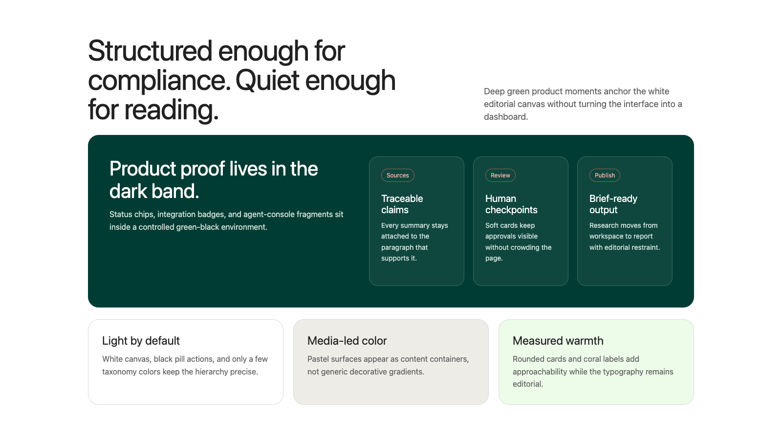
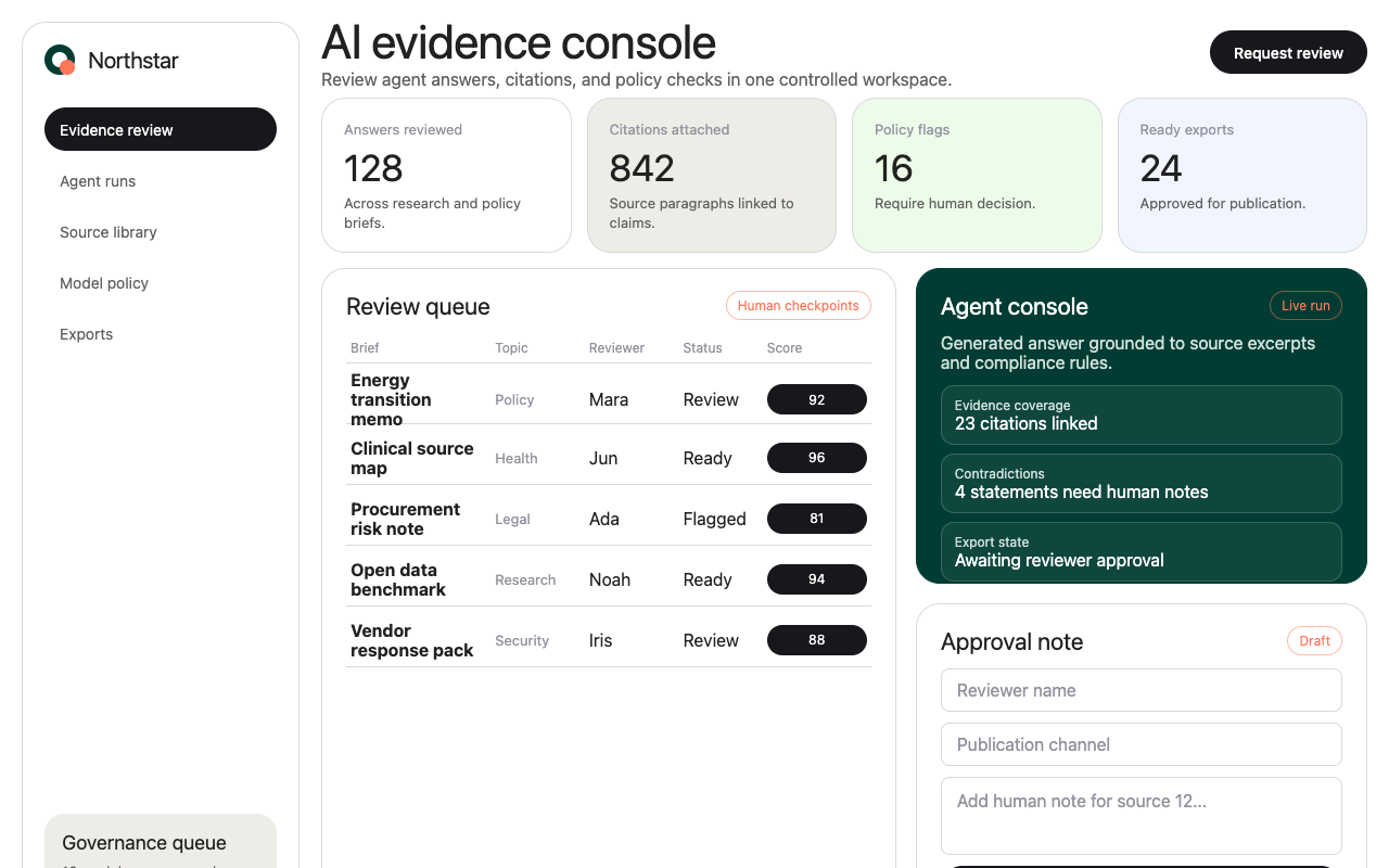

适合研究内容、企业知识和模型能力页,白色编辑留白配深绿产品带与圆角媒体卡,显得克制可信。
设计语言样张
白色编辑画布、近黑 pill CTA、深绿产品区块和圆角媒体卡共同构成 Cohere 的企业 AI 语气。
Source 12 needs a human note before publishing.
正文和 UI 文案保持精确、克制,不依赖加粗制造层级。
默认使用白色编辑画布,用大留白建立信任感。
深绿或深蓝作为完整产品 band,而不是小面积装饰色。
主 CTA 使用近黑或白色 pill,半径接近 32px。
媒体卡和产品卡使用 8px 到 22px 圆角,避免重阴影。
coral 只用于分类 chip、taxonomy 和少量暖色标记。
产品能量来自 agent console、摄影和媒体卡,不来自泛用渐变。
不要把 coral 或 blue 做成大面积装饰背景。
不要给卡片加沉重投影。
不要把每个 section 都做成卡片,Cohere 常用开放留白和规则线。
不要把主按钮改成方角或普通矩形。
不要用单一通用 sans 替代 display/body 的分工。
不要把渐变当作普通 UI 背景。
---
version: alpha
name: "Cohere"
description: "Cohere 的 DESIGN.md 中文参考模板,保留原始 design token 与专业术语,覆盖 color system、typography、layout、components、motion 与 interaction states。"
language: zh-CN
sourceLanguage: en
---

## 概览
Cohere 当前的 web presence 像一个冷静的 enterprise AI command center,并带有 editorial restraint。Home page 在 white canvas 上以巨大的 typographic declaration 开场,随后用 photography、dark product mockup、trust logo 和宽松 empty space,让 AI infrastructure 显得可控,而不是投机。Product page 将 tone 反转为 deep green-black 或 dark navy band;blog 和 research page 则转向 publishing-system clarity:large filter、thin rule、dense list 和 pale technical background。

系统的独特之处在于 austere black-and-white UI 与 tactile brand imagery 的短促爆发混合在一起。站点在常规 interface 中避免 decorative chrome;color 通过 photography、abstract 3D media、coral blog taxonomy chip、blue research link 和 dark product environment 到来。Card 是 rounded,但不 cute。Type 巨大、紧凑,并且精神上几乎接近 monospaced,在 marketing、product 和 editorial surface 中形成 research-lab cadence。

**Key Characteristics:**
- Monumental display headline,使用很紧的 line height 和 negative tracking。
- White editorial canvas 被 deep green、dark navy 和 image-led CTA band 打断。
- Rounded media card 和 product card,通常为 8px 到 22px。
- Pill CTA 使用 near-black 或 white;多数 secondary action 渲染为 underlined text link。
- Trust-logo strip 使用 monochrome partner mark 和非常宽的 vertical spacing。
- Agent-console mockup 使用 dark panel、small status chip 和 product integration badge。
- Blog 和 research surface 使用突出的 taxonomy chip、长 rule-separated list 和 search field。

## Colors

### Brand & Accent

- **Cohere Black** (`#000000`): Announcement bar、最高对比 text,以及 global brand anchor。
- **Near-Black Primary** (`#17171c`): Primary CTA button、dark footer 和 deep UI card。
- **Deep Enterprise Green** (`#003c33`): North 和 Command-style dark section 的 product hero band。
- **Dark Navy** (`#071829`): Financial-services 与 security-oriented solution band。
- **Action Blue** (`#1863dc`): Editorial link、pagination 和 secondary action emphasis。
- **Coral** (`#ff7759`): Blog category chip、taxonomy outline 和 warm product marker。
- **Soft Coral** (`#ffad9b`): Pale chip border 和 segmented article-label detail。

### Surface & Background

- **Canvas White** (`#ffffff`): 主导 page background 和 form/card surface。
- **Soft Stone** (`#eeece7`): Product card、testimonial placeholder 和 warm neutral surface block。
- **Pale Green Wash** (`#edfce9`): North page 中 stacked dark capability panel 后方的 section backdrop。
- **Pale Blue Wash** (`#f1f5ff`): Abstract 3D imagery 后方的 blog CTA surface。
- **Card Border** (`#f2f2f2`): 最柔和的 card containment line。

### Text & Rules

- **Ink** (`#212121`): Light background 上的 default body text 和多数 link text。
- **Muted Slate** (`#93939f`): Footer link、date、metadata 和 de-emphasized label。
- **Slate** (`#75758a`): Research separator 和 tertiary text。
- **Hairline** (`#d9d9dd`): Standard list rule 和 section divider。
- **Border Light** (`#e5e7eb`): Secondary divider 和 utility rule。

### Semantic Colors

- **Focus Blue** (`#4c6ee6`): Keyboard focus 和 ring color。
- **Form Focus Violet** (`#9b60aa`): Text input 的 focus border。
- **Error Red** (`#b30000`): 与 validation-like state 相关的 ring/shadow color。

### Gradient System

Cohere 不把 gradient 当作 generic UI fill。Gradient 和 color field 都是 media-led:abstract 3D hero imagery、deep blue open-science particle field、red-orange product video poster,以及 dark green-to-black product environment。UI surface 保持 flat;gradient richness 只留给 large media panel 和 CTA image band。

## Typography

### Font Family

- **Display**: `CohereText`, falling back to `Space Grotesk`, `Inter`, `ui-sans-serif`, and `system-ui`.
- **Body/UI**: `Unica77 Cohere Web`, falling back to `Inter`, `Arial`, `ui-sans-serif`, and `system-ui`.
- **Technical labels**: `CohereMono`, falling back to `Arial`, `ui-sans-serif`, and `system-ui`.
- **Icons**: Cohere uses custom icon fonts and thin-line geometric illustrations.

### Hierarchy

| Role | Font | Size | Weight | Line Height | Letter Spacing | 说明 |
|---|---|---:|---:|---:|---:|---|
| Hero Display | CohereText | 96px | 400 | 1.00 | -1.92px | Home page declaration scale。 |
| Product Display | CohereText | 72px | 400 | 1.00 | -1.44px | Product 和 research hero headline。 |
| Section Display | Unica77 | 60px | 400 | 1.00 | -1.2px | 大型 product-page heading。 |
| Section Heading | Unica77 | 48px | 400 | 1.20 | -0.48px | Split hero 和 CTA heading。 |
| Card Heading | Unica77 | 32px | 400 | 1.20 | -0.32px | Feature card 和 list section title。 |
| Feature Heading | Unica77 | 24px | 400 | 1.30 | 0 | Card、filter 和 article title。 |
| Body Large | Unica77 | 18px | 400 | 1.40 | 0 | Lead text 和 larger paragraph。 |
| Body | Unica77 | 16px | 400 | 1.50 | 0 | Default copy 和 link text。 |
| Button | Unica77 | 14px | 500 | 1.71 | 0 | Compact CTA label。 |
| Caption | Unica77 | 14px | 400 | 1.40 | 0 | Metadata 和 small explanatory text。 |
| Mono Label | CohereMono | 14px | 400 | 1.40 | 0.28px | Uppercase technical label。 |
| Micro | Unica77 | 12px | 400 | 1.40 | 0 | Footer、nav microcopy 和 small link。 |

### Principles

- 谨慎使用 massive type;Cohere 页面通常只有一个 oversized headline,然后回到克制的 16px-24px UI copy。
- Display type 保持紧。Hero copy 应该感觉 compact and carved,而不是 airy。
- 避免 heavy bold weight。Size、spacing 和 surface contrast 承担大部分 hierarchy work。
- Category 和 system marker 使用 uppercase mono label,尤其是在 product 和 research page。
- Editorial page 可以使用 coral chip 和 blue link,但 base typography 仍保持 black and measured。

## Layout

### Spacing System

系统使用 8px base,并带许多 one-off alignment value:`2px`、`6px`、`8px`、`10px`、`12px`、`16px`、`20px`、`22px`、`24px`、`28px`、`32px`、`36px`、`40px`、`56px`、`60px`、`64px` 和 `80px`。

Large section 依赖戏剧化的 vertical breathing room。Home page 将 trust-logo strip 放在 hero media 下方很远的位置。Product page 常把 dark panel 放在大量 empty white space 中,直到接近结尾才转入 dense form 或 footer。

### Grid & Container

- Global nav 使用 three-zone layout:logo left、menu centered、sign-in/CTA right。
- Home hero 是 centered text,位于 two-card media composition 上方:一个 wide product mockup card 旁边配一个更窄的 photography card。
- Feature section 在 desktop 上常用 3-column card。
- Product page 在 centered hero block、trust-logo strip、large single-feature band 和 2/3-column card grid 之间交替。
- Research page 使用带 date 和 chip column 的 full-width list,而不是 decorative card。
- Form 在 dark 或 stone section background 上的 rounded white card 内使用 two-column input row。

### Whitespace Philosophy

Cohere 将 whitespace 当作 trust signal。大量 empty interval 分隔 brand claim、customer proof、product proof 和 CTA。Dense content 只在服务 information architecture 的地方出现:research paper row、blog card grid 和 contact form field。

## Elevation & Depth

Cohere 整体 mostly flat。Depth 来自 surface alternation、media contrast、rounded corner 和 thin border,而不是 drop shadow。

| Level | Treatment | 用途 |
|---|---|---|
| Flat | 无 shadow,white 或 dark field | Hero copy、research list、editorial surface |
| Bordered | 1px `#d9d9dd`、`#e5e7eb` 或 dark translucent rule | Research row、form、pale card、footer input |
| Media Lift | Contrasting section color 上的 rounded image 或 video | Hero photo card、product video、CTA imagery |
| Dark Product Field | Deep green 或 navy full-width band | Command、North、financial services、security section |

## Shapes

### Radius Scale

| Token | Value | 角色 |
|---|---:|---|
| `xs` | 4px | Small image、search field、article thumbnail、utility element |
| `sm` | 8px | Blog chip、card、small media、dialog |
| `md` | 16px | Medium product card 和 grouped block |
| `lg` | 22px | Signature media-card 和 soft placeholder radius |
| `xl` | 30px | Research/topic filter pill |
| `pill` | 32px | Primary CTA button |
| `full` | 9999px | Round status element 和 fully pill-shaped control |

### Image Treatment

除 CTA band 外,image 不作为 text 的 decorative backdrop。大多数 imagery 都作为可见圆角的 rounded card 存在:product video、enterprise photography、article thumbnail 和 abstract 3D render。主导 radius 是 8px 和 22px。

## Components

### **`button-primary`**

Near-black 或 white pill CTA,取决于 surface contrast。使用 14px-16px Unica77、12px 24px padding 和 32px pill radius。这是 "Request a demo"、"Submit" 和 hero CTA 的 primary action style。

### **`button-secondary`**

Text-only action link,通常带 underline 或与 rule 对齐,没有 filled background。用于 "Explore products"、"Try the Playground"、newsletter signup 和 secondary hero action。

### **`button-pill-outline`**

Outlined pill control,transparent fill、1px dark border、30px radius。用于 research filter、topic tag 和 lightweight taxonomy control。

### **`announcement-bar`**

Nav 上方的 full-width black strip,高 36px。Centered microcopy 带 underlined "Learn more" link,最右侧有 close control。

### **`hero-photo-card`**

用于 home hero 和 solution page 的 rounded media card。它将 photography 或 abstract imagery 与叠加的 dark agent-console module 组合。Large card 通常 radius 22px,smaller thumbnail 通常 8px。

### **`agent-console-card`**

Dark product mockup panel,展示 agent name、status chip、integration badge、prompt field 和 generated response card。Background 为 near-black,text 为 white 或 muted,小 accent chip 使用 product color。

### **`trust-logo-strip`**

一行 monochrome customer logo 上方的 centered copy。它刻意安静:没有 card、没有 border,只有大 horizontal spacing,以及根据 background 切换的 black 或 white logo。

### **`capability-card`**

Content block,包含 thin-line geometric illustration、24px heading、body copy 和 text link。在 light background 上,card 通常只有 top rule 或 subtle image/card relationship,而不是完整 boxed container。

### **`dark-feature-band`**

Deep green 或 navy full-width section,用于 product capability、security claim 和 feature breakdown。Text 转为 white;card 使用 darker translucent surface、pale border 和 abstract line illustration。

### **`product-card`**

用于 product/model summary 的 warm stone card。Desktop 通常为 3-column,带 8px radius、generous padding、small pill button、divider line 和 checkmark bullet row。

### **`blog-filter-chip`**

Blog index 上使用的大型 coral taxonomy chip。Active chip 反转为 coral fill + dark text;inactive chip 使用 coral outline 和 pale fill。Typography 相对常规 filter 更大,让 taxonomy 成为 hero-level control。

### **`research-table`**

Rule-separated publication list:title 在左、topic pill 居中、date 在右。Row 高、white、由 border 驱动;上方 filter 使用许多 compact outlined pill。

### **`contact-form-card`**

放置在 dark green 或 warm stone section 上的 rounded white form panel。Input 为 rectangular,带 thin gray border、12px-16px padding 和 compact label/placeholder。Submit 使用与 primary CTA 相同的 near-black pill style。

### **`footer-newsletter`**

Dark footer subscription block,包含 coral "AI moves fast" label、white headline、muted legal microcopy、single-line email field 和 arrow submit marker。Footer column 使用 white section label 和 muted link。

## Do's and Don'ts

### Do

- 使用 white canvas 作为 default surface;用 dark green 或 navy 作为 full-width product band。
- Light surface 上的 primary CTA 保持 pill-shaped 和 near-black。
- Major media card 和 placeholder 使用 22px radius。
- Coral 用于 editorial taxonomy 和 small warm accent,不作为 main CTA system。
- Trust logo 使用 monochrome,并保持宽 spacing。
- Research 和 capability icon 使用 thin-line geometric illustration。
- 让 photography 和 product mockup 承担色彩,而 UI shell 保持 restrained。

### Don't

- 不要把 coral 或 blue 变成大面积 decorative surface color。
- 不要给 card 添加 heavy drop shadow。
- 不要把每个 section 都做成 card-based;Cohere 常使用 unframed row、rule 和 open space。
- Major media 不要使用低于 8px 的 rounded card。
- 不要用一种 generic sans-serif voice 替代 display/body type split。
- 不要在文档或 preview 中渲染 undocumented interaction variant。
- 不要把 saturated gradient 当作常规 UI background;gradient 保持 media-led。

## Responsive Behavior

### Breakpoints

| Name | Width | 关键变化 |
|---|---:|---|
| Small Mobile | <425px | Single-column card、compact nav、hero headline scale 降低 |
| Mobile | 425-640px | Hero media 堆叠、card grid 变为一列、form row 堆叠 |
| Large Mobile | 640-768px | 更宽的一列 layout,media card 更大 |
| Tablet | 768-1024px | 开始出现 two-column card,nav spacing 收紧 |
| Desktop | 1024-1440px | 完整 nav、3-column card grid、split hero composition |
| Large Desktop | 1440-2560px | Wide container 和 large empty vertical interval |

### Touch Targets

Primary CTA 和 pill 通过 12px-24px padding 与 pill radius 达到舒适 touch size。Research filter chip 和 blog category chip 比 standard tag 更大,让 dense taxonomy surface 在 touch device 上也可用。

### Collapsing Strategy

- Nav 从 full horizontal link 折叠为 compact mobile menu。
- Hero media 从 split card 变为 stacked card。
- Product 和 capability grid 从 3 columns 折叠到 2,再到 1。
- Form field 从 paired row 折叠为 single column。
- Research row 保留 rule-separated structure,但在较小宽度下把 metadata 堆到 title 下方。

## Iteration Guide

1. 从 white canvas 或 full-width dark green/navy band 开始;除非 screenshot 显示特定 CTA/form section,否则避免 mid-tone page background。
2. 使用 `button-primary` 承载单一最高优先级 action,使用 `button-secondary` 承载 companion action。
3. 页面需要 visual energy 时使用 `hero-photo-card` 或 `agent-console-card`;避免编造 dashboard data。
4. Editorial page 使用 `blog-filter-chip`、`button-pill-outline` 和 `research-table` 组合,而不是 generic marketing card。
5. Component example 要保持结构诚实:placeholder product frame 比编造 product content 更好。

## Known Gaps

- Exact proprietary font file 未打包;外部实现时使用已记录 fallback。
- 本次公开更新没有重新生成 mobile screenshot,因此 mobile behavior 基于 desktop system 和现有 responsive pattern 记录。
- 一些 live page 会较晚 lazy-load content block;空白 testimonial placeholder 被记录为 placeholder skeleton surface,而不是 filled testimonial card。


