

01 / 03
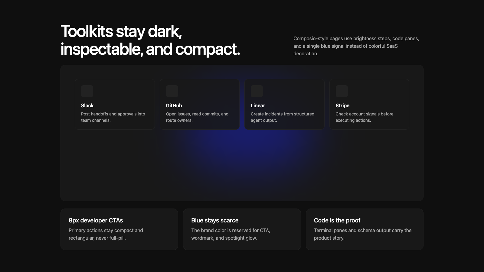
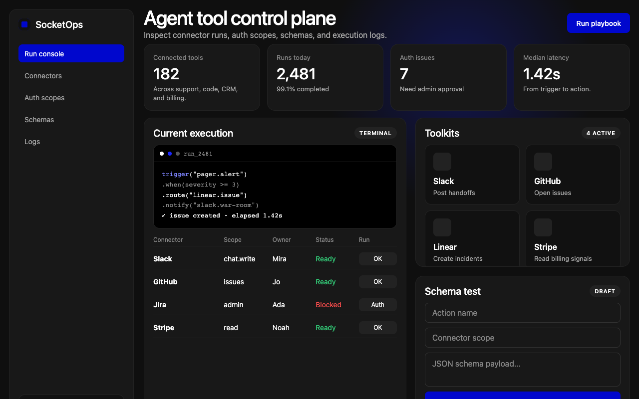

适合开发者工具、集成平台和自动化控制台,暗色画布、蓝色 spotlight 与终端四宫格突出技术感。
设计语言样张
近黑画布、深电蓝 CTA、中心 spotlight 和 2×2 终端面板,是 Composio 最强的视觉识别。
正文、导航和 UI 共享同一 sans,整体更像基础设施工具。
全页保持 #0f0f0f 近黑画布,用亮度阶梯建立层级。
主 CTA 使用 #0007cd 和 8px 圆角,不做 full pill。
hero 使用 2×2 终端 mockup grid,并保留中心蓝色 spotlight。
代码、CLI 和 schema 输出使用 JetBrains Mono。
卡片使用 12px 到 16px 圆角和细边框,不加阴影。
蓝色只用于主动作、wordmark 和 spotlight glow。
不要引入第二个品牌主色。
不要把 CTA 做成 full pill。
不要把展示字重降到 400 或加到 700。
不要用 drop shadow 制造暗色层级。
不要在非终端/代码区域滥用纯黑 #000000。
不要用抽象营销插画替代终端和 schema 面板。
---
version: alpha
name: "Composio"
description: "Composio 的 DESIGN.md 中文参考模板,保留原始 design token 与专业术语,覆盖 color system、typography、layout、components、motion 与 interaction states。"
language: zh-CN
sourceLanguage: en
---

## 概览
Composio 的 marketing site 读起来像一个严肃的 developer-infrastructure brand;氛围更接近 Vercel 或 Stripe Docs,而不是典型 AI-tools startup。基础 canvas 是 near-black `{colors.canvas}` (#0f0f0f),承载 white type,并由单一强度的 **deep electric blue** (`{colors.primary}` — #0007cd) 承载每个 primary CTA、brand wordmark,以及支撑 homepage hero 的 atmospheric spotlight glow。

Type 使用 **abcDiatype** 作为唯一 sans family,覆盖 display、body、navigation 和 caption。Display 保持 weight 500;自信但不夸张。Code block 和 terminal mockup 切换为 JetBrains Mono。

页面节奏是 monolithic:dark canvas 从上到下贯穿,并通过 card surface 的 subtle elevation step 建立层次。品牌最强的 visual signature 是 **four-pane terminal-style mockup**:一个 2×2 dark code/output panel grid,背后有居中的 blue spotlight glow。

**Key Characteristics:**
- 单一 accent:`{colors.primary}` (#0007cd) 用于 primary CTA、wordmark、spotlight glow。
- 单一 sans family:abcDiatype 承载除 code(JetBrains Mono)以外的一切。
- Dark monolithic canvas:`{colors.canvas}` 自上而下贯穿;depth 来自 `{colors.surface-card}` 和 `{colors.surface-card-elevated}` 的 brightness step。
- Terminal-mockup hero:2×2 code/output pane grid 是品牌 signature。
- Compact pill geometry:CTA 使用 `{rounded.md}` (8px),不是 full pill;这是 developer-tool dialect。
- Spotlight-glow atmospheric backdrop:居中位于 hero content 后方的 radial blue glow。
- 96px section rhythm。

## Colors

### Brand & Accent
- **Composio Blue** (`{colors.primary}` — #0007cd): Primary CTA、wordmark、spotlight glow center。
- **Composio Blue Active** (`{colors.primary-active}` — #0005a3): Press state。
- **Spotlight Glow Tone** (`{colors.primary-glow}` — #1a26ff): 更亮的 blue,用于 radial atmospheric glow 内部。
- **Accent Cyan** (`{colors.accent-cyan}` — #00d4ff): 少量用于 data-flow visualization。
- **Accent Violet** (`{colors.accent-violet}` — #7b3aed): 只用于特定 product illustration 内部。

### Surface
- **Canvas** (`{colors.canvas}` — #0f0f0f): Page floor,near-black。
- **Canvas Deep** (`{colors.canvas-deep}` — #000000): Pure black,用于 terminal mockup grid 和 code block。
- **Surface Card** (`{colors.surface-card}` — #181818): 默认 content card。
- **Surface Card Elevated** (`{colors.surface-card-elevated}` — #222222): Terminal pane、secondary button。
- **Surface Strong** (`{colors.surface-strong}` — #2a2a2a): Dropdown menu。

### Hairlines
- **Hairline** (`{colors.hairline}` — #222222): 默认 1px divider。
- **Hairline Soft** (`{colors.hairline-soft}` — #1a1a1a): 更浅 divider。
- **Hairline Strong** (`{colors.hairline-strong}` — #333333): 更强 panel outline。

### Text
- **Ink** (`{colors.ink}` — #ffffff): Display headline。
- **Body** (`{colors.body}` — #a8a8a8): 默认 running-text,soft gray。
- **Body Strong** (`{colors.body-strong}` — #ffffff): 与 ink 相同。
- **Muted** (`{colors.muted}` — #888888): Sub-title、breadcrumb。
- **Muted Soft** (`{colors.muted-soft}` — #666666): Disabled text。
- **On Primary** (`{colors.on-primary}` — #ffffff): Blue CTA 上的 white text。

### Semantic Colors
- **Success** (`{colors.semantic-success}` — #33d17a): "Online"、"active" indicator。
- **Error** (`{colors.semantic-error}` — #ff4d4d): Validation error。

## Typography

### Font Family
系统在所有文本角色上使用 **abcDiatype**(Lineto)。Code block 切换为 **JetBrains Mono**。Fallback: `ui-sans-serif, system-ui, sans-serif`。

### Hierarchy

| Token | Size | Weight | Line Height | Letter Spacing | 用途 |
|---|---|---|---|---|---|
| `{typography.display-mega}` | 72px | 500 | 1.05 | -2.16px | Homepage hero h1 |
| `{typography.display-xl}` | 56px | 500 | 1.05 | -1.68px | Subsidiary hero |
| `{typography.display-lg}` | 44px | 500 | 1.1 | -1.32px | Section head |
| `{typography.display-md}` | 32px | 500 | 1.15 | -0.96px | Sub-section head |
| `{typography.display-sm}` | 24px | 500 | 1.25 | -0.5px | Card group title |
| `{typography.title-md}` | 18px | 600 | 1.4 | 0 | Component title |
| `{typography.title-sm}` | 16px | 600 | 1.4 | 0 | Toolkit card title |
| `{typography.body-md}` | 16px | 400 | 1.5 | 0 | Default body |
| `{typography.body-sm}` | 14px | 400 | 1.5 | 0 | Footer body |
| `{typography.caption}` | 13px | 400 | 1.4 | 0 | Photo caption |
| `{typography.caption-uppercase}` | 11px | 600 | 1.4 | 0.88px | Section label、badge pill |
| `{typography.code}` | 13px | 400 | 1.5 | 0 | Code block — JetBrains Mono |
| `{typography.button}` | 14px | 500 | 1.0 | 0 | CTA pill label |
| `{typography.nav-link}` | 14px | 500 | 1.4 | 0 | Top-nav menu |

### Principles
- **Display weight 保持 500。** 自信但不是 display-bold。
- **abcDiatype 覆盖每个角色。** 没有 display/body family split。
- **每个 code surface 都使用 JetBrains Mono。**

### Font Substitutes
abcDiatype 是 Lineto 授权字体。开源替代:**Inter** weight 500,letter-spacing -1.5%。

## Layout

### Spacing System
- **Base unit:** 4px。
- **Tokens:** `{spacing.xxs}` 4px · `{spacing.xs}` 8px · `{spacing.sm}` 12px · `{spacing.base}` 16px · `{spacing.md}` 20px · `{spacing.lg}` 24px · `{spacing.xl}` 32px · `{spacing.xxl}` 48px · `{spacing.section}` 96px。
- **Section padding:** 主要 band 使用 `{spacing.section}` (96px)。

### Grid & Container
- Max content width: 约 1200px。
- Editorial body: 12-column grid。
- Terminal mockup grid: 2×2 等尺寸 pane。
- Toolkit grid: desktop 4-up、tablet 2-up、mobile 1-up。
- Footer: desktop 5-column。

### Whitespace Philosophy
Dark canvas 会创造自身 depth,因此 whitespace 可以保持紧凑而不显拥挤。Band 之间 96px;同一 band 内 card 之间 24px。

## Elevation & Depth

系统使用 **brightness-step elevation**:surface 通过亮度逐级抬升,而不是投下 drop shadow。配合 subtle radial blue glow,形成聚焦的 dark-mode atmosphere。

| Level | Treatment | 用途 |
|---|---|---|
| Flat (canvas) | `{colors.canvas}` (#0f0f0f) | Body band、footer |
| Recessed | `{colors.canvas-deep}` (#000000) | Terminal mockup grid background、code block |
| Card | `{colors.surface-card}` (#181818) | 默认 content card |
| Card elevated | `{colors.surface-card-elevated}` (#222222) | Terminal pane、secondary button |
| Atmospheric glow | 使用 `{colors.primary-glow}` 的 radial gradient | Hero spotlight backdrop |

### Decorative Depth
- **Spotlight glow backdrops** — 居中位于 hero content 后方的 radial blue gradient。
- **Terminal-pane brightness ladder** — 2×2 mockup 使用 canvas-deep outer + surface-card-elevated pane。

## Shapes

### Border Radius Scale

| Token | Value | 用途 |
|---|---|---|
| `{rounded.none}` | 0px | Reserved |
| `{rounded.xs}` | 4px | Inline tag |
| `{rounded.sm}` | 6px | Compact row |
| `{rounded.md}` | 8px | CTA button、form input |
| `{rounded.lg}` | 12px | Toolkit card、code block、terminal pane |
| `{rounded.xl}` | 16px | Feature card、terminal mockup grid |
| `{rounded.pill}` | 9999px | Section-label badge |
| `{rounded.full}` | 9999px | Avatar plate(少见) |

紧凑的 developer-ergonomic radius:8px CTA、12-16px card。它传达的是 "developer tool",不是 "consumer brand"。

## Components

### Top Navigation

**`top-nav-dark`** — 默认 top nav。Background `{colors.canvas}`、text `{colors.body-strong}`、height 64px。Layout:左侧 Composio wordmark,中间 primary horizontal menu(Product / Toolkits / Docs / Pricing / Customers / Blog),右侧 GitHub stars + Sign In + "Get started"。

### Buttons

**`button-primary`** — 标志性 Composio Blue CTA。Background `{colors.primary}`、text `{colors.on-primary}`、type `{typography.button}` (14px / 500)、padding 10px × 18px、height 40px、rounded `{rounded.md}` (8px)。

**`button-primary-active`** — Press state。背景为 `{colors.primary-active}`。

**`button-secondary-dark`** — Surface-elevated secondary。背景为 `{colors.surface-card-elevated}`、文字为 `{colors.body-strong}`。

**`button-outline`** — Transparent,带 1px hairline-strong border。

**`button-tertiary-text`** — Inline text link。

### Hero & Atmospheric

**`hero-band`** — Homepage hero。背景为 `{colors.canvas}`,包含 `{typography.display-mega}`(72px / 500)的 full-width display headline、subhead、两个 CTA,以及从居中 terminal-mockup grid 后方散发的 spotlight-glow backdrop。

**`terminal-mockup-grid`** — 品牌最强 visual signature。`{rounded.xl}` (16px) container 内的 2×2 dark code/output panel grid。背景为 `{colors.canvas-deep}`、内边距 32px、间距 16px。

**`terminal-pane`** — Mockup grid 内的单个 code/output panel。背景为 `{colors.surface-card}`,文字 `{colors.body}` 使用 `{typography.code}`,圆角 `{rounded.lg}` (12px),内边距 20px。

**`spotlight-glow-card`** — 大型 feature card,居中 display headline 后方带 radial blue glow。背景为 `{colors.surface-card}`,文字 `{colors.body-strong}` 使用 `{typography.display-md}`,圆角 `{rounded.xl}`,内边距 48px。

### Cards

**`feature-card`** — 3-up benefit grid。背景为 `{colors.surface-card}`、文字为 `{colors.body}`、字体为 `{typography.title-md}`、圆角 `{rounded.xl}`、内边距 28px。

**`toolkit-card`** — 4-up toolkit grid(Slack、GitHub、Stripe、Notion、Linear 等)。背景为 `{colors.surface-card}`、文字为 `{colors.body-strong}`、字体为 `{typography.title-sm}`、圆角 `{rounded.lg}`、内边距 20px。顶部是 40px square `{component.toolkit-icon}`,随后是 toolkit name 和 one-line description。

**`toolkit-icon`** — Square icon plate。背景为 `{colors.surface-card-elevated}`、圆角 `{rounded.md}`、尺寸 40px。

**`testimonial-card`** — Quote card。背景为 `{colors.surface-card}`、文字为 `{colors.body}`、圆角 `{rounded.lg}`、内边距 24px。

### Code

**`code-block`** — Inline code/terminal block。背景为 `{colors.canvas-deep}`,文字 `{colors.body}` 使用 `{typography.code}`,圆角 `{rounded.lg}`,内边距 20px。

### Forms

**`text-input`** — 背景为 `{colors.surface-card}`、文字为 `{colors.body-strong}`、圆角 `{rounded.md}` (8px)、内边距 12px × 16px、高度 44px。

**`search-input`** — Compact search field。相同 surface 和 radius,更小内边距,高度 40px。

### Tags & Badges

**`badge-pill`** — 小型 uppercase pill。背景为 `{colors.surface-card-elevated}`、文字为 `{colors.body-strong}`、字体为 `{typography.caption-uppercase}`、圆角 `{rounded.pill}`、内边距 4px × 10px。

### CTA / Footer

**`cta-band-spotlight`** — Pre-footer band。背景为 `{colors.canvas}`,带居中 radial spotlight glow。Display headline + 单个 primary CTA pill。内边距 96px。

**`footer-dark`** — Closing footer。背景为 `{colors.canvas}`、文字为 `{colors.body}`。5-column link list。64×48px 内边距。

**`footer-link`** — 背景 transparent、文字为 `{colors.body}`、字体为 `{typography.body-sm}`。

## Do's and Don'ts

### Do
- 将 `{colors.primary}` 保留给 primary CTA、wordmark 和 spotlight glow。
- 每个 CTA 使用 `{rounded.md}` (8px),不要 full pill。
- 使用 brightness-step ladder 表达 elevation;避免 drop shadow。
- 每个 hero 都搭配居中的 radial blue spotlight glow。
- Code 和 CLI command 通过 `{typography.code}` 以 JetBrains Mono 渲染。
- 使用 2×2 terminal-mockup grid 作为 homepage hero anchor。

### Don't
- 不要引入 secondary brand color。Cyan 和 violet 只用于 illustration。
- 不要在 CTA 上使用 full pill。
- 不要把 display weight 降到 400。
- 不要添加 drop shadow tier。
- 不要在 terminal/code surface 之外使用 canvas-deep (#000000)。
- 不要从第三方 widget(cookie consent、OneTrust)中提取 CTA color。品牌 CTA color 应来自实际页面 CTA。

## Responsive Behavior

### Breakpoints

| Name | Width | 关键变化 |
|---|---|---|
| Mobile | < 640px | Hero h1 72→36px;terminal mockup grid 折叠为 single pane;toolkit grid 1-up;nav hamburger。 |
| Tablet | 640–1024px | Hero h1 56px;terminal mockup grid 保持 2×2;toolkit grid 2-up。 |
| Desktop | 1024–1280px | Full hero h1 72px;完整 2×2 terminal mockup;toolkit grid 4-up。 |
| Wide | > 1280px | Content capped at 1200px。 |

### Touch Targets
- Primary CTA 高 40px;达到 WCAG AA,并通过 padding 支撑 AAA。
- Search input 高 40px。

### Collapsing Strategy
- Top nav 在 768px 以下切换为 hamburger。
- Terminal mockup 2×2 grid 在 mobile 上折叠为 single pane。
- Toolkit grid: 4-up → 2-up → 1-up。
- Hero spotlight glow 在每个 breakpoint 都保留。

## Iteration Guide

1. 一次只聚焦一个 component。
2. CTA 默认使用 `{rounded.md}` (8px)。Card 使用 `{rounded.lg}` 或 `{rounded.xl}`。
3. Variant 作为 `components:` 内部的独立条目存在。
4. 全部使用 `{token.refs}`,不要 inline hex。
5. 永远不要记录 hover state。
6. Display 使用 abcDiatype 500,body 使用 400/600。每个 code surface 都使用 JetBrains Mono。
7. Composio Blue 保持稀少。

## Known Gaps

- abcDiatype 是授权字体;Inter 是替代。
- Animation timing 不在范围内。
- In-product surface(toolkit dashboard、agent playground)位于登录墙后。
- 捕捉 surface 中未看到 focus 之外的 form validation state。


