

01 / 03
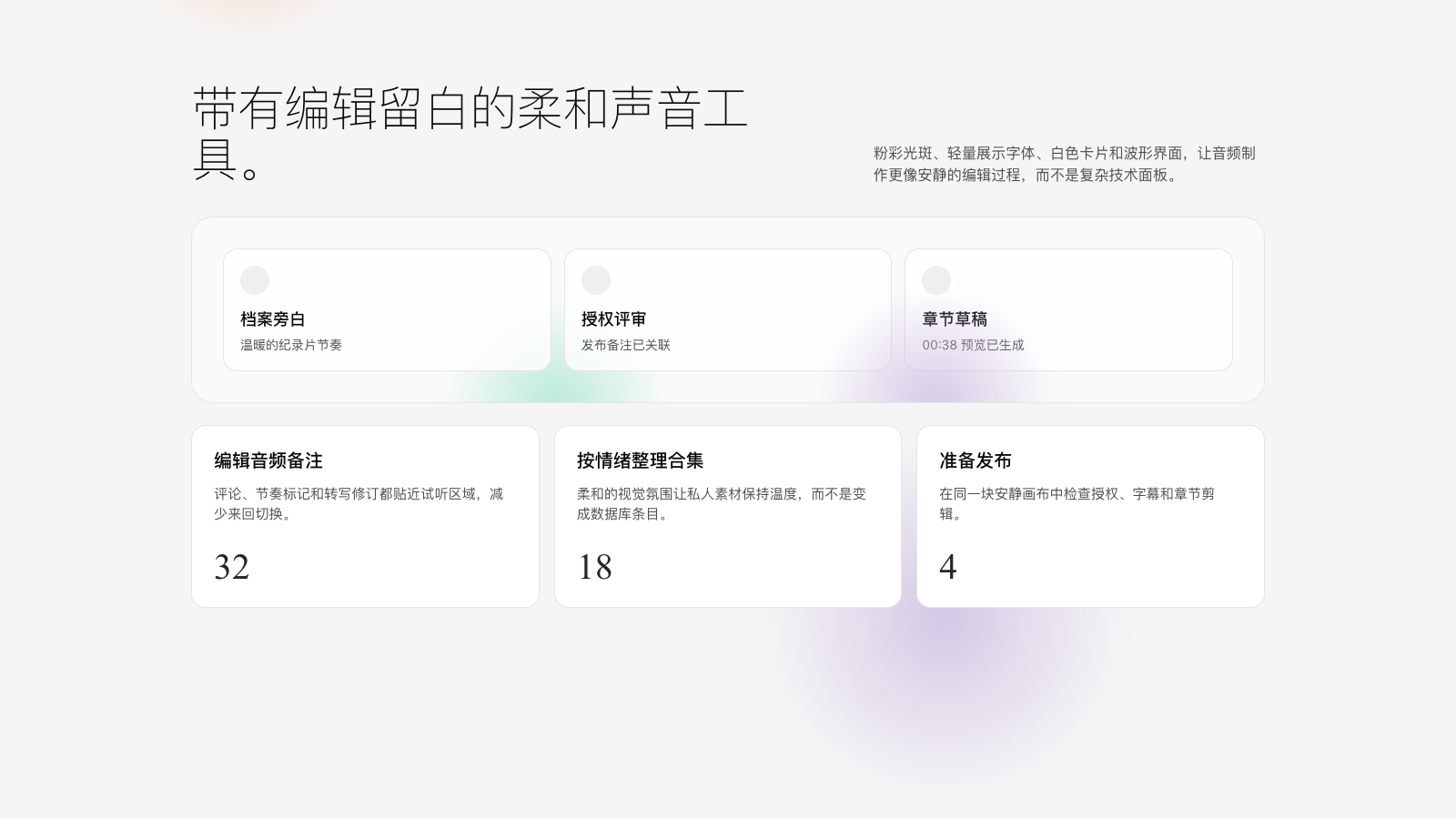
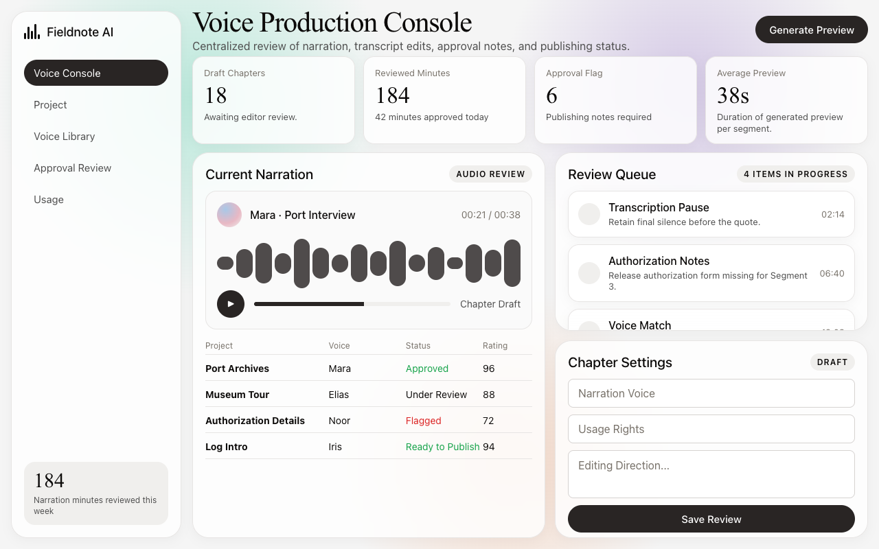

适合叙事内容、音频编辑和创作工作台,米白画布、轻 serif 标题和柔和渐变气氛营造安静编辑感。
设计语言样张
---
version: alpha
name: "Elevenlabs"
description: "Elevenlabs 的 DESIGN.md 中文参考模板,保留原始 design token 与专业术语,覆盖 color system、typography、layout、components、motion 与 interaction states。"
language: zh-CN
sourceLanguage: en
---

## 概览
ElevenLabs 读起来像一本安静的 editorial print magazine,只是它恰好是 voice-AI product。Base canvas 是 off-white `{colors.canvas}` (#f5f5f5),承载 warm near-black ink `{colors.ink}` (#0c0a09)。品牌能量是 **photographic, not chromatic**:soft pastel atmospheric gradient orb(mint、peach、lavender、sky、rose)在页面中漂移,成为唯一的“色彩”时刻。这里没有 neon accent、没有 saturated CTA color,也没有 dark-canvas dev-tools atmosphere。

Type 将 display 的 **Waldenburg Light**(weight 300 的 custom serif)与 body、navigation、caption 中的 **Inter** 配对。Display weight 300 是 editorial signature;绝不 bold,绝不 heavy。

CTA 很克制:near-black ink pill(`{component.button-primary}`)是 primary,transparent outline(`{component.button-outline}`)是 secondary。品牌相信 atmospheric photography 和 modest type weight 足以承担品牌表达。

**Key Characteristics:**
- Off-white canvas、warm near-black ink。没有 saturated CTA color。
- 单一 primary action:`{rounded.pill}` 上的 ink pill。Atmospheric gradient 承担 visual brand voltage。
- Display 使用 Waldenburg Light weight 300,形成 editorial magazine voice。
- Body 使用 Inter 400,并带 subtle letter-spacing(+0.15-0.18px)。
- Pastel gradient orb(5 个 token:mint、peach、lavender、sky、rose)只作为 atmospheric brand decoration 使用。
- Soft pill geometry(CTA 用 `{rounded.pill}`,card 用 `{rounded.xl}`)。
- 96px section rhythm。

## Colors

### Brand & Accent
- **Ink Primary** (`{colors.primary}` — #292524): Primary action color,即 warm near-black pill。谨慎使用。
- **Ink Primary Active** (`{colors.primary-active}` — #0c0a09): Press state。

### Surface
- **Canvas** (`{colors.canvas}` — #f5f5f5): Off-white page floor。
- **Canvas Soft** (`{colors.canvas-soft}` — #fafafa): 更浅的 band,用于 subtle alternating section。
- **Canvas Deep** (`{colors.canvas-deep}` — #0c0a09): 与 ink 相同,用于少见的 dark-mode hero(Agents page)。
- **Surface Card** (`{colors.surface-card}` — #ffffff): Pure white card。
- **Surface Strong** (`{colors.surface-strong}` — #f0efed): Badge、voice-icon plate。
- **Surface Dark** (`{colors.surface-dark}` — #0c0a09): Dark hero / CTA band canvas。
- **Surface Dark Elevated** (`{colors.surface-dark-elevated}` — #1c1917): Dark canvas 上的 card。

### Hairlines
- **Hairline** (`{colors.hairline}` — #e7e5e4): 默认 1px divider。
- **Hairline Soft** (`{colors.hairline-soft}` — #f0efed): 更浅的 divider。
- **Hairline Strong** (`{colors.hairline-strong}` — #d6d3d1): 更强的 panel outline。

### Text
- **Ink** (`{colors.ink}` — #0c0a09): Display、primary text。
- **Body** (`{colors.body}` — #4e4e4e): Default running-text。
- **Body Strong** (`{colors.body-strong}` — #292524): 与 primary 相同,用于 emphasis。
- **Muted** (`{colors.muted}` — #777169): Sub-title。
- **Muted Soft** (`{colors.muted-soft}` — #a8a29e): Disabled text。
- **On Primary** (`{colors.on-primary}` — #ffffff): Ink pill 上的 white text。
- **On Dark** (`{colors.on-dark}` — #ffffff): Dark hero 上的 white text。
- **On Dark Soft** (`{colors.on-dark-soft}` — #a8a29e): Dark 上的 muted off-white。

### Atmospheric Gradient Stops (signature)
- **Gradient Mint** (`{colors.gradient-mint}` — #a7e5d3): Mint green orb,用于柔和清新的 atmosphere。
- **Gradient Peach** (`{colors.gradient-peach}` — #f4c5a8): Peach orb,用于温暖、亲近的背景 bloom。
- **Gradient Lavender** (`{colors.gradient-lavender}` — #c8b8e0): Lavender orb,提供安静的 editorial softness。
- **Gradient Sky** (`{colors.gradient-sky}` — #a8c8e8): Sky-blue orb,带来轻盈、开放的空间感。
- **Gradient Rose** (`{colors.gradient-rose}` — #e8b8c4): Rose orb,用于更温柔的 human voice 场景。

这些颜色 **只** 作为 `{component.gradient-orb-card}` 内部的 soft radial-gradient atmospheric orb,或作为 hero copy 后方的 background atmospheric bloom 出现。绝不用于 button fill,也绝不作为 text color。

### Semantic Colors
- **Success** (`{colors.semantic-success}` — #16a34a): Confirmation。
- **Error** (`{colors.semantic-error}` — #dc2626): Validation error。

## Typography

### Font Family
**Waldenburg Light** 是授权 display serif,weight 300。**Inter** 承担 body、navigation、caption 和 button。Fallback:Waldenburg 使用 `'Times New Roman', serif`,Inter 使用 `sans-serif`。

### Hierarchy

| Token | Size | Weight | Line Height | Letter Spacing | 用途 |
|---|---|---|---|---|---|
| `{typography.display-mega}` | 64px | 300 | 1.05 | -1.92px | Homepage hero h1 |
| `{typography.display-xl}` | 48px | 300 | 1.08 | -0.96px | Subsidiary hero |
| `{typography.display-lg}` | 36px | 300 | 1.17 | -0.36px | Section head |
| `{typography.display-md}` | 32px | 300 | 1.13 | -0.32px | Sub-section head |
| `{typography.display-sm}` | 24px | 300 | 1.2 | 0 | Card group title |
| `{typography.title-md}` | 20px | 500 | 1.35 | 0 | Component title:Inter |
| `{typography.title-sm}` | 18px | 500 | 1.44 | 0.18px | List label |
| `{typography.body-md}` | 16px | 400 | 1.5 | 0.16px | Default body:Inter |
| `{typography.body-strong}` | 16px | 500 | 1.5 | 0.16px | Emphasized body |
| `{typography.body-sm}` | 15px | 400 | 1.47 | 0.15px | Footer body |
| `{typography.caption}` | 14px | 400 | 1.5 | 0 | Photo caption |
| `{typography.caption-uppercase}` | 12px | 600 | 1.4 | 0.96px | Section label、badge |
| `{typography.button}` | 15px | 500 | 1.0 | 0 | CTA pill |
| `{typography.nav-link}` | 15px | 500 | 1.4 | 0 | Top-nav menu |

### Principles
- **Display weight 保持 300。** Waldenburg Light 是 editorial signature。Display copy 绝不 bold。
- **Body 使用 subtle letter-spacing。** Inter 使用 +0.15-0.18px tracking,比默认 Inter 略松,带来更 editorial 的感觉。
- **Display 使用 negative letter-spacing。** Waldenburg 在 display size 上收紧 -0.32px 到 -1.92px。

### Font Substitutes
Waldenburg 是授权字体。Open-source substitute:weight 300 的 **EB Garamond**(略更 humanist)或 **GT Sectra**(更接近 Waldenburg 的 modernity)。Body 直接使用 Inter;这就是 ElevenLabs 使用的同一 family。

## Layout

### Spacing System
- **Base unit:** 4px.
- **Tokens:** `{spacing.xxs}` 4px · `{spacing.xs}` 8px · `{spacing.sm}` 12px · `{spacing.base}` 16px · `{spacing.md}` 20px · `{spacing.lg}` 24px · `{spacing.xl}` 32px · `{spacing.xxl}` 48px · `{spacing.section}` 96px.
- **Section padding:** 96px。

### Grid & Container
- Max content width: 约 1200px。
- Editorial body: 12-column grid。
- Feature card grid: hero split 在 desktop 为 2-up,benefit grid 为 3-up。
- Footer: desktop 为 5-column。

### Whitespace Philosophy
宽松的 editorial pacing,带有 print-magazine feel。Band 之间为 96px;band 内 card 靠得较近(16-24px gap)。Atmospheric gradient orb 占据宽松 breathing space,但不会与 copy 竞争。

## Elevation & Depth

系统使用 **hairline + soft drop**。Card 通过 1px hairline 和单一 subtle shadow tier 浮在 off-white canvas 上。Atmospheric depth 来自 gradient orb。

| Level | Treatment | 用途 |
|---|---|---|
| Flat (canvas) | `{colors.canvas}` (#f5f5f5) | Body band、footer |
| Card | `{colors.surface-card}` (#ffffff) | Content card |
| Hairline border | 1px `{colors.hairline}` | Card outline |
| Soft drop | `0 4px 16px rgba(0, 0, 0, 0.04)` | Hovered card(单一 shadow tier) |
| Gradient orb | 使用某个 `{colors.gradient-*}` 的 radial gradient | Atmospheric depth,绝不作为 card surface |

### Decorative Depth
- **Pastel gradient orb** 是品牌最强的 atmospheric pattern。Mint、peach、lavender、sky 或 rose 的 soft radial bloom 在 hero band 和 feature section 中漂移,不承载任何内容;它们是纯氛围。

## Shapes

### Border Radius Scale

| Token | Value | 用途 |
|---|---|---|
| `{rounded.none}` | 0px | Reserved |
| `{rounded.xs}` | 4px | Inline tag |
| `{rounded.sm}` | 6px | Compact row |
| `{rounded.md}` | 8px | Form input |
| `{rounded.lg}` | 12px | Compact card |
| `{rounded.xl}` | 16px | Feature card、pricing tier |
| `{rounded.xxl}` | 24px | Gradient orb card(extra-soft) |
| `{rounded.pill}` | 9999px | 所有 CTA button、badge |
| `{rounded.full}` | 9999px | Voice icon circle、avatar |

## Components

### Top Navigation

**`top-nav`** — Background `{colors.canvas}`、text `{colors.ink}`、height 64px。Layout:ElevenLabs wordmark 在左,primary horizontal menu(Creative / Agents / Video / Pricing / Enterprise / Docs)居中,Sign In + "Try free" primary CTA 在右。

### Buttons

**`button-primary`** — Near-black ink pill。Background `{colors.primary}`、text `{colors.on-primary}`、type `{typography.button}` (15px / 500)、padding 10px × 20px、height 40px、rounded `{rounded.pill}`。

**`button-primary-active`** — Press state。Background `{colors.primary-active}`。

**`button-outline`** — 带 1px ink border 的 transparent pill。Background transparent、text `{colors.ink}`、1px `{colors.hairline-strong}` border。

**`button-tertiary-text`** — Inline ink text link。

### Hero & Atmospheric

**`hero-band`** — Background `{colors.canvas}`,full-width display headline 使用 `{typography.display-mega}`(64px / 300 / -1.92px),subhead 使用 `{typography.body-md}`,包含两个 CTA,并在居中 headline 后方放置 atmospheric gradient orb。

**`gradient-orb-card`** — 大型 card,centered display copy 后方有 soft radial-gradient orb。Background `{colors.canvas-soft}`、rounded `{rounded.xxl}` (24px)、padding 32px。每个 variant 使用五个 gradient token 之一(`gradient-mint`、`gradient-peach`、`gradient-lavender`、`gradient-sky`、`gradient-rose`)。

**`audio-waveform-card`** — Waveform visualization card。Background `{colors.surface-card}`、rounded `{rounded.xl}`、padding 24px。包含 play button + waveform glyph + voice metadata。

### Cards

**`feature-card`** — 用于 2-up 或 3-up grid。Background `{colors.surface-card}`、text `{colors.ink}`、rounded `{rounded.xl}`、padding 24px、1px hairline border。内容通常由短标题、说明文字和轻量图标组成,保持安静的产品叙事。

**`product-card-stack`** — Stacked product preview card。Background `{colors.surface-card}`、rounded `{rounded.xl}`、无 padding,children edge-to-edge 填满 card。

**`testimonial-card`** — Quote card。Background `{colors.surface-card}`、text `{colors.body}`、rounded `{rounded.xl}`、padding 32px。语气像杂志引用块,避免过重的品牌色或大面积装饰。

### Voice Library

**`voice-row`** — Voice list 中的 horizontal row。Background transparent,带 1px hairline divider。Layout:左侧为 32px circular voice icon(`{component.voice-icon-circular}`),中间为 voice name + accent stack,右侧可选 preview button。

**`voice-icon-circular`** — Background `{colors.surface-strong}`、rounded `{rounded.full}`、32px diameter。承载 initials 或 voice glyph。

### Pricing

**`pricing-tier-card`** — Background `{colors.surface-card}`、rounded `{rounded.xl}`、padding 32px、1px hairline border。用于清晰比较方案,同时维持 off-white 页面上的轻浮层感。

**`pricing-tier-featured`** — Featured tier 做反相。Background `{colors.surface-dark}`、text `{colors.on-dark}`。Shape 相同,但使用 dark inversion。

### Forms & Tags

**`text-input`** — Background `{colors.surface-card}`、text `{colors.ink}`、rounded `{rounded.md}` (8px)、padding 12px × 16px、height 44px、1px `{colors.hairline-strong}` border。Focus 时 border 加粗为 2px ink。

**`badge-pill`** — Background `{colors.surface-strong}`、text `{colors.ink}`、type `{typography.caption-uppercase}`、rounded `{rounded.pill}`、padding 4px × 10px。

### CTA / Footer

**`cta-band`** — Pre-footer。Background `{colors.canvas}`,centered display headline 使用 `{typography.display-lg}`,单个 ink pill CTA。Padding 96px。

**`footer`** — Closing footer。Background `{colors.canvas}`、text `{colors.body}`。5-column link list。64×48px padding。

**`footer-link`** — Background transparent、text `{colors.body}`、type `{typography.body-sm}`。

## Do's and Don'ts

### Do
- 将 `{colors.primary}`(ink pill)保留给 primary CTA。
- 每个 display headline 都使用 Waldenburg Light weight 300。绝不 bold。
- Body 使用 Inter,并带 +0.15-0.18px tracking;这是 editorial dialect。
- Atmospheric gradient orb(mint/peach/lavender/sky/rose)只作为 decoration 使用。
- 每个 CTA 和 badge 都使用 pill shape。

### Don't
- 不要引入 saturated brand action color。Ink pill 是唯一 CTA color。
- 不要 bold display copy。Display 位于 weight 300;bold 会把 brand voice 从 editorial 推向 consumer-marketing。
- 不要把 gradient orb 用作 button fill、text color 或 component background。它们是纯 atmosphere。
- 不要在 CTA 上使用 sharp `{rounded.none}` (0px)。Pill geometry 才是品牌 button。
- 不要为了匹配 Waldenburg 而把 body Inter 降到 weight 300;body 为了可读性保持 400/500。
- 不要从 third-party widget(cookie consent、OneTrust)提取 CTA color。品牌 CTA color 以真实 product CTA 为准。

## Responsive Behavior

### Breakpoints

| Name | Width | 关键变化 |
|---|---|---|
| Mobile | < 640px | Hero h1 64→32px;feature card 1-up;nav hamburger;gradient orb 缩小。 |
| Tablet | 640–1024px | Hero h1 48px;feature card 2-up。 |
| Desktop | 1024–1280px | 完整 hero h1 64px;feature card 3-up。 |
| Wide | > 1280px | Content capped at 1200px。 |

### Touch Targets
- Primary pill 高度 40px,达到 WCAG AA,并通过 padding 接近 AAA。
- Voice icon circle 为 32px;padded row 创建有效 48px tap zone。

### Collapsing Strategy
- Top nav 在 768px 以下切换为 hamburger。
- Feature grid: 3-up → 2-up → 1-up。
- Gradient orb 在每个 breakpoint 缩小 diameter,但永不消失。

## Iteration Guide

1. 每次聚焦单个 component。
2. CTA 默认使用 `{rounded.pill}`。Card 使用 `{rounded.xl}` (16px)。
3. Variant 作为独立条目存在。
4. 所有地方使用 `{token.refs}`,不要 inline hex。
5. 不记录 hover state。
6. Display 使用 Waldenburg 300,body 使用 Inter 400/500。
7. Gradient orb 仅限于 atmospheric decoration。

## Known Gaps

- Waldenburg 是授权 typeface;EB Garamond / GT Sectra 是已记录 substitute。
- Animation timing(orb drift、waveform pulse、hero entrance)不在范围内。
- In-product surface(voice library editor、agent playground)只通过 marketing mockup 部分捕获。
- Focus 之外的 form validation state 在捕获 surface 中不可见。


