

01 / 03
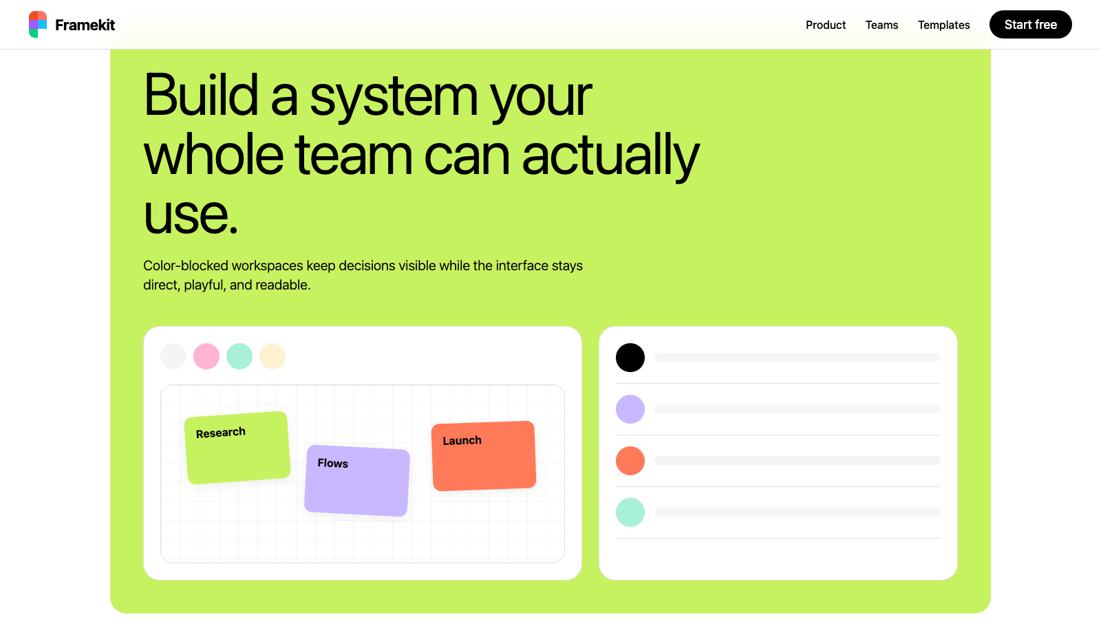
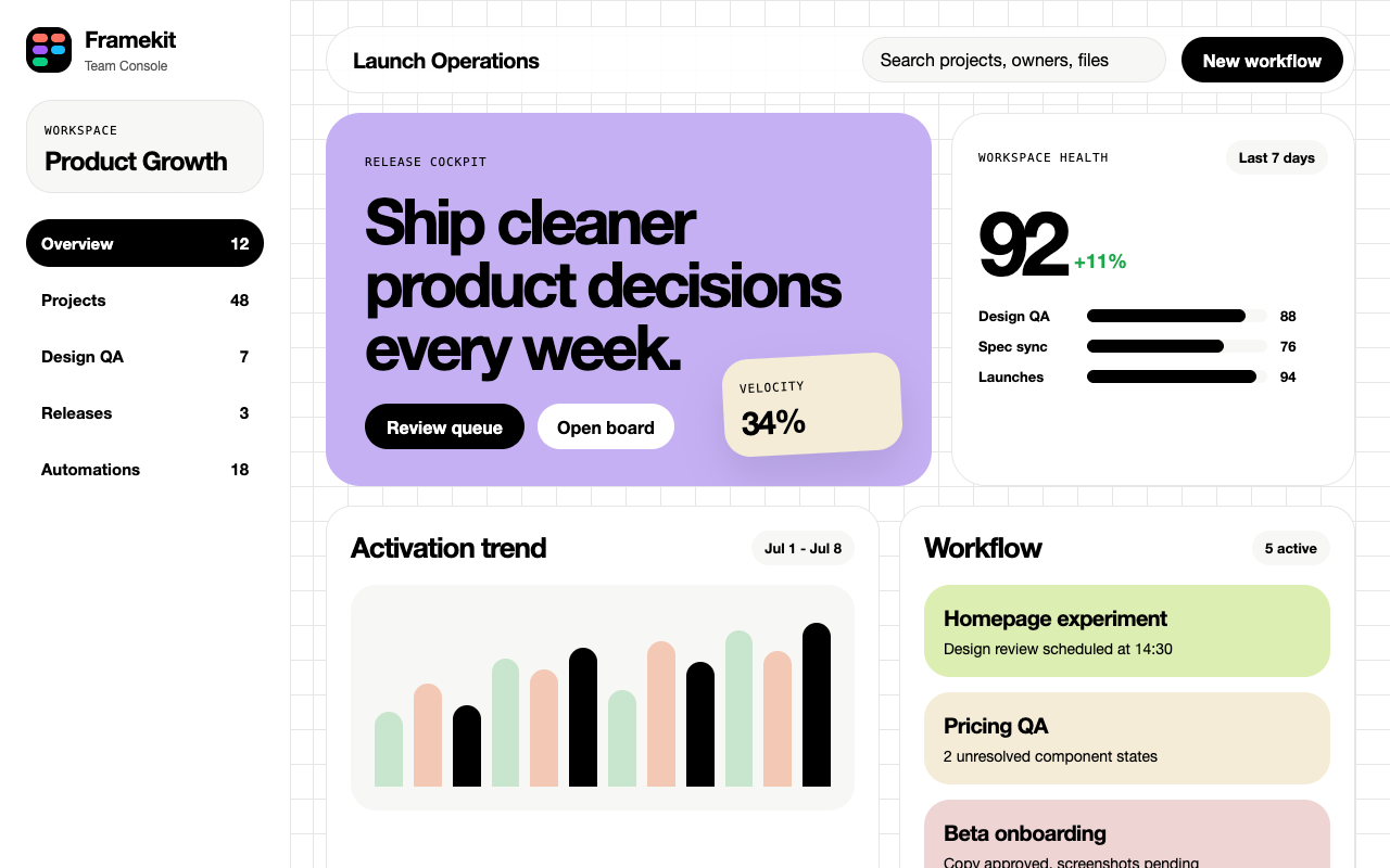

适合设计协作、白板和创意工具,明亮友好,强调多人协作和灵活创作空间。
设计语言样张
正文依靠 figmaSans 的轻字重和清晰行高建立层级,不用中灰弱化文本。
SECTION EYEBROW
将黑色保留给真正的 primary CTA 和 selected state。
每个 story section 只选择一个 {colors.block-*} 色块横跨 full content width。
使用 figmaSans 的 320、330、340、480、540、700 表达层级。
所有 CTA 使用 pill,所有 icon button 使用 circle。
不要引入 mid-gray text;body hierarchy 来自字重而不是 opacity。
不要给 color-block section 添加 drop shadow。
不要在单个 viewport 中同时展示超过一个 color block。
不要把 CTA 做成 square,也不要把 figmaMono 用在正文里。
---
version: alpha
name: "Figma"
description: "Figma 的 DESIGN.md 中文参考模板,保留原始 design token 与专业术语,覆盖 color system、typography、layout、components、motion 与 interaction states。"
language: zh-CN
sourceLanguage: en
---

## 概览
Figma 的 marketing canvas 在 system level 上是 editor-clean 的 black-and-white frame。Chrome,包括 top nav、body type、footer、primary CTA,都是 monochrome。Headline 是 oversized `{typography.display-xl}`,用 `figmaSans` 设置并带 aggressive negative tracking;body copy 使用同一 variable family 的 weight 320–340;small mono `{typography.eyebrow}` 与 `{typography.caption}` label(figmaMono、all-caps、positive tracking)作为 section marker。每个 CTA 都是 pill(`{rounded.pill}`),整个站点的 primary action 都是同一个 black `{components.button-primary}`,搭配同一个 white `{components.button-secondary}`。

设计独特之处在于这些 monochrome bookends **之间** 发生的事:页面反复进入 oversized pastel **color-block sections**,包括 lime、lavender、cream、mint、pink、coral 与 deep navy。这些 block 以 `{rounded.lg}` corners 与 `{spacing.xxl}` interior padding 跨越 full content width。Storytelling 就生活在这些 block 中。它们不是塞在 card 里的 accent,而是接管整个 viewport 的 vertical space,像设计师在干净墙面上安排 giant sticky notes。FigJam 的 pastel saturation 最高,home page 轮转整套 palette,pricing page 以 lime FAQ panel 收尾;同一 vocabulary,在不同 route 上有不同 rhythm。

这是一个建立在 contrast 上的系统:monochrome chrome 让 color block 显得 intentional,而不是 decorative;color block 又让 monochrome chrome 像 editorial paper,而不是 enterprise SaaS。Density generous,display size 上 line-height tight,interface 从不依赖 shadow 或 gradient 来完成 color block 与 confident typography 已经完成的工作。

**Key Characteristics:**
- Monochrome system core:`{colors.primary}`(black)与 `{colors.canvas}`(white)承载每个 CTA、每行 body、每个 footer link。
- Oversized pastel **color-block sections**(`{colors.block-lime}`、`{colors.block-lilac}`、`{colors.block-cream}`、`{colors.block-mint}`、`{colors.block-pink}`、`{colors.block-coral}`、`{colors.block-navy}`)定义每个 long-form page 的 narrative rhythm。
- Pill 是唯一 button shape:text CTA 使用 `{rounded.pill}`,icon button 使用 `{rounded.full}`。没有任何 square button。
- `figmaSans` variable typeface 使用异常细的 weight increment(320、330、340、450、480、540);type system 读起来像一个灵活变化的 single voice,而不是 multi-weight family。
- Display size 上 tight negative letter-spacing(86px 时 -1.72px,64px 时 -0.96px)创造 confident editorial cadence。
- `figmaMono` 保留给 category label、eyebrow 与 caption,始终 uppercase、positive tracking,用于标记 taxonomy,而不与 display type 竞争。
- Color-block page rhythm(home):white hero → marquee strip → white feature → lime systems block → navy ship-products block → coral developer block → white template grid → white footer。

## Colors

> Source pages: figma.com (home), /design/, /figjam/brainstorming-tool/, /pricing/, /contact/.

### Brand & Accent
- **Black** ({colors.primary}): System primary。每个 primary CTA、每个 headline、每行 body、marquee strip、dark section 的 inverse canvas。
- **White** ({colors.on-primary}): Black surface 上的 inverse text;也是 secondary pill button(`{components.button-secondary}`)前景使用的 canvas color。
- **Magenta Promo** ({colors.accent-magenta}): 单一 saturated CTA pink,保留给 promotional inline button;例如出现在 lilac “Save your spot” Release Notes banner 上。谨慎使用;它不是 section color。

### Surface
- **Canvas** ({colors.canvas}): Default page background 与每个 white card 的 body。
- **Inverse Canvas** ({colors.inverse-canvas}): Footer、marquee strip,以及部分 “ship products” 风格 story section。
- **Surface Soft** ({colors.surface-soft}): Off-white tile background,用于位于 white canvas 上的 icon button、template card 与 feature illustration tile。
- **Hairline** ({colors.hairline}): Form input、pricing card 与 table divider 上的 1px border。
- **Hairline Soft** ({colors.hairline-soft}): 更 subtle 的 divider,用于 comparison-table row separator 与 footer column rule。
- **Block Lime** ({colors.block-lime}): Signature **systems / FAQ / contact-form** color block。反复出现在 home、pricing、contact。
- **Block Lilac** ({colors.block-lilac}): `/design/` 上的 hero block;也是 inline Release Notes promo banner。
- **Block Cream** ({colors.block-cream}): Soft warm background,用于 FigJam hero strip、template-grid section。
- **Block Mint** ({colors.block-mint}): FigJam pastel section。
- **Block Pink** ({colors.block-pink}): FigJam pastel section。
- **Block Coral** ({colors.block-coral}): Home 上 “Ship products” coral story block。
- **Block Navy** ({colors.block-navy}): Deep indigo story block,是 footer 之上唯一出现 dark surface 的地方。

### Text
- **Ink** ({colors.ink}): Light surface 上所有 headline、body 与 caption type。Marketing 中没有 softer mid-gray text role;body copy 始终是 black,weight 320–340,并由 weight(而不是 opacity)承载 hierarchy。
- **Inverse Ink** ({colors.inverse-ink}): Inverse-canvas surface(footer、marquee strip、navy color block)上的 type。
- **On-Inverse Soft** ({colors.on-inverse-soft}): Dark section 上 circular icon-button surface 使用的约 16% opacity white(token 捕获 base color;translucency 在 render time 应用)。

### Semantic Colors
- **Success Green** ({colors.semantic-success}): Pricing 中 comparison-table checkmark。作为 glyph fill 使用,而不是 surface。
- **Overlay Scrim** ({colors.overlay-scrim}): Modal / video-overlay surface 背后约 60% opacity 的 black(token 捕获 base;opacity 在 render time 应用)。

## Typography

### Font Family

- **figmaSans** — Figma proprietary variable typeface;fallback stack 为 `figmaSans Fallback, SF Pro Display, system-ui, helvetica`。Variable weight axis 使用异常细的 increments(320、330、340、450、480、540、700),使 design system 读作单一 voice 的 modulation,而不是 stepped weight family。
- **figmaMono** — Proprietary monospace;fallback 为 `figmaMono Fallback, SF Mono, menlo`。只用于 eyebrow label 与 caption,始终 uppercase,并带 positive letter-spacing。

每个 role 都启用 OpenType `kern`。

### Hierarchy

| Token | Size | Weight | Line Height | Letter Spacing | 用途 |
|---|---|---|---|---|---|
| `{typography.display-xl}` | 86px | 340 | 1.00 | -1.72px | Hero headline(home、FigJam) |
| `{typography.display-lg}` | 64px | 340 | 1.10 | -0.96px | Section opener headline |
| `{typography.headline}` | 26px | 540 | 1.35 | -0.26px | Color block 内的 story-block title |
| `{typography.subhead}` | 26px | 340 | 1.35 | -0.26px | 接近 headline scale 的 long-form intro paragraph |
| `{typography.card-title}` | 24px | 700 | 1.45 | 0 | Pricing-tier title、feature card title |
| `{typography.body-lg}` | 20px | 330 | 1.40 | -0.14px | Hero 上的 lead body copy、contact form label |
| `{typography.body}` | 18px | 320 | 1.45 | -0.26px | Default body |
| `{typography.body-sm}` | 16px | 330 | 1.45 | -0.14px | Card body、footer link list |
| `{typography.link}` | 20px | 480 | 1.40 | -0.10px | Inline link emphasis |
| `{typography.button}` | 20px | 480 | 1.40 | -0.10px | 所有 pill button,primary 与 secondary |
| `{typography.eyebrow}` | 18px | 400 | 1.30 | 0.54px | figmaMono uppercase section eyebrow |
| `{typography.caption}` | 12px | 400 | 1.00 | 0.60px | figmaMono uppercase caption、footer column head |

### Principles

- **Body copy 的 hierarchy 由 weight 而不是 size 承载。** 20px weight 330 paragraph 旁边可以是 20px weight 480 link;眼睛在不改变 scale 的情况下读到 emphasis。
- **Negative letter-spacing 随 size 缩放。** Display-xl 拉到 -1.72px;subhead 只拉到 -0.26px。Body copy 接近 0。结果是在不牺牲 body size readability 的情况下形成 editorial-feeling display type。
- **Mono 是 taxonomy,不是 body。** figmaMono 保留给 eyebrow 与 caption,绝不用于 paragraph。
- **Display 上 tight line-height,body 上 generous。** Display size 为 1.00–1.10;body 为 1.40–1.45。这种 contrast 强化了 headline 是 graphics,body copy 用于 reading。

### Font Substitutes

如果无法访问 figmaSans / figmaMono,合适的 open-source substitute 是 sans 用 **Inter**(或 **Geist**),mono 用 **JetBrains Mono**(或 **Geist Mono**)。Variable weights 的 Inter 接近 figmaSans 使用的 fine-grained weight axis;需要手动将 line-height 下调约 0.02,以补偿 Inter 略高的 x-height。

## Layout

### Spacing System

- **Base unit**: 8px。
- **Tokens (front matter)**: `{spacing.hair}` 1px · `{spacing.xxs}` 4px · `{spacing.xs}` 8px · `{spacing.sm}` 12px · `{spacing.md}` 16px · `{spacing.lg}` 24px · `{spacing.xl}` 32px · `{spacing.xxl}` 48px · `{spacing.section}` 96px。
- Section interior padding:color-block section 上使用 `{spacing.xxl}`(48px)。
- Card interior padding:pricing card 与 template tile 上使用 `{spacing.lg}`(24px)。
- Form input padding:`{spacing.sm}` 12px vertical · 14px horizontal。
- Button padding:pill button 使用 `{spacing.xs}` 8px vertical · `{spacing.lg}` 24px horizontal(`button-secondary` 上提取的 asymmetric `8px 18px 10px` 用于在 pill 内 optically center type)。
- Universal rhythm constant:`{spacing.section}`(96px),major content section 之间的 vertical gap 在 home、pricing 与 FigJam 页面上保持一致。

### Grid & Container

- Max content width 约 1280px(明确 breakpoint 之一),side gutter 从 desktop 的 `{spacing.xxl}` 缩放到 mobile 的 `{spacing.lg}`。
- Desktop pricing comparison 与 FigJam template gallery 使用 three- and four-column grid。
- Color-block section 打破 column grid:它们以 rounded `{rounded.lg}` corners 内的 full bleed 横跨 content width,然后在内部放置单一 editorial column 的 headline + body。

### Whitespace Philosophy

White space 用于让 color block 显得 deliberate。每个 colored panel 与下一个之间,页面回到 white canvas,并留出 `{spacing.section}` 的 breathing room。Color block 内部,type 本身获得 generous side margins(两侧通常超过 block width 的 1/4),让 panel 读作 poster,而不是 copy wall。

## Elevation & Depth

| Level | Treatment | 用途 |
|---|---|---|
| 0 (flat) | 无 shadow,无 border | Color-block section、inverse-canvas footer、hero 的默认层级 |
| 1 (hairline) | `{colors.canvas}` 上 1px `{colors.hairline}` border | Pricing card、form input、comparison table cell |
| 2 (soft elevation) | 约 0 4px 16px rgba(0,0,0,0.06) 的 subtle drop shadow | Floating template tile、dropdown menu |
| 3 (modal) | Stronger shadow + 背后的 `{colors.overlay-scrim}` | Video / image lightbox overlay |

Figma marketing system 从设计上就是 shadow-light;color block 替代了传统 elevation。多数 SaaS site 用 shadowed white card 吸引注意,而 Figma 使用 saturated background panel。这让罕见的 actual shadow(例如 hover 在 cream section 上的 floating template card)显得像值得注意的例外。

### Decorative Depth

- **Color-block sections** 是 primary depth device。从 white canvas 切换到 lime / lavender / cream,就是 section break。
- FigJam 中的 **Sticky-note style component thumbnails**:略 off-axis 的 pastel rectangle,像 board 上的 notes 一样排列,读作 collage,而不是 card-stack。
- **Embedded product UI mocks**(Figma Design panels、FigJam canvas snippets)作为 color block 上的 flat composition 出现;内部 shadow subtle,并留在 mock 内部。

## Shapes

### Border Radius Scale

| Token | Value | 用途 |
|---|---|---|
| `{rounded.xs}` | 2px | Anchor / link decoration corner |
| `{rounded.sm}` | 6px | Small chip、sub-nav tab |
| `{rounded.md}` | 8px | Form input、list item、image frame |
| `{rounded.lg}` | 24px | Pricing card、color-block section、large image container |
| `{rounded.xl}` | 32px | Hero feature panel、oversized callout |
| `{rounded.pill}` | 50px | 所有 text CTA(primary、secondary、tab toggle) |
| `{rounded.full}` | 9999px | Circular icon button、comparison-table checkmark glyph |

### Photography & Illustration Geometry

- Image frame 使用 `{rounded.md}`(8px),足够 friendly,也足够 conservative 以读作 editorial。
- Home grid 上的 template thumbnail 位于 `{rounded.md}` tile 内,embedded preview 周围有 `{spacing.md}` interior padding。
- FigJam pastel sticky-note component thumbnail 保留 small `{rounded.sm}` corner,模拟真实 sticky paper。
- Marketing surface 中不出现 avatar circle;Figma marketing 避免 personification。

## Components

### Buttons

**`button-primary`** — Black “Get started for free” pill,出现在 top nav、每个 hero 与每个 closing CTA 中。
- Background `{colors.primary}`、text `{colors.on-primary}`、type `{typography.button}`、padding 10px 20px、rounded `{rounded.pill}`。
- Pressed state 位于 `button-primary-pressed`(surface 相同;live site 依赖 micro-scale,而不是 darkened fill)。

**`button-secondary`** — Black text 的 white pill。用于 tertiary navigation action(“Contact sales”),也是 primary pill 的 visual counterpart。
- Background `{colors.canvas}`、text `{colors.ink}`、type `{typography.button}`、padding 8px 18px 10px(asymmetric vertical,用来 optically center type)、rounded `{rounded.pill}`。无 border。

**`button-tertiary-text`** — Top nav 与 footer 内 styled as button hit target 的 plain text link。
- Background `{colors.canvas}`、text `{colors.ink}`、type `{typography.link}`、rounded `{rounded.full}`(仅用于 hit target)、padding `{spacing.xs}` `{spacing.sm}`。

**`button-icon-circular`** — 40px circular icon button,用于 light surface 上的 carousel controls、social links 与 inline actions。
- Background `{colors.surface-soft}`、text `{colors.ink}`、rounded `{rounded.full}`、size 40px。

**`button-icon-circular-inverse`** — 相同 shape,用于 inverse-canvas / dark color block。
- Background `{colors.on-inverse-soft}`(translucent white)、text `{colors.inverse-ink}`、rounded `{rounded.full}`、size 40px。

**`button-magenta-promo`** — Saturated pink pill,只用于 promotional surface,例如 lilac “Save your spot” Release Notes banner。保留给 Figma product team 希望 CTA 在 already-colored panel 上 pop 的 moment。
- Background `{colors.accent-magenta}`、text `{colors.on-primary}`、type `{typography.button}`、rounded `{rounded.pill}`、padding 10px 18px。

### Pricing Tabs

**`pricing-tab-default`** + **`pricing-tab-selected`** — `/pricing/` 上切换 Starter / Professional / Organization / Enterprise 的 pill-toggle。
- Default:`{colors.canvas}` background、`{colors.ink}` text、rounded `{rounded.pill}`。
- Selected:`{colors.primary}` background、`{colors.on-primary}` text;与 `button-primary` 完全相同的 surface,让 selected tab 感觉像 active CTA,而不是 passive state。

### Inputs & Forms

**`text-input`** + **`text-input-focused`** — `/contact/` 与 pricing seat-count stepper 上的 form field。
- Background `{colors.canvas}`、text `{colors.ink}`、type `{typography.body}`、rounded `{rounded.md}`、padding 12px 14px。
- Focused state 保持同一 surface;focus 通过 ring 传达,而不是 fill change。

### Cards & Containers

**`pricing-card`** — `/pricing/` 上的每个 tier。
- Background `{colors.canvas}`、text `{colors.ink}`、type `{typography.body}`、rounded `{rounded.lg}`、padding `{spacing.lg}`。使用 `{colors.hairline}` stroke,而不是 shadow。

**`pricing-card-feature-row`** — Comparison table 内的 single row。
- Background `{colors.canvas}`、text `{colors.ink}`、type `{typography.body-sm}`。Row separator 为 `{colors.hairline-soft}`。

**`template-card`** — Home “Explore what people are making” grid 与 FigJam template gallery 中的 thumbnail tile。
- Background `{colors.surface-soft}`、text `{colors.ink}`、type `{typography.body-sm}`、rounded `{rounded.md}`、padding `{spacing.md}`。

**`feature-illustration-tile`** — 承载 product UI mock 或 pastel illustration 的 larger composition tile。
- Background `{colors.surface-soft}`、text `{colors.ink}`、type `{typography.eyebrow}`、rounded `{rounded.md}`、padding `{spacing.lg}`。

### Color-Block Sections (signature)

Figma marketing 的 defining surface。每个都是 full-content-width panel,带 `{rounded.lg}` corners 与 `{spacing.xxl}` interior padding。Variants:

**`color-block-section`** — “systems” story(home)、pricing FAQ 与 contact form 的 lime ground。
- Background `{colors.block-lime}`、text `{colors.ink}`、type `{typography.subhead}`、rounded `{rounded.lg}`、padding `{spacing.xxl}`。

**`color-block-section-lilac`** — `/design/` hero 与 FigJam highlight section 的 lavender ground。
- Background `{colors.block-lilac}`,其他结构相同。

**`color-block-section-navy`** — Home “Ship products” story block 的 deep indigo ground。Footer 之上唯一 inverse color-block surface。
- Background `{colors.block-navy}`、text `{colors.inverse-ink}`,其他结构相同。

(Cream、mint、pink 与 coral block variant 遵循相同 shape,只替换为各自 `{colors.block-*}` surface。)

### Promo Banner

**`promo-banner-lilac`** — 浮在 contact form 上方的 Release Notes / “Save your spot” inline banner。
- Background `{colors.block-lilac}`、text `{colors.ink}`、type `{typography.body-sm}`、rounded `{rounded.md}`、padding `{spacing.md}` `{spacing.lg}`。右侧边缘承载 `button-magenta-promo`。

### Navigation

**`top-nav`** — Sticky white bar,包含 logo、primary nav links、sign-in link,以及右侧锚定的 `button-secondary`(“Contact sales”)+ `button-primary`(“Get started for free”)组合。
- Background `{colors.canvas}`、text `{colors.ink}`、type `{typography.body-sm}`、height 56px。
- Mobile:primary links 折叠为 hamburger,打开 full-canvas overlay;两个 pill CTA 保持在 bar 上可见。

**`marquee-strip`** — Nav 正下方的 thin black ribbon,以 white 滚动展示 customer logos。
- Background `{colors.inverse-canvas}`、text `{colors.inverse-ink}`、type `{typography.body-sm}`、height 36px。

### Comparison Glyphs

**`comparison-checkmark`** — Pricing comparison matrix 中使用的 green check。
- Background `{colors.canvas}`、glyph color `{colors.semantic-success}`、rounded `{rounded.full}`、size 16px。

### Footer

**`footer`** — White canvas 上的 dense link grid,左上角 wordmark “Figma” 使用 display weight。
- Background `{colors.canvas}`、text `{colors.ink}`,column heading 与 small link 使用 `{typography.caption}`,padding `{spacing.section}` top/bottom · `{spacing.xl}` sides。

## Do's and Don'ts

### Do

- 将 `{colors.primary}` 保留给真正 primary CTA 与 selected state(例如 `pricing-tab-selected`)。不要把它当作 decorative accent。
- 引入 story section 时,从 `{colors.block-*}` family 中选择 **一个** color block,让它以 `{rounded.lg}` corners 与 `{spacing.xxl}` interior padding 横跨 full content width。
- Type 保持 `figmaSans` variable weights;从 320、330、340、480、540、700 中选择以表达 hierarchy。避免使用此集合之外的 intermediate weight。
- `figmaMono` 只用于 eyebrow 与 caption,始终 uppercase,并使用文档中的 positive letter-spacing。
- 每个 CTA 都做成 pill(`{rounded.pill}`),每个 icon button 都做成 circle(`{rounded.full}`)。
- 每两个 color block 之间允许页面 **return to white canvas**,让每个 block 都读作 deliberate。
- 当 section 同时需要 primary action 与 sales / secondary action 时,搭配 `button-primary` 与 `button-secondary`;black-and-white pair 是 brand signature。

### Don't

- 不要引入 mid-gray text。Body hierarchy 来自 `figmaSans` weight,而不是 opacity。
- 不要给 color-block section 添加 drop shadow;color 本身就是 depth device。
- 不要在文档记录的 `{colors.block-*}` palette 与 `{colors.accent-magenta}` 之外引入新 accent color。例如添加 saturated brand orange 会破坏系统。
- 不要在 single viewport 中同时可见超过一个 color block;Figma 的 pacing 始终让 white canvas 分隔它们。
- 不要把 CTA 做成 square。Square button 会读成另一个品牌。
- 不要在 body copy 中使用 `figmaMono`;它是 taxonomy tool,不是 reading typeface。
- 不要用 colored tab 替换 `pricing-tab-selected` 的 black fill;品牌 pattern 是 “selected = primary surface”。

## Responsive Behavior

### Breakpoints

| Name | Width | 关键变化 |
|---|---|---|
| 4k | 1920px | Max content width 保持 1280px;gutter 扩展 |
| Desktop-XL | 1440px | 默认 desktop layout |
| Desktop | 1400px | Comparison table column width normalize |
| Desktop-S | 1280px | 保持 pricing 4-up tier grid |
| Tablet | 960px | Pricing 从 4-up 折叠为 2-up;nav 变为 hamburger |
| Mobile-L | 768px | Color-block section 变为 full-bleed(边缘无 rounded corners) |
| Mobile | 560px | Display-xl 从 86px 降到约 48px;pill CTA 变为 full-width |
| Mobile-XS | 559px | Two-column footer 折叠为 single column |

### Touch Targets

- Pill button(`button-primary`、`button-secondary`)在所有 viewport 保持最小 44px tap height;通过 `{typography.button}` 20px line-height 与文档中的 vertical padding 组合实现。
- Circular icon button(`button-icon-circular`)desktop 上为 40px,在 touch viewport 增长到 44px。
- `/contact/` 上 form input 的 minimum tap target 高 48px。

### Collapsing Strategy

- **Nav**:Desktop horizontal nav 带两个右侧锚定 pill,960px 以下折叠为 hamburger overlay。两个 pill(`Contact sales`、`Get started for free`)在 560px 以上保持在 bar 上可见,以下堆叠进 overlay。
- **Pricing tier grid**:960px 处 4-up → 2-up,768px 以下 → 1-up。Pill toggle 保持 horizontal,560px 以下如有需要可 horizontal scroll。
- **Color-block sections**:768px 以上 section 周围保留 `{spacing.xxl}` canvas,让 rounded corners 可读;768px 以下移除 corners,block bleed 到 viewport edge,形成 poster effect。
- **Comparison table**:960px 以下 matrix 折叠为 per-tier accordion,避免 horizontal scroll。

### Image Behavior

- Color block 内的 product UI mock 按比例缩放,绝不裁切。768px 以下它们 shrink,而不是 reflow。
- Home grid 中的 template thumbnail 使用 lazy loading,并在 scroll 时 animate in。
- Sticky-note style FigJam thumbnail 在各 breakpoint 保持轻微 off-axis rotation;rotation 是 brand signal,不是 desktop-only flourish。

## Iteration Guide

1. 一次只聚焦一个 component,并通过其 `components:` token name 引用(例如 `{components.button-primary}`、`{components.color-block-section}`)。
2. 引入新 section 时,**先** 决定它位于哪个 `{colors.block-*}` token 上;surface choice 是最关键的决定。
3. 默认 body type 使用 `{typography.body}`;只有在 color block 内才使用 `{typography.subhead}` 或 `{typography.headline}`。
4. 编辑后运行 `npx @google/design.md lint DESIGN.md`;`broken-ref`、`contrast-ratio`、`orphaned-tokens` warning 会自动标记问题。
5. 将新 variant 作为独立 component entry 添加(`-pressed`、`-selected`),不要埋在 prose 里。
6. 保持 `{colors.primary}` 稀缺。如果同一 viewport 中出现两个 `button-primary`,说明该 section 做得太多;将其中一个 neutralize 为 `button-secondary`。
7. 把 `{colors.accent-magenta}` 当作 single-shot color:每页一个 promo CTA,绝不两个。

## Known Gaps

- `{colors.block-*}` 的精确 pastel hex value 来自 screenshot pixel;production source 可能使用未通过 CSS variables 暴露的 named tokens。文档中的 hex value 应视为 faithful approximation,而不是 exact brand specs。
- Dark mode 未记录,因为 marketing site 没有交付 dark theme;最接近的 analog 是 navy color-block(`color-block-section-navy`)与 inverse-canvas footer。
- `/contact/` 上看不到 form-field error 与 validation styling,因为 static screenshot 没有渲染 error state。Input 具有 hairline border 与 rounded `{rounded.md}` corner;error treatment 未记录。
- Animated marquee-strip 与 color-block reveal animation 未记录(遵循 no-interaction policy)。


