

01 / 03
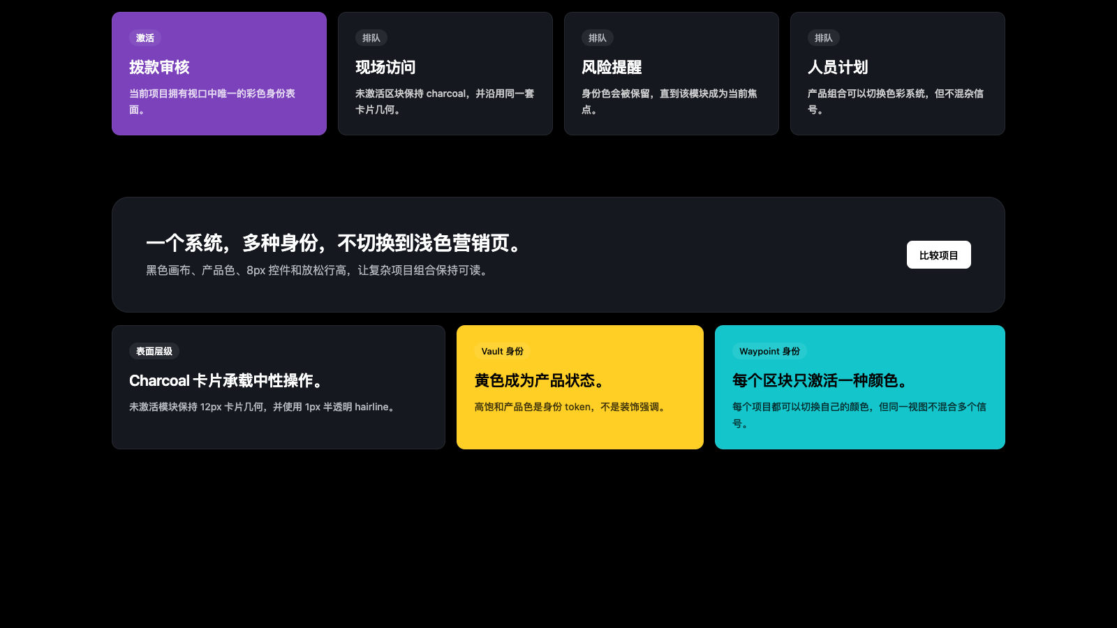
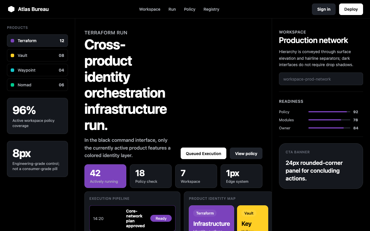

适合多产品平台、基础设施和企业控制台,黑底、炭灰卡片与产品色块建立清晰的系统身份。
设计语言样张
HashiCorp 的营销界面不靠单一品牌色统一,而是用 charcoal card、1px 弱边线和 Terraform/Vault/Waypoint 等产品身份色建立系统感。
正文和说明保持 500 字重与放松行高,让高密度产品信息仍然可读。
产品组合操作系统
CTA、输入、列表项
feature / product / pricing card
CTA banner
只给 product pill 小标签
黑色 canvas 和 surface-1 charcoal 是两层锚点表面。
产品 section 只能使用对应 product-* 身份色。
CTA 使用 8px 圆角,不做 pill,也不做 0px 硬角。
display 行高保持 1.17–1.21,body 行高放松到 1.50–1.71。
每个重要 section 都放 12px uppercase eyebrow。
用 surface lift 和 1px hairline 表达层级,不用阴影。
不要做 light-mode 营销页,HashiCorp 的营销系统是暗色。
不要把多种产品色混在同一视口里,产品色是身份信号。
不要把 Terraform 紫用于 Vault 页面或无关 CTA。
不要把 CTA 做成 pill 或 0px 方角。
不要用未定义的中灰文字色替代 ink-muted / ink-subtle。
不要用阴影在暗色上制造 elevation。
---
version: alpha
name: "Hashicorp"
description: "Hashicorp 的 DESIGN.md 中文参考模板,保留原始 design token 与专业术语,覆盖 color system、typography、layout、components、motion 与 interaction states。"
language: zh-CN
sourceLanguage: en
---

## 概览
HashiCorp 的 marketing canvas 是 near-black ground,用来承载 multi-product portfolio,却从不显得 generic。Dominant surface 是 `{colors.canvas}`(pure black),上面叠加 `{colors.surface-1}` charcoal cards 与 1px translucent gray hairlines。Chrome 是 monochrome:white pill-rounded buttons(`{components.button-primary}`)、white type、gray secondary type;但系统由一组 **per-product accent colors** 维系,用来提示某个 section 属于哪个 HashiCorp tool:Terraform purple、Vault yellow、Consul red、Waypoint cyan、Vagrant blue、Nomad green、Boundary coral。

Display type 是 **hashicorpSans**,使用 weights 600 / 700,并带 tight line-height(1.17–1.21);body type 使用同一 family 的 500 weight,并有意设置 relaxed line-height(1.50–1.71)。这种 contrast 读起来是 editorial,而不是 enterprise-templated。CTA 使用 small `{rounded.md}` 8px corners,而不是 pill,这让系统读作 developer-facing,而不是 consumer-y。

Signature device 是 **product-card** family:每个 HashiCorp product 在 home 与 infrastructure page 上都有自己的 colored card variant,把 Terraform 放进 violet ground,把 Vault 放进 yellow,把 Waypoint 放进 cyan。这些不是 decorative gradient,而是 identity surfaces。读者滚动页面时,余光就能判断一个 section 讲的是哪个 product。

**Key Characteristics:**
- Black-canvas marketing system:`{colors.canvas}` 同时是 hero、body、pricing、comparison table 与 footer 的 surface。
- **Per-product color identity**:Terraform `{colors.product-terraform}`、Vault `{colors.product-vault}`、Waypoint `{colors.product-waypoint}`、Vagrant `{colors.product-vagrant}`、Consul `{colors.product-consul}`、Nomad `{colors.product-nomad}`、Boundary `{colors.product-boundary}`,每个都有自己的 button + card variant。
- Display headline 使用 hashicorpSans 600 / 700,line-height 1.17–1.21(tight);body 使用同一 family 的 500,line-height 1.50–1.71(relaxed);这种 proportional gap 就是品牌 voice。
- CTA shape 是 `{rounded.md}` 8px,不是 pill,让系统读作 developer-tool 而不是 consumer-app。
- 使用 charcoal surface lift(canvas → surface-1 → surface-2),而不是 shadow-driven elevation。
- 1px translucent gray hairline(`rgba(178,182,189,0.1)`)定义 card 与 divider;border 更像被感知到,而不是被看见。
- Eyebrow typography(12–13px、600 weight、0.6px positive tracking、uppercase)把每个 section 标记为 category label。

## Colors

> Source pages: hashicorp.com/en (home), /en/infrastructure-cloud, /en/products/terraform, /en/pricing, /en/resources?contentType=PDF.

### Brand & Accent
- **Black** ({colors.primary}): System primary surface。Canvas、footer、comparison table、hero 全部是 black。
- **White** ({colors.on-primary}): Black 上的 inverse text;也是 `button-primary` 的 canvas。
- **Accent Blue** ({colors.accent-blue}): Marketing surface 上的 hyperlink。
- **Visited Purple** ({colors.semantic-visited}): Visited-link state。

### Surface
- **Canvas** ({colors.canvas}): Default page background。
- **Surface 1** ({colors.surface-1}): Canvas 上方一级的 charcoal,用于 feature card、pricing card、resource tile。
- **Surface 2** ({colors.surface-2}): Canvas 上方两级,用于 featured pricing card、secondary button、hovered product chrome。
- **Surface 3** ({colors.surface-3}): Canvas 上方三级,用于 small chip、badge、sub-nav background。
- **Hairline** ({colors.hairline}): Card 与 divider 上的 1px border。
- **Hairline Soft** ({colors.hairline-soft}): 更 subtle 的 divider,用于 comparison-table row。
- **Inverse Canvas** ({colors.inverse-canvas}): Pure white,只用作 `button-primary` 的 surface。

### Text
- **Ink** ({colors.ink}): 所有 headline 与 emphasized body type,pure white。
- **Ink Muted** ({colors.ink-muted}): #b2b6bd 的 secondary type,用于 meta info、footer column。
- **Ink Subtle** ({colors.ink-subtle}): #656a76 的 tertiary type,用于 form helper text、timestamp、footnote。

### Per-Product Identity (signature)
HashiCorp marketing 不是由单一 accent color 维系,而是由 product-specific accents 系统维系;每个 accent 都用来标记一个 section 代表哪个 tool。

- **Terraform Purple** ({colors.product-terraform}): Terraform section、terraform CTA、home hero 上的 violet 3D cube。
- **Terraform Bright** ({colors.product-terraform-bright}): Saturated highlight,用于 Terraform page 上的 link emphasis。
- **Vault Yellow** ({colors.product-vault}): Vault section 与 CTA。
- **Consul Red** ({colors.product-consul}): Consul section。
- **Waypoint Cyan** ({colors.product-waypoint}): Waypoint section,deep variant `{colors.product-waypoint-deep}` 用于 hover / active。
- **Vagrant Blue** ({colors.product-vagrant}): Vagrant section。
- **Nomad Green** ({colors.product-nomad}): Nomad section。
- **Boundary Coral** ({colors.product-boundary}): Boundary section。

### Semantic Colors
- **Success** ({colors.semantic-success}): Positive state(也复用为 Nomad green)。
- **Warning** ({colors.semantic-warning}): Warning state(也就是 Vault yellow)。
- **Error** ({colors.semantic-error}): Error state(也就是 Consul red)。
- **Amber 100** ({colors.amber-100}): Soft warm highlight,已提取但使用很少。
- **Amber 200** ({colors.amber-200}): Caution badge 使用的 saturated amber。
- **Blue 7** ({colors.blue-7}): Unified-core gradient 中使用的 deep navy。

## Typography

### Font Family

- **hashicorpSans** — HashiCorp proprietary marketing typeface。Geometric、clean、略 humanist。Fallback stack 为 `__hashicorpSans_Fallback_96f0ca`(system font),然后是 `-apple-system, BlinkMacSystemFont, Segoe UI, helvetica, arial`。

同一 family 承载 display、body、button 与 caption,没有单独 display + body pairing。Hierarchy 由 weight(500 body / 600 emphasis / 700 display)以及 deliberate line-height contrast(display tight、body relaxed)承载。

### Hierarchy

| Token | Size | Weight | Line Height | Letter Spacing | 用途 |
|---|---|---|---|---|---|
| `{typography.display-xl}` | 80px | 700 | 1.17 | -2.5px | 最大 hero headline |
| `{typography.display-lg}` | 56px | 700 | 1.18 | -1.6px | Section opener headline |
| `{typography.display-md}` | 40px | 600 | 1.19 | -1.0px | Sub-section headline |
| `{typography.headline}` | 28px | 600 | 1.21 | -0.6px | Pricing tier title、CTA banner heading |
| `{typography.card-title}` | 22px | 600 | 1.18 | -0.4px | Feature card title |
| `{typography.subhead}` | 20px | 600 | 1.35 | -0.2px | Long-form intro paragraph |
| `{typography.body-lg}` | 18px | 500 | 1.69 | 0 | Hero subhead、lead body |
| `{typography.body}` | 16px | 500 | 1.50 | 0 | Default body |
| `{typography.body-sm}` | 14px | 500 | 1.71 | 0 | Card body、footer column |
| `{typography.caption}` | 13px | 500 | 1.38 | 0.2px | Meta、comparison cell label |
| `{typography.button}` | 14px | 600 | 1.29 | 0 | Pill / square CTA button |
| `{typography.eyebrow}` | 12px | 600 | 1.23 | 0.6px | Uppercase section eyebrow |

### Principles

- **Display tight,body relaxed。** Display 的 line-height 为 1.17–1.21;body 提升到 1.50–1.71。Size + line-height contrast 承载 hierarchy。
- **Weight hierarchy 很小。** 500 body / 600 emphasis / 700 display。没有 light / black extremes,品牌读起来 engineered。
- **Eyebrow 是 positive-tracked uppercase 12px section header。** 每个 meaningful section 的 headline 上方都有一个。
- **No mono。** 尽管是 developer-tools brand,marketing surface 不使用 monospace face;code voice 保留给 in-product surface。

### Font Substitutes

如果不使用 hashicorpSans,可用的 open-source substitute 包括 **Inter**(最接近的 geometric character set)、**Geist Sans** 或 **IBM Plex Sans**。Weights 500 / 600 / 700 的 Inter 接近 hashicorpSans 的 proportions;预计需要手动将 line-height 下调约 0.02 以匹配。

## Layout

### Spacing System

- **Base unit**: 8px(primary increments 为 4 / 8 / 12 / 16 / 24 / 32 / 48)。
- **Tokens (front matter)**: `{spacing.hair}` 1px · `{spacing.xxs}` 4px · `{spacing.xs}` 8px · `{spacing.sm}` 12px · `{spacing.md}` 16px · `{spacing.lg}` 24px · `{spacing.xl}` 32px · `{spacing.xxl}` 48px · `{spacing.section}` 96px。
- Card interior padding:product card 使用 `{spacing.lg}` 24px;pricing card 使用 `{spacing.xl}` 32px;CTA banner 使用 `{spacing.xxl}` 48px。
- Button padding:`{components.button-primary}` 上为 10px vertical · 18px horizontal。
- Universal rhythm constant:major section 之间使用 `{spacing.section}`(96px)vertical gap。

### Grid & Container

- Max content width 约 1280px,side gutter 从 desktop 的 `{spacing.xxl}` 缩放到 mobile 的 `{spacing.lg}`。
- Product card grid 在 desktop 为 3-up,tablet 为 2-up,mobile 为 1-up。
- Pricing tier grid 在 desktop 为 3-up;下方 comparison table 使用 fixed-width left column。
- Resource directory(PDF library)使用 4-up dense thumbnail grid。

### Whitespace Philosophy

Dark canvas 本身就是 whitespace。Section 通过 surface lift(canvas → surface-1)分隔,而不是通过 white gap。Section 内部,card 之间使用 generous `{spacing.xl}` 32px gap;row 之间使用 `{spacing.lg}` 24px。

## Elevation & Depth

| Level | Treatment | 用途 |
|---|---|---|
| 0 (flat) | 无 shadow,无 border | Canvas-mounted display type、hero、footer |
| 1 (charcoal lift) | `{colors.surface-1}` background + 1px `rgba(178,182,189,0.1)` border | Default card、resource tile、pricing card |
| 2 (surface-2 lift) | `{colors.surface-2}` background + 1px `{colors.hairline}` border | Featured pricing card、hovered card、sub-nav |
| 3 (product chromatic) | Per-product accent color background,如 Terraform purple、Vault yellow、Waypoint cyan | Product showcase card |

Product chromatic level 不是 “modal lift”,而是 identity device。Terraform card 与 feature-card 位于同一 z-plane;差异是 meaning,而不是 depth。

### Decorative Depth

- **3D product visuals**:isometric purple cubes(Terraform)、translucent yellow safes(Vault)以及类似 product-tinted illustration 位于 hero section 右列。
- **1px translucent gray hairlines** 是 dominant edge;border 可见但不竞争。
- **Dark 上无 drop shadow。** Card 通过 surface change lift,而不是 shadow。

## Shapes

### Border Radius Scale

| Token | Value | 用途 |
|---|---|---|
| `{rounded.xs}` | 4px | Small chip / badge |
| `{rounded.sm}` | 6px | Inline tag |
| `{rounded.md}` | 8px | 所有 CTA button、form input、list item |
| `{rounded.lg}` | 12px | Feature card、product card、pricing card |
| `{rounded.xl}` | 16px | Large illustrative tile |
| `{rounded.xxl}` | 24px | CTA banner panel |
| `{rounded.pill}` | 9999px | Eyebrow-style product pill(small chip) |
| `{rounded.full}` | 9999px | Avatar circle(marketing 上少见) |

### Photography & Illustration Geometry

- Product 3D illustration 在 container 内 full-bleed,没有 rounded inner mask。
- Customer marquee 中的 logo chip 位于 `{rounded.sm}` 6px tile 上,并带 1px hairline。
- Resource thumbnail 使用 `{rounded.lg}` 12px corners。

## Components

### Buttons

**`button-primary`** — White rounded-rect CTA。所有页面的 primary CTA。
- Background `{colors.inverse-canvas}`、text `{colors.inverse-ink}`、type `{typography.button}`、padding 10px 18px、rounded `{rounded.md}`。
- Pressed state 位于 `button-primary-pressed`。

**`button-secondary`** — Charcoal rounded-rect。Secondary CTA,如 “Read docs” / “Talk to sales”。
- Background `{colors.surface-2}`、text `{colors.ink}`、type `{typography.button}`、rounded `{rounded.md}`、padding 10px 18px。

**`button-tertiary`** — Canvas 上 text-only treatment 的 bare ghost button。
- Background `{colors.canvas}`、text `{colors.ink}`、type `{typography.button}`、rounded `{rounded.md}`、padding 10px 18px。

**`button-product-terraform`** — Terraform page 上的 Terraform-tinted CTA。
- Background `{colors.product-terraform}`、text `{colors.ink}`、type `{typography.button}`、rounded `{rounded.md}`、padding 10px 18px。

**`button-product-vault`** — Vault-yellow CTA。
- Background `{colors.product-vault}`、text `{colors.inverse-ink}`(yellow 需要 dark text)、type `{typography.button}`、rounded `{rounded.md}`、padding 10px 18px。

**`button-product-waypoint`** — Waypoint-cyan CTA。
- Background `{colors.product-waypoint}`、text `{colors.inverse-ink}`、type `{typography.button}`、rounded `{rounded.md}`、padding 10px 18px。

(Vagrant blue、Nomad green、Consul red、Boundary coral 使用相同 pattern,只替换各自 `{colors.product-*}` token。)

### Cards & Containers

**`product-card`** — Default product showcase card,surface-1 charcoal。
- Background `{colors.surface-1}`、text `{colors.ink}`、type `{typography.body}`、rounded `{rounded.lg}`、padding 24px。

**`product-card-terraform`** — 带 Terraform purple ground 的 product card(作为 identity surface,而不是 modal elevation)。
- Background `{colors.product-terraform}`、text `{colors.ink}`、type `{typography.body}`、rounded `{rounded.lg}`、padding 24px。

**`product-card-vault`** — Vault-yellow ground。
- Background `{colors.product-vault}`、text `{colors.inverse-ink}`,其他结构相同。

**`product-card-waypoint`** — Waypoint-cyan ground。
- Background `{colors.product-waypoint}`、text `{colors.inverse-ink}`,其他结构相同。

(其他 product variant 使用相同 shape,只替换各自 product token。)

**`feature-card`** — Surface-1 上的通用 feature highlight。
- Background `{colors.surface-1}`、text `{colors.ink}`、type `{typography.body}`、rounded `{rounded.lg}`、padding 24px。

**`pricing-card`** — `/en/pricing` 上的 pricing tier。
- Background `{colors.surface-1}`、text `{colors.ink}`、type `{typography.body}`、rounded `{rounded.lg}`、padding 32px。

**`pricing-card-featured`** — Recommended tier(通过 surface lift 视觉强调)。
- Background `{colors.surface-2}`,其他结构相同。

**`resource-card`** — Resources directory 中的 PDF / whitepaper / guide tile。
- Background `{colors.surface-1}`、text `{colors.ink}`、type `{typography.body-sm}`、rounded `{rounded.lg}`、padding 16px。

### Inputs & Forms

**`text-input`** + **`text-input-focused`** — Pricing seat-count 与 contact form 上的 form field。
- Background `{colors.surface-1}`、text `{colors.ink}`、type `{typography.body}`、rounded `{rounded.md}`、padding 10px 14px。
- Focused state 保持同一 surface;focus ring 是 1px `{colors.accent-blue}` outline。

### Pills & Chips

**`product-pill`** — Small product-name chip,用在 hero headline 上方与 resource card 上,用来标记一段 content 属于哪个 product。
- Background `{colors.surface-1}`、text `{colors.ink-muted}`、type `{typography.caption}`、rounded `{rounded.pill}`、padding 4px 10px。

### Comparison Table

**`comparison-row`** — Pricing comparison table 内的 single row。
- Background `{colors.canvas}`、text `{colors.ink-muted}`、type `{typography.body-sm}`。Row separator 为 `{colors.hairline-soft}`。

### CTA Banner

**`cta-banner`** — Long-form page 底部用于 closing CTA 的 large rounded panel。
- Background `{colors.surface-1}`、text `{colors.ink}`、type `{typography.subhead}`、rounded `{rounded.xxl}`、padding 48px。

### Navigation

**`top-nav`** — Sticky black bar:左侧 HashiCorp logomark,中间 primary nav links,右侧 `button-primary`(“Sign up”)+ `button-secondary`(“Sign in”)。
- Background `{colors.canvas}`、text `{colors.ink}`、type `{typography.body-sm}`、height 64px。
- Mobile:primary links 折叠为 hamburger;primary CTA 保持可见。

### Footer

**`footer`** — `{colors.canvas}` 上的 dense link grid,左侧 wordmark,5–6 列 caption-sized links。
- Background `{colors.canvas}`、text `{colors.ink-muted}`、type `{typography.caption}`、padding 64px 32px。

## Do's and Don'ts

### Do

- 将 `{colors.canvas}`(black)和 `{colors.surface-1}`(charcoal)作为系统的两类 anchor surface。页面每个 band 都应落在其中一种。
- 引入某个 HashiCorp 产品的 section 时,持续使用该产品的 `{colors.product-*}` token:section pill、CTA button,以及适用时的 showcase card background 都保持一致。
- CTA buttons 使用 `{rounded.md}` 8px;HashiCorp 的品牌气质是 engineered,而不是 consumer。
- 将紧凑的 display line-height(1.17–1.21)与舒展的 body line-height(1.50–1.71)配对。这个反差就是品牌语气。
- 每个有意义的 section 上方都使用 eyebrow typography(`{typography.eyebrow}`、uppercase、0.6px tracking)。
- 用 surface lift(canvas → surface-1 → surface-2)在 dark 环境里表达层级。
- product-chromatic cards 只用于产品 identity;generic feature cards 保持在 `{colors.surface-1}`。

### Don't

- 不要交付 light-mode marketing page。HashiCorp 的 marketing brand 本身就是 dark。
- 不要在已记录的 `ink` / `ink-muted` / `ink-subtle` 之外引入 mid-tone gray text。
- 不要把 CTA corners 做成直角;使用 `{rounded.md}` 8px,而不是 0px。
- 不要在非该产品主题的页面里,把某个 product accent color 用作 CTA。比如在 Vault 页面使用 Terraform purple 就是品牌违规。
- 不要在同一 viewport 混用多个 product accent。系统传达的是“这个 section 讲的是这个 tool”,混用 accent 会破坏这个信号。
- 不要在 dark 上添加 drop shadows;surface lift 已经承担 elevation。
- 不要用 display-only sans 替换 headline,再用另一个 family 做 body。整个层级应由同一个 `hashicorpSans` 维系。

## Responsive Behavior

### Breakpoints

| 名称 | 宽度 | 关键变化 |
|---|---|---|
| Desktop-XL | 1440px | 默认 desktop layout |
| Desktop | 1280px | Pricing 保持 3-up grid |
| Tablet | 1024px | Product card grid 从 3-up → 2-up |
| Mobile-Lg | 768px | Pricing comparison 变为 per-tier accordion;nav 变为 hamburger |
| Mobile | 480px | 全部变为 single-column;display-xl 从 80px 缩放到约 36px |

### Touch Targets

- CTA buttons(`button-primary`、`button-secondary`)在所有 viewport 保持 ≥40px tap height。
- Product pills 在 desktop 为 24px 高,在 touch viewport 增至 28px。
- Form inputs 在 touch viewport 保持 ≥44px tap target。

### Collapsing Strategy

- **Nav**:带 right-anchored CTAs 的 horizontal nav 在 768px 以下折叠为 hamburger overlay。primary CTA 保持在 bar 上可见。
- **Product card grid**:3-up → 1024px 时 2-up → 768px 以下 1-up。
- **Pricing comparison table**:768px 以下折叠为 per-tier accordions,避免 horizontal scroll。
- **Display type**:`{typography.display-xl}` 80px 在 mobile 上向 `{typography.display-md}` 40px 缩放,同时保留 negative-tracking 百分比。

### Image Behavior

- 3D product illustrations(cubes、safes 等)保持 aspect ratio,绝不裁切;768px 以下缩小,而不是重新排布。
- Customer logo marquee 横向缩放,在窄宽度下可换到第二行。

## Iteration Guide

1. 一次只聚焦 ONE component,并用它的 `components:` token name 引用。
2. 引入新 section 时,先判断它是 generic feature(surface-1)还是 product-identity section(product-* color)。
3. 默认 body 使用 `{typography.body}`、500 weight;只在 CTA banners 和 feature cards 内使用 `{typography.subhead}`。
4. 修改后运行 `npx @google/design.md lint DESIGN.md`。
5. 将新的 product variants 添加为独立 component entries(`product-card-nomad`、`button-product-consul` 等)。
6. 将 per-product palette 当作 identity tokens,而不是装饰。如果在产品语境之外使用 product color,品牌就开始漂移。
7. 每个 section 上方都必须有 eyebrow type;跳过它会让 section 显得漂浮、缺少锚点。

## Known Gaps

- 精确的 product-color hex values 来自直接提取的 `--mds-color-*` CSS variable set;它们是 HashiCorp 的 canonical brand spec。
- Shadow tokens 没有大量记录,因为 dark surface system 使用 surface lift,而不是 shadow elevation。
- inspected pages 中没有看到 form-field error 与 validation styling。
- Dark mode 是唯一的 marketing mode;未记录 light-mode adaptation。
- Consul、Nomad、Vagrant、Boundary 的 product-card variants 遵循已记录的 Terraform / Vault / Waypoint pattern,但目前只在 prose 中引用;如果需要 formal entries,可添加为 `product-card-consul`、`product-card-nomad` 等。


