

01 / 03
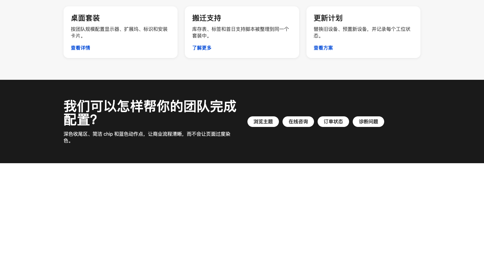
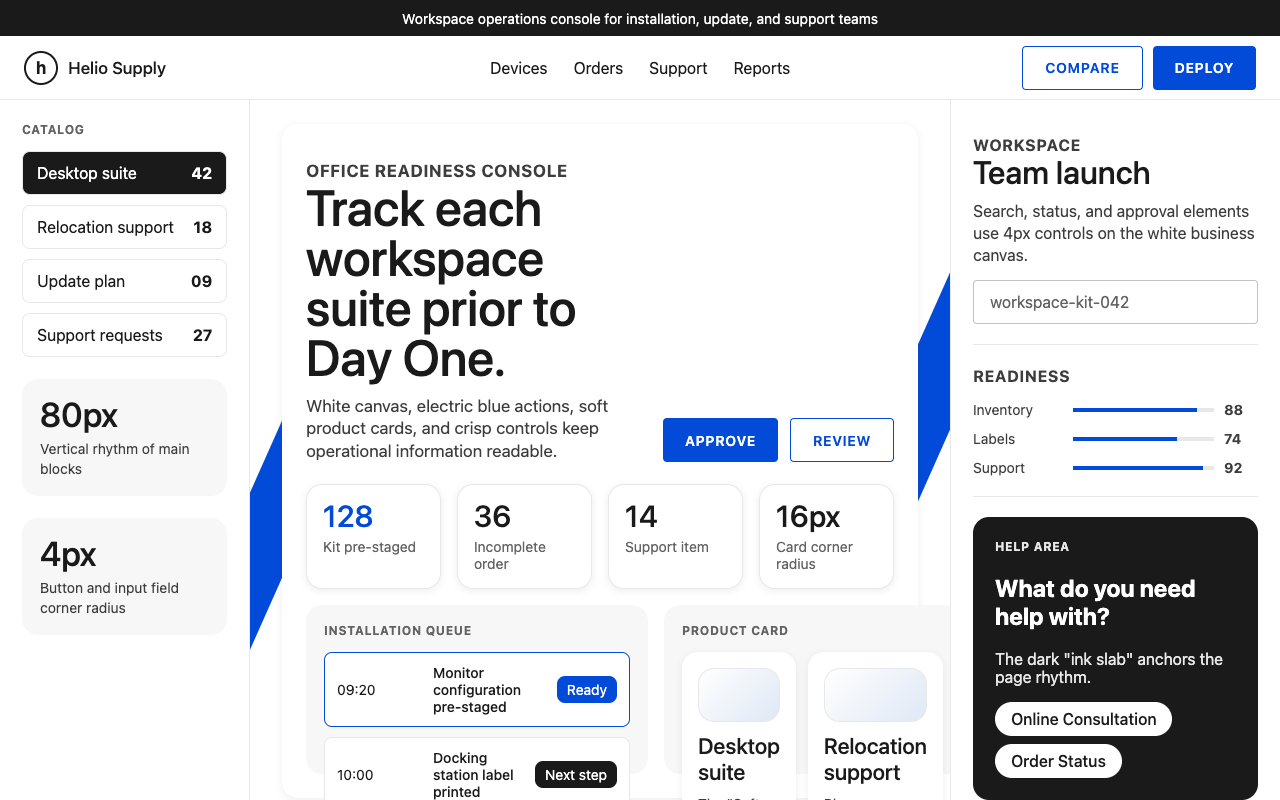

适合硬件目录、办公方案和企业服务页,白底配电蓝 CTA、斜切装饰和深色收尾区,商业感清楚稳妥。
设计语言样张
Forma DJR Micro 用 500 字重做大标题,正文靠 ink、charcoal、graphite 分层;按钮和输入 4px,产品与图片卡 16px。
---
version: alpha
name: "HP"
description: "HP 的 DESIGN.md 中文参考模板,保留原始 design token 与专业术语,覆盖 color system、typography、layout、components、motion 与 interaction states。"
language: zh-CN
sourceLanguage: en
---

## 概览
HP 读起来像一本长期运营的消费电子目录,与企业软件产品页交叉融合。整个系统建立在 **pure white** (`{colors.canvas}` — `#ffffff`) 之上,并用浅灰 panels(`{colors.cloud}` / `{colors.fog}`)交替形成 section bands。系统只有一个有彩度的 action color:**HP Electric Blue** (`{colors.primary}` — `#024ad8`),以及一个 ink color(`{colors.ink}` — `#1a1a1a`);两者共同完成九成视觉工作。所有 surface 使用同一字体家族:**Forma DJR Micro**,这是 HP 定制的 geometric grotesque;headlines 用 weight 500,body 用 400,整体干净、中性、略带机械感。

标志性动作是 **angular blue chevrons**:尖锐、0-radius 的斜切形,源自 HP wordmark 中一对平行斜线。它们锚定 homepage hero、laptop-page hero 和 printer pricing page,出现在 primary banner card 左右边缘,并叠在产品摄影背后。除了这些装饰性斜线,其他 surface 都偏直线构成;cards 使用 **soft 8–16px corners**,buttons 使用 4px corner。

系统分为三种语气模式:用于产品浏览的 **white commercial body**(cards、category icons、pricing tiers);用于 testimonial bands、收尾的 "How can we help?" footer-prelude 和 page footer 的 **dark navy slab**(`{colors.ink}` 近黑);以及用于 comparison strips、FAQ accordions 等 utility sections 的 **light fog band**(`{colors.cloud}` / `{colors.fog}`)。Blue accent 只出现在 filled CTAs、link text、chevron decorations,以及 featured tier 的 active price-stamp 上,绝不作为 section background。

**关键特征:**
- Pure white canvas (`{colors.canvas}`) 与 deep ink (`{colors.ink}`) 贯穿所有 body surface;light fog bands(`{colors.cloud}`、`{colors.fog}`)交替形成 section rhythm
- HP Electric Blue (`{colors.primary}`) 是唯一 CTA fill 与 link color;每个 viewport 最多出现两次
- 定制 Forma DJR Micro 覆盖所有 surface:display、body、button、caption,使用 weights 400 / 500 / 600 / 700
- Product/pricing tiles 的 cards 使用 `{rounded.xl}` (16px);buttons 使用 `{rounded.md}` (4px) 并采用 capitalize labels
- Geometric blue chevrons(`{colors.primary}` 矩形以 45° 切割)框住 hero photography,并强化 wordmark
- Dark-navy slabs (`{colors.ink}`) 负责收束每个页面节奏:testimonial bands、"how can we help?" prelude 与 footer
- Section rhythm:utility-strip → top nav → white body → cloud-band → ink slab → cloud-band → ink footer

## Colors

> **No Interaction sub-section.** Hover colors are silently filtered. Allowed sub-sections: Brand & Accent, Surface, Text, Semantic.

### Brand & Accent
- **HP Electric Blue** (`{colors.primary}` — `#024ad8`): the system's lone signal — primary CTA fill, link color, chevron-decoration fill, active sub-nav indicator. Reserved.
- **Bright Blue** (`{colors.primary-bright}` — `#296ef9`): a slightly lighter variant used inside dark slabs (testimonial-card buttons, dark-band CTA links) where the deeper blue would muddy.
- **Deep Navy** (`{colors.primary-deep}` — `#0e3191`): pressed state for the primary CTA and the visited-link color.
- **Soft Blue** (`{colors.primary-soft}` — `#c9e0fc`): pale-blue surface used inside customer-story cards and selection chips.

### Surface
- **Canvas** (`{colors.canvas}` — `#ffffff`): the universal page background. White, full opacity.
- **Paper** (`{colors.paper}` — `#ffffff`): card surfaces — same white as canvas, with hairline borders or shadows providing the lift.
- **Cloud** (`{colors.cloud}` — `#f7f7f7`): the lightest gray section band, used for alternating-row backgrounds and product-feature card groups.
- **Fog** (`{colors.fog}` — `#e8e8e8`): a slightly darker gray surface band, used for FAQ outer panels and the "Trending laptops" header strip.
- **Steel** (`{colors.steel}` — `#c2c2c2`): hairline border used on outlined elements with stronger emphasis (focus states, active filter).
- **Bloom Coral / Bloom Rose** (`{colors.bloom-coral}` / `{colors.bloom-rose}` — `#ff5050`, `#f9d4d2`): the "Get 25% off" sale-tag chip + soft pink lifestyle accent on the sale hero.
- **Storm Mist / Sea / Deep** (`{colors.storm-mist}`, `{colors.storm-sea}`, `{colors.storm-deep}` — `#8ebdce`, `#7fadbe`, `#356373`): the teal-storm tones reserved for the printer-plan illustration backdrop and supporting infographic accents.

### Text
- **Ink** (`{colors.ink}` — `#1a1a1a`): the universal text color on white surfaces — headlines, body, button labels, navigation.
- **Ink Deep** (`{colors.ink-deep}` — `#000000`): pure black used for the wordmark and 1px hairline strokes around badge outlines.
- **Ink Soft** (`{colors.ink-soft}` — `#292929`): an alternate near-black used inside dark-navy slabs as a subtle textural shift.
- **On Ink** (`{colors.on-ink}` — `#ffffff`): pure white used for headline and body text on every dark-navy slab.
- **Charcoal** (`{colors.charcoal}` — `#3d3d3d`): muted body color on white surfaces — secondary descriptions, fine-print disclaimers.
- **Graphite** (`{colors.graphite}` — `#636363`): smaller-print color, used for legal lines and timestamp metadata.

### Semantic Colors
- **Bloom Deep** (`{colors.bloom-deep}` — `#b3262b`) + **Bloom Wine** (`{colors.bloom-wine}` — `#5a1313`): error and discount-emphasis colors. The deep brick reads as "sale" or "destructive" depending on placement.
- **Storm Deep** (`{colors.storm-deep}` — `#356373`): used as a neutral status accent (e.g., printer-plan tier "Versatile" tier color).

## Typography

### Font Family

The voice is **single-family**: Forma DJR Micro (HP's bespoke geometric grotesque, fallback Arial) across every surface — display, body, button, caption. Forma DJR Micro is a wide, slightly rounded grotesque designed at small optical sizes to stay legible at UI-chrome scale. HP runs it at weight 400 for body, 500 for display headlines, 600/700 for emphasis and button labels.

The 16/14/12-px caption tier carries the catalog metadata — model numbers, spec rows, fine print — at weight 400 with a 1.4–1.5 line-height. Button labels lift to weight 600/700 with positive 0.5–1.1px letter-spacing and uppercase transform — the only place the system tracks letters.

### Hierarchy

| Token | Size | Weight | Line Height | Letter Spacing | Use |
|---|---|---|---|---|---|
| `{typography.display-xxl}` | 72px | 500 | 1.0 | 0 | Hero headline (homepage, laptop hub) |
| `{typography.display-xl}` | 56px | 500 | 1.0 | 0 | Section headlines on landing pages |
| `{typography.display-lg}` | 44px | 500 | 1.0 | 0 | Sub-section headlines on shop pages |
| `{typography.display-md}` | 32px | 500 | 1.0 | 0 | Promo strip headlines, FAQ section headers |
| `{typography.display-sm}` | 24px | 500 | 1.17 | 0 | Card titles, pricing-tier names |
| `{typography.display-xs}` | 20px | 500 | 1.0 | 0 | Inline list headers, accordion labels |
| `{typography.body-lg}` | 18px | 400 | 1.33 | 0 | Lead paragraphs |
| `{typography.body-md}` | 16px | 400 | 1.38 | 0 | Default body |
| `{typography.body-emphasis}` | 16px | 500 | 1.38 | 0 | Bolded run-in copy |
| `{typography.caption-md}` | 14px | 400 | 1.5 | 0 | Specs, metadata, captions |
| `{typography.caption-bold}` | 14px | 700 | 1.3 | 0 | Sale tags, in-card highlights |
| `{typography.caption-sm}` | 12px | 400 | 1.33 | 0 | Footnotes, legal lines |
| `{typography.link-md}` | 16px | 500 | 1.38 | 0 | Inline link emphasis |
| `{typography.button-md}` | 14px | 600 | 1.4 | 0.7px | Primary/secondary button labels (uppercase) |
| `{typography.button-sm}` | 12.6px | 700 | 1.0 | 0.126px | Compact button labels in tight cells |
| `{typography.price-md}` | 24px | 500 | 1.17 | 0 | Tier and product price stamps |

### Principles

值得标记的字体决策:HP 对**每个 display size 都使用 weight 500**,包括最大的 72px hero headline。多数 editorial systems 会在 hero scale 跳到 600/700;HP 不这样做。因此结果更开放、更亲近,而不是压迫式命令感;这很适合一个同时面向 consumer、SMB 和 enterprise 受众的目录型品牌。

Forma DJR Micro 的 rounded-grotesque 形态承担了大部分温度。除了 legal disclaimers,系统中几乎没有 italic;强调主要通过 weight 承载(500 → body-emphasis,700 → caption-bold)。

### Font Substitutes

Forma DJR Micro 是 proprietary 字体(Commercial Type / Mark Caneso)。最接近的 open-source substitutes:
- **Inter** weights 400 / 500 / 600 / 700:比 Forma DJR Micro 略窄;可将 font-size 提高约 3% 补偿
- **Manrope** weights 400 / 500 / 600 / 700:比例更接近,曲线更柔和;可直接使用,无需 metric adjustment
- **Roboto** weights 400 / 500 / 700:字形更平;作为 last-resort fallback 使用

替换字体时,应明确设置 body line-height 为 1.4,display line-height 为 1.0;Forma DJR Micro 的 line-height 数值偏紧,而多数替代字体默认更松。

## Layout

### Spacing System

- **Base unit**:8px。较小 half-step 为 4px。Scale 很温和;多数 card padding 落在 16px 或 24px,section gap 为 80px。
- **Tokens (front matter)**:`{spacing.xxs}` 4px · `{spacing.xs}` 8px · `{spacing.sm}` 12px · `{spacing.md}` 16px · `{spacing.lg}` 20px · `{spacing.xl}` 24px · `{spacing.xxl}` 32px · `{spacing.section}` 80px
- **Section padding**:desktop 上 major bands 之间使用 `{spacing.section}` (80px) vertical;mobile 收缩到约 48px。
- **Card internal padding**:product cards 使用 `{spacing.xl}` (24px);promo strips 与 feature cards 使用 `{spacing.xxl}` (32px);compact article tiles 使用 `{spacing.md}` (16px)。
- **Gutter**:desktop grid columns 之间使用 `{spacing.xl}` (24px);tablet/mobile 使用 `{spacing.md}` (16px)。

80px section gap 是通用 rhythm constant;它出现在每个 major homepage band 之间、printer-plan page 的 hero 与 comparison table 之间,以及 laptop-shop page 的 feature rows 之间。

### Grid & Container

- **Desktop max-width**:1366px content container,配合 full-bleed-on-canvas section backgrounds。
- **Hero**:单个 full-width photo card(homepage 与 laptop-hub hero),headline overlay 位于 upper-left 或 upper-right。
- **Product family grid**:>1200px 为 4 columns,1024–1199px 为 3,768–1023px 为 2,768px 以下为 1。
- **Pricing tiers**:>1024px 为 4 columns,768–1023px 为 2x2 grid,768px 以下为 single-column accordion。
- **Footer**:>1024px 为 5-column link grid,随后折叠为 2-column,再在 mobile 变为 accordion。

### 留白哲学

留白是 **commercial-clean**:hero photography 周围宽松,catalog spec rows 周围紧凑。Product cards 会在照片上下保留呼吸空间(≥32px),让 laptop 或 printer 看起来像 hero shot,而不是 thumbnail。Fine-print disclaimer 区域(legal、footnote rows)将 line-height 收紧到 1.3,并把字号缩到 11–12px,让大量细则保持紧凑。

## Elevation & Depth

| Level | Treatment | Use |
|---|---|---|
| 0 — Flat | No border, no shadow. | Section bands (white, cloud, fog), full-bleed photo heroes |
| 1 — Hairline | 1px solid `{colors.hairline}` (`#e8e8e8`) border, no shadow. | Outlined buttons, comparison-table cells, FAQ accordion outers |
| 2 — Soft Lift | `0 2px 8px rgba(26, 26, 26, 0.08)`. | Product cards, pricing-tier columns, customer-story tiles |
| 3 — Floating Modal | `0 8px 24px rgba(26, 26, 26, 0.12)`. | Add-to-cart drawer, mobile-nav sheet, image zoom modal |

系统整体偏扁平;depth 主要通过 **color contrast**(同一 band 上的 cloud-band 与 white card)传达,而不是 shadow elevation。Soft Lift 是目录场景的主力:每个 product tile 和 pricing column 都使用它,其他元素不使用。Modal-floating 很少见,只保留给 transient overlays。

### Decorative Depth

系统最有辨识度的 depth gesture 是 **HP blue chevron pair**:两个 angular `{colors.primary}` slashes(无 radius、无 shadow),位于 homepage hero card 与 laptop-shop hero 的左右两侧。它们不是装饰噪声,而是 HP wordmark 两条平行斜线的直接回声,被放大到建筑尺度。应把它们视为 brand artifact,而不是通用 geometric flourish。

Homepage 与 laptop-shop pages 上的 photography 会把 product imagery 放进 `{rounded.xl}` (16px) containers,并带 soft 1px hairline。Lifestyle photography(testimonials、"How HP works for X")则在 dark-navy slabs 中 full-bleed 展开,不使用 rounding。

## Shapes

### Border Radius Scale

| Token | Value | Use |
|---|---|---|
| `{rounded.none}` | 0px | Hero chevron decorations, full-bleed photo heroes, marquee strips |
| `{rounded.xs}` | 2px | Secondary chip backgrounds, sale-tag pills |
| `{rounded.sm}` | 3px | Default secondary CTA radius (small touch zones) |
| `{rounded.md}` | 4px | Primary buttons, secondary buttons, text inputs |
| `{rounded.lg}` | 8px | Badge pills, category-icon cards, FAQ row containers |
| `{rounded.xl}` | 16px | Product cards, pricing tiers, customer-story tiles, photo frames |
| `{rounded.pill}` | 9999px | Category sub-nav tabs, search-pill input, filter chips |

The system maintains a clear two-tier philosophy: **buttons stay sharp** (4px, almost rectilinear) while **cards and photo frames stay soft** (16px). This split is the visual signature — sharp interactive elements against softer container surfaces.

### Photography Geometry

Hero photography sits in `{rounded.xl}` (16px) frames with no border. Product family thumbnails inside the laptop-grid are 1:1 (square) on a `{colors.canvas}` background, padded so the laptop is shown at ~70% of the frame. Customer-story photography uses 16:9 inside the same `{rounded.xl}` frame. There are no full-bleed circular avatars; testimonial avatars are 4px-rounded squares.

## Components

> **No hover states documented.** Every component spec below documents only Default and Active/Pressed states. Variants live as separate front-matter entries.

### Buttons

**`button-primary`** — the lone HP Electric Blue CTA
- Background `{colors.primary}`, text `{colors.on-primary}`, type `{typography.button-md}` (uppercase, 0.7px tracking), padding `{spacing.sm} {spacing.xl}` (12 × 24), height 44px, rounded `{rounded.md}`
- Pressed state `button-primary-pressed` — background `{colors.primary-deep}`, same text
- Disabled state `button-primary-disabled` — background `{colors.steel}`, white text
- Used for: "Buy now", "Shop now", "Get a printer", primary form submit

**`button-ink`** — black filled CTA
- Background `{colors.ink}`, text `{colors.on-primary}`, padding `{spacing.sm} {spacing.xl}`, height 44px, rounded `{rounded.md}`, type `{typography.button-md}`
- Used for: "Buy now" on dark photo overlays, secondary primary actions where the blue would clash with imagery

**`button-outline`** — blue-text outlined CTA
- Background `{colors.canvas}`, text `{colors.primary}`, 1px `{colors.primary}` border, padding `{spacing.sm} {spacing.xl}`, height 44px, rounded `{rounded.md}`
- Used for: "Compare", "Customize", "Learn more" — secondary actions on white surfaces

**`button-outline-ink`** — black-text outlined CTA
- Background `{colors.canvas}`, text `{colors.ink}`, 1px `{colors.ink}` border, padding `{spacing.sm} {spacing.xl}`, height 44px, rounded `{rounded.md}`
- Used for: "View" buttons inside product family card grids — neutral against the blue primary

**`button-text-link`** — inline blue link with underline
- Background `{colors.canvas}`, text `{colors.primary}`, type `{typography.link-md}`, padding `{spacing.xxs} 0`
- Used for: "See details", "Read more" inside cards and disclaimer rows

### Cards & Containers

**`card-product`** — 主力 product tile
- Background `{colors.canvas}`, rounded `{rounded.xl}` (16px), padding `{spacing.xl}` (24px), Soft Lift shadow
- Layout:顶部为 hero photo(1:1 ratio),title 使用 `{typography.display-xs}`,spec rows 使用 `{typography.caption-md}`,price 使用 `{typography.price-md}`,CTA 固定在底部
- 用于:laptop catalog cards、desktop catalog cards

**`card-product-feature`** — full-row feature card,包含 photo + copy
- Background `{colors.cloud}`, rounded `{rounded.xl}`, padding `{spacing.xxl}` (32px)
- Layout:左侧 photo(50% width),右侧 copy block 包含 section eyebrow + title + body + CTA pair
- 用于:"Trending laptops" feature rows、"Shop these must haves"

**`card-pricing-tier`** + **`card-pricing-tier-featured`**
- Background `{colors.canvas}`, rounded `{rounded.xl}`, padding `{spacing.xl}`, Soft Lift shadow
- Tier name in `{typography.display-sm}`, monthly price in `{typography.display-md}` with `{typography.caption-md}` cadence, page count caption, full feature list, primary CTA
- Featured tier carries `{colors.primary}` text accent on the price-stamp + a `{colors.primary}` thin top border instead of a colored card background — never inverted to dark

**`card-customer-story`** — three-up testimonial tile
- Background `{colors.canvas}`, rounded `{rounded.xl}`, padding `{spacing.md}` (16px), Soft Lift shadow
- 顶部为 `{rounded.xl}` frame 中的 16:9 photo,quote excerpt 使用 `{typography.body-md}`,底部为 attribution row
- 用于 homepage 的 "See what our customers say" section

**`card-article-tile`** — four-up "Latest from HP" tile
- Background `{colors.canvas}`, rounded `{rounded.xl}`, padding `{spacing.md}`, Soft Lift shadow
- 顶部为 16:9 thumbnail,date eyebrow 使用 `{typography.caption-sm}`,title 使用 `{typography.body-emphasis}`,并带 "Read more" link

**`card-category-icon`** — homepage "Our Products" row 中的小型 icon-and-label card
- Background `{colors.canvas}`, rounded `{rounded.lg}` (8px), padding `{spacing.md}`
- 顶部为 48px icon,下方 label 使用 `{typography.body-emphasis}`
- 用于:Laptops、Desktops、Printers、Computer Tools、Accessories、Enterprise Solutions

**`hero-promo-card`** — 带 chevron decorations 的 homepage hero card
- Background `{colors.canvas}`, rounded `{rounded.xl}`, padding `{spacing.xxl}` (32px)
- Photography 占据左半部分;copy block(eyebrow + headline + price stamp + CTA pair)占据右半部分
- 左右边缘在 card bounding box 外侧由 `chevron-decoration` blue slashes 夹住

**`promo-strip-dark`** — inline dark navy promo block
- Background `{colors.ink}`, text `{colors.on-ink}`, rounded `{rounded.xl}`, padding `{spacing.xxl} 48px`
- 用于:"When did work start getting in the way of work?" mid-page promo,以及 SMB testimonial slab

### Inputs & Forms

**`text-input`** + **`text-input-focused`**
- Background `{colors.canvas}`, text `{colors.ink}`, rounded `{rounded.md}`, padding `{spacing.sm} {spacing.md}`, height 44px
- 1px `{colors.steel}` border in default; gains 1px `{colors.ink}` border on focus (no halo)

**`text-input-search`** — pill search in the top nav
- Background `{colors.canvas}`, rounded `{rounded.md}`, padding `{spacing.sm} {spacing.md}`, height 40px, 1px `{colors.steel}` border, magnifying-glass icon at right

**`badge-pill-ink`** — filled tag pill
- Background `{colors.ink}`, text `{colors.on-primary}`, rounded `{rounded.lg}`, padding 6px 12px, type `{typography.body-md}`
- Used inline next to product titles to mark "New" or featured indicators

**`badge-pill-outline`** — outlined tag pill
- Background `{colors.canvas}`, text `{colors.ink}`, 1px `{colors.ink}` border, rounded `{rounded.lg}`, padding 6px 12px

**`badge-sale-coral`** — the sale price-stamp
- Background `{colors.bloom-coral}`, text `{colors.on-primary}`, rounded `{rounded.sm}`, padding `{spacing.xxs} {spacing.xs}`, type `{typography.caption-bold}`
- Used for: "Save $200", "25% off" overlay tags on hero promo cards

### Navigation

**`utility-strip`** — 页面顶部 utility bar
- Background `{colors.ink}`, text `{colors.on-primary}`, height 36px, padding 0 {spacing.xl}, type `{typography.caption-md}`
- 承载:country/locale picker、"For Business / For Home" toggle、"Sign in" link、cart link

**`nav-bar-top`** — desktop top nav(位于 utility strip 下方)
- Background `{colors.canvas}`, height 64px, padding 0 32px
- Layout:HP wordmark logo flush left → middle category list(Laptops / Desktops / Printers / Accessories / Solutions / Support)→ right slot,包含 Search field、Sign-in link、Cart icon
- 使用 1px `{colors.hairline}` bottom border 将 nav 与 page 分开

**`nav-link`**
- Background `{colors.canvas}`, text `{colors.ink}`, type `{typography.body-md}`, padding `{spacing.xs} {spacing.md}`
- Active page draws a 2px `{colors.primary}` underline below the text baseline

**Top Nav (Mobile)**
- 高度保持一致,hamburger icon 替代中间 category list,Search 与 Cart 保持可见
- Drawer 展开为 full-canvas sheet,内部是 `{typography.body-lg}` link list,底部有 sticky Sign-in CTA

**`category-tab`** + **`category-tab-active`** — the pill sub-nav
- Default: background `{colors.canvas}`, text `{colors.ink}`, type `{typography.body-emphasis}`, rounded `{rounded.pill}`, padding `{spacing.xs} {spacing.lg}`
- Active: background `{colors.ink}`, text `{colors.on-primary}`, same rounding
- Used on the laptop-shop page for "All / Trending / On Sale" filtering, and on the homepage "How can we help?" closing band

### Signature Components

**`chevron-decoration`** — geometric blue slash motif
- Background `{colors.primary}`, rounded `{rounded.none}`, no shadow
- 渲染为约 60° 斜切的 sharp parallelogram,高度与它夹住的 hero card 相匹配
- 只保留给 hero bands 与 full-page banners;不要作为 cards 内的 decorative noise

**`faq-row`** — printer-plan FAQ 上的 accordion row
- Background `{colors.canvas}`, rounded `{rounded.lg}`, padding `{spacing.lg} {spacing.xl}`, type `{typography.body-emphasis}`
- Rows 之间使用 1px `{colors.hairline}` divider;右侧折叠时为 chevron-down icon,展开时为 chevron-up
- 展开后,body answer 在同一 row container 内以 `{typography.body-md}` 渲染

**`help-band-dark`** — 收尾的 "How can we help?" prelude band
- Background `{colors.ink}`, text `{colors.on-primary}`, padding 64px {spacing.xl}
- Layout:以 large lifestyle photograph 作为 band background(low-opacity),中间放 chip-style category tabs:Browse Topics / Live Chat / Contact / Diagnose / Order Status

**`footer-dark`**
- Background `{colors.ink}`, text `{colors.on-primary}`, type `{typography.body-md}`, padding 64px {spacing.xl}
- 5-column link grid(Company / Shop / Support / Resources / Connect),headers 使用 `{typography.body-emphasis}`,link rows 使用 `{typography.caption-md}`
- Bottom strip 承载 social icons、language picker,以及 `{typography.caption-sm}` legal lines,并弱化到 `{colors.steel}`

## Do's and Don'ts

### Do
- 为 primary CTA、link color 和 `chevron-decoration` motif 保留 `{colors.primary}`;每个 viewport 最多两处
- 每个 headline 都使用 Forma DJR Micro、weight 500、line-height 1.0;即使 hero scale 也不要提高字重
- Cards 与 photo frames 使用 `{rounded.xl}` (16px);buttons 与 inputs 使用 `{rounded.md}` (4px),保持两级拆分清晰
- 将 white `{colors.canvas}` body bands 与 `{colors.cloud}` (`#f7f7f7`) alternating bands 配对;让灰色承担呼吸感
- 每个页面节奏都以 dark-navy `{colors.ink}` slab 收束,即 "How can we help?" prelude + footer
- Button labels 使用 uppercase 与 `{typography.button-md}`(0.7px tracking);这是系统唯一追踪字距的地方
- Soft Lift shadow 只用于 product cards 与 pricing tiers;section bands 保持扁平
- Product photography 放在 `{rounded.xl}` containers 中;不要使用 full-bleed circular masks

### Don't
- 不要在 `{colors.primary}` family、`bloom-coral` sale-tag 和 `storm` printer-plan accents 之外引入 secondary saturated colors
- 不要应用 heavy material shadows;depth 只通过 color contrast(cloud vs. white)与 Soft Lift 建立
- 不要把 buttons 圆角提高到 `{rounded.md}` (4px) 以上;8px+ 的柔和按钮会像另一个品牌
- 不要让 Forma DJR Micro 小于 12px;small caption 的 11px 已经是下限
- 不要把 chevron decoration 当作 inline noise;它是与 wordmark 绑定的 hero-only architectural element
- 不要通过降低 ink text opacity 创建层级;改为切换 surface 或使用 `{colors.charcoal}` / `{colors.graphite}`
- 不要用通用 sans lockup 替换 HP wordmark;wordmark 是有自身比例的 custom mark

## Responsive Behavior

### Breakpoints

| Name | Width | Key Changes |
|---|---|---|
| Mobile | < 480px | Single-column stack; hamburger nav; section padding drops to ~48px; hero serif scales to ~36px |
| Mobile-Large | 480–767px | Same column count; hero scales to ~44px; pricing tiers stack vertically |
| Tablet | 768–1023px | 2-column product grid; pricing 2x2; nav still full text labels |
| Desktop | 1024–1279px | 3-column product grid; 4-column pricing; full nav |
| Desktop-Large | ≥ 1280px | 4-column product grid; 1366px content max-width with full-bleed bands |

### Touch Targets

Mobile 上每个 interactive element 都达到 44×44px。`button-primary` 使用 44px height + 24px horizontal padding,满足 WCAG-AAA touch target。`category-tab` 的 8px 20px padding 在 touch screens 上提升到 12px 24px。Nav-link tap areas 会在文字范围外不可见地扩展到完整 44px row height。Top nav 中 sticky cart/sign-in icons 的可见 24×24 glyph 周围使用 44×44 invisible hit boxes。

### 折叠策略

- **Utility strip**:每个 breakpoint 都保持可见;768px 以下 dropdowns 折叠成单个 "Account" icon
- **Top nav**:1024px 以下中间 category list 折叠为 hamburger drawer;右侧 Search + Sign-in + Cart 保持可见
- **Hero**:每个 breakpoint 都保持 single-column;chevron decorations 在 tablet 缩小到约 60%,在 mobile 完全消失
- **Product family grid**:随着 breakpoints 缩小按 4 → 3 → 2 → 1 column 变化;cards 在所有尺寸保持 `{rounded.xl}` corners
- **Pricing comparison table**:desktop 的 4-column grid 在 tablet 折叠为 2x2,再在 mobile 堆叠为独立 accordion-style cards
- **Footer**:5-column link grid → 2-column tablet → mobile single-column accordion;HP wordmark 始终 flush left

### 图片行为

Hero photography 在每个 breakpoint 都使用 `{rounded.xl}` containers。Chevron decorations 在 mobile 消失;底层 photo card 在 viewport 中居中。Testimonial 与 "how-can-we-help" bands 中的 lifestyle photography 在 mobile 保持 16:9 ratio,并使用横向裁切而不是 letterboxing。Desktop 与 mobile 之间没有 art-direction crop swaps;所有尺寸都使用同一张图片。

## Iteration Guide

1. 一次只聚焦 ONE component;避免在一次迭代中重构整个 section
2. 直接引用 component names 与 tokens(`{colors.primary}`、`{typography.display-xxl}`、`{rounded.xl}`、`card-product`),不要在 prose 中改写成 hex/px
3. 编辑后运行 `npx @google/design.md lint DESIGN.md`;`broken-ref`、`contrast-ratio` 和 `orphaned-tokens` warnings 会自动标记问题
4. 新 variants 应作为独立 component entries 添加(`-pressed`、`-disabled`、`-focused`);不要把 state 埋进 prose
5. Default body 使用 `{typography.body-md}`;run-in bolds 使用 `{typography.body-emphasis}`;display sizes 只用于真正 heading roles
6. 保持 `{colors.primary}` 稀缺:每个 viewport 最多两个 flame elements(一个 CTA + 一个 chevron decoration)。同一 viewport 出现三个 flame items 就过饱和
7. 引入新 section band 时,从 `{colors.canvas}` / `{colors.cloud}` / `{colors.fog}` / `{colors.ink}` 中选择;这些预定义 surface modes 就是完整 surface vocabulary


