

01 / 03
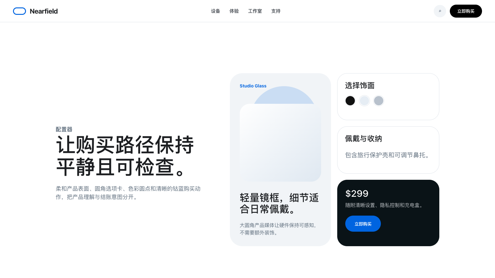
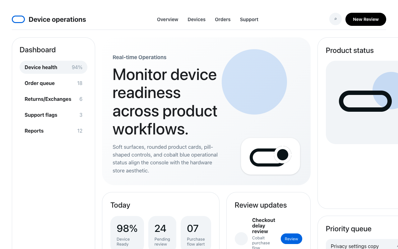

适合智能硬件、消费科技和产品展示页,白底大留白、圆角摄影卡、黑色 pill CTA 与钴蓝购买动作显得友好可信。
设计语言样张
---
version: alpha
name: "Meta"
description: "Meta 的 DESIGN.md 中文参考模板,保留原始 design token 与专业术语,覆盖 color system、typography、layout、components、motion 与 interaction states。"
language: zh-CN
sourceLanguage: en
---

## 概览
Meta 的 commerce surfaces(homepage、Quest configurator、Ray-Ban product detail、prescription page)呈现出自信的硬件零售气质。品牌表达以 photography-first 为核心:大尺寸、full-bleed 的 product imagery 占据首屏主要空间,其余信息由白空间与紧凑的 typography hierarchy 承载。系统有清晰的双 CTA 模式:marketing surface 使用黑色 pill primary,buy-now flow 内切换为饱和 cobalt blue({colors.primary}),并搭配 outlined ghost button 作为 secondary navigation。

Optimistic VF 是整个系统的核心 variable display face,从 64px hero display 到 12px caption 都由它承载。所有 heading role 都启用 `ss01` 与 `ss02` stylistic sets,让几何字形带有更友好的人文感。768px 以下系统会干净折叠:hero 改为纵向堆叠,pill nav 变为 hamburger,three-up feature grids 收为单列,product configurator 的 right-rail summary 下沉为 sticky bottom bar。

**Key Characteristics:**
- Stark white canvas({colors.canvas})承载 full-bleed product photography;showcase tile 使用 `{rounded.xxxl}` (32px) 柔化角部。
- 双层 primary button system:marketing CTA 使用 {colors.ink-button} pill;commerce CTA 在 buy-now panel 内使用 {colors.primary} cobalt pill。
- Optimistic VF 同时覆盖 display 与 body,并持续启用 `ss01, ss02` OpenType features。
- Pill button({rounded.full})和 `{rounded.xxxl}` / `{rounded.feature}` card 是主要几何特征。
- 饱和 promo banner(yellow {colors.warning}、dark {colors.ink-deep})只在限时 offer 中谨慎出现在 nav 上方。
- Photographic feature card 不使用 chrome(无 border、无 shadow);product imagery 本身就是 surface treatment。

## Colors

> Source pages: meta.com/ (homepage), /ai-glasses/ray-ban-meta-skyler-gen-2/ (PDP), /quest/quest-3s/buy-now/ (configurator), /ai-glasses/prescription/ (lens upsell)。四个页面的 token coverage 一致,说明 design system 高度统一。

### Brand & Accent
- **Cobalt Primary** ({colors.primary}): buy-now CTA 色。用于 commerce flow 与 right-rail purchase panel 内的 "Add to cart"、"Configure"、"Pre-order"。
- **Deep Cobalt** ({colors.primary-deep}): cobalt primary 的 pressed-state 与 dark-surface variant,也用于 active link。
- **Soft Cobalt** ({colors.primary-soft}): informational callout 的半透明背景 tint(15% alpha)。
- **Facebook Blue** ({colors.fb-blue}): selected radio/checkbox state 与 inline form-control activation color。
- **Meta Link Blue** ({colors.meta-link}): 保留给 legacy navigation 与 footer link affordance。
- **Oculus Purple** ({colors.oculus-purple}): VR product accent,用于 Quest-branded surface 的 category emphasis。

### Surface
- **Canvas White** ({colors.canvas}): page 背景 与 primary card surface。
- **Soft Cloud** ({colors.surface-soft}): product-thumbnail、warranty-card 背景,也用于 search-pill rest state。
- **Hairline Gray** ({colors.hairline}): 1px input 边框 与 form-control divider。
- **Hairline Soft** ({colors.hairline-soft}): card、footer separator 与 section break 上更轻的 divider。

### Text
- **Deep Ink** ({colors.ink-deep}): light surface 上的 primary headline 与 body text。
- **Ink** ({colors.ink}): standard body 与 secondary headline text。
- **Charcoal** ({colors.charcoal}): tertiary body 文本 与 form-button label。
- **Slate** ({colors.slate}): section-header copy 与 supporting microcopy。
- **Steel** ({colors.steel}): caption 文本 与 footer link hierarchy。
- **Stone** ({colors.stone}): disabled 或 de-emphasized label。

### Semantic Colors
- **Success** ({colors.success}): "In stock"、"Free returns" 等肯定状态。
- **Attention** ({colors.attention}): 中优先级 alert 与 timed callout。
- **Warning** ({colors.warning}): promotional banner 与 limited-time tag。
- **Critical** ({colors.critical}): validation error 与 destructive feedback。
- **Critical Strong** ({colors.critical-strong}): form-input error 边框 与 inline error label。

## Typography

### Font Family
**Optimistic VF** 是 Meta 的 proprietary variable display face。Fallbacks: Montserrat, Helvetica, Arial, Noto Sans。Variable axes 从 300(轻量 editorial intro headline,如 "Look forward")到 500(display、hero、heading-sm),再到 700(subtitle、body emphasis、button label)。所有 heading role 都开启 `ss01` 与 `ss02`,它们一起软化几何感,让字体有更自然的呼吸。

Technical microcopy(12px)在 spec sheet 与 footer fine print 内使用 secondary Helvetica fallback chain。

### Hierarchy

| Token | Size | Weight | Line Height | Letter Spacing | OpenType | 用途 |
|---|---|---|---|---|---|---|
| `{typography.hero-display}` | 64px | 500 | 1.16 | 0 | ss01, ss02 | Homepage hero、category opener |
| `{typography.display-lg}` | 48px | 500 | 1.17 | 0 | ss01, ss02 | Section-opener display |
| `{typography.heading-lg}` | 36px | 500 | 1.28 | 0 | ss01, ss02 | Subsection headline |
| `{typography.heading-md}` | 28px | 300 | 1.21 | 0 | ss01, ss02 | 较轻的 editorial subhead |
| `{typography.heading-sm}` | 24px | 500 | 1.25 | 0 | ss01, ss02 | 卡片 title、feature-tile header |
| `{typography.subtitle-lg}` | 18px | 700 | 1.44 | 0 | - | Bold callout、FAQ question title |
| `{typography.subtitle-md}` | 18px | 400 | 1.44 | 0 | - | 正文 lead 与长行 subtitle |
| `{typography.body-md}` | 16px | 400 | 1.50 | -0.16px | - | Primary body 文本 |
| `{typography.body-md-bold}` | 16px | 700 | 1.50 | -0.16px | - | 正文 emphasis 与 link-md |
| `{typography.body-sm}` | 14px | 400 | 1.43 | -0.14px | - | Secondary body、helper 文本 |
| `{typography.body-sm-bold}` | 14px | 700 | 1.43 | -0.14px | - | Pill tab label、footer heading |
| `{typography.caption-bold}` | 12px | 700 | 1.33 | 0 | - | Badge label、timestamp |
| `{typography.caption}` | 12px | 400 | 1.33 | 0 | - | 页脚 fine print、legal microcopy |
| `{typography.button-md}` | 14px | 700 | 1.43 | -0.14px | - | Pill button label |
| `{typography.link-md}` | 16px | 700 | 1.50 | -0.16px | - | Inline navigation link |

### Principles
- 正文 role 使用轻微 negative letter-spacing(`-0.14px` 到 `-0.16px`),让 Optimistic VF 更紧致但不显拥挤。
- Editorial subhead 使用 300 weight,在 500 display 与 400 body 之间制造视觉休息点。
- Heading 必须成对启用 `ss01, ss02`,系统不单独使用其中一个 stylistic set。
- Button、pill tab 与 footer heading 共用 `{typography.body-sm-bold}`,让 interactive element 之间保持紧密关系。

## Layout

### Spacing System
- **Base unit**: 4px increment,8px 是最常用主步长。
- **Tokens**: `{spacing.xxs}` (4px) · `{spacing.xs}` (8px) · `{spacing.sm}` (10px) · `{spacing.md}` (12px) · `{spacing.base}` (16px) · `{spacing.lg}` (20px) · `{spacing.xl}` (24px) · `{spacing.xxl}` (32px) · `{spacing.xxxl}` (40px) · `{spacing.section-sm}` (48px) · `{spacing.section}` (64px) · `{spacing.section-lg}` (80px) · `{spacing.hero}` (120px)。
- **区块 rhythm**: Marketing section 用 `{spacing.section-lg}` (80px) 分隔;product detail section 收到 `{spacing.section}` (64px);FAQ stack 进一步压到 `{spacing.xxl}` (32px)。
- **卡片 internal padding**: 标准为 `{spacing.xxl}` (32px);icon-feature tile 收到 `{spacing.xl}` (24px);promo-strip card 扩到 `{spacing.section}` (64px) 以形成 hero presence。

### Grid & Container
- Marketing page max-width 约 1280px,gutter 32-48px。
- PDP 使用 2-column split:hero gallery 约 58% + sticky purchase rail 约 42%,rail 上 `max-width: 380px`。
- Three-up feature grid 使用 24px column gap;six-up product thumbnail row(color/SKU picker)使用 12px gap。

### Whitespace Philosophy
Whitespace 服务于 product photography。英雄区 section 给 product imagery 50-70% viewport height;copy 在上下 `{spacing.xxl}` 到 `{spacing.xxxl}` block 中获得呼吸空间。Configurator 内部更紧凑,buy-now panel 信息密度高,option group 之间采用 `{spacing.base}` 到 `{spacing.lg}` 的节奏。

## Elevation & Depth

系统整体偏 flat。Elevation 只保留给两类 interaction layer:

| Level | Treatment | 用途 |
|---|---|---|
| 0 (flat) | No shadow;`{rounded.xxxl}` + `{colors.hairline-soft}` 边框 | Default product card、why-buy tile |
| 1 (subtle) | `rgba(0, 0, 0, 0.2) 1px 1px 0px 0px` | Pill-tab activation indicator |
| 2 (sticky panel) | `rgba(20, 22, 26, 0.3) 0px 1px 4px 0px` | PDP right-rail purchase summary、sticky mobile checkout bar |

### Decorative Depth
- Photography-as-depth: full-bleed product imagery 放在 `{rounded.xxxl}` card 内,通过图像而不是 shadow 建立层次。
- Translucent overlay(`rgba(255, 255, 255, 0.1)` 到 `rgba(10, 19, 23, 0.12)`)覆盖 dark hero photography,提高 overlay 文本 可读性。
- Accessory card 内的 pastel tint(soft pink、ice-blue、mint)属于 photographic content,不作为正式 system token。

## Shapes

### Border Radius Scale

| Token | Value | 用途 |
|---|---|---|
| `{rounded.xs}` | 2px | Inline checkbox mark、细小 UI corner |
| `{rounded.sm}` | 4px | Tag、micro-control |
| `{rounded.md}` | 6px | Square thumbnail rounding |
| `{rounded.lg}` | 8px | Form input、radio-option container |
| `{rounded.xl}` | 16px | Standard feature card、FAQ accordion item |
| `{rounded.xxl}` | 24px | Warranty / accessory tile、ghost-style action card |
| `{rounded.xxxl}` | 32px | Photographic feature card、big promo strip |
| `{rounded.feature}` | 40px | Accessory hero panel、"Built for prescriptions" card |
| `{rounded.full}` | 100px | Pill button、tab chip、badge |
| `{rounded.circle}` | 50% | Color swatch、circular icon button |

### Photography Geometry
- Product hero photography 多数放在 `{rounded.xxxl}` (32px) frame 中,而不是直角矩形。
- Color/material swatch 是标准圆形(`{rounded.circle}`,32px diameter),selected 时有 2px white 边框 ring。
- Square product thumbnail(`aspect-ratio: 1/1`)使用 `{rounded.xl}`。
- Six-up "color & SKU" picker 使用 1:1 tile 与 `{rounded.lg}` (8px),比 hero photography frame 更紧,以区分 selection grid 与 showcase context。

## Components

> 按 no-hover policy,下列组件不记录 hover state,只记录 default 与 pressed/active state。

### Buttons

**`button-primary`** — marketing surface 的黑色 pill primary CTA("Shop", "Pre-order")。
- 背景 `{colors.ink-button}`,文本 `{colors.on-ink-button}`,typography `{typography.button-md}`,内距 `14px 30px`,圆角 `{rounded.full}`。
- 按下状态 `button-primary-pressed` 将 背景 切换为 `{colors.charcoal}`。
- Disabled state `button-primary-disabled` 使用 `{colors.disabled-text}` background。

**`button-buy-cta`** — commerce flow 的 cobalt pill primary CTA("Add to cart", "Configure", "Continue")。
- 背景 `{colors.primary}`,文本 `{colors.on-primary}`,typography `{typography.button-md}`,内距 `14px 30px`,圆角 `{rounded.full}`。
- 按下状态 `button-buy-cta-pressed` 将 背景 加深到 `{colors.primary-deep}`。
- 该 variant 只出现在 buy-now configurator 与 PDP purchase rail;marketing surface 使用 `button-primary`。

**`button-secondary`** — outlined ghost CTA,常与 primary 组成 dual-CTA hero pattern。
- 背景 transparent,文本 `{colors.ink-deep}`,边框 `2px solid {colors.ink-deep}`,typography `{typography.button-md}`,内距 `12px 28px`,圆角 `{rounded.full}`。

**`button-ghost`** — 更安静的 outlined variant,用于 tertiary CTA。
- 背景 transparent,文本 `{colors.ink-deep}`,边框 `2px solid rgba(10, 19, 23, 0.12)`,typography `{typography.button-md}`,内距 `10px 22px`,圆角 `{rounded.full}`。

**`button-pill-tab`** + **`button-pill-tab-active`** — 页面顶部 category navigation pill("Glasses / Quest / Apps")。
- 未激活: 背景 `{colors.canvas}`,文本 `{colors.ink}`,边框 `1px solid {colors.hairline}`,内距 `8px 16px`,圆角 `{rounded.full}`。
- 激活: 背景 `{colors.ink-deep}`,文本 `{colors.canvas}`。Active state 不保留 border,深色 fill 直接替代。

**`button-icon-circular`** — 40x40px circular utility button(carousel arrow、share、favorite)。
- 背景 `{colors.canvas}`,icon color `{colors.ink}`,圆角 `{rounded.circle}`。

### Cards & Containers

**`card-product-feature`** — 带 product photography 与 copy 的白色 feature card。
- 背景 `{colors.canvas}`,圆角 `{rounded.xxxl}`,内距 `{spacing.xxl}`,边框 `1px solid {colors.hairline-soft}`。

**`card-feature-photo`** — edge-to-edge photographic showcase tile,无 chrome。
- 背景 `{colors.canvas}`(只在角落可见),圆角 `{rounded.xxxl}`,无 padding、无 border。Image 填满 card,copy 以白色 overlay 在 bottom-left。

**`card-promo-strip`** — dark full-width promo card,内含 copy + CTA。
- 背景 `{colors.ink-deep}`,文本 `{colors.canvas}`,圆角 `{rounded.xxxl}`,内距 `{spacing.section}`。

**`card-icon-feature`** — three-up feature tile,包含 line icon、headline 与 short copy。
- 背景 `{colors.canvas}`,圆角 `{rounded.xl}`,内距 `{spacing.xl}`,边框 `1px solid {colors.hairline-soft}`。

**`card-checkout-summary`** — PDP right-rail sticky summary,包含 title、price、color picker 与 "Add to cart" button。
- 背景 `{colors.canvas}`,圆角 `{rounded.xl}`,内距 `{spacing.xl}`,边框 `1px solid {colors.hairline-soft}`,shadow `rgba(20, 22, 26, 0.3) 0px 1px 4px 0px`。

**`product-thumbnail`** — color/SKU picker 与 "People also bought" row 中的 square product image cell。
- 背景 `{colors.surface-soft}`,圆角 `{rounded.xl}`,内距 `{spacing.base}`,aspect-ratio `1 / 1`。

**`warranty-card`** — warranty + finance offer 的 promo callout。
- 背景 `{colors.surface-soft}`,圆角 `{rounded.xxl}`,内距 `{spacing.xxl}`。额外权益可使用 pastel-tinted variant。

**`why-buy-tile`** — lower marketing zone 的 4-up reassurance tile row。
- 背景 `{colors.canvas}`,圆角 `{rounded.xl}`,内距 `{spacing.xxl} {spacing.xl}`,边框 `1px solid {colors.hairline-soft}`。Heading 使用 `{typography.subtitle-lg}`,body 使用 `{typography.body-sm}`。

### Inputs & Forms

**`text-input`** — standard form field。
- 背景 `{colors.canvas}`,文本 `{colors.ink}`,边框 `1px solid {colors.hairline}`,圆角 `{rounded.lg}`,内距 `{spacing.md}`,高度 44px。

**`text-input-focused`** — activated state。
- Border 切换为 `2px solid {colors.fb-blue}`。

**`text-input-error`** — validation error state。
- Border 切换为 `1px solid {colors.critical-strong}`;下方 error label 使用 `{colors.critical-strong}` 与 `{typography.body-sm}`。

**`search-pill`** — top-nav search field。
- 背景 `{colors.surface-soft}`,文本 `{colors.steel}`,typography `{typography.body-sm}`,圆角 `{rounded.full}`,高度 40px。

**`radio-option`** + **`radio-option-selected`** — configurator option card(storage、color variant、shipping option)。
- 未激活: 背景 `{colors.canvas}`,圆角 `{rounded.lg}`,内距 `{spacing.lg}`,边框 `1px solid rgba(10, 19, 23, 0.12)`。
- 已选择: 边框 切换为 `2px solid #0143b5`,cobalt theme 继续作为 form-control selection signal。

**`color-swatch-circle`** — Ray-Ban frame finish 与 glass color 的 round picker。
- 32px diameter,`{rounded.circle}`,selected 时在 swatch 自身 fill color 上叠加 `2px solid {colors.canvas}` ring。

### Badges & Status

**`badge-promo-yellow`** — limited-time offer chip("Limited time", "Sale")。
- 背景 `{colors.warning}`,文本 `{colors.ink-deep}`,typography `{typography.caption-bold}`,圆角 `{rounded.full}`,内距 `4px 10px`。

**`badge-attention`** — 中优先级 status indicator("Almost gone", "Selling fast")。
- 背景 `{colors.attention}`,文本 `{colors.canvas}`,typography `{typography.caption-bold}`,圆角 `{rounded.full}`,内距 `4px 10px`。

**`badge-success`** — 肯定状态("In stock", "Verified", "Free shipping")。
- 背景 `{colors.success}`,文本 `{colors.canvas}`,typography `{typography.caption-bold}`,圆角 `{rounded.full}`,内距 `4px 10px`。

**`badge-critical`** — urgent/destructive label("Out of stock", "Discontinued", error chips)。
- 背景 `{colors.critical}`,文本 `{colors.canvas}`,typography `{typography.caption-bold}`,圆角 `{rounded.full}`,内距 `4px 10px`。

**`promo-banner`** — top nav 上方的 sticky full-width promotional strip。
- 背景 `{colors.ink-deep}`(yellow promo variant 可用 `{colors.warning}`),文本 `{colors.canvas}`(yellow 上使用 `{colors.ink-deep}`),typography `{typography.body-sm-bold}`,内距 `{spacing.md} {spacing.xl}`。承载单行 offer copy 与 inline CTA link。

### 导航

**Top 导航 (Desktop)** — sticky white bar,包含 category pill tabs、search、account、cart。
- 背景 `{colors.canvas}`,高度 约 64px,底部 `1px solid {colors.hairline-soft}`。
- Left: Meta wordmark logo (61x14px)。Center: pill-tab category nav。Right: search-pill + circular icon buttons。

**Top 导航 (Mobile)** — 压缩为 logo + hamburger + cart icon。768px 以下 pill-tab nav 进入 full-screen drawer。

**Promo Banner** — nav 上方的 full-width strip,用于限时 offer。
- 背景 `{colors.ink-deep}` 或 `{colors.warning}`,文本 `{colors.canvas}` 或 `{colors.ink-deep}`,typography `{typography.body-sm-bold}`,内距 `{spacing.md} {spacing.xl}`。承载单行 offer copy + inline link。

**Breadcrumb (PDP)** — product hero 上方的 inline path。
- Typography `{typography.body-sm}`,separator dot 使用 `{colors.stone}`,active leaf 使用 `{colors.ink}`,parent links 使用 `{colors.steel}`。

### Signature Components

**`hero-band-marketing`** — full-bleed photographic hero,叠加 copy + dual-CTA pair。
- Edge-to-edge product photography 位于 dark 或 photographic 背景 上。Overlay copy 使用白色 `{typography.hero-display}`。Title 下方是一行 `{typography.subtitle-md}` subtitle,然后是 `button-primary` + `button-secondary`。

**`product-gallery-pdp`** — PDP main hero:左侧 4-up vertical thumbnail strip,中间大图,右侧 sticky purchase rail。
- Thumbnails: 80x80px,`{rounded.lg}`,`{colors.surface-soft}` background,1px `{colors.hairline-soft}` border;active 边框 切换为 `{colors.ink-deep}`。
- Main image area: desktop 约 720x720px,`{rounded.xxxl}`,photographic surface。
- Sticky rail 使用 `card-checkout-summary`。

**`color-sku-picker-row`** — 六列 square product variant grid,下方有 name + price。
- Tile 背景 `{colors.surface-soft}`,圆角 `{rounded.lg}`,image 内距 `{spacing.base}`。Active tile 边框 切换为 `2px solid {colors.ink-deep}`。Tile 下方:variant name 用 `{typography.body-sm-bold}`,price 用 `{typography.body-sm}`。

**`feature-icon-row`** — 四个 reassurance benefit。
- 4-column grid,每个 cell 使用 `card-icon-feature` chrome,顶部 32px line icon,headline `{typography.subtitle-lg}`,body `{typography.body-sm}`。

**`faq-accordion`** — expandable Q&A item 的 vertical stack。
- 每个 item 使用 `faq-accordion-item` chrome。Question 左侧用 `{typography.subtitle-lg}`,右侧 chevron icon(`{colors.steel}`,20px)。Expanded answer 在下方用 `{typography.body-md}`,top 内距 `{spacing.base}`。

**`tech-specs-table`** — product specification 的 two-column key/value table。
- Row layout: 左侧 spec label(`{typography.body-sm-bold}` `{colors.ink}`),右侧 spec value(`{typography.body-sm}` `{colors.charcoal}`)。Row separator `1px solid {colors.hairline-soft}`。Spec group 上方用 `{typography.heading-sm}` section header。

**`testimonial-customer-card`** — 带 author、quote 与 photo 的小 editorial card。
- 背景 `{colors.canvas}`,圆角 `{rounded.xl}`,内距 `{spacing.xxl}`,边框 `1px solid {colors.hairline-soft}`。Avatar circle 40px,byline 用 `{typography.body-sm-bold}`,quote 用 `{typography.body-md}`。

**`footer-region`** — 密集 multi-column site footer。
- 背景 `{colors.canvas}`,top 边框 `1px solid {colors.hairline-soft}`,内距 `{spacing.section} {spacing.xxl}`。六组 column,section heading 使用 `{typography.body-sm-bold}` `{colors.ink}`,link list 使用 `{typography.body-sm}` `{colors.steel}`。Bottom row 包含 language picker、region selector、legal links,使用 `{typography.caption}` `{colors.stone}`。

## 使用建议与禁忌

### 应该
- 将 `{colors.primary}` (cobalt) 保留给 buy-now CTA;它的视觉重量来自稀缺使用。
- Marketing-surface primary CTA 使用 `{colors.ink-button}` (black),secondary action 搭配 `{colors.button-secondary}` ghost outline。
- 所有 button、category pill、badge、chip 都使用 `{rounded.full}`;Meta 系统里 button 不能是方角。
- Photographic product card 使用 `{rounded.xxxl}`,icon-feature tile 使用 `{rounded.xl}`,保持可见的 card hierarchy contrast。
- Optimistic VF heading 必须成对开启 `ss01, ss02`。
- Editorial subhead 使用 300-weight `{typography.heading-md}`,与 500-weight display 形成品牌节奏。

### 不要
- 不要在 marketing-surface primary button 上使用 `{colors.primary}` (cobalt),这会破坏 black-CTA-on-white-canvas 的品牌定位。
- 不要引入 cobalt + Oculus purple 之外的额外 accent color;product photography 之外硬件品牌刻意保持 monochrome。
- 不要把 pill button 的角度弱化到低于 `{rounded.full}`。
- 不要让 feature card 失去圆角;任何 photographic surface 至少需要 `{rounded.xxxl}`。
- 不要把 `{typography.body-md}` line-高度 降到 1.50 以下;negative letter-spacing 已经收紧指标,再压缩会损害可读性。
- 不要给 marketing card 添加 heavy shadow。Elevation 是 commerce-flow signal,不是 marketing flourish。

## Responsive Behavior

### Breakpoints
| Name | Width | Key Changes |
|---|---|---|
| Mobile (small) | < 480px | Single column。英雄区 文本 降到 `{typography.display-lg}` 或更小。Pill tabs 折叠为 hamburger drawer。PDP gallery 堆叠在 purchase rail 上方;rail 变为 sticky bottom bar。 |
| Mobile (large) | 480 - 767px | 与 small 类似,但 feature tile 可 two-up。 |
| Tablet | 768 - 1023px | Two-column feature grids。Pill-tab nav 返回。PDP gallery + purchase rail 以压缩比例并排。 |
| Desktop | 1024 - 1359px | 完整 three-/four-up feature grid;完整 pill-tab category nav;PDP 使用标准 58/42 split。 |
| Wide Desktop | >= 1360px | 与 desktop 相同,但 hero gutter 更宽,product photography 更大。 |

### Touch Targets
- Pill button 有效高度 40-44px,高于 WCAG AAA 44px 下限。
- Circular icon button 为 40x40px,移动端通过 override 提升到 44x44px。
- Color swatch circle 为 32x32px;通过周围 12px clear hit zone 达到约 56px effective target。
- Form input 为 44px 高,与 primary button 高度 对齐。

### Collapsing Strategy
- **Promo banner** 全 breakpoint 保持 full-width;小屏使用 ellipsis 截断,并保留 inline link affordance。
- **Pill-tab nav** 在 768px 以下折叠为 hamburger drawer;closed nav 内显示 active tab label。
- **PDP layout**: < 1024px 时 gallery 堆叠到 purchase summary 上方;< 768px 时 summary 变为 sticky bottom bar,包含 price + "Add to cart" button。
- **Feature grids** 从 3-up / 4-up 在 768-1023px 收为 2-up,在 < 768px 收为 1-up;1-up 时 card 内距 从 `{spacing.xxl}` 收为 `{spacing.xl}`。
- **英雄区 typography**: `{typography.hero-display}` (64px) 在 < 768px 降为 `{typography.heading-lg}` (36px),在 < 480px 降为 `{typography.heading-sm}` (24px)。
- **Footer**: 6-column desktop layout 在 tablet 重排为 2-column,mobile 变为 accordion-collapsed groups。

### Image Behavior
- Product photography 使用 1:1(thumbnail、color picker)、4:3(PDP gallery)与 16:9(homepage promo strip)ratio。
- 英雄区 photography full-bleed,并带 `{rounded.xxxl}` corners;fold 以下 lazy-loaded。
- Product variant image 在所有 breakpoint 保持 `{rounded.lg}` thumbnail,不会在 mobile 变成 full-width。

## Iteration Guide

1. 一次只聚焦 ONE component。系统内部一致性高,小的精度收益会叠加。
2. 直接引用 component name 与 token(`{colors.primary}`, `{component-name}-pressed`, `{rounded.full}`),不要改写。
3. 修改后运行 `npx @google/design.md lint DESIGN.md` 捕捉 broken refs、contrast issues 与 orphaned tokens。
4. 新 variant 作为独立 `components:` entry 添加(`-pressed`, `-disabled`, `-focused`),不要埋在 prose 内。
5. 正文 默认用 `{typography.body-md}`,emphasis 用 `{typography.subtitle-lg}`。Headline 通过 `hero-display -> display-lg -> heading-lg -> heading-md -> heading-sm` 逐级下降。
6. 保持 `{colors.primary}` (cobalt) 稀缺。如果它在 buy-now flow 外出现在同一 viewport,先确认该 surface 是否真的需要像 checkout panel。
7. 按钮 始终是 pill-shaped(`{rounded.full}`);square button 在该 design language 中像 third-party widget,应从 work surface 中过滤。

## Known Gaps

- 非 button form control(toggle、multi-select)的 selected/checked states 在捕获页面中不可见;可按 `radio-option-selected` 的 cobalt-on-white pattern 实现。
- Animation/transition timing 未提取;primary surface transition 建议 150-250ms ease-out,accordion expand/collapse 建议 300ms ease-in-out。
- Dark-mode canvas、surface、ink、hairline 的具体 token value 未定义;这些 commerce pages 未公开 dark-mode token set。
- Accessory card 内的 pastel decorative tint(soft pink、ice blue、mint)视觉上存在但未 token 化;按 photographic content 处理,而不是 system color。


