

01 / 03
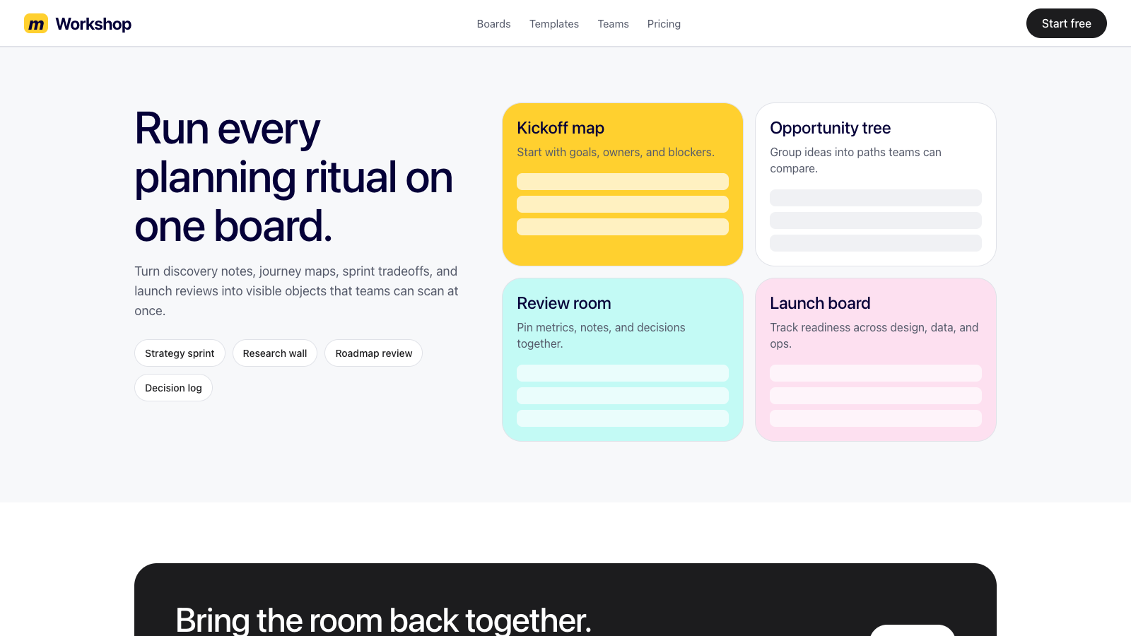
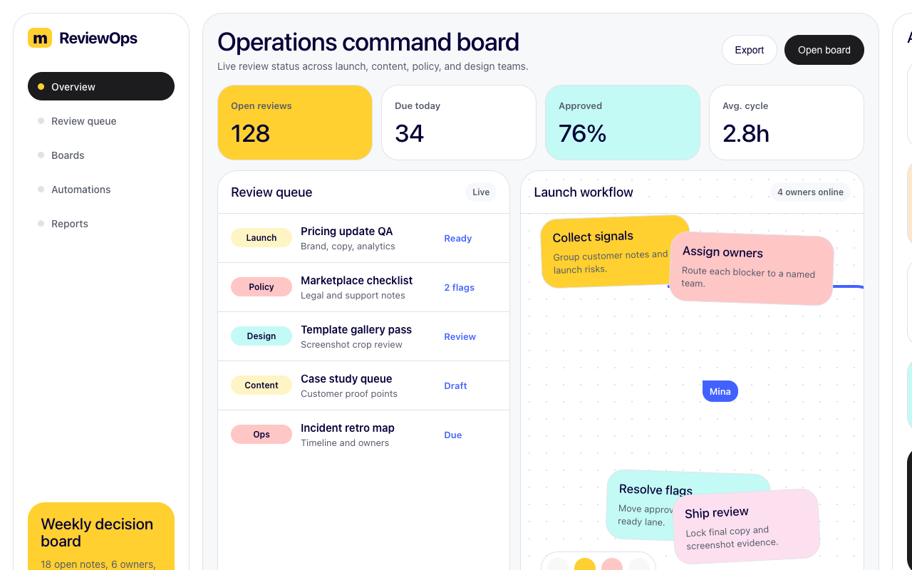

适合工作坊、协作规划和创意看板,白板网格、便签色块、黑色 pill CTA 与实时光标让复杂流程更活泼。
设计语言样张
正文清晰、圆润、友好,适合解释工作坊、流程图和团队协作内容。
视觉工作坊
保持白色画布,把协作对象、便签和光标作为主要视觉内容。
主 CTA 使用黑色胶囊按钮,黄色只做品牌识别和少量标签。
彩色功能卡使用黄、粉、珊瑚、青绿等便签色,圆角接近 28px。
用白板 mockup、路径线、协作光标表达流程和多人协同。
不要把黄色铺成大面积背景或常规主按钮。
不要使用沉重阴影;普通卡片靠细边框,白板 mockup 才有轻投影。
不要引入便签色之外的随意强调色。
不要用库存照片替代真实产品白板、便签和流程图样张。
---
version: alpha
name: "Miro"
description: "Miro 的 DESIGN.md 中文参考模板,保留原始 design token 与专业术语,覆盖 color system、typography、layout、components、motion 与 interaction states。"
language: zh-CN
sourceLanguage: en
---

## 概览
Miro 将自己定位为 AI-powered visual workspace,品牌声音自信并略带 playful。首页以纯白画布开场,左上角是小巧的 canary-yellow Miro wordmark,核心操作是 black-pill primary CTA “Get started free” 与 outlined pill “Book a demo”;随后由真实 Miro board mockup(sticky notes、kanban、mind maps)承担主要视觉重量。进入更深层页面后,系统会展开 pastel feature card(rose、teal、coral、yellow),这些颜色呼应真实 whiteboard 产品中的 sticky-note palette;customer story card 也复用这些 tint 来区分品牌故事。

Roobert PRO 是 Miro 的自定义 display face,锚定从 80px hero display 到 11px micro label 的全部排版表面。它略圆润的几何特征与 playful 产品摄影、友好的产品定位自然契合。Black-pill primary button({rounded.full})主导 marketing CTA;品牌签名 canary yellow({colors.brand-yellow})只保留给 wordmark、顶部 promo banner 和 “yellow tag” feature pill,而不作为 primary CTA。四层 pricing comparison(Free / Starter / Business / Enterprise)之后,是系统中最密集的 feature comparison table,跨多个 section divider 延伸约 80 行。

**关键特征:**
- 纯白 canvas + canary yellow({colors.brand-yellow})Miro wordmark 作为开场识别
- Black-pill primary CTA({colors.primary} + {rounded.full})是主导交互元素
- Pastel feature cards(yellow、rose、coral、teal、mint)呼应真实 sticky-note palette
- Roobert PRO 贯穿所有 UI 表面,几何且略圆润
- 使用真实 Miro-board mockup 作为功能插图
- 四层 pricing card grid + 密集 feature comparison table
- 大型 dark footer({colors.footer-bg})包含多栏链接与 app-store badge

## 色彩

> 来源页面:miro.com/(homepage)、/pricing/、/products/ai-workflows/、/agile/、/customers/。五个页面的 token 覆盖一致。

### 品牌与强调色
- **Miro Yellow**({colors.brand-yellow}):可识别的 canary yellow,用于 wordmark、top promo banner 与 yellow tag pill。
- **Yellow Deep / Yellow Light / Yellow Dark**:分别用于 yellow 的 pressed/emphasis、pale chip background 与 chip foreground。
- **Brand Blue**({colors.brand-blue}):inline link 与 featured pricing tier border 的 action blue。
- **Blue Pressed**({colors.blue-pressed}):blue pressed state。
- **Brand Coral / Coral Light / Coral Dark**:用于 warm callout、pale coral feature background 与 deep wine tag text。
- **Brand Rose**({colors.brand-rose}):soft rose-pink feature variant。
- **Brand Teal / Teal Light / Moss Dark**:用于 teal accent、pale teal card background 与 deep teal-green text。
- **Brand Pink**({colors.brand-pink})与 **Brand Orange Light**({colors.brand-orange-light}):用于 soft callout 与 feature background。

### 表面
- **Canvas White**({colors.canvas}):page background 与 primary card surface。
- **Surface / Surface Soft**:subtle section background 与 quieter division。
- **Surface Yellow**({colors.surface-yellow}):yellow-tinted tag chip surface。
- **Surface Pricing Featured**({colors.surface-pricing-featured}):featured pricing tier 的 pale lavender。
- **Hairline / Hairline Soft / Hairline Strong**:用于 1px border、table-row divider 与 input border。

### 文本
- **Ink Deep**({colors.ink-deep}):light feature card 上的 headline。
- **Ink / Charcoal / Slate / Steel / Stone / Muted**:依次用于 primary text、body emphasis、secondary metadata、tertiary/footer link、caption 与 disabled/placeholder。
- **On Dark / On Dark Muted**:dark surface 上的 white 与 reduced-opacity white。

### 语义色
- **Success Accent**({colors.success-accent}):success indicator green。
- **Brand Red**({colors.brand-red})与 **Brand Red Dark**({colors.brand-red-dark}):error background 与 stronger error border。

## 字体

### 字体家族
**Roobert PRO** (primary): Miro's custom geometric sans-serif typeface. Used across every UI surface from oversized 80px hero displays to 11px micro labels. The face has a slightly rounded, friendly character that matches the brand's playful product positioning. Fallbacks: Noto Sans, -apple-system, BlinkMacSystemFont, sans-serif.

### 层级

| Token | 尺寸 | 字重 | 行高 | 字距 | 用途 |
|---|---|---|---|---|---|
| `{typography.hero-display}` | 80px | 500 | 1.05 | -2px | Marketing hero ("See how teams get great done with Miro") |
| `{typography.display-lg}` | 60px | 500 | 1.10 | -1.5px | Major section openers |
| `{typography.heading-1}` | 48px | 500 | 1.15 | -1px | Page-level headlines |
| `{typography.heading-2}` | 36px | 500 | 1.20 | -0.5px | Subsection headlines |
| `{typography.heading-3}` | 28px | 500 | 1.25 | 0 | 卡片标题 |
| `{typography.heading-4}` | 22px | 500 | 1.30 | 0 | 功能区块标题 |
| `{typography.heading-5}` | 18px | 500 | 1.40 | 0 | FAQ questions, smaller cards |
| `{typography.subtitle}` | 18px | 400 | 1.50 | 0 | Hero subtitle |
| `{typography.body-md}` | 16px | 400 | 1.50 | 0 | 主要正文 |
| `{typography.body-md-medium}` | 16px | 500 | 1.50 | 0 | Logo wall labels |
| `{typography.body-sm}` | 14px | 400 | 1.50 | 0 | 次级正文、表格单元格 |
| `{typography.body-sm-medium}` | 14px | 500 | 1.50 | 0 | Filter dropdowns, button labels |
| `{typography.caption}` | 13px | 400 | 1.40 | 0 | Helper 文本 |
| `{typography.caption-bold}` | 13px | 600 | 1.40 | 0 | 徽章标签, tag chips |
| `{typography.micro}` | 12px | 500 | 1.40 | 0 | 页脚 microcopy |
| `{typography.micro-uppercase}` | 11px | 600 | 1.40 | 0.5px | Section dividers in tables |
| `{typography.button-md}` | 14px | 500 | 1.30 | 0 | Pill button labels |
| `{typography.stat-display}` | 64px | 500 | 1.10 | -1.5px | "100M+ users" stat callouts |

### 原则
- **Tight hero leading** (1.05) creates magazine-grade display headlines on the 80px hero
- **Negative letter-spacing progression** — display sizes use -2px to -1.5px; smaller headings relax to 0
- **Stat-display token** (64px / 500) for marketing stat callouts
- **Single weight scale** — 400 (body), 500 (medium emphasis + headings), 600 (badges and uppercase). Roobert PRO does not use 700 in this system.

## 布局

### 间距系统
- **Base unit**: 4px (8px primary increment)
- **Tokens**: `{spacing.xxs}` (4px) · `{spacing.xs}` (8px) · `{spacing.sm}` (12px) · `{spacing.md}` (16px) · `{spacing.lg}` (20px) · `{spacing.xl}` (24px) · `{spacing.xxl}` (32px) · `{spacing.xxxl}` (40px) · `{spacing.section-sm}` (48px) · `{spacing.section}` (64px) · `{spacing.section-lg}` (96px) · `{spacing.hero}` (120px)
- **Section rhythm**: Marketing pages use `{spacing.section-lg}` (96px); pricing comparison tightens to `{spacing.section}` (64px); customer story stack uses `{spacing.xxl}` (32px)
- **Card internal padding**: `{spacing.xl}` (24px) for compact cards; `{spacing.xxl}` (32px) for feature panels

### 网格与容器
- Marketing pages use 1280px max-width with 32px gutters
- 定价 page renders 4-tier card row at desktop (Free / Starter / Business / Enterprise)
- Customer stories page uses 2-column grid with filter dropdowns
- AI Workflows page uses 2-column hero, then 3-up feature grid

### 留白理念
Marketing surfaces give content generous breathing room — `{spacing.hero}` (120px) hero padding gives the small wordmark room to breathe. 定价 surfaces tighten dramatically.

## 层级与深度

The system runs predominantly flat with strategic depth on hero mockups.

| 层级 | 处理方式 | 用途 |
|---|---|---|
| 0 (flat) | 无阴影; `{colors.hairline-soft}` border | 默认卡片、表格行, form inputs |
| 1 (subtle) | `rgba(5, 0, 56, 0.04) 0px 1px 2px 0px` | Subtle hover-elevated tiles |
| 2 (card) | `rgba(5, 0, 56, 0.06) 0px 4px 12px 0px` | Standard feature cards |
| 3 (mockup) | `rgba(5, 0, 56, 0.08) 0px 12px 32px -4px` | Hero whiteboard mockup framing |
| 4 (modal) | `rgba(5, 0, 56, 0.12) 0px 16px 48px -8px` | 模态框、下拉菜单 |

### 装饰性深度
- The atmospheric depth on Miro's hero comes from the live-product-board mockup illustrations — sticky notes layered at z-offsets, color-block tints behind whiteboard frames
- Pastel feature cards carry their own visual weight via saturated background color
- Customer-story cards layer dark photographic content with overlay scrims

## 形状

### 圆角尺度

| Token | 值 | 用途 |
|---|---|---|
| `{rounded.xs}` | 4px | Small chips, micro-controls |
| `{rounded.sm}` | 6px | Discount badges |
| `{rounded.md}` | 8px | Inputs, search-pill |
| `{rounded.lg}` | 12px | Standard cards, table containers |
| `{rounded.xl}` | 16px | 定价 cards, feature panels |
| `{rounded.xxl}` | 20px | Larger feature cards |
| `{rounded.xxxl}` | 28px | Pastel feature cards (yellow, rose, coral, teal) |
| `{rounded.feature}` | 32px | Hero CTA banner cards |
| `{rounded.full}` | 9999px | All buttons, pill tabs, badges |

### 图像几何
- Real Miro board mockups render with `{rounded.xl}` (16px) corners and a subtle drop shadow
- Customer story cards use `{rounded.xxxl}` (28px) corners with full-bleed photography
- Template card thumbnails use `{rounded.xl}` (16px) with photographic content
- Customer logos wall presents wordmarks inline at consistent 100px height

## 组件

> 根据 no-hover policy,不记录 hover 状态;仅记录默认与 pressed/active 状态。

### 按钮

**`button-primary`** — Black pill primary CTA, the dominant action ("Get started free").
- 背景 `{colors.primary}`, 文本 `{colors.on-primary}`, typography `{typography.button-md}`, padding `12px 24px`, rounded `{rounded.full}`.
- Pressed 状态 `button-primary-pressed` lifts to `{colors.charcoal}`.
- Disabled 状态 `button-primary-disabled` uses `{colors.hairline}` background and `{colors.muted}` text.

**`button-yellow`** — Brand-yellow pill for moments of brand emphasis.
- 背景 `{colors.brand-yellow}`, 文本 `{colors.primary}`, typography `{typography.button-md}`, padding `12px 24px`, rounded `{rounded.full}`.

**`button-blue`** — Brand-blue pill for inline action callouts.
- 背景 `{colors.brand-blue}`, 文本 `{colors.on-primary}`, typography `{typography.button-md}`, padding `12px 24px`, rounded `{rounded.full}`.

**`button-secondary`** — Outlined pill for secondary actions ("Book a demo").
- 背景 transparent, 文本 `{colors.ink}`, border `1px solid {colors.hairline-strong}`, typography `{typography.button-md}`, padding `12px 24px`, rounded `{rounded.full}`.

**`button-on-dark`** — White pill for dark CTA banners.
- 背景 `{colors.on-dark}`, 文本 `{colors.primary}`, typography `{typography.button-md}`, padding `12px 24px`, rounded `{rounded.full}`.

**`button-ghost`** — Quieter rectangular ghost button.
- 背景 transparent, 文本 `{colors.ink}`, typography `{typography.button-md}`, padding `8px 12px`, rounded `{rounded.md}`.

**`button-link`** — 行内文本链接.
- 背景 transparent, 文本 `{colors.brand-blue}`, typography `{typography.body-sm-medium}`, padding `0`.

**`button-icon-circular`** — 36×36px circular utility button.
- 背景 `{colors.canvas}`, 文本 `{colors.ink}`, border `1px solid {colors.hairline}`, rounded `{rounded.full}`.

### 卡片与容器

**`card-base`** — 标准内容卡片.
- 背景 `{colors.canvas}`, rounded `{rounded.xl}`, padding `{spacing.xl}`, border `1px solid {colors.hairline-soft}`.

**`card-feature`** — White feature card with larger 28px corners.
- 背景 `{colors.canvas}`, rounded `{rounded.xxxl}`, padding `{spacing.xxl}`, border `1px solid {colors.hairline-soft}`.

**`card-feature-yellow`** — Pastel-yellow feature card.
- 背景 `{colors.brand-yellow}`, 文本 `{colors.primary}`, rounded `{rounded.xxxl}`, padding `{spacing.xxl}`.

**`card-feature-coral`** — Pastel-coral feature card variant.
- 背景 `{colors.coral-light}`, 文本 `{colors.primary}`, rounded `{rounded.xxxl}`, padding `{spacing.xxl}`.

**`card-feature-teal`** — Pastel-teal feature card variant.
- 背景 `{colors.teal-light}`, 文本 `{colors.primary}`, rounded `{rounded.xxxl}`, padding `{spacing.xxl}`.

**`card-feature-rose`** — Pastel-rose feature card variant.
- 背景 `{colors.rose-light}`, 文本 `{colors.primary}`, rounded `{rounded.xxxl}`, padding `{spacing.xxl}`.

**`card-customer-story`** — Customer story card.
- 背景 `{colors.canvas}`, rounded `{rounded.xxxl}`, padding `0` (image fills the card), border `1px solid {colors.hairline-soft}`.

**`card-stat`** — Stat-row cell for "100M+ users".
- 背景 transparent, 文本 `{colors.ink}`, typography `{typography.stat-display}`, padding `{spacing.lg}`.

**`pricing-card`** — Standard 定价层级 card.
- 背景 `{colors.canvas}`, rounded `{rounded.xl}`, padding `{spacing.xxl}`, border `1px solid {colors.hairline}`.

**`pricing-card-featured`** — Featured 定价层级 (Business — lavender background + blue border).
- 背景 `{colors.surface-pricing-featured}`, rounded `{rounded.xl}`, padding `{spacing.xxl}`, border `2px solid {colors.brand-blue}`.

**`pricing-card-enterprise`** — Dark-canvas enterprise tier card.
- 背景 `{colors.primary}`, 文本 `{colors.on-primary}`, rounded `{rounded.xl}`, padding `{spacing.xxl}`.

### 输入与表单

**`text-input`** — 标准文本字段.
- 背景 `{colors.canvas}`, 文本 `{colors.ink}`, border `1px solid {colors.hairline-strong}`, rounded `{rounded.md}`, padding `{spacing.sm} {spacing.md}`, height 44px.

**`text-input-focused`** — 激活状态.
- Border switches to `2px solid {colors.brand-blue}`.

**`search-pill`** — 搜索栏.
- 背景 `{colors.surface}`, 文本 `{colors.steel}`, typography `{typography.body-sm}`, rounded `{rounded.md}`, height 40px, border `1px solid {colors.hairline}`.

**`filter-dropdown`** — Pill-shaped filter dropdown ("Company use" / "Industry" / "Use case").
- 背景 `{colors.canvas}`, 文本 `{colors.ink}`, typography `{typography.body-sm-medium}`, rounded `{rounded.full}`, padding `{spacing.xs} {spacing.md}`, border `1px solid {colors.hairline-strong}`.

### 标签页

**`pill-tab`** + **`pill-tab-active`** — Pill-style tab nav.
- Inactive: background `{colors.canvas}`, 文本 `{colors.steel}`, border `1px solid {colors.hairline}`, padding `{spacing.xs} {spacing.md}`, rounded `{rounded.full}`.
- Active: background `{colors.primary}`, 文本 `{colors.on-primary}`.

**`toggle-monthly-yearly`** — Two-state pill toggle (Monthly / Annual on pricing).
- 背景 `{colors.surface}`, rounded `{rounded.full}`, padding `4px`.

### 徽章与状态

**`badge-promo`** — Yellow promo banner badge.
- 背景 `{colors.brand-yellow}`, 文本 `{colors.primary}`, typography `{typography.caption-bold}`, rounded `{rounded.full}`, padding `4px 10px`.

**`badge-tag-yellow`** — Soft-yellow feature tag chip ("Yellow" tag on AI Workflows page).
- 背景 `{colors.surface-yellow}`, 文本 `{colors.yellow-dark}`, typography `{typography.caption-bold}`, rounded `{rounded.full}`, padding `4px 10px`.

**`badge-tag-purple`** — Lavender feature tag chip ("AI agent" tag).
- 背景 `{colors.surface-pricing-featured}`, 文本 `{colors.brand-blue}`, typography `{typography.caption-bold}`, rounded `{rounded.full}`, padding `4px 10px`.

**`badge-tag-coral`** — Coral feature tag chip variant.
- 背景 `{colors.coral-light}`, 文本 `{colors.coral-dark}`, typography `{typography.caption-bold}`, rounded `{rounded.full}`, padding `4px 10px`.

**`badge-success`** — Green success indicator.
- 背景 `{colors.success-accent}`, 文本 `{colors.on-primary}`, typography `{typography.caption-bold}`, rounded `{rounded.full}`, padding `4px 10px`.

**`badge-discount`** — Yellow rectangular discount pill ("Save 15%").
- 背景 `{colors.brand-yellow}`, 文本 `{colors.primary}`, typography `{typography.caption-bold}`, rounded `{rounded.sm}`, padding `2px 6px`.

**`promo-banner`** — Sticky black promo strip ABOVE the top nav.
- 背景 `{colors.primary}`, 文本 `{colors.on-primary}`, typography `{typography.body-sm-medium}`, padding `{spacing.sm} {spacing.md}`. Carries inline yellow "GET YOUR SPOT" pill.

### 表格

**`comparison-table`** — 定价 功能对比表.
- 背景 `{colors.canvas}`, 文本 `{colors.ink}`, typography `{typography.body-sm}`, rounded `{rounded.md}`, border `1px solid {colors.hairline}`.

**`comparison-row`** — Individual feature row.
- 背景 `{colors.canvas}`, 文本 `{colors.ink}`, padding `{spacing.md} {spacing.lg}`, bottom border `1px solid {colors.hairline-soft}`.

### 文档组件

**`whiteboard-mockup`** — Real Miro-board UI rendered as feature illustration.
- 背景 `{colors.canvas}`, rounded `{rounded.xl}`, border `1px solid {colors.hairline-soft}`, shadow `rgba(5, 0, 56, 0.08) 0px 12px 32px -4px`.

**`template-card`** — Template thumbnail card.
- 背景 `{colors.canvas}`, rounded `{rounded.xl}`, padding `{spacing.md}`, border `1px solid {colors.hairline}`.

**`industry-tile`** — Industry-vertical tile.
- 背景 `{colors.canvas}`, rounded `{rounded.xl}`, padding `{spacing.xl}`, border `1px solid {colors.hairline-soft}`.

**`faq-accordion-item`** — FAQ 面板 item.
- 背景 `{colors.canvas}`, rounded `{rounded.md}`, padding `{spacing.xl}`, bottom border `1px solid {colors.hairline}`.

**`logo-wall-item`** — Customer logo wordmark cell.
- 背景 transparent, 文本 `{colors.steel}`, typography `{typography.body-md-medium}`, padding `{spacing.lg}`.

**`capterra-badge`** — Review/rating badge in the footer.
- 背景 `{colors.canvas}`, 文本 `{colors.ink}`, typography `{typography.caption}`, rounded `{rounded.md}`, padding `{spacing.sm} {spacing.md}`, border `1px solid {colors.hairline}`.

**`app-store-badge`** — App store / Google Play download pill.
- 背景 `{colors.canvas}`, 文本 `{colors.primary}`, typography `{typography.caption-bold}`, rounded `{rounded.md}`, padding `{spacing.sm} {spacing.md}`.

### 导航

**顶部导航(Marketing)** — Sticky white bar with yellow Miro wordmark + horizontal links + right-side CTAs.
- 背景 `{colors.canvas}`, height ~64px.
- Left: Yellow square Miro wordmark + horizontal link list (Product, Solutions, Resources).
- Right: "Login / 定价 / Contact sales" links + black-pill "Get started free".

### 标志性组件

**`hero-band-marketing`** — Marketing hero band.
- 背景 `{colors.canvas}`, padding `{spacing.hero}`.
- Layout: centered headline in `{typography.hero-display}`, centered subtitle, centered button row, then whiteboard mockup illustration below.

**`cta-banner-dark`** — Dark CTA banner at the bottom of feature pages.
- 背景 `{colors.primary}`, 文本 `{colors.on-primary}`, rounded `{rounded.feature}`, padding `{spacing.section}`. Centered headline + subtitle + `button-on-dark` "Get started free".

**`footer-region`** — Massive multi-column dark footer.
- 背景 `{colors.footer-bg}`, padding `{spacing.section} {spacing.xxl}`.
- 6-column link grid (Product / Solutions / Tools / Resources / Company / Plans & 定价).
- Section headings in `{typography.body-md-medium}` `{colors.on-dark}`.

**`footer-link`** — Individual link in the footer.
- 背景 transparent, 文本 `{colors.on-dark-muted}`, typography `{typography.body-sm}`, padding `{spacing.xxs} 0`.

## 使用准则

### 应该
- 严格使用本文定义的 brand color、surface token、typography token 与 rounded token,不要临时创造视觉规则
- 将 primary CTA 保持在品牌最有识别度的颜色或按钮形态上,并让 secondary action 明显退后
- 根据组件角色选择正确圆角:button、card、badge、tab 各自遵循本文的 radius scale
- 真实产品 UI mockup、code mockup、logo wall 与 feature card 应使用对应组件 token,而不是重新发明样式
- 在 responsive breakpoint 中保持 hero typography、grid column 与 footer layout 的收缩节奏
- 引用 component id 与 token 名称时保持原样,便于实现时直接映射

### 不要
- 不要把品牌强调色扩展到 body text 或大面积背景,除非该品牌明确把它作为 surface color
- 不要混用不属于该品牌的圆角语言,例如把矩形按钮改成 pill,或把 pill button 改成 square
- 不要引入未记录的新 accent color、重阴影或第二套字体
- 不要在 flat documentation card 上使用过重 elevation;阴影应保留给 mockup、modal 或明确的 featured surface
- 不要删除品牌标志性组件,例如 hero mockup、sunset stripe、workspace card、product matrix 或 footer band

## 响应式行为

### 断点
| 名称 | 宽度 | 关键变化 |
|---|---|---|
| Mobile(小) | < 480px | 单列. Hero scales to 36px. Pill nav collapses to hamburger. 定价 tiers stack 1-up. |
| Mobile(大) | 480 – 767px | Feature tiles 2-up. Hero scales to 48px. |
| Tablet | 768 – 1023px | 2-column feature grids. Pill-tab nav returns. |
| Desktop | 1024 – 1279px | 4-tier pricing card row. Customer story grid 2-up. Hero at 64px. |
| Wide Desktop | ≥ 1280px | Full hero presentation, 80px hero display. |

### 触控目标
- Pill buttons render at 40–44px effective height — at WCAG AAA floor
- Circular icon buttons: 36×36px desktop → 44×44px mobile
- Form inputs render at 44px height
- Filter dropdowns render at ~36px tall — bumps to 44px on mobile

### 折叠策略
- **Promo banner** stays full-width; truncates at < 480px
- **Top nav** below 1024px collapses to hamburger
- **Hero band**: 2-column hero collapses to stacked at < 1024px
- **定价 comparison**: 4-column tiers → 2-column tablet → 1-column mobile; comparison table becomes horizontal-scroll
- **Customer story grid**: 2-up → 1-up at < 768px
- **Hero typography**: 80px → 60px tablet → 48px mobile-large → 36px mobile-small
- **页脚**: 6-column desktop → 3-column tablet → 2-column mobile → accordion at small mobile

### 图像行为
- Whiteboard mockups maintain aspect ratio; lazy-loaded below the fold
- Customer story photography uses 16:9 ratio with full-bleed scaling
- Logo wall presents wordmarks at consistent 100px height

## 迭代指南

1. 一次只聚焦一个组件,避免同时重写多个 surface。
2. 直接引用 component name 与 token(例如 {colors.primary}、{component-name}-pressed、{rounded.full}),不要改写标识符。
3. 修改后运行 npx @google/design.md lint DESIGN.md,检查 broken refs、contrast 与结构问题。
4. 新增状态时用单独 variant 表达,例如 -pressed、-disabled、-focused、-active。
5. 正文默认使用 {typography.body-md};强调文本、hero display 与 caption 按本文 hierarchy 向下选择。
6. 品牌主色只用于它被授权的角色;如果出现在 generic surface 上,需要重新确认是否合理。
7. 保持按钮圆角、卡片圆角、badge 圆角与 responsive typography 的品牌节奏。

## 已知缺口

- 部分 dark-mode token 没有在公开页面中完整暴露,不能推断为正式 palette。
- animation / transition timing 未全部抽取;一般建议 150–200ms ease,并根据组件语境微调。
- form validation success / error 的完整样式没有覆盖所有场景,应按现有 semantic color 与 badge pattern 实现。
- 个别 feature tint、category color 或 code syntax palette 来自页面观察,正式设计库中可能还有更细的映射。


