

01 / 03
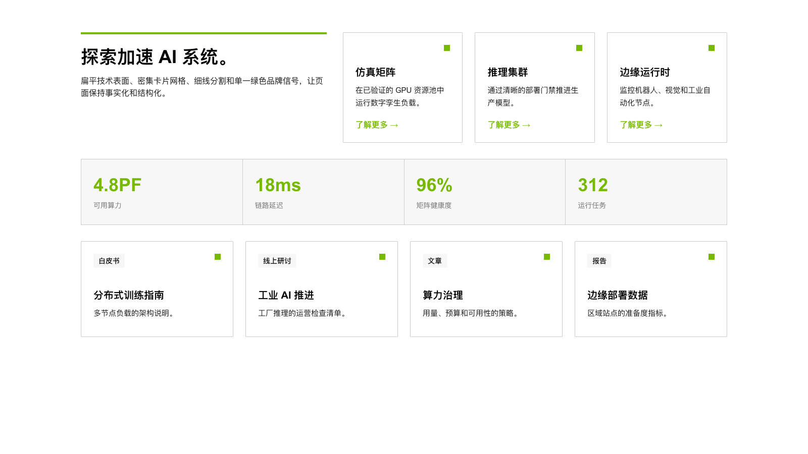
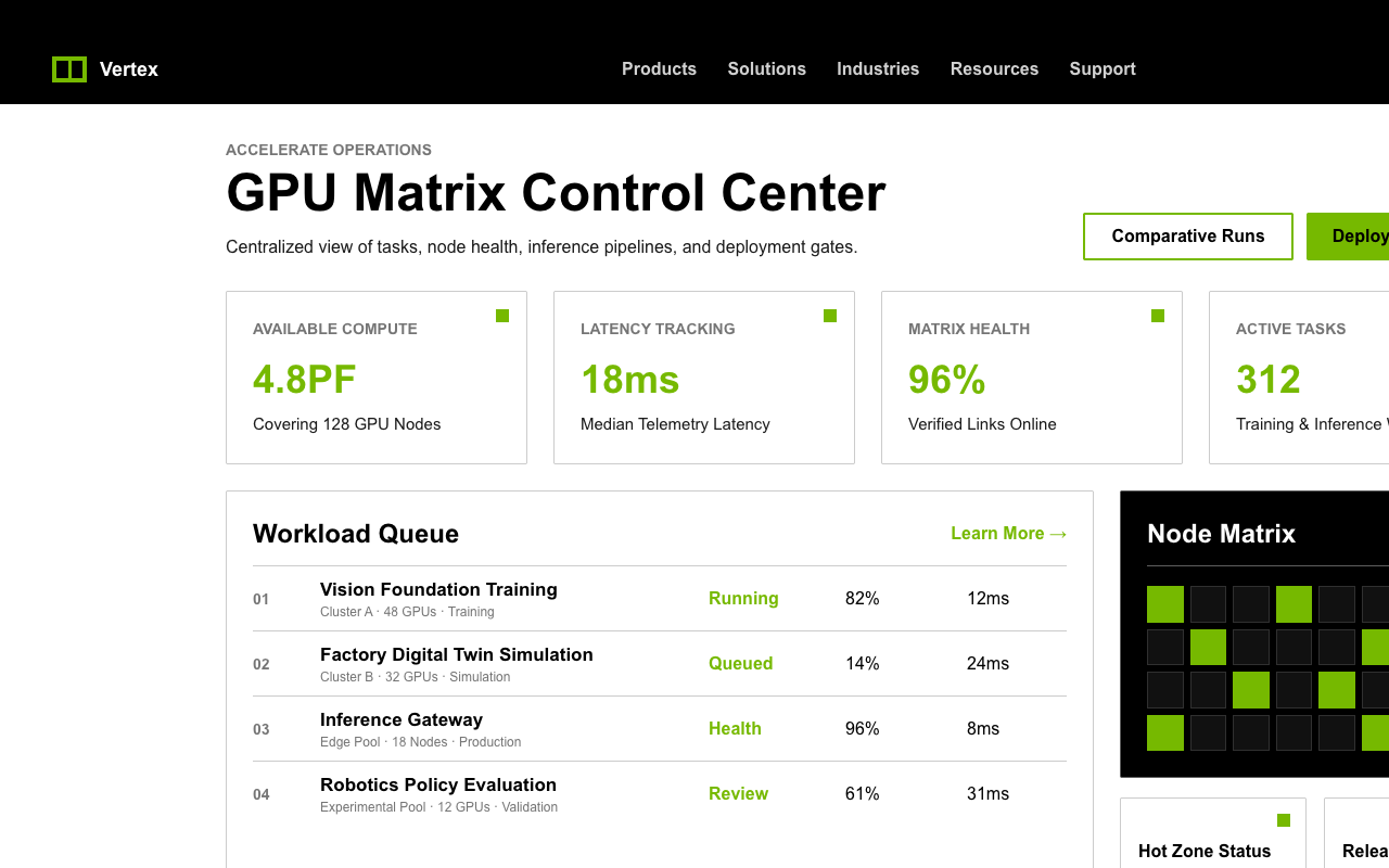

适合技术平台、硬件能力和企业级方案页,黑白工程网格配单一绿色角标与 CTA,强调性能和秩序。
设计语言样张
黑色章节承载主叙事,绿色只作为行动和识别信号,其余内容回到白底工程网格。
了解更多 →
---
version: alpha
name: "Nvidia"
description: "Nvidia 的 DESIGN.md 中文参考模板,保留原始 design token 与专业术语,覆盖 color system、typography、layout、components、motion 与 interaction states。"
language: zh-CN
sourceLanguage: en
---

## 概览
NVIDIA 的 marketing system 像一份学会了 graphic design 的工程文档:每个页面都是一组结构化、信息密集、事实导向的内容 cascade,排列在 paper-white grid 上,并由深黑色 hero/footer chapter 在上下框定。整个系统只有一个 accent color,而且它承担了几乎全部注意力分配:NVIDIA Green(`{colors.primary}` - `#76b900`)用于 primary CTA、active tab、dark surface 上的 link affordance,以及标记 card container 的小 decorative corner square。没有其它颜色与它竞争。

系统气质来自极端克制的 typography 和近乎严苛的 angular geometry。所有 container、button、image 都使用 `{rounded.sm}` (2px),这个 token 几乎不可见但绝不为 0,让系统更像 CAD output,而不是温暖的 consumer software。卡片 直接放在 `{colors.canvas}` 上,只有 `{colors.hairline}` hairline border,无 shadow、无 elevation,并按 8px-base spacing rhythm 密集分隔。Long-form page 会把 6-10 个 card 组织进 multi-column technical grid,而不会引入装饰性断点。

Black-canvas hero 与 footer chapter 是系统的 headline moment:一张 full-bleed photographic 或 3D-rendered image,白色 `{typography.display-xl}` headline,一枚绿色 CTA button,以及一个小 green corner square 作为唯一装饰。其它内容都从属于这个框架。

**Key Characteristics:**
- Single-accent system:`{colors.primary}` 承载 CTA、active state 与 decorative motif,其余为 black / white / gray。
- Two-mode surface architecture:`{colors.surface-dark}` 用于 hero/footer chapter,`{colors.canvas}` 用于 body,沿页面形成可预测节奏。
- Hyper-angular geometry:所有 interactive element 使用 `{rounded.sm}` (2px),没有 pill button、圆角 card 或 soft chrome。
- NVIDIA-EMEA proprietary sans-serif 使用 400 / 700,从 `{typography.utility-xs}` (10px) 到 `{typography.display-xl}` (48px) 建立 12-tier hierarchy。
- 卡片 library 依赖 `{colors.hairline}` 边框 与 `{colors.surface-soft}` 背景 分隔,而不是 shadow。
- Signature decorative element 是 `{component.corner-square}`,约 12px green square,锚定在 resource / feature card 的角上。
- Dense multi-column footer 位于 `{colors.surface-dark}` 上,所有页面都以相同 global navigation 收尾。

## Colors

> **Source pages:** `/tr-tr/`, `/en-eu/industries/healthcare-life-sciences/`, `/en-eu/solutions/ai/`, `/en-eu/ai/foundry/`。四个页面的 chrome palette 一致,只有 photography 与 copy 变化。

### Brand & Accent
- **NVIDIA Green** (`{colors.primary}` - `#76b900`): 品牌本身。用于所有 primary CTA、active state、dark surface link affordance、corner square 与 wordmark。
- **NVIDIA Green Dark** (`{colors.primary-dark}` - `#5a8d00`): primary button pressed state,比 brand green 深一档。
- **Accent Green Pale** (`{colors.accent-green-pale}` - `#bff230`): 少量 editorial callout 与 decorative micro-block 使用的 highlight tint,不用于 chrome。

### Surface
- **Page Canvas** (`{colors.canvas}` - `#ffffff`): 每个页面的 body。卡片 直接放在其上,只加 hairline rule。
- **Soft Surface** (`{colors.surface-soft}` - `#f7f7f7`): breadcrumb strip、sub-nav、comparison panel 与 alternating row background。
- **Black Canvas** (`{colors.surface-dark}` - `#000000`): hero chapter、dark CTA strip、footer、primary nav,是系统的 frame color。
- **Surface Elevated** (`{colors.surface-elevated}` - `#1a1a1a`): footer 内的 nested dark panel。
- **Hairline** (`{colors.hairline}` - `#cccccc`): card border、table rule、footer link section divider。
- **Hairline Strong** (`{colors.hairline-strong}` - `#5e5e5e`): dark surface 上的 1px divider。

### Text
- **Ink** (`{colors.ink}` - `#000000`): `{colors.canvas}` 上的 headline 与 body。
- **Body** (`{colors.body}` - `#1a1a1a`): long-form paragraph,避免纯黑过重。
- **Mute** (`{colors.mute}` - `#757575`): metadata、breadcrumb separator、footer copyright。
- **Stone** (`{colors.stone}` - `#898989`): 最低强调文本与 disabled state。
- **Ash** (`{colors.ash}` - `#a7a7a7`): disabled icon 与 faint utility text。
- **On Dark** (`{colors.on-dark}` - `#ffffff`): `{colors.surface-dark}` 上的 primary text。
- **On Dark Mute** (`{colors.on-dark-mute}` - `rgba(255,255,255,0.7)`): footer secondary link 与 dark-canvas body copy。

### Semantic Colors
- **Error** (`{colors.error}` - `#e52020`): validation message、destructive confirmation。
- **Error Deep** (`{colors.error-deep}` - `#650b0b`): error button pressed state 与 validation icon。
- **Warning** (`{colors.warning}` - `#df6500`): caution callout 与 deprecated documentation banner。
- **Warning Bright** (`{colors.warning-bright}` - `#ef9100`): dark canvas 上的 inverse warning。
- **Success Deep** (`{colors.success-deep}` - `#3f8500`): 避免与 NVIDIA Green saturation 冲突的 positive confirmation。
- **Link Blue** (`{colors.link-blue}` - `#0046a4`): light canvas prose 内 inline anchor 的唯一蓝色。

### Editorial Accents
- **Accent Purple** (`{colors.accent-purple}` - `#952fc6`): research / scientific computing editorial accent。
- **Accent Purple Deep** (`{colors.accent-purple-deep}` - `#4d1368`): purple lockup 的 paired dark。
- **Accent Purple Pale** (`{colors.accent-purple-pale}` - `#f9d4ff`): editorial callout wash background。
- **Accent Yellow Pale** (`{colors.accent-yellow-pale}` - `#feeeb2`): documentation tip / soft callout fill。

## Typography

### Font Family
- **NVIDIA-EMEA** 是站点所有文本角色使用的 proprietary brand sans-serif,包含 400 regular 与 700 bold,fallback 到 Arial -> Helvetica。
- **Font Awesome 6 Pro** 与 **Font Awesome 6 Sharp** 只用于 iconography(chevron、social glyph、breadcrumb separator、search/menu icon),尺寸 14-22px。

NVIDIA 的 字体 system 非常 flat:大多数 chrome 与 body role 使用相近 line-height(1.25-1.5),真正的差异主要来自 weight(400 vs 700)与 size。系统用 weight contrast 建立 hierarchy,而不是依赖大幅 size jump 或 color tint,因此 marketing copy 与 technical documentation 带有 editorial newspaper 气质。

### Hierarchy

| Token | Size | Weight | Line Height | Letter Spacing | 用途 |
|---|---|---|---|---|---|
| `{typography.display-xl}` | 48px | 700 | 1.25 | 0 | `{component.hero-card-dark}` 上的 hero headline |
| `{typography.display-lg}` | 36px | 700 | 1.25 | 0 | 区块 headline、large stat callout |
| `{typography.heading-xl}` | 24px | 700 | 1.25 | 0 | Sub-section title、dark CTA-strip headline |
| `{typography.heading-lg}` | 22px | 400 | 1.75 | 0 | 兼作 heading 的 long-form intro paragraph |
| `{typography.heading-md}` | 20px | 700 | 1.25 | 0 | 卡片 group title、sub-nav anchor heading |
| `{typography.heading-sm}` | 18px | 700 | 1.4 | 0 | Side-rail filter group、小 section label |
| `{typography.card-title}` | 17px | 700 | 1.47 | 0 | Resource card title、product card title |
| `{typography.body-md}` | 16px | 400 | 1.5 | 0 | 正文 copy、default paragraph |
| `{typography.body-strong}` | 16px | 700 | 1.5 | 0 | Inline emphasis、primary nav link、label |
| `{typography.body-sm}` | 15px | 400 | 1.67 | 0 | 卡片 description、secondary copy |
| `{typography.button-lg}` | 18px | 700 | 1.25 | 0 | 英雄区 primary CTA |
| `{typography.button-md}` | 16px | 700 | 1.25 | 0 | Standard button |
| `{typography.button-sm}` | 14.4px | 700 | 1 | 0.144px | Compact pill tab、in-card secondary CTA |
| `{typography.link-md}` | 15px | 400 | 1.5 | 0 | 正文 prose inline link |
| `{typography.caption-md}` | 14px | 700 | 1.43 | 0 | 区块 eyebrow、breadcrumb uppercase |
| `{typography.caption-sm}` | 12px | 400 | 1.25 | 0 | Footnote、metadata、table caption |
| `{typography.caption-xs}` | 11px | 700 | 1 | 0 | Pill chip label、utility-bar 文本 |
| `{typography.utility-xs}` | 10px | 700 | 1.5 | 0 | 底部 legal fine-print bar uppercase |

### Principles
Typography 是 brand-locked:NVIDIA-EMEA 覆盖所有层级,不使用 serif、display variant、monospace 或 italic。Hierarchy 主要由 size + weight 产生;color 只用于 emphasis(dark 上 `{colors.primary}` link、light 上 `{colors.link-blue}`),不用于拆分 字体 tier。

### Font Substitutes
NVIDIA-EMEA 是 proprietary。最接近的 open-source pairing 是 **Inter**(400/700),其 x-高度 与 stroke contrast 在 body size 上接近 NVIDIA-EMEA。**Arial** 是官方 fallback,在无法使用 Inter 时可接受。避免 Helvetica Now 或 Helvetica Neue;它们 cap 高度 更紧,会偏离品牌几何感。

## Layout

### Spacing System
- **Base unit:** 8px。
- **Tokens:** `{spacing.xxs}` (2px) · `{spacing.xs}` (4px) · `{spacing.sm}` (8px) · `{spacing.md}` (12px) · `{spacing.lg}` (16px) · `{spacing.xl}` (24px) · `{spacing.xxl}` (32px) · `{spacing.section}` (64px)。
- **Universal section rhythm:** major content block 之间使用 `{spacing.section}` (64px)。卡片 grid 使用 `{spacing.xl}` (24px) gutter;in-card 内距 依密度在 `{spacing.xl}` 到 `{spacing.xxl}`。
- **英雄区 chapter padding:** 80px vertical / 48px horizontal,只用于 `{component.hero-card-dark}`。

### Grid & Container
- **Max width:** desktop content area 约 1280px,gutter 24px,ultrawide 增至约 48px。
- **Column patterns:** card grid desktop 4-up,1024px 为 3-up,768px 为 2-up,480px 为 1-up;long-form 文本 desktop 为 60/40 split,< 960px 单列;footer desktop 6-up,tablet 2-up,mobile accordion。
- **卡片 aspect:** product card 偏 1:1 或 4:3,顶部 16:9 image + 下方 metadata;resource card 为 3:2 image + 更长 description block。

### Whitespace Philosophy
Whitespace 是结构性的,不是氛围性的。区块 以 `{spacing.section}` rhythm 相接,没有 decorative divider、空白 breathing band 或 gradient transition。空气感来自 `{colors.canvas}` body section 被 `{colors.surface-dark}` chapter block 夹住,而不是单个 component 内的过度 padding。

## Elevation & Depth

| Level | Treatment | 用途 |
|---|---|---|
| 0 - Flat | No border, no shadow | Canvas-on-canvas block、hero chapter content、footer column body |
| 1 - Hairline 边框 | 1px solid `{colors.hairline}` | `{colors.canvas}` 上的所有 card、table cell、comparison panel |
| 2 - Hairline strong | 1px solid `{colors.hairline-strong}` | `{colors.surface-dark}` 上的 divider |
| 3 - Soft shadow | `0 0 5px 0 rgba(0,0,0,0.3)` | scrolled sticky nav bottom edge、sticky CTA bar,极少使用 |

NVIDIA system 基本不在 card 或 content surface 上使用 drop-shadow elevation。唯一 shadow 是 sticky chrome bar 上的 5px ambient。卡片 不悬浮,只是带 hairline 边框 的 flat rectangle。

### Decorative Depth
- **英雄区 imagery:** data-center hardware、neural-net visualization、life-sciences microscopy 等 full-bleed image 位于 hero copy 后,并加 dark gradient overlay 保证可读性。
- **Decorative corner squares:** `{component.corner-square}` 是唯一持续出现的 ornament,锚定于 resource / feature card 的 top-left 或 bottom-right。
- **Editorial 3D accents:** isometric 或 wireframe 3D rendering 用作 long-form article 的 illustration fill,不作为 chrome。

## Shapes

### Border Radius Scale

| Token | Value | 用途 |
|---|---|---|
| `{rounded.none}` | 0px | 英雄区 chapter、footer、dark CTA strip、primary nav |
| `{rounded.xs}` | 1px | Decorative micro-rule 与 inset accent strip |
| `{rounded.sm}` | 2px | 所有 interactive element:button、card、input、pill tab、badge |
| `{rounded.full}` | 9999px / 50% | Avatar circle、social-icon dot、brand wordmark icon |

系统极度 angular。除 avatar / icon circle 外,没有元素超过 2px radius。2px 足以软化 sharp edge 的光学 aliasing,但仍保持 engineering-grade 观感。

### Photography Geometry
- 英雄区 imagery: desktop 为 full-bleed 16:9,mobile 裁为 4:5 portrait。
- 卡片 imagery: resource card 顶部 16:9 thumbnail;product/SKU card 用 1:1;editorial article card 用 3:2。
- Decorative corner square: standard card 为 12x12px,hero callout 放大到 16x16px。
- Avatar/social icon: 32-40px circle,带 1px hairline。

## Components

> 按 system policy 不记录 hover state。每个 spec 只覆盖 Default 与 Active/Pressed;variant 在 front matter 中作为独立 `components:` entry。

### Buttons

**`button-primary`** — universal NVIDIA CTA
- 背景 `{colors.primary}`,文本 `{colors.on-primary}`,字体 `{typography.button-md}`,内距 `11px 24px`,高度 `44px`,圆角 `{rounded.sm}`。
- 用于 hero CTA、dark CTA strip、card group 的 "Learn More"、long-form page 底部的 "Sign Up" / "Get Started"。
- 按下状态 `button-primary-active` 将 背景 降到 `{colors.primary-dark}` (`#5a8d00`)。

**`button-outline`** — light canvas 上的 secondary CTA。
- 背景 transparent,文本 `{colors.ink}`,2px solid `{colors.primary}` border,字体 `{typography.button-md}`,内距 `11px 13px`,圆角 `{rounded.sm}`。
- 常用于 "Read the Documentation"、"Watch the Video"、"Compare Products" 等 second-tier action。

**`button-outline-on-dark`** — `{colors.surface-dark}` 上的 outline button。
- 背景 transparent,文本 `{colors.on-dark}`,1px solid `{colors.on-dark}`,字体 `{typography.button-md}`,圆角 `{rounded.sm}`。

**`button-ghost-link`** — inline arrow link。
- Text `{colors.primary}`,带小 right-arrow icon,字体 `{typography.button-md}`,无 background、无 border、圆角 `{rounded.none}`。
- 用在 resource card 与 long-form section 底部的 "Learn More ->" affordance。

**`button-disabled`**
- 背景 `{colors.surface-soft}`,文本 `{colors.ash}`,圆角 `{rounded.sm}`。

### Tabs & Chips

**`pill-tab`** + **`pill-tab-active`**
- 默认: transparent background,文本 `{colors.ink}`,字体 `{typography.button-sm}`,内距 `10px 18px`,圆角 `{rounded.sm}`。
- 激活: 背景 `{colors.ink}`,文本 `{colors.on-dark}`,selection 时反相。用于 resource filter strip 与 segmented control。

**`badge-tag`**
- 背景 `{colors.surface-soft}`,文本 `{colors.body}`,字体 `{typography.caption-md}`,内距 `4px 10px`,圆角 `{rounded.sm}`,uppercase。
- Resource card 顶部的 document 字体 / category label。

### Inputs & Forms

**`text-input`** + **`text-input-focused`**
- 默认: 背景 `{colors.canvas}`,文本 `{colors.ink}`,1px solid `{colors.hairline}`,字体 `{typography.body-md}`,内距 `12px 16px`,高度 `44px`,圆角 `{rounded.sm}`。
- 聚焦: surface 不变,边框 变为 2px solid `{colors.primary}`,绿色 边框 是唯一 focus signal。

**`search-input`**
- 用于 global search overlay,处理方式同 `text-input`,但高度 40px,左侧有 magnifier glyph。

### Cards

**`product-card`**
- 容器: 背景 `{colors.canvas}`,1px solid `{colors.hairline}`,内距 `{spacing.xl}`,圆角 `{rounded.sm}`。
- 布局: 顶部 16:9 product image,`{typography.card-title}` title,`{typography.body-sm}` description,底部 `{component.button-ghost-link}`。
- `{component.corner-square}` 位于 top-left corner。

**`feature-card`**
- 容器: 背景 `{colors.canvas}`,1px solid `{colors.hairline}`,内距 `{spacing.xxl}`,圆角 `{rounded.sm}`。
- 布局: 顶部 Font Awesome icon(22-24px,`{colors.primary}`),后接 `{typography.heading-md}` title 与 `{typography.body-md}` body。

**`resource-card`**
- 容器: 背景 `{colors.canvas}`,1px solid `{colors.hairline}`,内距 `{spacing.xl}`,圆角 `{rounded.sm}`。
- Header strip 为 `{component.badge-tag}`;body 为 3:2 thumbnail、`{typography.card-title}` title、`{typography.body-sm}` description;footer 为 "Read More ->" ghost-link。

**`callout-stat`**
- 背景 `{colors.canvas}`,1px hairline `{colors.hairline}`,内距 `{spacing.xxl}`,圆角 `{rounded.sm}`。
- 使用巨大 `{typography.display-lg}` (36px) 数字,颜色 `{colors.primary}`,下方是 `{typography.body-md}` caption。用于 industry long-form page 的 stat block。

### 英雄区 & CTA Strips

**`hero-card-dark`**
- 背景 `{colors.surface-dark}`,包含 full-bleed 16:9 photographic/3D image 与 dark gradient overlay,copy slot 在左侧。
- `{typography.display-xl}` headline 使用 `{colors.on-dark}`,subhead 使用 `{typography.heading-lg}`,单个 `{component.button-primary}` CTA,有时搭配 `{component.button-outline-on-dark}`。
- 锚定每个 primary landing page 顶部。

**`cta-strip-dark`**
- 与 hero 同 surface,但压缩为 1-row band,包含 `{typography.heading-xl}` headline + single CTA。
- 位于 content section 之间,作为 "Ready to get started?" bridge。

### Decorative

**`corner-square`**
- 12x12px solid `{colors.primary}` square,锚定在 card corner,是品牌 signature ornamental motif。
- 用于 resource card、feature card、editorial callout;位置可变,但 size 与 color 恒定。

### 导航

**`utility-bar`**
- 背景 `{colors.surface-dark}`,文本 `{colors.on-dark}`,高度 32px,字体 `{typography.caption-sm}`,圆角 `{rounded.none}`。
- 右对齐 cluster:locale selector / "Login" / "Account",总是位于页面最顶部。

**`primary-nav`**
- 背景 `{colors.surface-dark}`,文本 `{colors.on-dark}`,高度 64px,字体 `{typography.body-strong}`,圆角 `{rounded.none}`。
- 布局: 左侧 NVIDIA wordmark,中间 nav row,右侧 search glyph + "Login" + green CTA "Get Started"。

**`breadcrumb-bar`**
- 背景 `{colors.surface-soft}`,文本 `{colors.body}`,高度 48px,字体 `{typography.caption-md}` uppercase。
- 位于 interior page 的 primary nav 下方,chevron separator 使用 `{colors.mute}`。

**`sub-nav-strip`**
- 背景 `{colors.surface-soft}`,文本 `{colors.ink}`,高度 56px,字体 `{typography.button-md}`,圆角 `{rounded.none}`。
- Section-specific nav,锚定在 content 上方。

**Top Nav (Mobile)**
- 左侧 hamburger,中央 NVIDIA wordmark,右侧 search + locale icon。Primary nav 折叠为从右侧滑入的 full-screen drawer。

### Footer

**`footer-section`**
- 背景 `{colors.surface-dark}`,文本 `{colors.on-dark-mute}`,内距 `{spacing.section}` vertical / 48px horizontal,圆角 `{rounded.none}`。
- 布局: 6-column link grid,column header 使用 `{typography.body-strong}` `{colors.on-dark}`,link list 使用 `{typography.body-sm}` `{colors.on-dark-mute}`。
- 下方为 social-icon strip、locale selector、legal/privacy fine-print row(`{typography.utility-xs}` uppercase `{colors.mute}`)。

### Inline Elements

**`link-inline`**
- Body-prose anchor link:`{colors.link-blue}` 文本 + underline。它是系统中唯一蓝色,只出现在 `{typography.body-md}` paragraph 内。

## 使用建议与禁忌

### 应该
- 将 `{colors.primary}` 保留给 primary CTA、active state、decorative corner square 与 NVIDIA wordmark;把它当作稀缺资源。
- 按可预测节奏交替使用 `{colors.surface-dark}` hero/footer chapter 与 `{colors.canvas}` body section。
- 每个 reusable card 都锚定一个 `{component.corner-square}`,这是系统 identity tag。
- 所有 interactive element 使用 `{rounded.sm}` (2px),不要到 0,也不要超过 4。
- 用 font weight(400 vs 700)与 size 建立 hierarchy,而不是 color tint。
- Content section 按 `{spacing.section}` (64px) rhythm 堆叠,不添加 decorative divider。
- Primary + secondary action pair 使用 `{component.button-primary}` green fill 搭配 `{component.button-outline}` green border。

### 不要
- 不要给 card 或 content surface 添加 drop shadow;唯一允许的 shadow 是 sticky chrome 上的 5px ambient。
- 不要用 `{colors.success-deep}`、`{colors.accent-green-pale}` 或其它 green 替代 CTA 中的 `{colors.primary}`。
- 不要在 inline body-prose link 之外使用 `{colors.link-blue}`;它不是 button color,也不是 chrome color。
- 不要软化几何。除了 avatar/social icon,不使用 pill button、圆角 card 或 `{rounded.lg}` 以上 radius。
- 不要对 `{component.hero-card-dark}` 做对称 padding;copy 贴近左三分之一,image 填满右侧。
- 不要添加第二 accent color。系统刻意是 one-color。
- 不要在 `{colors.canvas}` 背景 上滥用 `{component.button-primary}`,如 green-on-white 与 photo content 冲突,应改用 `{component.button-outline}`。

## Responsive Behavior

### Breakpoints

| Name | Width | Key Changes |
|---|---|---|
| ultrawide | 1920px+ | Content max-width 保持 1280px;outer gutter 增至约 80px |
| desktop-large | 1440px | 默认 desktop layout,4-up card grid,6-col footer |
| desktop | 1280px | 同 large,但 outer gutter 略窄 |
| desktop-small | 1024px | 4-up card 收为 3-up;sub-nav 保持 horizontal |
| tablet | 768px | 3-up card 收为 2-up;primary nav 变为 hamburger drawer |
| mobile | 480px | 全部单列;footer column 折叠为 accordion |
| mobile-narrow | 320px | 英雄区 `{typography.display-xl}` 从 48px 缩到 32px |

### Touch Targets
所有 interactive element 满足 WCAG AA(>= 44x44px)。`{component.button-primary}` 高 44px,水平 内距 24px;`{component.text-input}` 高 44px;`{component.pill-tab}` 约 40px 高并通过扩展 hit-target 到 44px;footer link 通过 8-12px vertical 内距 达到约 36-44px tap target。

### Collapsing Strategy
- **Primary nav:** desktop center cluster 在 768px 变为 hamburger drawer。
- **卡片 grid:** 4-up -> 3-up -> 2-up -> 1-up,断点为 1024、768、480px;mobile gutter 从 24px 降到 16px。
- **Footer:** 6-up link column -> tablet 2-up -> mobile full accordion。
- **英雄区 copy:** desktop `{typography.display-xl}` 48px -> tablet 36px -> mobile 32px,line-高度 保持 1.25。
- **Sub-nav strip:** desktop horizontal anchor row -> tablet horizontal scroll -> mobile select dropdown。
- **区块 padding:** `{spacing.section}` 64px desktop -> 48px tablet -> 32px mobile。
- **Long-form text:** desktop 60/40 body+sidebar -> tablet/mobile single-column,sidebar 下移。

### Image Behavior
- 英雄区 imagery 使用 art-direction crop:desktop 16:9 wide hero,mobile 4:5 portrait,保证主体居中且 headline 有 overlay space。
- 卡片 imagery 维持固定 aspect(resource 16:9、product 1:1),跨 breakpoint 只 scale 不重新裁切。
- 非关键 imagery 在用户滚动到下一 grid row 时 lazy-loaded。

## Iteration Guide

1. 一次只聚焦 ONE component。读取其 front matter YAML entry 并验证所有 property 可解析。
2. 直接引用 component name 与 token(`{colors.primary}`, `{component.button-primary-active}`, `{rounded.sm}`),不要改写。
3. 修改后运行 `npx @google/design.md lint DESIGN.md`;`broken-ref`、`contrast-ratio`、`orphaned-tokens` warning 会自动暴露问题。
4. 新 variant 作为独立 component entry 添加(`-active`, `-disabled`, `-focused`),不要埋在 prose 内。
5. 正文 默认 `{typography.body-md}`;emphasis 使用 `{typography.body-strong}`;`{typography.display-xl}` 严格保留给 hero chapter headline。
6. 每个 viewport 保持 `{colors.primary}` 稀缺;同一 fold 若出现多个 solid-green CTA,应将其中一个 neutralize 为 `{component.button-outline}`。
7. 新增 component 前先判断是否能用现有 card + 2px-radius + corner-square + green-CTA vocabulary 表达。系统强项是几乎不需要新 token。

## Known Gaps

- **Mobile screenshots not captured**:responsive behavior 基于 NVIDIA 已知 mobile pattern(hamburger drawer、accordion footer、1-up card grid、hero downscale)与 breakpoint stack 综合推断。
- **Hover states not documented**:符合 system policy。
- **Dialog / modal styling**:除 locale-selector overlay 外,捕获页面中不可见。
- **Form field styling**:完整 sign-up / contact form 未出现在捕获页面,仅记录 inline search 与 basic 文本 input。
- **Login / authenticated chrome**:不在捕获页面中。


