

01 / 03
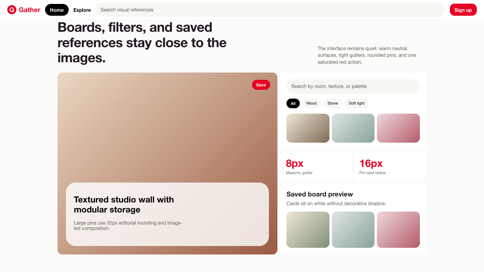
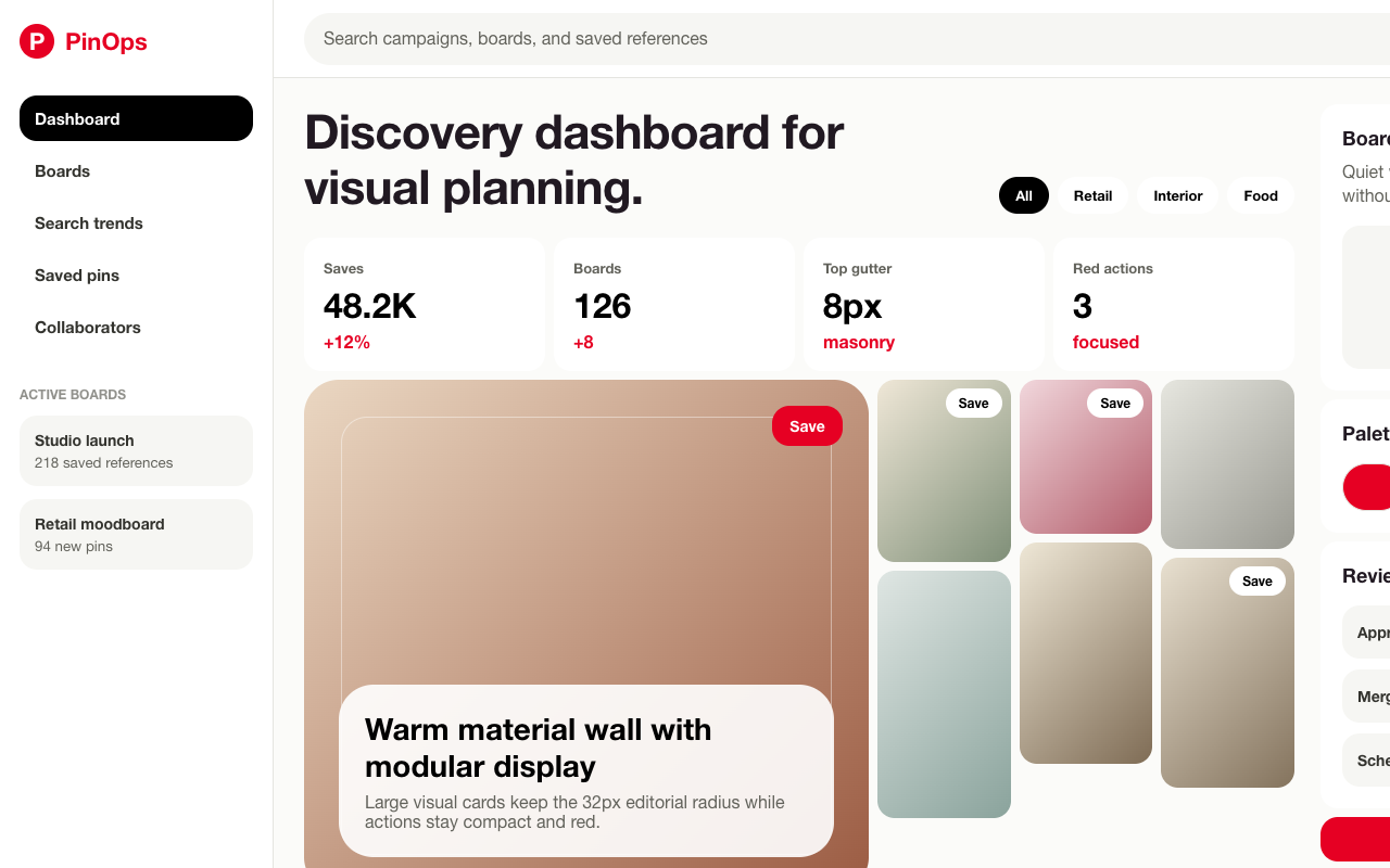

适合灵感库、素材发现和视觉目录页,红色保存动作、暖中性搜索框和圆角瀑布流让图片成为主角。
设计语言样张
搜索是主入口,浅暖灰底,文字保持低噪声。
列间距紧,图片卡自然错落,不靠阴影制造层级。
红色只出现在保存、注册和关键按钮上。
---
version: alpha
name: "Pinterest"
description: "Pinterest 的 DESIGN.md 中文参考模板,保留原始 design token 与专业术语,覆盖 color system、typography、layout、components、motion 与 interaction states。"
language: zh-CN
sourceLanguage: en
---

## 概览
Pinterest 的 marketing system 围绕一个核心原则构建:让 chrome 退后,不要挡住照片。界面 chrome 使用安静的 warm-cream neutral palette(`{colors.surface-soft}`、`{colors.surface-card}`、`{colors.canvas}`),由 Pinterest proprietary Pin Sans 承载 typography;Pinterest Red(`{colors.primary}` — `#e60023`)只保留给 “Sign up” CTA、active-tab indicator 和 sticky top-nav anchor。其他 surface 都应退到 imagery 之后:pin tiles、category tiles、content thumbnails、profile shots,这些才是真正的 product。

Design system 有两种 distinct surface modes,并在 home page 向下交替:**hero/CTA chrome**(cream surfaces、70px Pin Sans display headlines、左右交替的 photo-illustrated feature cards)与 **content masonry**(基于 column 的 grid,`{colors.surface-card}` 上放置 16px-radius pin cards,且没有 internal padding:pin 就是 card)。Search results page 几乎是 pure masonry:mixed aspect ratios 的 pin imagery 组成紧凑 column grid,顶部是小型 filter-chip strip,右上角保持 sticky red Sign-up CTA。`create.pinterest.com` business surface 把 grid 反转回更传统的 editorial layout,但保留系统其他规则:Pin Sans、cream chrome、red CTA、16px-radius pills。

系统的 signature gesture 是 **shape geometry**:几乎所有 surface 都用 16px radius(`{rounded.md}`):buttons、inputs、pin cards、feature cards;32px radius(`{rounded.lg}`)只保留给 pin-card-large 与 modal cards。实际使用的 radius 只有三个值:16px、32px、pill(9999px)。系统从不使用 flat sharp corners,也不引入中间 radius;这些值就是完整 shape vocabulary。

**关键特征:**
- Single-accent CTA:Pinterest Red(`{colors.primary}`)承载所有 primary action;其他全部保持 monochrome。
- Pin Sans proprietary typography 覆盖从 `{typography.display-xl}`(70px)到 `{typography.caption-sm}`(12px)的所有 text role;没有 serif,也没有 monospace。
- Two-radius shape system:多数 components 使用 `{rounded.md}`(16px),large cards 与 modals 使用 `{rounded.lg}`(32px),circular elements 使用 `{rounded.full}`。
- Masonry pin grid 是 load-bearing visual element:column-based layout,保留每个 pin 的 natural aspect ratio。
- Warm-cream neutral chrome(`{colors.surface-card}` — #f6f6f3)在 imagery 后方柔和退后,不与内容竞争。
- Sticky top nav 在每个 breakpoint 都把 always-red Sign-up CTA 锚定在右上角。
- Modal overlay(login/signup)使用覆盖 page content 的 soft scrim,而不是 navigation jump。

## Colors

> **Source pages:** `/` (home), `/search/pins/?q=bold lip` (search results), `create.pinterest.com/` (creator marketing), `create.pinterest.com/product-features/how-to-create-boards/` (creator article). The chrome palette is identical across all four pages.

### Brand & Accent
- **Pinterest Red**(`{colors.primary}` — `#e60023`):品牌唯一 highly-saturated color。用于 Sign-up CTAs、sticky top-nav anchor、tab strips active state 和 brand wordmark。
- **Pinterest Red Pressed**(`{colors.primary-pressed}` — `#cc001f`):primary button 的 pressed state,比 brand red 深一档。

### Surface
- **Canvas**(`{colors.canvas}` — `#ffffff`):true white。Primary nav、modals、feature cards 与 content body 的 base surface。
- **Soft Surface**(`{colors.surface-soft}` — `#fbfbf9`):轻微 cream-tinted off-white,用于 home page hero 的 page body wash。
- **Surface Card**(`{colors.surface-card}` — `#f6f6f3`):warm-cream card 与 pin-tile background。承载 category tiles、search-bar default fill、button-secondary default 与 pin-card backgrounds。
- **Secondary BG**(`{colors.secondary-bg}` — `#e5e5e0`):`{component.button-secondary}`(“I already have an account”)fill 使用的 gray-cream,比 `{colors.surface-card}` 深一档。
- **Secondary Pressed**(`{colors.secondary-pressed}` — `#c8c8c1`):secondary button 的 pressed state。
- **Surface Dark**(`{colors.surface-dark}` — `#262622`):warm near-black,用于 `create.pinterest.com` 上少见的 dark CTA strip。
- **Hairline**(`{colors.hairline}` — `#dadad3`):1px row dividers、footer column rules。
- **Hairline Soft**(`{colors.hairline-soft}` — `#e5e5e0`):更浅的 inline divider;也可作为 secondary-button background。

### Text
- **Ink**(`{colors.ink}` — `#000000`):primary headlines、button text、primary nav links。
- **Ink Soft**(`{colors.ink-soft}` — `#211922`):body prose 中的 inline-link color。它是 chrome 中除 Pinterest Red 外唯一的“color”:带轻微 warm cast 的 near-black。
- **Body**(`{colors.body}` — `#33332e`):`{colors.canvas}` 上的默认 paragraph text。
- **Charcoal**(`{colors.charcoal}` — `#262622`):当 pure ink 过重时使用的更柔和 body。
- **Mute**(`{colors.mute}` — `#62625b`):metadata text、footer links、secondary captions。
- **Ash**(`{colors.ash}` — `#91918c`):disabled button text、inputs 中的 placeholder text。
- **Stone**(`{colors.stone}` — `#c8c8c1`):最低强调级别的 utility text、disabled-state borders。
- **On Dark**(`{colors.on-dark}` — `#ffffff`):`{colors.surface-dark}` 上的 primary text。

### Semantic Colors
- **Error**(`{colors.error}` — `#9e0a0a`):validation messages、destructive confirmation copy。
- **Error Deep**(`{colors.error-deep}` — `#cc001f`):当常规 error tone 需要更高对比度时使用的 deepened error background。注意:它与 primary-pressed 值相同,但在 error context 中表示 semantic destructiveness。
- **Success Deep**(`{colors.success-deep}` — `#103c25`):in-product success messaging。
- **Success Pale**(`{colors.success-pale}` — `#c7f0da`):pale success-pill background。
- **Focus Outer**(`{colors.focus-outer}` — `#435ee5`):系统 focus-ring blue,作为 focused inputs 与 buttons 外侧 2px outer outline 出现。
- **Focus Inner**(`{colors.focus-inner}` — `#ffffff`):focus-ring stack 内的 white inner gap。

### Editorial Accents (used sparingly inside content imagery and category badges)
- **Accent Pressed Blue**(`{colors.accent-pressed-blue}` — `#617bff`):blue informational badges 与 editorial pin chips 的 pressed state。
- **Accent Purple**(`{colors.accent-purple}` — `#7e238b`):editorial recommendation badge、in-product “Pinterest Predicts” callout。
- **Accent Purple Deep**(`{colors.accent-purple-deep}` — `#6845ab`):purple lockups 与 “Performance+” iconography 的 paired dark。

## Typography

### Font Family
**Pin Sans** 是 Pinterest proprietary geometric sans-serif,用于每个页面的所有 text role。它包含 weights 400(regular)、500(medium)、600(semibold)、700(bold),并通过长 fallback stack 回退:`-apple-system` → `system-ui` → `Segoe UI` → `Roboto` → `Helvetica Neue` → `Arial` 以及 emoji fallbacks。该字体的 distinctive trait 是 display sizes 下的紧密 letter-spacing(`{typography.display-xl}` 与 `{typography.heading-xl}` 为 -1.2px),让 70px headlines 呈现 confident、friendly 的密度,而不是常规 display geometric sans 的 airy spread。

### Hierarchy

| Token | Size | Weight | Line Height | Letter Spacing | 用途 |
|---|---|---|---|---|---|
| `{typography.display-xl}` | 70px | 600 | 1.1 | -1.2px | Marketing hero headline(“Create the life you love on Pinterest”) |
| `{typography.display-lg}` | 44px | 700 | 1.15 | -0.8px | “Where your content can thrive” creator hero |
| `{typography.heading-xl}` | 28px | 700 | 1.2 | -1.2px | Section heading(“Bring your favorite ideas to life”、“Pinterest for your brand”) |
| `{typography.heading-lg}` | 22px | 600 | 1.25 | 0 | Sub-section heading、modal title(“Welcome to Pinterest”) |
| `{typography.heading-md}` | 18px | 600 | 1.3 | 0 | Card title、in-grid pin label |
| `{typography.body-md}` | 16px | 400 | 1.4 | 0 | Body copy、modal body、default paragraph |
| `{typography.body-strong}` | 16px | 600 | 1.4 | 0 | Inline emphasis、primary nav link、form label |
| `{typography.body-sm}` | 14px | 400 | 1.4 | 0 | Footer copy、in-grid pin metadata、helper text |
| `{typography.body-sm-strong}` | 14px | 700 | 1.4 | 0 | Search-result count label、table-header text |
| `{typography.caption-md}` | 12px | 500 | 1.5 | 0 | Caption text、link metadata |
| `{typography.caption-sm}` | 12px | 400 | 1.4 | 0 | Smallest utility text、copyright |
| `{typography.link-md}` | 16px | 600 | 1.4 | 0 | Body prose 中的 inline anchor link |
| `{typography.button-md}` | 14px | 700 | 1 | 0 | Standard primary/secondary button label |
| `{typography.button-sm}` | 12px | 700 | 1 | 0 | Compact pill chip、in-card button |

### Principles
系统在 display 与 body 之间有非常陡峭的 size jump:home hero 上 `{typography.display-xl}`(70px)直接落到 `{typography.body-md}`(16px),中间没有 intermediate tier。最大层级上的 negative tracking(-1.2px / -0.8px)比默认 geometric sans 更紧、更自信;body copy 使用宽松的 1.4 line-height,让多行描述保持呼吸感。

### Font Substitutes
Pin Sans 是 proprietary。最接近的 open-source substitute 是 **Inter**(weights 400 / 500 / 600 / 700):它的 geometry、x-height 与 metric balance 在 body sizes 上与 Pin Sans 约 3% 内匹配。**Manrope** 是 display tier 的强 secondary substitute,稍紧的 letterspacing 有助于 70px headline 显得更有重量。无论选择哪种 substitute,display sizes 都应用 -1.2px tracking。

## Layout

### Spacing System
- **Base unit:** 8px(pill buttons 与 chips 的 tight inline gaps 可使用更细的 4/6/7px steps)。
- **Tokens(front matter):** `{spacing.xxs}`(4px)· `{spacing.xs}`(6px)· `{spacing.sm}`(8px)· `{spacing.md}`(12px)· `{spacing.lg}`(16px)· `{spacing.xl}`(24px)· `{spacing.xxl}`(32px)· `{spacing.section}`(64px)。
- **Universal section rhythm:** 集合中每个页面都用 `{spacing.section}`(64px)作为 major content blocks 之间的 vertical gap。Pin grids 在 tiles 之间使用 `{spacing.sm}`(8px)gutters,这是系统最紧的 grid gutter,让 imagery 在 columns 间几乎相接。
- **Modal padding:** `{component.modal-card}` 四边都使用 32px internal padding(`{spacing.xxl}`)。

### Grid & Container
- **Max width:** desktop content area 约 1280px,gutters 为 24px(ultrawide 约 48px)。
- **Pin masonry grid:** auto-fitting column-based layout:ultrawide 为 5–6 columns,desktop 为 4 columns,tablet 为 3,mobile-landscape 为 2,mobile 为 1。每个 tile 保留 natural aspect ratio(square / 2:3 / 3:4 / 4:5 portrait;几乎不使用 landscape,因为 pins 是 vertical-oriented)。Horizontal 与 vertical gutters 都是 `{spacing.sm}`(8px)。
- **Home hero feature row:** asymmetric 2-column split,text 与 imagery 沿页面向下左右交替(text-left + image-right,然后 image-left + text-right 等)。
- **Footer:** desktop 为 4-column link grid,tablet 折叠到 2-up,mobile 为 1-up。

### Whitespace Philosophy
Marketing surfaces 上 whitespace 宽松,discovery surfaces 上 whitespace 紧凑。Home page 的 sections 间距为 64px,photo-illustrated feature cards 使用 32px internal padding;search results page 则收紧为 8px-gutter masonry grid,让 imagery 近似 edge-to-edge。系统读起来像两个共享同一 chrome 的工具:一个 magazine(hero / feature / CTA / footer)和一个 search engine(top nav / filter row / pin grid / load more)。

## Elevation & Depth

| Level | Treatment | 用途 |
|---|---|---|
| 0 — Flat | No border, no shadow | Pin cards、feature cards、footer 的默认处理,也是 dominant treatment |
| 1 — Hairline border | 1px solid `{colors.hairline}` | Inputs、footer column dividers、in-list rows |
| 2 — Modal scrim + soft shadow | Modal 位于覆盖 page content 的 dark scrim 上,并带 soft 16px ambient shadow | Login / signup modal、image preview modal |
| 3 — Pin hover lift | (intentionally undocumented per system policy) | n/a |

Pinterest 的 content surfaces 实际上没有 shadow elevation。Pin cards 平铺在 canvas 上;唯一的“elevation”出现在 modal layer,16px ambient shadow 与 50%-opacity scrim 配对,把 modal 提升到 page content 之上。

### Decorative Depth
Depth 完全来自 imagery 自身,而不是 CSS effects:
- **Pin photography** 通过构图承载 cinematic depth(food photography、fashion close-ups、interior shots);设计让每个 tile 的 image 自己说话,而不是额外添加 chrome。
- **Category tile thumbnails** 在 home page feature rows 中使用 Pinterest 自有 pin imagery 作为 composition assets,通常在 image 角落叠加一个小 `{component.pin-overlay-pill}`(“Cherry red”、“Preppy look”、“Earthy space inspo”)。
- **Modal scrim**:login modal 打开时,一个 50%-opacity dark overlay 覆盖整个 page content;modal card 下方的 16px ambient shadow 将其抬到 visual top。

## Shapes

### Border Radius Scale

| Token | Value | 用途 |
|---|---|---|
| `{rounded.none}` | 0px | Footer、primary nav、page sections;全部是 flat structural surfaces |
| `{rounded.sm}` | 8px | 少见的 medium-radius surface(例如 editorial tooltip) |
| `{rounded.md}` | 16px | Buttons、inputs、pin cards、feature cards、category tiles;dominant component radius |
| `{rounded.lg}` | 32px | Large pin cards、modal cards;只少量用于“big” content surfaces |
| `{rounded.full}` | 9999px | Search bar、filter chips、pin overlay pills、icon-circular buttons、avatars |

Radius vocabulary 本质上只有三个值:大多数内容用 16px,big cards 与 modals 用 32px,circular elements 用 pill。系统没有 sharp-cornered buttons,也没有 sharp-cornered pin cards。

### Photography Geometry
- **Pin imagery:** mixed aspect ratios:square(1:1)、portrait(3:4、2:3、4:5)以及少量 landscape;small tiles 中以 `{rounded.md}`(16px)corners 保留 natural ratio,large feature pins 使用 `{rounded.lg}`(32px)。
- **Category tile thumbnails:** square(1:1),使用 `{rounded.md}` corners。
- **Avatar circles:** in-pin attribution 与 profile chips 中为 32–48px,使用 `{rounded.full}`。
- **Feature card imagery:** home-page category cards 上通常是 4:5 portrait,photo 占 card 约 60%,headline + CTA 堆叠在下方。

## Components

> 根据 system policy,**不记录 hover states**。每条 spec 只覆盖 Default 与 Active/Pressed。

### Buttons

**`button-primary`** — universal Pinterest CTA。
- Background `{colors.primary}`(Pinterest Red)、text `{colors.on-primary}`、type `{typography.button-md}`、padding `6px 14px`、height 约 40px、rounded `{rounded.md}`(16px)。
- 用于 “Sign up”、“Join Pinterest for free”、“Get started”:系统中每个 surface 的 primary action。
- Pressed state 位于 `button-primary-pressed`;background 降到 `{colors.primary-pressed}`(`#cc001f`)。

**`button-secondary`** — gray-cream alternative。
- Background `{colors.secondary-bg}`(`#e5e5e0`)、text `{colors.on-secondary}`、type `{typography.button-md}`、padding `6px 14px`、height 约 40px、rounded `{rounded.md}`。
- “I already have an account”、“Continue”、“Cancel”:与 red primary 配对的 second-tier actions。
- Pressed state 位于 `button-secondary-pressed`;background 降到 `{colors.secondary-pressed}`。

**`button-tertiary`** — ghost link。
- Background transparent、text `{colors.ink}`、type `{typography.button-md}`、rounded `{rounded.md}`。
- 用于 dialogs 内的 low-emphasis actions(“Read the docs”、“Learn more →” 并带 small chevron)。

**`button-icon-circular`** — circular icon button。
- Background `{colors.surface-card}`、icon `{colors.ink}`、rounded `{rounded.full}`、size 40px。
- 用于 carousel paddles、modal close button,以及 pin imagery 中的小 floating action buttons。

**`button-pill-on-image`** — photography 上的小 overlay pill。
- Background `{colors.canvas}`、text `{colors.ink}`、type `{typography.button-md}`、rounded `{rounded.full}`、padding `8px 14px`。
- 标志性的 “Cherry red” / “Preppy look” / “Earthy space inspo” overlay pill,用于锚定 category-tile pin imagery 的角落。

**`button-disabled`**
- Background `{colors.surface-card}`、text `{colors.ash}`;flat soft-cream。

### Filter & Tab Chips

**`filter-chip`** + **`filter-chip-active`**
- Default:background `{colors.surface-card}`、text `{colors.ink}`、type `{typography.button-md}`、rounded `{rounded.full}`、padding `8px 16px`。
- Active:background `{colors.ink}`、text `{colors.on-dark}`;selection 时 chip 完全 inverted。
- 用于 search results page filter strip(“Beauty makeup”、“Lipstick”、“Editorial makeup” 等)。

### Inputs & Forms

**`text-input`** + **`text-input-focused`**
- Default:background `{colors.canvas}`、text `{colors.ink}`、1px solid `{colors.ash}`、type `{typography.body-md}`、padding `11px 15px`、height 约 44px、rounded `{rounded.md}`。
- Focused:2px `{colors.ink}` inner border + 4px `{colors.focus-outer}` outer outline;这是 signature double-ring focus signal。
- 用于 login/signup modal 的 email、password、birthdate、country fields。

**`search-bar`** + **`search-bar-focused`**
- Default:background `{colors.surface-card}`、text `{colors.ink}`、type `{typography.body-md}`、padding `11px 15px`、height 约 48px、rounded `{rounded.full}`。
- Focused:dimensions 相同,background 翻转为 `{colors.canvas}` 并带 1px `{colors.ash}` border。
- 锚定在 primary nav 中央,左边缘有 magnifier glyph,placeholder 为 “Search for ideas, fashion...”。

### Cards & Containers

**`pin-card`** — standard masonry pin tile。
- Container:background `{colors.surface-card}`、rounded `{rounded.md}`(16px)、padding 0。
- Layout:full-bleed image,使用 card 的 natural aspect ratio,无 internal padding。可选 `{component.pin-overlay-pill}` 锚定 image 一角;可选 32px circular avatar 与 `{typography.body-sm-strong}` profile name overlay 在 bottom-left。

**`pin-card-large`** — home-page feature pin。
- 与 `pin-card` 相同,但 rounded `{rounded.lg}`(32px);用于锚定 home-page feature rows 的 large editorial pins。

**`pin-overlay-pill`** — pin imagery 上的 anchored chip。
- Background `{colors.canvas}`、text `{colors.ink}`、type `{typography.button-sm}`、rounded `{rounded.full}`、padding `6px 12px`。
- 浮在 pin 的 bottom-left 或 top-left corner;当 pin 匹配 search 时显示 search-term label(“Cherry red”、“Preppy look”、“Earthy space inspo”)。

**`category-tile`**
- Background `{colors.surface-card}`、rounded `{rounded.md}`、padding 16px。
- Home-page “Bring your favorite ideas to life” section 内的 3-up 或 4-up small category thumbnails grid。每个 tile 包含 category icon 或 composition photograph,并配一个 `{typography.body-strong}` short label。

**`feature-card`** + **`feature-card-soft`**
- Standard:background `{colors.canvas}`、rounded `{rounded.md}`、padding 32px。将 4:5 portrait pin image(left 或 right)与 `{typography.heading-xl}` headline + body copy + `{component.button-primary}` red CTA 配对。
- Soft:background `{colors.surface-card}`,用于需要 cream surface 打断内容节奏的 alternating-row variant。

**`modal-card`** — login/signup overlay。
- Background `{colors.canvas}`、rounded `{rounded.lg}`(32px)、padding 32px。
- Layout:title 使用 `{typography.heading-lg}`(“Welcome to Pinterest”),subtitle 使用 `{typography.body-md}`,堆叠 `{component.text-input}` fields(Email、Password、Birthdate、Country),primary `{component.button-primary}` “Continue”,下方有 small “Already a member? Log in” link。
- 浮在覆盖整个 page content 的 50%-opacity scrim 上,并带 16px ambient shadow。

**`hero-cta-strip`** — `create.pinterest.com` 上的 dark CTA strip。
- Background `{colors.surface-dark}`、text `{colors.on-dark}`、type `{typography.heading-xl}`、padding `48px 32px`、rounded `{rounded.none}`。
- 位于 creator marketing page 顶部,右侧有单个 `{component.button-primary}` red CTA。

### Navigation

**`primary-nav`**
- Background `{colors.canvas}`、text `{colors.ink}`、height 约 64px、type `{typography.body-strong}`、rounded `{rounded.none}`;inner pages 带 1px `{colors.hairline}` bottom rule(home hero 不带 rule)。
- Layout(desktop home):左侧 Pinterest red wordmark + “Explore” link,中间 `{component.search-bar}`,右侧 cluster(“About / Businesses / Create / Log in” + always-red `{component.button-primary}` “Sign up” CTA)。
- Layout(search results):左侧 Pinterest red P-logo,中间带 active query 的 search bar,右侧 cluster(“Log in” + red Sign-up button)。

**Top Nav (Mobile)**
- 左侧 hamburger menu icon,中间 P-logo,右侧 search-glyph + Sign-up CTA。Search bar 折叠为 magnifier icon,点击后展开为 full-width。

### Footer

**`footer-section`**
- Background `{colors.canvas}`、text `{colors.mute}` 使用 `{typography.body-sm}`、padding `32px 24px`、rounded `{rounded.none}`,顶部有 1px `{colors.hairline}` top rule。
- Layout:4-column link grid(Get the app — iOS / Android · Quick Links — Explore / Shop / Users / Collections / Shopping · Pinterest for · About — Privacy / Terms / Help Center),column headers 使用 `{typography.body-sm-strong}`,link lists 使用 `{typography.body-sm}` `{colors.mute}`。
- Bottom row:Pinterest red wordmark + `{typography.caption-sm}` `{colors.mute}` 中的 “© 2026 Pinterest”。

### Inline Elements

**`link-inline`** — body-prose anchor link。
- `{colors.ink-soft}` text,默认无 underline。它是 chrome 上除 brand red 外唯一的“color”:一种 near-black warm tint,用于在 inline 中区分 links 与 body,但不依赖强 color contrast。

## Do's and Don'ts

### Do
- 将 `{colors.primary}`(Pinterest Red)只保留给 primary CTAs、active-tab indicator 与 brand wordmark。它绝不用于装饰。
- 每个 interactive element 与 standard card 使用 `{rounded.md}`(16px);large pin cards 与 modals 保留 `{rounded.lg}`(32px);circular elements(search bar、chips、avatars)保留 `{rounded.full}`。
- 每张 pin image 都放在无 internal padding 的 `{component.pin-card}` 内:photograph 本身就是 card。
- Content sections 按 `{spacing.section}`(64px)节奏堆叠;pin grids 收紧到 `{spacing.sm}`(8px)gutters,让 imagery 几乎相接。
- 使用 `{component.pin-overlay-pill}` 将 search-term tag 锚定在 category-tile pin photograph 的角落,这是系统 signature decorative gesture。
- 用 font weight(400 → 600 → 700)和 size 建立 hierarchy,而不是 color tinting。无论 section context 如何,Body 都保持 `{colors.body}`。
- 在 `{typography.display-xl}` 与 `{typography.heading-xl}` 上应用 -1.2px letter-spacing。Negative tracking 是品牌语气的一部分。

### Don't
- 不要使用 sharp-cornered buttons 或 cards。系统中没有 `{rounded.none}` interactive elements。
- 不要给 cards 引入 drop shadows。系统唯一 shadow 是 `{component.modal-card}` 下方的 16px ambient。
- 不要给 `{component.pin-card}` 加 internal padding。Image 必须 full-bleed;metadata 作为 overlay pill 覆盖在 image 上,而不是放在下方。
- 不要用其他 red 替换 `{colors.primary}`。Brand red 是精确值:`#e60023`。
- 不要在 inline body anchor links 之外使用 `{colors.ink-soft}`(body-prose link tint)。它不是 chrome color。
- 不要在 16px 与 32px 之间引入第三个 radius value。系统从 md 直接跳到 lg,中间没有其他值。

## Responsive Behavior

### Breakpoints

| 名称 | 宽度 | 关键变化 |
|---|---|---|
| ultrawide | 1920px+ | Pin grid 扩展到 5–6 columns;content max-width 保持约 1280px |
| desktop-large | 1440px | 默认;4-column pin grid、full primary nav |
| desktop | 1280px | 同 layout,但 outer gutters 更窄 |
| desktop-small | 1024px | Pin grid 折叠到 3 columns;sub-nav 保持 horizontal |
| tablet | 768px | Pin grid 折叠到 2 columns;primary nav 变为 hamburger drawer;search bar 变为 icon-only |
| mobile | 480px | Single-column pin grid;hero `{typography.display-xl}` 从 70px 缩放到约 44px |
| mobile-narrow | 320px | Hero 继续缩放到约 36px;section padding 收紧到 32px |

### Touch Targets
所有 interactive elements 都满足 WCAG AA(≥ 44×44px)。`{component.button-primary}` 与 `{component.button-secondary}` 高度约 40px,horizontal padding 14px(有效 tappable 约 40×80px)。`{component.search-bar}` 为 48px。`{component.text-input}` 为 44px。`{component.filter-chip}` 高度约 36–40px、padding 16px,并通过 inline padding 扩展到 44px tappable。`{component.button-icon-circular}` 本体为 40×40,并在 parent 内扩展 hit-target padding 到 48×48。

### Collapsing Strategy
- **Primary nav:** desktop horizontal cluster → 768px 时变为 tablet hamburger drawer。Red Sign-up CTA 在每个 breakpoint 都保持可见。
- **Search bar:** desktop 居中(约 480px 宽)→ tablet 压缩(约 320px)→ mobile 折叠为 magnifier icon,点击后展开为 full-width overlay。
- **Pin masonry grid:** 在 1920、1024、768、480px 依次从 5/6-up → 4-up → 3-up → 2-up → 1-up。Mobile gutters 从 8px 降到 6px。
- **Home feature row:** desktop 为左右交替 2-column → tablet 为 text above image 的 vertical stack → mobile 为 single-column with full-bleed image。
- **Modal:** desktop 居中约 480px-wide card → mobile 为 full-width sheet,只有顶部 rounded `{rounded.lg}`,CTA bottom-anchored。
- **Section padding:** `{spacing.section}`(64px)desktop → 48px tablet → 32px mobile。
- **Hero headline:** `{typography.display-xl}`(70px)在 desktop 使用,并沿 breakpoint stack 缩放到 56px / 44px / 36px。
- **Footer:** 4-up link columns → tablet 2-up → mobile full accordion(每个 header 变为 tap-to-expand row)。

### Image Behavior
- Pin imagery 在每个 breakpoint 都保持 natural aspect ratio;变化的是 column count,而不是 aspect。
- Category tile thumbnails 在所有尺寸下保持 1:1。
- Hero feature imagery 在 mobile 使用 art-direction crops(4:5 portrait → square),让 layout 折叠到 single-column 时 subject 仍保持居中。
- 所有 non-critical imagery 都在用户滚动到下一行 grid 时 lazy-loaded。

## Iteration Guide

1. 一次只聚焦 ONE component。拉取它的 YAML entry,并验证每个 property 都能 resolve。
2. 直接引用 component names 与 tokens(`{colors.primary}`、`{component.button-primary-pressed}`、`{rounded.md}`),不要改写。
3. 修改后运行 `npx @google/design.md lint DESIGN.md`;`broken-ref`、`contrast-ratio`、`orphaned-tokens` warnings 会自动标记问题。
4. 将新 variants 添加为独立 component entries(`-pressed`、`-disabled`、`-focused`),不要埋进 prose。
5. 默认 body 使用 `{typography.body-md}`;强调时使用 `{typography.body-strong}`;`{typography.display-xl}` 严格保留给 top-of-page hero headlines。
6. 保持 `{colors.primary}` 稀缺:每个 fold 最多一个 Pinterest-red CTA(nav、hero、feature-card CTAs 合并计算)。
7. 引入新 component 时,先问它是否可以用现有 pin-card + 16px-radius + cream-surface vocabulary 表达,再添加新 tokens。系统的优势在于几乎不需要新 token。

## Known Gaps

- **Mobile screenshots not captured**:responsive behavior 基于 desktop evidence 与 documented breakpoint stack,综合 Pinterest 已知 mobile pattern(hamburger drawer、single-column grid、hero downscale)。
- **Hover states** 根据 system policy 不记录。
- **Pin-detail close-up(single pin overlay)** 不在 captured set 中;in-product Pin detail view(comments、related pins、save board picker)可能引入本文未记录的 components。
- **Authenticated chrome**(logged-in home feed、board pages、profile pages)不在 captured pages 中;本次 captured surfaces 是 logged-out marketing 与 search experience。
- **Pinterest mobile app screens** 不在此系统记录范围内;本文只覆盖 web-only chrome。
- **Form validation states**(success / error inline messages)未记录;只捕获了 focused-state field。


