

01 / 03
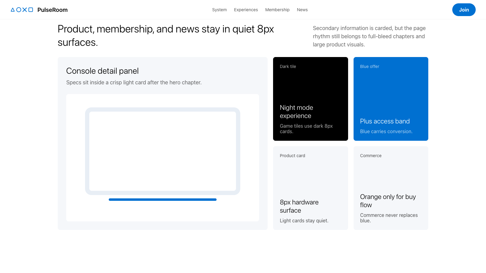
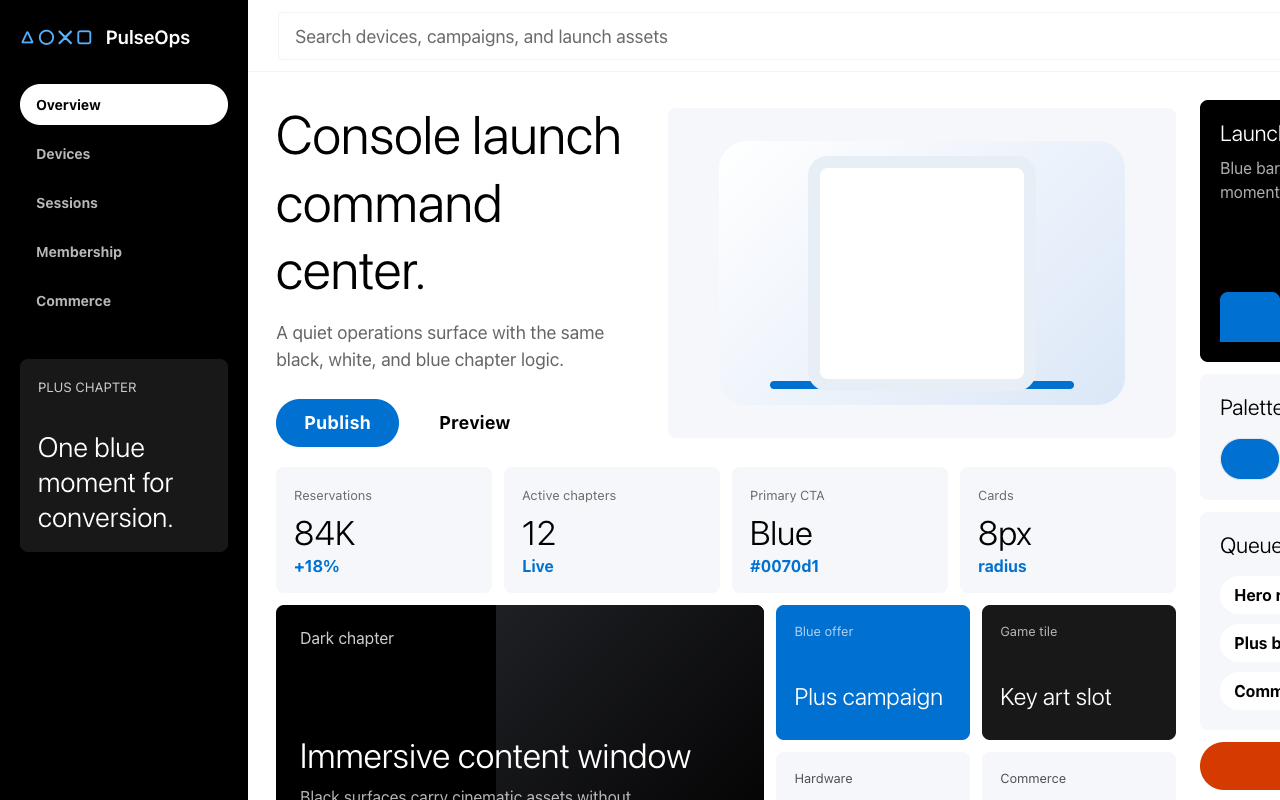

适合影音硬件、会员服务和沉浸式发布页,黑白蓝三段式大画面、轻字重标题和蓝色 pill CTA 带来高级娱乐感。
设计语言样张
---
version: alpha
name: "Playstation"
description: "Playstation 的 DESIGN.md 中文参考模板,保留原始 design token 与专业术语,覆盖 color system、typography、layout、components、motion 与 interaction states。"
language: zh-CN
sourceLanguage: en
---

## 概览
PlayStation 的 marketing system 像一支主机发布预告片,以章节方式从观者眼前滚动而过。每个 section 都是 full-bleed band:pure black `{colors.canvas-dark}`、true white `{colors.canvas-light}` 或 PlayStation Blue `{colors.primary}`。每个章节只承载一个 editorial moment:hero console photography、games-coming-soon strip、PlayStation Plus tier banner、"30 Years of PlayStation" anniversary band、来自 PlayStation Blog 的 news strip。章节之间没有额外 decorative chrome;section background 的变化本身就是 divider。Sections 以 `{spacing.section}` (96px) 节奏堆叠,下一个 band 的颜色从页面边缘到边缘接管视野。

系统有两种沿页面交替出现的 surface modes:用于 editorial product moments(hero、"ON PLAYSTATION" band、marathon game pages)的 **dark canvas mode**,以及用于 utility surfaces(PS5 games listing、support pages、news index)的 **light canvas mode**。两种模式共用同一套 chrome vocabulary:全圆角 `{rounded.full}` pill buttons、8px-radius `{rounded.md}` cards、专有 PlayStation SST 字体;变化的只是 surface 与 on-surface colors。第三种 surface mode 是 **PlayStation Blue band**(`{colors.primary}` — `#0070d1`),只保留给最高优先级时刻:Marathon launch CTA strip、footer,以及任何 "Action Required" banner。

字体是这个系统最鲜明的选择。PlayStation SST 以 **weight 300** (light) 渲染 display headlines;对于一个原本很容易选择 bold geometric display faces 的游戏品牌来说,这很少见。轻字重让 chrome 拥有通透、近似 editorial 的质感,把叙事让给图像;copy 是信息而非装饰。Heading sizes 按紧密级差下降(54 → 44 → 35 → 28 → 22 → 18),body 固定在 18px 与 1.5 line-height,以支持 support 与 games pages 上舒适的长文阅读。

**关键特征:**
- Three-canvas chapter system:`{colors.canvas-dark}` (black)、`{colors.canvas-light}` (white)、`{colors.primary}` (PlayStation Blue) 沿页面交替
- PlayStation Blue(`{colors.primary}` — `#0070d1`)是通用 primary CTA;使用 `{rounded.full}` (9999px) 全圆角 pill
- Commerce orange(`{colors.commerce}` — `#d53b00`)是 secondary CTA,只保留给 "Buy now" / "Pre-order" / store actions
- PlayStation SST display tier 使用 **weight 300** 与 -0.1px 到 +0.4px tracking,形成品牌标志性的 airy editorial voice
- Product cards 与 feature panels 使用 8px-radius (`{rounded.md}`);inputs 使用 4px-radius (`{rounded.sm}`);每个 CTA 都是 pill (`{rounded.full}`)
- Game tiles、console renders 与 PS Plus tier illustrations 占据每个 section 的 60-90%;由 imagery 完成 storytelling
- Color-block page rhythm(观察到的一组 band sequence):dark hero → light console showcase → dark "Great PS4 & PS5 games" rail → light "Discover PlayStation Plus" tier band → light "30 years of PlayStation" callout → dark "ON PLAYSTATION" band → light news strip → blue footer

## Colors

> **Source pages:** `/en-tr/` (home)、`/en-tr/ps5/games/` (PS5 games listing)、`/en-tr/games/marathon/` (single game page)、`/tr-tr/support/account/` (support center)。四个页面的 chrome palette 完全一致;support page 只使用 light-canvas mode,而 marketing pages 会交替使用不同 surface。

### Brand & Accent
- **PlayStation Blue** (`{colors.primary}` — `#0070d1`):品牌的 universal primary。用于每个 primary CTA pill、active filter chip、footer surface、badge fills,以及 dark surfaces 上的 inline link color。
- **PlayStation Blue Pressed** (`{colors.primary-pressed}` — `#0064b7`):primary pill 的 pressed state;也兼作 light surfaces 上的 inline link color。
- **PlayStation Blue Active** (`{colors.primary-active}` — `#004d8d`):primary button 的 deeply-pressed state。
- **Commerce Orange** (`{colors.commerce}` — `#d53b00`):secondary CTA,只保留给 store/buy/pre-order actions。它是系统中唯一 warm color。
- **Commerce Orange Pressed** (`{colors.commerce-pressed}` — `#aa2f00`):commerce buttons 的 pressed state。
- **Marathon Yellow** (`{colors.marathon-yellow}` — `#deff20`):从 Marathon product palette 提取的单一高饱和 game-page accent;只用于专属 `/marathon/` game page chrome,不属于系统通用 accent vocabulary。

### Surface
- **Canvas Dark** (`{colors.canvas-dark}` — `#000000`):pure black hero band、primary nav background、footer base。它是 editorial product moments 的主导 surface。
- **Surface Dark Elevated** (`{colors.surface-dark-elevated}` — `#121314`):inset dark panels、PS Plus tier banner background、"ON PLAYSTATION" gradient end。
- **Surface Dark Card** (`{colors.surface-dark-card}` — `#181818`):game tile fill、dark product card background。
- **Canvas Light** (`{colors.canvas-light}` — `#ffffff`):true white console-showcase band、support page body、news strip background。
- **Soft Surface** (`{colors.surface-soft}` — `#f3f3f3`):light pages 上的 hairline-soft band fill,以及 light surfaces 上的 divider rule。
- **Surface Card** (`{colors.surface-card}` — `#f5f7fa`):light canvas 上带 cool-blue tint 的 product card 与 tier-card background。
- **Surface Filter** (`{colors.surface-filter}` — `rgba(245,247,250,0.3)`):light canvas 上 filter-pill default state 的 translucent fill。
- **Hairline Light** (`{colors.hairline-light}` — `#f3f3f3`):light pages 上的 1px divider rule。
- **Hairline Dark** (`{colors.hairline-dark}` — `rgba(229,229,229,0.2)`):dark canvas 上的 translucent 1px divider。

### Text
- **Ink** (`{colors.ink}` — `#000000`):`{colors.canvas-light}` 上的 primary text,用于 headlines、button text、support body。
- **Ink Deep** (`{colors.ink-deep}` — `#121314`):更暖的 near-black,用于 dark surfaces 上的 in-card titles 与 deep-shadow gradients。
- **Ink Elevated** (`{colors.ink-elevated}` — `#181818`):dark-canvas inks 中最浅的一档,用于 elevated card backgrounds。
- **Body Light** (`{colors.body-light}` — `rgba(0,0,0,0.6)`):light canvas 上的 translucent body text,是系统默认 paragraph color。
- **Mute Light** (`{colors.mute-light}` — `#6b6b6b`):light canvas 上的 metadata text 与 footer link captions。
- **Ash Light** (`{colors.ash-light}` — `#cccccc`):light surfaces 上的 disabled-state text 与最低强调 utility。
- **On Dark** (`{colors.on-dark}` — `#ffffff`):`{colors.canvas-dark}` 上的 primary text,用于 dark hero bands 上的 headlines 与 button text。
- **Body Dark** (`{colors.body-dark}` — `rgba(255,255,255,0.7)`):dark canvas 上的 translucent body text。
- **On Dark Mute** (`{colors.on-dark-mute}` — `#cccccc`):dark surfaces 上的 secondary text 与 disabled state。
- **Mute Dark** (`{colors.mute-dark}` — `rgba(229,229,229,0.55)`):dark canvas 上的 captions 与 metadata。

### Semantic Colors
- **Warning** (`{colors.warning}` — `#c81b3a`):validation errors 与 destructive confirmation copy。
- **Link Light** (`{colors.link-light}` — `#0064b7`):light canvas 上的 inline body-prose anchor link,与 `{colors.primary-pressed}` 使用相同 hex。
- **Link Dark** (`{colors.link-dark}` — `#53b1ff`):dark canvas 上的 inline body-prose anchor link,是为 dark-mode legibility 提亮的 blue。

### Brand Gradient
- **PlayStation Plus Gold Gradient** — a horizontal three-stop gold gradient `{colors.ps-plus-gold-start}` (`#ffce21`) → `{colors.ps-plus-gold-mid}` (`#f5a623`) → `{colors.ps-plus-gold-end}` (`#ee8e00`) that anchors the PS Plus banner on the home page. The only gradient in the system; reserved exclusively for PS Plus chrome.

## Typography

### Font Family
- **PlayStation SST** 是 proprietary brand sans-serif,覆盖站点上的每个 text role。它包含 weights 300 (light)、400 (regular)、500 (medium)、600 (semibold)、700 (bold),fallback 顺序为 `sst` → `Arial` → `Helvetica`。品牌最有辨识度的选择,是让 **display headlines 使用 weight 300 (light)**;这对游戏品牌来说并不常见,也是系统 editorial、airy character 的来源。
- **SST** 作为 in-product surfaces 的 secondary cut 出现,fallback 为 Helvetica → Arial。

### Hierarchy

| Token | Size | Weight | Line Height | Letter Spacing | Use |
|---|---|---|---|---|---|
| `{typography.display-xl}` | 54px | 300 | 1.25 | -0.1px | Hero headline ("Discover all PS5 consoles and accessories") |
| `{typography.display-lg}` | 44px | 300 | 1.25 | 0.1px | Section headline ("Great PS4 & PS5 games out now or coming soon") |
| `{typography.display-md}` | 35px | 300 | 1.25 | 0 | Mid-section headline, game-page sub-hero |
| `{typography.heading-xl}` | 28px | 300 | 1.25 | 0.1px | "30 Years of PlayStation" callout, in-band sub-heading |
| `{typography.heading-lg}` | 22px | 300 | 1.25 | 0.1px | News card title, support category title |
| `{typography.heading-md}` | 18px | 600 | 1 | 0 | Card label, navigation menu heading, in-product strong title |
| `{typography.body-md}` | 18px | 400 | 1.5 | 0.1px | Body copy, paragraph text, support article body |
| `{typography.body-strong}` | 18px | 500 | 1.25 | 0.4px | Inline emphasis, primary nav link, button label (large) |
| `{typography.body-sm}` | 16px | 400 | 1.5 | 0 | Card description, secondary body |
| `{typography.caption-md}` | 14px | 400 | 1.5 | 0 | Footer link, metadata, sub-nav text |
| `{typography.caption-sm}` | 12px | 500 | 1.5 | 0 | Smallest utility text, badge label |
| `{typography.link-md}` | 18px | 400 | 1.5 | 0 | Inline body-prose anchor link |
| `{typography.button-lg}` | 18px | 700 | 1.25 | 0.45px | Primary CTA pill |
| `{typography.button-md}` | 14px | 700 | 1.25 | 0.324px | Compact pill, filter chip, secondary CTA |

### 原则
层级几乎完全运行在 1.25 line-height ladder 上;即使 body 也使用 1.5,而不是常见的 1.6。这让长篇 support pages 保持紧凑,也让 console showcases 更高效。Display (300) 与 button (700) 的 weight contrast 非常强:同一条 18px chrome line 中,可能并置一个厚重 CTA 与轻盈的 22px headline,从而形成 editorial gaming-magazine 的质感。

### Font Substitutes
PlayStation SST 是 proprietary 字体。最接近的 open-source substitutes:
- **Roboto Light (300)** 用于 display tier;其略松的 letter-spacing 接近 SST 的 display optical fit。
- **Inter** weights 400/500/600 用于 body 与 chrome;它是最接近 SST body cut 的 geometric sans。
- **Source Sans Pro Light (300)** 可作为 display tier 替代,适用于 Roboto 显得过于 utilitarian 的场景。

替换字体时,应保留 display 与 button tiers 上 +0.1px 到 +0.45px 的 tracking;这种 spacing 是 PlayStation SST 在 light weight 下显得 premium 的关键。

## Layout

### Spacing System
- **Base unit:** 8px(并使用更细的 4/12px steps 处理 tight inline gaps)。
- **Tokens (front matter):** `{spacing.xxs}` (4px) · `{spacing.xs}` (8px) · `{spacing.sm}` (12px) · `{spacing.md}` (16px) · `{spacing.lg}` (24px) · `{spacing.xl}` (32px) · `{spacing.xxl}` (48px) · `{spacing.section}` (96px).
- **Universal section rhythm:** 这一组页面都使用 `{spacing.section}` (96px) 作为 major content blocks 之间的 vertical gap。Card grids 使用 `{spacing.lg}` (24px) gutters;in-card padding 根据密度落在 `{spacing.lg}` 到 `{spacing.xl}`。
- **Hero band padding:** 96px vertical / 48px horizontal,是系统中最大的 spacing,只保留给 full-bleed surface chapters。

### Grid & Container
- **Max width:** desktop body text content area 约 1280px,24px gutters 在 ultrawide 扩展到约 48px。Hero bands 与 game-tile rails 采用 full-bleed,imagery 没有 max-width constraint。
- **Game tile carousel:** desktop 为 4-up,并在同一 row 上 horizontal scroll;1024px 折叠为 3-up,768px 折叠为 2-up。每个 tile 使用 `{rounded.md}` 的 16:9 cover art。
- **Console showcase grid:** desktop 在 main hero render 下方使用 5-column thumbnail strip;tablet 折叠为 3-up + horizontal scroll。
- **Support page:** desktop 为 2-column 30/70 split(sidebar nav + article body);mobile 折叠为 single-column,并把 sidebar 提升为 top accordion。
- **News strip:** desktop 为 3-up card grid,tablet 为 2-up,mobile 为 1-up。

### 留白哲学
留白是结构性的,由 band 定义。章节之间的 96px `{spacing.section}` 像预告片剪辑之间的静默;没有 decorative wash、没有 gradient transition、没有 mid-section divider。Section 内部,内容以紧凑列左对齐,图像在右侧 60-70% 的 band 中呼吸。Paragraph text 使用舒适的 1.5 line-height,但 column widths 在 desktop 保持较窄(约 520px),以保证长文可读。

## Elevation & Depth

| Level | Treatment | Use |
|---|---|---|
| 0 — Flat | No border, no shadow | Default for hero bands, footer, full-bleed sections — the dominant treatment |
| 1 — Hairline divider | 1px solid `{colors.hairline-light}` or `{colors.hairline-dark}` | Card borders, support row dividers, footer column rules |
| 2 — Soft active shadow | `0 4px 12px rgba(0,0,0,0.16)` | Active/pressed CTAs, lifted product card |
| 3 — Section gradient | Soft top-to-bottom darkening from `{colors.surface-dark-elevated}` to `{colors.canvas-dark}` | "ON PLAYSTATION" band — only place a gradient appears on chrome |

系统中的 cards 基本没有 resting shadow;depth 由 band chapters 之间的 surface-color contrast 建立。Cards 只在 press 时抬起。

### Decorative Depth
Depth comes from the alternating-band rhythm and from the imagery itself:
- **Console product photography** — DualSense controller and PS5 console renders shot on neutral white with crisp edge lighting, full-bleed inside the light-canvas band.
- **Game key art** — full-bleed cinematic stills (Marathon, the latest blockbuster releases) inside dark-canvas bands with title lockup overlaid in the lower-left.
- **PS Plus tier banner** — a subtle horizontal gold gradient (`{colors.ps-plus-gold-start}` → `{colors.ps-plus-gold-end}`) sits as the only chrome gradient in the system, anchoring the "Discover PlayStation Plus" CTA.
- **"ON PLAYSTATION" gradient band** — top-to-bottom deepening from `{colors.surface-dark-elevated}` (`#121314`) to `{colors.canvas-dark}` (`#000000`) creates a cinematic dimming effect under the anniversary callout.

## Shapes

### Border Radius Scale

| Token | Value | Use |
|---|---|---|
| `{rounded.none}` | 0px | Hero bands, primary nav, footer, sub-nav, support article body — every full-bleed structural surface |
| `{rounded.sm}` | 4px | Text inputs, support search field utilities |
| `{rounded.md}` | 8px | Game tiles, product cards, feature cards, PS Plus banner |
| `{rounded.lg}` | 16px | Rare large container with extra-soft corners (e.g., dialog cards) |
| `{rounded.full}` | 9999px | Every CTA pill (primary / commerce / secondary), filter chips, pagination dots, carousel paddles |

The radius vocabulary works on a 4 / 8 / pill rhythm for chrome with structural surfaces staying flat at 0px.

### Photography Geometry
- **Hero console render:** large centered console + DualSense composition on white, ~70% width of the band, with copy slot to the left.
- **Game tiles:** 16:9 key art at `{rounded.md}` (8px), 4-up rail at desktop with horizontal carousel.
- **Marathon game page hero:** full-bleed cinematic 16:9 still with the "MARATHON" wordmark in the lower-left at light weight, brand yellow `{colors.marathon-yellow}` accent on a few small UI tags.
- **News card thumbnails:** 16:9 imagery at `{rounded.md}` with a small text block below.
- **Avatar / brand icons:** 32–40px circles for sub-nav social row.

## Components

> **No hover states documented** per system policy. Each spec covers Default and Active/Pressed only.

### Buttons

**`button-primary`** — 通用 PlayStation CTA
- Background `{colors.primary}` (PlayStation Blue), text `{colors.on-primary}`, type `{typography.button-lg}`, padding `12px 28px`, height ~48px, rounded `{rounded.full}`.
- 用于 "Add to bag"、"Sign up"、"Learn more"、"Subscribe";覆盖 light 与 dark canvases 上的每个 primary action。
- Pressed state 位于 `button-primary-pressed`;background 降到 `{colors.primary-pressed}` (`#0064b7`)。

**`button-commerce`** — orange store CTA
- Background `{colors.commerce}` (`#d53b00`), text `{colors.on-commerce}`, type `{typography.button-lg}`, padding `12px 28px`, height ~48px, rounded `{rounded.full}`.
- 只保留给 "Buy now"、"Pre-order"、"Add to cart" 等 store actions。它是系统中唯一 warm color。
- Pressed state 位于 `button-commerce-pressed`;background 降到 `{colors.commerce-pressed}`。

**`button-secondary-light`** — light canvas 上的 outline variant
- Background transparent, text `{colors.ink}`, 1px solid `{colors.ash-light}` border, type `{typography.button-lg}`, padding `12px 28px`, height ~48px, rounded `{rounded.full}`.
- 用于 white surfaces 上的 lower-emphasis CTA("Learn more →"、"Watch trailer")。

**`button-secondary-dark`** — dark canvas 上的 outline variant
- Background transparent, text `{colors.on-dark}`, 1px solid `{colors.hairline-dark}`, type `{typography.button-lg}`, padding `12px 28px`, height ~48px, rounded `{rounded.full}`.
- 与 light variant 职责相同,但反转后用于 `{colors.canvas-dark}` hero bands。

**`button-disabled`**
- Background `{colors.surface-soft}`, text `{colors.ash-light}`, rounded `{rounded.full}` — flat soft gray.

### Filter & Tab Chips

**`filter-pill`** + **`filter-pill-active`**
- Default:background `{colors.surface-filter}`(translucent),text `{colors.ink}`,type `{typography.button-md}`,padding `8px 16px`,rounded `{rounded.full}`。
- Active:background 切换到 `{colors.canvas-light}`(opaque white),chip 从 translucent default 中“lift”出来。
- 用于 PS5 games filter strip("All"、"Coming Soon"、"PlayStation VR2"、"Recently Released")。

### Inputs & Forms

**`text-input`** + **`text-input-focused`**
- Default:background `{colors.canvas-light}`,text `{colors.ink}`,1px solid `{colors.ash-light}`,type `{typography.body-md}`,padding `12px 16px`,height ~48px,rounded `{rounded.sm}` (4px)。
- Focused:2px solid `{colors.primary}` border,无 halo(依靠 border weight 增加作为 focus signal)。

**`support-search-bar`** — support-page 标志性 search field
- Background `{colors.canvas-light}`, text `{colors.ink}`, type `{typography.body-md}`, padding `12px 24px`, height ~56px, rounded `{rounded.full}`.
- 位于 support page hero 顶部,左侧有 magnifier icon,并使用 "Search the support center" placeholder。

### Cards & Containers

**`product-card`** — light-canvas product/feature card
- Container:background `{colors.surface-card}`(`#f5f7fa` cool-blue-tinted),1px solid `{colors.hairline-light}`(少见,通常 borderless),padding `{spacing.lg}` (24px),rounded `{rounded.md}` (8px)。
- 用于 light canvas 上的 "PlayStation Store" sale callout、news cards 与 PS Plus tier comparison cards。

**`product-card-dark`** — dark-canvas product card
- Container: background `{colors.surface-dark-card}` (`#181818`), padding `{spacing.lg}`, rounded `{rounded.md}`.
- 用于 game-detail cards 与 dark-canvas feature panels。

**`game-tile`** — game/console thumbnail tile
- Container: background `{colors.surface-dark-elevated}`, padding 0, rounded `{rounded.md}`.
- Layout:16:9 cover art 在 radius 内 full bleed,底部左侧叠加 title + platform tag,使用 `{typography.body-sm}`。
- 用于 "Great PS4 & PS5 games" rail 与 PS5 games listing grid。

**`feature-card`** — light-canvas marketing card
- Container: background `{colors.canvas-light}`, padding `{spacing.xl}` (32px), rounded `{rounded.md}`.
- 用于 "PlayStation Store" hero card 以及类似 feature panels,包含 small product icon、title、body 与 CTA。

**`hero-band-blue`** — PlayStation Blue full-bleed band
- Background `{colors.primary}`, text `{colors.on-primary}` in `{typography.display-md}`, padding `96px 48px`, rounded `{rounded.none}`.
- Marathon launch CTA strip 与 footer surface 使用这个 band。该 band 的定义性用途是“这是页面的 action moment”。

**`hero-band-dark`** — full-bleed dark hero
- Background `{colors.canvas-dark}` (with optional gradient end at `{colors.surface-dark-elevated}`), text `{colors.on-dark}` in `{typography.display-xl}`, padding `96px 48px`, rounded `{rounded.none}`.
- 用于 home-page hero、game-detail page hero 与 "ON PLAYSTATION" anniversary band。

**`hero-band-light`** — full-bleed white hero
- Background `{colors.canvas-light}`, text `{colors.ink}` in `{typography.display-xl}`, padding `96px 48px`, rounded `{rounded.none}`.
- 用于 console showcase band("Discover all PS5 consoles and accessories")与 support page top。

**`ps-plus-banner`** — PlayStation Plus tier callout
- Background `{colors.surface-dark-elevated}` with the `{colors.ps-plus-gold-start}` → `{colors.ps-plus-gold-end}` gold gradient as a horizontal accent bar across the top, text `{colors.on-dark}` in `{typography.heading-xl}`, padding `48px 32px`, rounded `{rounded.md}`.
- 用于 home page 上的 "Discover PlayStation Plus" full-width banner。

**`carousel-paddle`** — circular carousel control
- Background `rgba(255,255,255,0.16)`, icon `{colors.on-dark}`, rounded `{rounded.full}`, size 48px.
- Anchored to the left/right edge of the game tile carousel.

**`pagination-dot`** + **`pagination-dot-active`**
- 8px circle at `{rounded.full}`. Default fill `{colors.ash-dark}`; active fill `{colors.on-dark}`.
- Carousel position indicator below the game tile rail.

### Inline Elements

**`badge-info`** — small info tag
- Background `{colors.primary}`, text `{colors.on-primary}` in `{typography.caption-sm}`, padding `4px 10px`, rounded `{rounded.full}`.
- "New", "Pre-order", "Coming Soon" labels overlaid on game tiles.

**`link-inline`** — body-prose anchor link
- `{colors.link-light}` text on light canvas / `{colors.link-dark}` on dark canvas, no underline by default. Inline body links inside support article paragraphs.

### Navigation

**`primary-nav`**
- Background `{colors.canvas-dark}`, text `{colors.on-dark}`, height ~48px, type `{typography.body-strong}`, rounded `{rounded.none}`.
- Layout(desktop):最左为 PlayStation P-logo,中间为 centered nav row("Games · PS5 · PS4 · PS VR2 · Subscriptions · Hardware · Mobile · News · Shop · Support"),右侧 cluster 包含 search-glyph + locale + cart icon + user-avatar circle。

**`sub-nav`** — secondary nav strip
- Background `{colors.canvas-dark}`, text `{colors.on-dark}` in `{typography.caption-md}`, height ~40px, rounded `{rounded.none}`.
- 位于 PS5 games / single game / PS Plus pages 的 primary nav 正下方,提供 section-specific anchor links。

**Top Nav (Mobile)**
- 左侧为 hamburger menu icon,中间为 P-logo,右侧为 search + cart icons。Primary nav 折叠为从左侧滑入的 full-screen dark drawer。

### Footer

**`footer-section`**
- Background `{colors.primary}` (PlayStation Blue), text `{colors.on-primary}` in `{typography.caption-md}`, padding `{spacing.xxl}` (48px) vertical.
- Layout:左上角为 large PlayStation wordmark,multi-column link grid(locale selector、store links、account、support、social),底部 row 使用 `{typography.caption-sm}` 呈现 terms / privacy fine-print。
- Footer 的 blue surface 是系统的“结束并回到品牌”的 anchor。

### Support-page-specific

**`support-row`** — support article-list row
- Background `{colors.canvas-light}`, text `{colors.ink}` in `{typography.body-md}`, padding `16px 0`, with a 1px `{colors.hairline-light}` bottom rule.
- Used for FAQ / category-listing rows on the support page with a small chevron-right icon at the right edge.

## Do's and Don'ts

### Do
- `{colors.primary}` (PlayStation Blue) 只保留给 primary CTAs 与 footer surface。Blue band 很珍贵;每页最多一个 full-bleed blue band。
- `{colors.commerce}` (orange) 只保留给 store/buy/pre-order CTAs。不要用于 marketing chrome 或 hero pills。
- Display headings(54 / 44 / 35 / 28 / 22)使用 PlayStation SST weight 300。Light weight 就是品牌声音。
- Content sections 以 `{spacing.section}` (96px) rhythm 堆叠,下一个 band 的 surface color 直接接管页面边缘;bands 之间不要加 decorative dividers。
- 每个 CTA pill 使用 `{rounded.full}` (9999px),每个 product card 使用 `{rounded.md}` (8px)。除 inputs 外,这两种 radius vocabulary 就是整个 shape system。
- 在 dark 或 light bands 内配对 full-bleed game key art 与 console renders;让 imagery 占据 band 垂直高度的 60-90%。
- `{component.ps-plus-banner}` 的 gold gradient 只用于 PlayStation Plus tier callout;不要用 gold 装饰其他组件。

### Don't
- 不要在 resting cards 上引入 drop shadows。系统是 flat-on-canvas;cards 只在 press 时 lift。
- 不要用其他蓝色替换 `{colors.primary}`。Brand blue 很精确:default 为 `#0070d1`,pressed 为 `#0064b7`。
- 不要在 marketing/hero CTAs 上使用 `{colors.commerce}` (orange)。它只属于 store actions。
- 不要引入额外 sans-serif body font、italic 或 monospace style。PlayStation SST 承担所有 text role。
- 不要软化 pill geometry。CTAs 始终是 `{rounded.full}`;没有 medium-radius buttons。
- 不要把 gold PS Plus gradient 用在 PS Plus banner 以外的任何地方。它是 tier-specific brand asset。
- 不要给 chrome 添加 gradient。唯一允许的 gradient 是 gold PS Plus accent,以及 "ON PLAYSTATION" band 的 soft top-to-bottom darkening。

## Responsive Behavior

### Breakpoints

| Name | Width | Key Changes |
|---|---|---|
| ultrawide | 1920px+ | Hero band stays at content max-width 1280px; outer gutters grow to ~80px |
| desktop-large | 1440px | Default desktop — 4-up game tile carousel, full primary nav |
| desktop | 1280px | Same layout with narrower outer gutters |
| desktop-small | 1024px | Game tile rail collapses to 3-up; sub-nav remains horizontal |
| tablet | 768px | Game tiles → 2-up; primary nav becomes hamburger drawer |
| mobile | 480px | Single-column everything; hero `{typography.display-xl}` scales 54px → ~32px |
| mobile-narrow | 320px | Section padding tightens to 32px; hero further scales to ~28px |

### Touch Targets
所有 interactive elements 都满足 WCAG AAA(≥ 44×44px)。`{component.button-primary}` 与 `{component.button-commerce}` 高度为 48px,horizontal padding 为 28px(有效 tappable 区域约 48×100px)。`{component.text-input}` 为 48px。`{component.support-search-bar}` 为 56px。`{component.filter-pill}` 高约 36–40px,并通过 16px padding 扩展到 44px tappable。`{component.carousel-paddle}` 是精确 48×48 的圆形控件。

### 折叠策略
- **Primary nav:** desktop horizontal cluster → 768px tablet hamburger drawer。右侧 cluster icons(search、cart、account)在每个 breakpoint 保持可见。
- **Sub-nav:** desktop horizontal anchor row → tablet horizontal scroll → mobile select dropdown。
- **Game tile carousel:** 在 1024 与 768px 从 4-up → 3-up → 2-up;carousel paddles 在 desktop breakpoints 保持可见,mobile 隐藏并改用 touch-swipe。
- **Hero bands:** 每个 breakpoint 都保持 full-bleed;只有内部 content column 从 2-column(text-left + image-right)重排为 single-column(text above image)。
- **Console showcase:** desktop 5-up thumbnail strip → tablet 3-up + horizontal scroll → mobile 1-up with paddle。
- **Support page:** desktop 30/70 split(sidebar + body)→ tablet sidebar 提升为 top accordion → mobile 完全折叠 accordion。
- **Section padding:** `{spacing.section}` (96px) desktop → 64px tablet → 48px mobile。
- **Hero headline:** `{typography.display-xl}` 在 desktop 为 54px,并沿 breakpoint stack 缩放到 44px / 32px / 28px。

### 图片行为
- Hero imagery(console renders、game key art)在 mobile 使用 art-direction crops,让 band 折叠为 single-column 时中央主体仍保持居中。
- Game tile cover art 在每个 breakpoint 都保持 16:9 ratio;只改变 column count。
- Console showcase thumbnails 在各 breakpoint 保持自然比例(约 1:1 product render)。
- 所有非关键 imagery 都在用户滚动进入下一章节时 lazy-loaded。

## Iteration Guide

1. 一次只聚焦 ONE component。拉取对应 YAML entry,并验证每个 property 都能解析。
2. 直接引用 component names 与 tokens(`{colors.primary}`、`{component.button-primary-pressed}`、`{rounded.full}`),不要改写。
3. 编辑后运行 `npx @google/design.md lint DESIGN.md`;`broken-ref`、`contrast-ratio` 和 `orphaned-tokens` warnings 会自动标记问题。
4. 新 variants 应作为独立 component entries 添加(`-pressed`、`-disabled`),不要埋进 prose。
5. Default body 使用 `{typography.body-md}`(18px / 400 / 1.5);`{typography.display-xl}` 严格只用于 page-top hero headline;primary nav links 使用 `{typography.body-strong}`。
6. 每个 viewport 保持 `{colors.primary}` 稀缺;每页最多一个 full-bleed PlayStation Blue band。
7. 引入新 component 前,先判断它能否用现有 pill + 8px-radius card + full-bleed-band vocabulary 表达,再决定是否添加 new tokens。这个系统的优势正是几乎不需要新 token。

## Known Gaps

- **Mobile screenshots not captured**:responsive behavior 是根据 desktop evidence 与 breakpoint stack,综合 PlayStation 已知 mobile pattern(hamburger drawer、single-column band reflow、hero downscale)推导。
- **Hover states not documented**:按 system policy 未记录 hover states。
- **Sign-in / authentication chrome**:login modal、account dashboard、profile pages 不在捕获页面内。
- **PlayStation Store**:in-store browsing surfaces(PDP / cart / checkout)不在捕获集合中;它们使用更密集的 data-table layout,本文档未描述。
- **Game-page-specific theming**:`/marathon/` 页面使用 `{colors.marathon-yellow}` 作为 chapter accent。其他 game pages 可能拉取各自 title 的 brand colors,超出本文档系统。
- **Form validation states**:除 `{colors.warning}` color token 外,捕获 surfaces 中未出现 success / error inline messages。


