

01 / 03
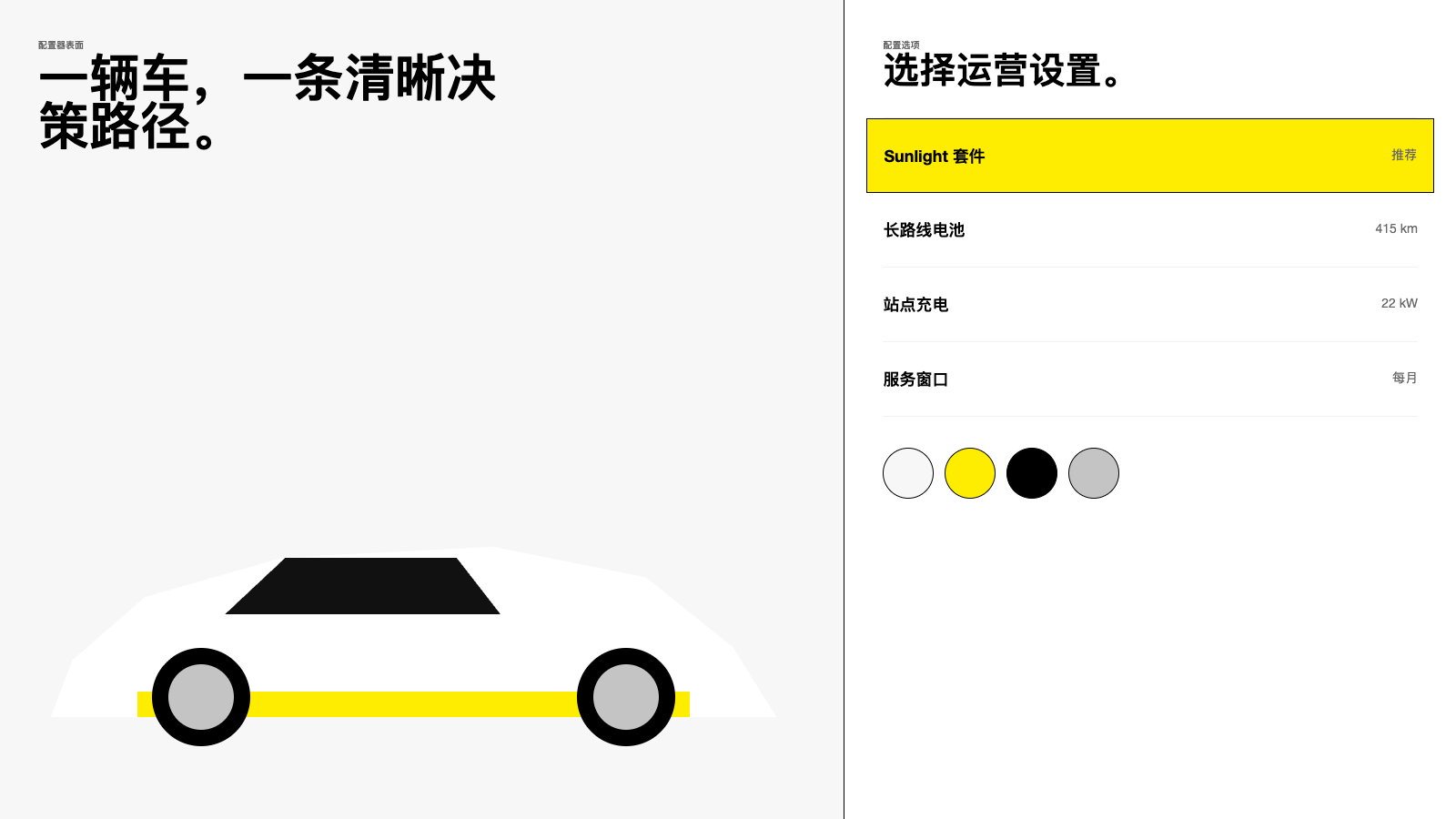
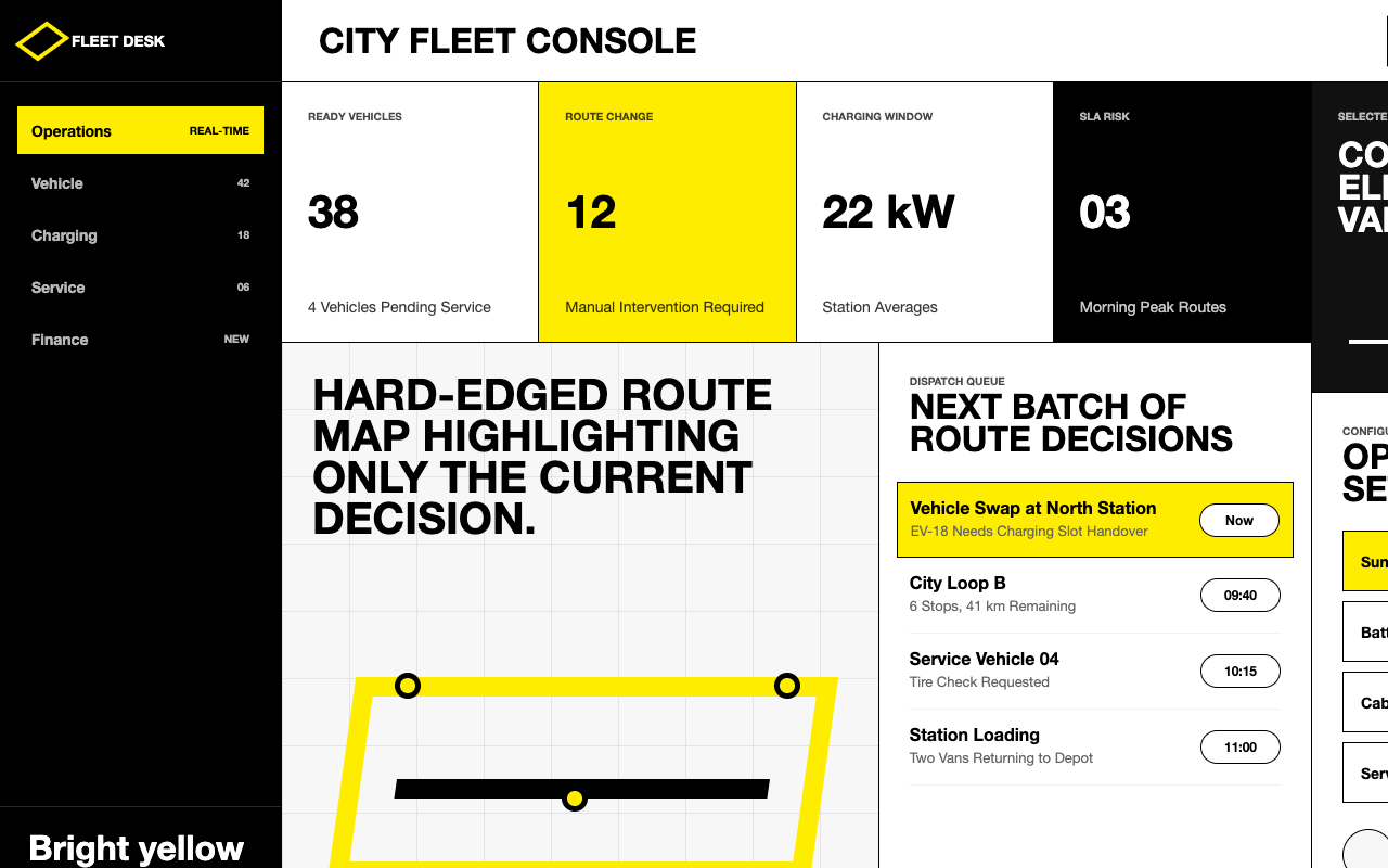

适合活动、场馆和产品配置页,黑白硬边结构配单一明黄行动点,带来清晰、有行动感的品牌节奏。
设计语言样张
---
version: alpha
name: "Renault"
description: "Renault 的 DESIGN.md 中文参考模板,保留原始 design token 与专业术语,覆盖 color system、typography、layout、components、motion 与 interaction states。"
language: zh-CN
sourceLanguage: en
---

## 概览
Renault 的 Turkish marketing surface 非常高对比:用于浏览的 white canvas、用于 product storytelling 的 black canvas,以及只保留给关键 action 的 Sunlight Yellow accent(`{colors.primary}` — `#ffed00`)。现代化 flat diamond logo 定下了几何、自信、略带工业感的语气,系统也沿着这个方向展开。Square corner 占主导,hairline border 很少,elevation 通过 colour blocking 而非 shadow 表达。

Typography 是单一而有纪律的。站点所有文本都使用 **NouvelR**,Renault 的定制 display family;display size 强烈偏向 700 weight,并使用紧密 `lineHeight: 0.95`,body 则保持 400 weight。没有 secondary serif、decorative italic 或 script;这种纪律本身就是 signature。

页面节奏在三种 surface mode 间切换:用于 listing 与 configurator 的 **white catalogue mode**(`{colors.canvas}` 加极细 `{colors.hairline}` divider)、用于 hero section、lifestyle imagery 和 campaign page 下半部分的 **black storytelling mode**,以及短暂的 **yellow accent moments**(`{colors.primary}` tile、"NEW" badge、R5 yellow paint shot)。这些 yellow moment 点缀在中性色系统中。

**关键特征:**
- Two-tone canvas system:`{colors.canvas}`(white)用于 browsing,`{colors.surface-dark}`(black)用于 storytelling,并以 full-bleed band 切换,而不是细微渐变。
- 单一品牌 accent:`{colors.primary}` Sunlight Yellow,仅用于 primary CTA、"NEW" badge、R5 hero photography、configurator dot indicator。
- **NouvelR everywhere**,`{typography.display-xl}` headline 为 56px / weight 700 / `lineHeight: 0.95`,多行 headline 可紧密堆叠。
- Square geometry:`{rounded.xs}` (2px) 用于 button,`{rounded.none}` 用于 tile 和 product card,`{rounded.pill}` 只用于 sub-nav chip 与 decorative badge。
- Photography-first product tile:vehicle photo 在中性 card 中 full-bleed,copy 堆叠在下方而不是覆盖在图上。
- 页面级节奏 white -> black -> yellow accent -> black,wordmark 与 footer 始终以 `{colors.surface-dark}` 收尾。

## Colors

### Brand & Accent
- **Sunlight Yellow** (`{colors.primary}` — `#ffed00`): 品牌 accent。只用于 primary CTA、"NEW" / "yeni" badge、configurator dot indicator、full-bleed promotional tile。绝不作为装饰。
- **Sunlight Yellow Pressed** (`{colors.primary-deep}` — `#e6d200`): `{colors.primary}` button 与 tile 的 active/pressed state。
- **On-Primary** (`{colors.on-primary}` — `#000000`): `{colors.primary}` surface 上的 label color。Yellow 始终搭配黑字,绝不搭配白字。

### Surface
- **Canvas** (`{colors.canvas}` — `#ffffff`): 默认页面背景与 card surface。
- **Surface Soft** (`{colors.surface-soft}` — `#f7f7f7`): grouped configurator row 与 inactive form field 的轻微 elevation step。
- **Surface Dark** (`{colors.surface-dark}` — `#000000`): alternate canvas,用于 hero band、footer、full-bleed storytelling section。
- **Surface Deep** (`{colors.surface-deep}` — `#111111`): `{colors.surface-dark}` 区域内的上一层 elevation,用于 inset card 与 form panel。
- **Hairline** (`{colors.hairline}` — `#f2f2f2`): white surface 上 row 间柔和 1px divider。
- **Hairline Strong** (`{colors.hairline-strong}` — `#000000`): white 上的全强度 divider,以及所有 card / button outline。
- **Divider Dark** (`{colors.divider-dark}` — `rgba(255,255,255,0.16)`): `{colors.surface-dark}` 区域内对应的低对比 divider。

### Text
- **Ink** (`{colors.ink}` — `#000000`): white surface 上的 primary text color,同时用于 logo、icon、outline border;black 是结构性的,不是装饰性的。
- **Body** (`{colors.body}` — `#222222`): 长正文中比纯黑更轻的 secondary body text。
- **Charcoal** (`{colors.charcoal}` — `#333333`): caption、metadata、小 label。
- **Mute** (`{colors.mute}` — `#666666`): supporting text 与 inactive nav label。
- **Ash** (`{colors.ash}` — `#8a8a8a`): placeholder text、disabled label。
- **Stone** (`{colors.stone}` — `#c4c4c4`): disabled-state foreground。
- **On-Dark** (`{colors.on-dark}` — `#ffffff`): `{colors.surface-dark}` surface 上的 primary text。
- **On-Dark Mute** (`{colors.on-dark-mute}` — `rgba(255,255,255,0.72)`): dark region 中的 secondary text,保持高对比气质而不退到中灰。

### Semantic Colors
- **Error** (`{colors.error}` — `#be6464`): muted desaturated red,用于 inline form error,比典型纯红 error state 更暖。
- **Warning** (`{colors.warning}` — `#f0ad4e`): amber alert。
- **Success** (`{colors.success}` — `#8dc572`): muted green confirmation。
- **Info** (`{colors.info}` — `#337ab7`): informational chip 中的去饱和 mid-blue。
- **Link** (`{colors.link}` — `#0000ee`): fallback inline text link 保留的 unstyled-anchor default;production link 继承 `{colors.ink}`,依赖 underline/weight 而非颜色。

## Typography

### Font Family
整个系统使用 **NouvelR**,Renault 的专有 display family,覆盖 navigation、headline、body、caption 与 button label。它有轻微几何、半压缩的个性,高 x-height 与方正 apex 与 diamond logomark 很自然地匹配。

无法授权 NouvelR 时,可用 **Inter Tight**、**Manrope** 或 **HK Grotesk Semi Condensed** 替代;它们都保留 geometric-with-warmth 的感觉,并能适配 400 / 600 / 700 weight。Display size 的 `lineHeight` 应收紧到约 0.95,不要放松。

### Hierarchy

| Token | Size | Weight | Line Height | Letter Spacing | Use |
|---|---|---|---|---|---|
| `{typography.display-xl}` | 56px | 700 | 0.95 | 0 | Hero headline、campaign title,如 "E-TECH ELEKTRİKLİ"、"REVOLUTION"。 |
| `{typography.display-lg}` | 40px | 700 | 0.95 | 0 | Secondary section title。 |
| `{typography.display-md}` | 32px | 700 | 0.95 | 0 | Sub-page 与 configurator panel 的 page-level H1。 |
| `{typography.heading-lg}` | 24px | 700 | 0.95 | 0 | Section header、card title。 |
| `{typography.heading-md}` | 20px | 700 | 0.95 | 0 | Sub-section header、prominent label。 |
| `{typography.heading-sm}` | 18px | 700 | 1.0 | 0 | Tile title、list group header。 |
| `{typography.subtitle}` | 19.2px | 600 | 1.3 | 0 | Lead paragraph、hero subtitle。 |
| `{typography.body-lg}` | 18px | 400 | 1.5 | 0 | Long-form body。 |
| `{typography.body-md}` | 16px | 400 | 1.4 | 0 | Default body 与 form field。 |
| `{typography.body-sm}` | 14px | 400 | 1.57 | 0 | Caption、metadata。 |
| `{typography.button-lg}` | 16px | 700 | 1.0 | 0 | Hero band 中的大 CTA。 |
| `{typography.button-md}` | 14.4px | 700 | 1.0 | 0.144px | 系统默认 button label。 |
| `{typography.button-sm}` | 13px | 600 | 1.2 | 0.13px | Sub-nav pill、小型 in-card action。 |
| `{typography.caption}` | 12px | 400 | 1.4 | 0 | Footer disclosure、regulatory text。 |
| `{typography.overline}` | 10px | 700 | 1.45 | 0 | Title 上方的短 uppercase label。 |

### Principles
- Display size 始终 700 weight,始终 `lineHeight: 0.95`。这种紧密度让品牌感觉自信,而不是 corporate。
- Body copy 保持 400 weight,不使用 500;body 与 display 的 contrast 是系统的一部分。
- Button label 带极小正 letter-spacing(`{typography.button-md}` 为 `0.144px`),几乎不可察觉,但给 CTA 增加机械精度。
- 不使用 italic、script 或 decorative ligature。

### Font Substitutes
NouvelR 是授权字体;替代字体(Inter Tight / Manrope / HK Grotesk Semi Condensed)能保留几何特征,但 display size 默认 line height 通常更松,应明确 clamp display `lineHeight` 到 0.95。

## Layout

### Spacing System
- **Base unit**: 4px,工作 scale 基于 4 和 8 的倍数。
- **Tokens**: `{spacing.xxs}` 4px · `{spacing.xs}` 8px · `{spacing.sm}` 12px · `{spacing.md}` 16px · `{spacing.lg}` 20px · `{spacing.xl}` 24px · `{spacing.xxl}` 32px · `{spacing.xxxl}` 40px · `{spacing.section}` 80px。
- Section padding(full-bleed band 到下一 band):desktop 为 `{spacing.section}` (80px),mobile 收缩到 `{spacing.xxxl}` (40px)。
- Promo-tile internal padding: desktop 四边 `{spacing.xxl}` (32px)。
- Configurator row vertical padding: 上下 `{spacing.xl}` (24px),row 间使用 hairline divider。

### Grid & Container
- **Max content width** ≈ 1440px;更宽时内容居中,dark/light band full-bleed 延展。
- **Promo grid**: homepage desktop 为 2-column tile grid,mobile 降为 1-up。每个 tile 都是 square-cornered(`{rounded.none}`),background 可为 photography 或 solid colour。
- **Vehicle range grids**: desktop 每行 3–4 辆车,tablet 2-up,small mobile 1-up。
- **Configurator**: desktop 使用固定左侧 visualization pane(约 60% width)与右侧 scrolling option list(约 40% width)。

### Whitespace Philosophy
- Whitespace 是结构性的,不是装饰性的。Section 通过 colour-blocking(white -> black)分隔,而不是柔和 padding ramp。
- Card 与 configurator row 内部 padding 充足但不空旷;品牌是 mass-market,适度密度可以接受。
- White surface 上的 `{colors.hairline}` divider 形成 catalogue precision;dark surface 上由 `{colors.divider-dark}` 承担同样角色。

## Elevation & Depth

| Level | Treatment | Use |
|---|---|---|
| 0 — flat | No shadow, no border | Default page surface、full-bleed band。 |
| 1 — outline | 1px solid `{colors.hairline-strong}` or `{colors.hairline}` | Light promo tile、vehicle card、configurator panel。 |
| 2 — colour-blocked elevation | Surface color shift,如 `{colors.surface-soft}` band 中的 `{colors.canvas}` card | Configurator detail card、related-content row。 |
| 3 — dark inversion | Card 在 `{colors.canvas}` band 上切换为 `{colors.surface-dark}` | "Ticari araç" hero promo tile、lifestyle storytelling card。 |

Drop shadow 已从系统中提取,但 marketing surface 上很少可见。出现时也非常 subtle(约 10% opacity、2–4px blur),只用于 configurator sticky summary bar 等 floating element。

### Decorative Depth
- R5 hero band 使用 atmospheric mesh-gradient backdrop,在 car silhouette 后方形成 purple-to-pink-to-yellow glow,这是系统中唯一真正的 atmospheric depth。其他地方的 depth 都是结构性的(colour-blocking + outline),不是氛围性的。
- E-TECH electric powertrain page 在 cutaway diagram 后使用 luminous magenta-to-violet gradient,专用于 electric sub-brand。

## Shapes

### Border Radius Scale

| Token | Value | Use |
|---|---|---|
| `{rounded.none}` | 0px | Tile、vehicle card、divider、banner band、full-bleed image。 |
| `{rounded.xs}` | 2px | Default button(primary yellow、secondary black、outline)。 |
| `{rounded.sm}` | 3px | Tab panel、小 chip。 |
| `{rounded.md}` | 4px | Form label、inline tag。 |
| `{rounded.pill}` | 46px | Sub-nav pill、"yeni" / "NEW" badge、decorative carousel chip。 |
| `{rounded.full}` | 9999px | Configurator colour swatch、avatar dot。 |

### Photography Geometry
- Vehicle photography 始终 **square-cornered**(`{rounded.none}`)。没有 rounded vehicle hero shot 或 soft-edged car card。
- Aspect ratio 集中在 **16:9**(hero band)、**1:1**(square promo tile)、**4:3**(vehicle range card)。Lifestyle imagery 有时在 full-bleed band 中使用 **2:1 wide**。
- Avatar 与小型 profile cue(如出现)使用 `{rounded.full}` circle,与整体 square geometry 形成对比。

## Components

### Buttons

**`button-primary`** — yellow CTA
- Background `{colors.primary}`, label `{colors.on-primary}`, type `{typography.button-md}`, padding `14px 24px`, `rounded: {rounded.xs}`。
- 页面上最重要的单一 action,如 "Hemen randevu al"、"Hesapla"、"Konfigüratörü başlat"。
- Pressed state 位于 `button-primary-pressed`(background `{colors.primary-deep}`)。

**`button-secondary-dark`** — solid black CTA
- Background `{colors.surface-dark}`, label `{colors.on-dark}`, type `{typography.button-md}`, `rounded: {rounded.xs}`。
- 与 `{component.button-primary}` 配对的等权重 secondary action,或在 yellow tile background 上作为 primary action。

**`button-outline-dark`** — outlined CTA on light
- Background `{colors.canvas}`, label `{colors.ink}`, 1px solid `{colors.hairline-strong}`, type `{typography.button-md}`, `rounded: {rounded.xs}`。
- Tertiary action,用于 "Detayları gör"、"Modeller" 等。

**`button-outline-light`** — outlined CTA on dark
- Background `{colors.surface-dark}`, label `{colors.on-dark}`, 1px solid `{colors.on-dark}`, type `{typography.button-md}`, `rounded: {rounded.xs}`。
- `{component.button-outline-dark}` 在 dark-canvas 上的对应版本。

**`button-pill`** — sub-nav chip
- Background `{colors.canvas}`, label `{colors.ink}`, 1px solid `{colors.hairline-strong}`, type `{typography.button-sm}`, `rounded: {rounded.pill}`, height 36px。
- 系统中唯一使用 pill 的位置:top-level filter chip("Servis & randevu"、"Sahiplik dönemi geçişi"、"Kampanyalar")与 configurator tab switch。

**`button-icon-square`** — small icon button
- Background `{colors.canvas}`, 1px solid `{colors.hairline-strong}`, `rounded: {rounded.xs}`, 40×40px square。
- Carousel arrow、share、language switcher。

### Cards & Containers

**`promo-tile-light`** — white promo tile
- Background `{colors.canvas}`, text `{colors.ink}`, type `{typography.heading-lg}`, padding `{spacing.xxl}`, `rounded: {rounded.none}`。
- 用于 homepage 2-up grid 中的 "Hybrid araç modelleri"、"binek araç satış kampanyaları" tile。

**`promo-tile-dark`** — black promo tile
- Background `{colors.surface-dark}`, text `{colors.on-dark}`, type `{typography.heading-lg}`, padding `{spacing.xxl}`, `rounded: {rounded.none}`。
- Lifestyle / commercial-vehicle storytelling tile,如 "ticari araç satış kampanyaları"。

**`promo-tile-yellow`** — accent promo tile
- Background `{colors.primary}`, text `{colors.on-primary}`, type `{typography.heading-lg}`, padding `{spacing.xxl}`, `rounded: {rounded.none}`。
- 单个 "PARLAK SARI" / "Sunlight Yellow" attention tile,用来锚定 campaign band;应保留,通常每页最多一个。

**`vehicle-card`** — car listing card
- Background `{colors.canvas}`, 顶部为 full-bleed product photography,下方为 text,`rounded: {rounded.none}`,无 outer border。
- 包含 vehicle name(`{typography.heading-md}`)、variant subtitle(`{typography.body-sm}`)和尾部 arrow icon。

**`hero-banner`** — full-bleed hero
- Background `{colors.surface-dark}`,使用 full-bleed photo 或 atmospheric gradient,content 左侧堆叠,title 使用 `{typography.display-xl}`。
- Homepage 上的 "SCENIC E-TECH ELEKTRİKLİ" hero。

### Inputs & Forms

**`text-input`** — default input
- Background `{colors.canvas}`, text `{colors.ink}`, type `{typography.body-md}`, 1px bottom border `{colors.hairline-strong}`, `rounded: {rounded.none}`, padding `{spacing.sm} {spacing.md}`, height 48px。
- Input 故意极简:顶部和两侧无边框,只在底部保留单条 hairline,以保持 catalogue feel。

### Configurator

**`configurator-row`** — option list row
- Background `{colors.canvas}`, row 间 separator hairline `{colors.hairline}`, padding `{spacing.xl}` top/bottom,type `{typography.body-md}`。
- Configurator 右侧 scrolling list,如 "kasa tipi"、"motor seçimi"、"versiyon seçimi"、"renk seçenekleri"。

**`configurator-swatch`** — circular colour pick
- Background `{colors.surface-soft}`(或真实车色),`rounded: {rounded.full}`, 56×56px。
- 用于 paint colour selection。Active state 添加 1px solid `{colors.hairline-strong}` ring。

### Navigation

**`nav-bar`** — top nav (desktop)
- Background `{colors.canvas}`, type `{typography.button-md}`, height 60px,底部 `{colors.hairline}` hairline。
- 左侧 diamond logomark;中间 top-level nav ("Modeller", "Hizmetler", "Renault Yaşamı", "MyRenault");右侧 language switcher + login icon。

**`nav-bar`** (mobile)
- 同样 60px height,中间 nav 折叠为 hamburger icon。Logo 保持左侧,login 保持右侧。

**`sub-nav-pill`** — pill-style sub-nav
- Hero 与 content body 之间的 horizontal scroll bar 中放置 pill chip(如 "Servis & randevu"、"Sahiplik dönemi geçişi"、"Kampanyalar"),使用 `{component.button-pill}` styling。

### Signature Components

**`badge-new`** — "yeni" badge
- Background `{colors.primary}`, label `{colors.on-primary}`, type `{typography.button-md}`, `rounded: {rounded.full}`, padding `6px 14px`。
- 锚定在 new vehicle card 左下角。

**`footer`** — global footer
- Background `{colors.surface-dark}`, text `{colors.on-dark}`, type `{typography.body-sm}`, padding `64px 24px`。
- Three-column legal/quick-links/locale grid 位于 single-line copyright row 之上,并由 `{colors.divider-dark}` 分隔。

## Do's and Don'ts

### Do
- 将 `{colors.primary}` 只保留给 primary CTA、"yeni"/"NEW" badge,以及每个 band 最多一个 accent promo tile;`{component.promo-tile-yellow}` 有意保持稀缺。
- `{colors.primary}` 只搭配 `{colors.on-primary}` text。Yellow + white 禁止。
- 所有文本使用 **NouvelR**,不使用 secondary serif、script 或 decorative italic。
- Display headline 使用 `{typography.display-xl}` weight 700 与 `lineHeight: 0.95`,确保多行 wrap 紧密堆叠。
- 所有 standard button 使用 `{rounded.xs}` (2px);近乎平直的角是品牌的一部分。
- Full band 在 `{colors.canvas}` 与 `{colors.surface-dark}` 间切换以形成 storytelling rhythm,避免 mid-grey section background。
- 在 `{component.vehicle-card}` 中展示 full-bleed vehicle photography,copy 堆叠在下方,绝不覆盖在图上。
- `{component.sub-nav-pill}` (`{rounded.pill}`) 只用于 sub-nav 和小 filter row,绝不用于 primary CTA。

### Don't
- 不要引入 secondary accent color。Yellow 是唯一品牌 accent;semantic color(`{colors.error}`、`{colors.success}`、`{colors.warning}`)是功能性的,不是装饰性的。
- 不要圆角化 vehicle card 或 promo tile。Square-cornered photography 是品牌表达核心。
- 不要把 body weight 改为 500 或 600;系统依赖 400 / 700 contrast。
- 不要把 `{colors.primary}` 用于 body text 或超出每个 band 单个 accent tile 的大面积 surface。
- 不要在专用 R5 / E-TECH hero context 之外添加 atmospheric gradient wash。
- 不要在 white 上搭配 light grey text。Body text 应在 `{colors.body}`、`{colors.charcoal}`、`{colors.mute}` 间递进;`{colors.ash}` 与 `{colors.stone}` 保留给 placeholder 和 disabled state。
- 不要给 vehicle card 或 promo tile 加 drop shadow;catalogue level 是 shadow-free 的。

## Responsive Behavior

### Breakpoints

| Name | Width | Key Changes |
|---|---|---|
| Desktop XL | ≥ 1440px | Full max-width container,3–4 column vehicle grid,2-up promo tile grid。 |
| Desktop | 1280–1439px | 同样布局,container 随 viewport 收窄,并使用 `{spacing.xl}` side padding。 |
| Tablet Large | 1024–1279px | Vehicle grid 降到 3-up,configurator left/right pane 调整为 55/45。 |
| Tablet | 768–1023px | Promo tile grid 折叠为 2-up,sub-nav pill 变为 horizontal scroll。 |
| Mobile Large | 426–767px | Vehicle grid 2-up,configurator 切换为 stacked pane(visualisation 在上,option 在下),nav 折叠为 hamburger。 |
| Mobile | ≤ 425px | 所有 grid 1-up,hero `{typography.display-xl}` clamp 到约 40px,section padding `{spacing.section}` 收缩到 `{spacing.xxxl}`。 |

### Touch Targets
- 所有 button 在 mobile 最小 44×44px;默认 `{component.button-primary}` 高 48px,明显超过 WCAG AAA。
- `{component.sub-nav-pill}` (36px) 在 mobile 通过增加 vertical padding 提升到 40px。
- `{component.button-icon-square}` (40px) 位于 WCAG AA minimum,当作为 primary navigation control 使用时应增至 44px。

### Collapsing Strategy
- Top-level nav 在 < 1024px 折叠为 hamburger;logo 与 login icon 保持锚定。
- 2-up promo grid 在 < 768px 折叠为 1-up;tile padding 从 `{spacing.xxl}` 缩到 `{spacing.lg}`。
- Configurator 在 < 1024px 从 side-by-side 改为 stacked,scroll 时 visualisation 固定在 viewport 顶部。
- Display headline 按 `{typography.display-xl}` 56px -> 40px -> 32px clamp。
- Sub-nav pill 在 < 768px 从 wrap row 转为 horizontal scroll-rail。

### Image Behavior
- Vehicle photography 提供 1.5× 与 2× DPR;768px 以下在 art direction 允许时切换为 portrait-oriented composition。
- Hero atmospheric gradient(R5、E-TECH)在 primary content 后 lazy-load,不阻塞。
- `{component.promo-tile-dark}` 中的 lifestyle / commercial photography 在各 breakpoint 保持 16:9 framing,通过向内裁切而不是 letterbox 适配。

## Iteration Guide

1. 一次只关注 ONE component。多数 component 共享 `{rounded.xs}`、`{colors.canvas}` / `{colors.surface-dark}` 和 NouvelR,只有 role-specific token(`{colors.primary}`、`{component.promo-tile-yellow}`)在 variant 间变化。
2. 直接引用 component name 与 token(`{colors.primary}`、`{component.button-primary-pressed}`、`{rounded.pill}`),不要改写。
3. 编辑后运行 `npx @google/design.md lint DESIGN.md`;orphaned-tokens warning 会在发布前捕捉未使用条目。
4. 新 variant 作为独立 entry 添加(`-pressed`、`-disabled`、`-outline`),不要埋在 prose 中。
5. 默认 body type 使用 `{typography.body-md}`;只有 hero subtitle 和 lead paragraph 使用 `{typography.subtitle}`。
6. 保持 `{colors.primary}` 稀缺;如果每个 viewport 出现多个 yellow element,应考虑将其中一个降级为 `{colors.surface-dark}` 或 `{colors.canvas}`。

## Known Gaps

- Active/pressed visual state 在 static surface 中不总是可观察;`button-primary-pressed` 记录了提取出的 darkened-yellow value,但没有其它 component 的 pressed variant 被提升到 YAML。
- Drop-shadow value 存在于提取 token 中,但很少在视觉上出现;捕获页面中只有 configurator sticky summary bar 使用。
- MyRenault application surface(logged-in product)不在本次提取范围;这里只记录公开 marketing canvas。
- Form-field focus styling 未提取;系统可能依赖 `{colors.ink}` 的更粗 bottom border,但捕获页面未视觉确认。


