

01 / 03
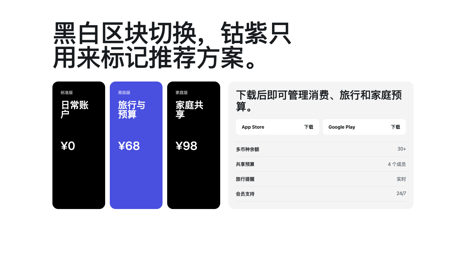
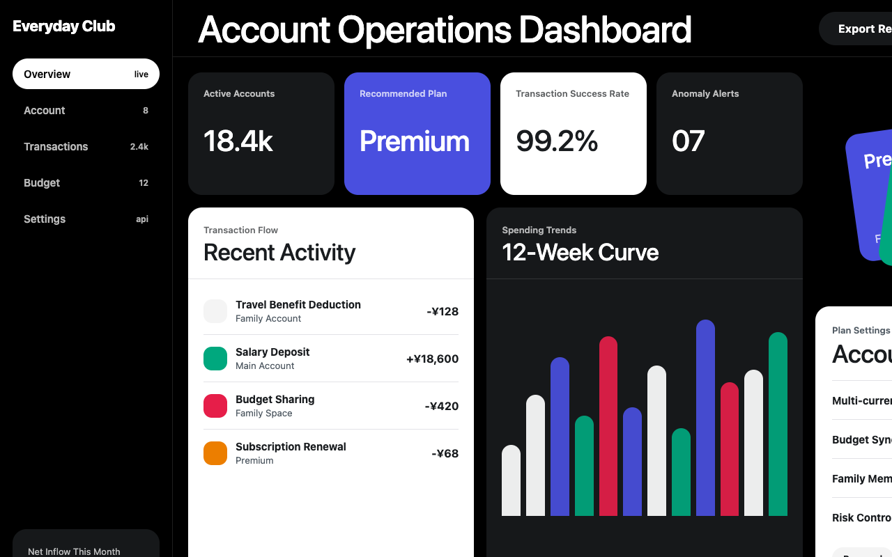

适合会员权益、消费工具和金融类产品页,黑白大场景、钴紫重点色、饱和功能卡和 pill CTA 显得年轻直接。
设计语言样张
Revolut 的样张用真黑故事区和白色目录区快速切换,超大标题压住版面,钴紫只作为少量品牌 stamp。
---
version: alpha
name: "Revolut"
description: "Revolut 的 DESIGN.md 中文参考模板,保留原始 design token 与专业术语,覆盖 color system、typography、layout、components、motion 与 interaction states。"
language: zh-CN
sourceLanguage: en
---

## 概览
Revolut 的 marketing canvas 是高对比的 two-mode system:**near-black storytelling canvas**(`{colors.canvas-dark}` - `#000000`)承载 hero band、product mockup 与 planning section;**white catalogue band**(`{colors.canvas-light}` - `#ffffff`)承载 comparison table、FAQ row 与 download tile。两个 mode 以 full-bleed band 直接切换,而不是柔和过渡;section 彼此强烈相接,形成品牌典型的 magazine-spread rhythm。

Display typography 使用 **Aeonik Pro weight 500**,尺寸从 20px 到 136px。旗舰 hero("Banking & Beyond"、"Join the 70+ million using Revolut")在 80-136px 上使用 `lineHeight: 1.0` 与紧密 negative letter-spacing。正文 字体 使用 **Inter** weight 400,开源、直接,并在 UI label 上使用 positive tracking(`0.24px`)来获得更机械、精确的 fintech 气质。

品牌 accent 是 `{colors.primary}`(`#494fdf`),一种饱和 cobalt violet,但它在 marketing surface 上使用很少。英雄区 中真正的 primary CTA 是 **black canvas 上的 white pill**("Choose your subscription");cobalt violet 主要保留给 featured plan card、white section 内的 secondary CTA 与 brand glyph。Teal、light-blue、deep-pink、light-green、warning orange、yellow 等宽 secondary palette 出现在 product mockup 与 feature illustration 内,不作为 button surface。

**Key Characteristics:**
- Two-mode canvas system:`{colors.canvas-dark}` 用于 storytelling,`{colors.canvas-light}` 用于 browsing,并以 full-bleed band 切换。
- Display typography 为 **Aeonik Pro 500**,尺寸 20-136px,display size 使用 tight `lineHeight: 1.0` 与较大 negative letter-spacing。
- 真正 primary CTA 是 `{component.button-primary}`:black canvas 上的 white pill + black text;`{colors.primary}` cobalt-violet 保留给 featured plan card 与 secondary CTA。
- 八种 saturated accent 只存在于 product mockup 与 illustration 中,从不作为 button surface。
- 按钮 全部 pill-shaped(`{rounded.full}`);content card 用 `{rounded.lg}` (20px);input 与 small chip 用 `{rounded.md}` (12px)。
- Photography 是 product-led:phone、card、terminal mockup 在 dark section 中 full-bleed 展示,无 caption overlay。

## Colors

### Brand & Accent
- **Cobalt Violet** (`{colors.primary}` - `#494fdf`): brand accent。保留给 `{component.plan-card-featured}`、brand wordmark icon 与 white-canvas region 的 secondary CTA。
- **Cobalt Bright** (`{colors.primary-bright}` - `#4f55f1`): 更亮一档,用于 inline link color 与 accent-photo header。
- **Cobalt Deep** (`{colors.primary-deep}` - `#3a40c4`): cobalt element 的 active/pressed state。
- **On-Primary** (`{colors.on-primary}` - `#ffffff`): `{colors.primary}` surface 上的 label color。

### Surface
- **Canvas Light** (`{colors.canvas-light}` - `#ffffff`): FAQ、download tile、comparison table 的 white catalogue mode。
- **Canvas Dark** (`{colors.canvas-dark}` - `#000000`): storytelling canvas,是真黑,不是 near-black。
- **Surface Soft** (`{colors.surface-soft}` - `#f4f4f4`): download tile、soft button、white band 内 inset card group 的 subtle off-white。
- **Surface Card** (`{colors.surface-card}` - `#ffffff`): white-canvas region 内的 pure white card surface。
- **Surface Deep** (`{colors.surface-deep}` - `#0a0a0a`): black-canvas region 内 inset card 的深色 surface。
- **Surface Elevated** (`{colors.surface-elevated}` - `#16181a`): planning-section card background,让 plan card 从黑色 canvas 上浮出。
- **Hairline Light** (`{colors.hairline-light}` - `#e2e2e7`): white band 内 1px divider。
- **Hairline Dark** (`{colors.hairline-dark}` - `rgba(255,255,255,0.12)`): dark region 中低对比 divider。
- **Hairline Strong** (`{colors.hairline-strong}` - `#191c1f`): structural divider 与 light card outline。

### Text
- **Ink** (`{colors.ink}` - `#191c1f`): primary 文本 color,比纯黑更暖,与 white canvas 搭配用于 body legibility。
- **Body** (`{colors.body}` - `#1f2226`): long-form body,避免 `{colors.ink}` 过锐。
- **Charcoal** (`{colors.charcoal}` - `#3a3d40`): caption 与 secondary nav。
- **Mute** (`{colors.mute}` - `#505a63`): supporting text。
- **Ash** (`{colors.ash}` - `#5c5e60`): tertiary text、footer copy。
- **Stone** (`{colors.stone}` - `#8d969e`): metadata 与 subtle caption。
- **Faint** (`{colors.faint}` - `#c9c9cd`): disabled foreground 与 hairline replacement。
- **On-Dark** (`{colors.on-dark}` - `#ffffff`): `{colors.canvas-dark}` 上的 primary text。
- **On-Dark Mute** (`{colors.on-dark-mute}` - `rgba(255,255,255,0.72)`): dark region secondary text。

### Semantic Colors
- **Accent Teal** (`{colors.accent-teal}` - `#00a87e`): product mockup illustration。
- **Accent Light Blue** (`{colors.accent-light-blue}` - `#007bc2`): dark photo header 内 inline link。
- **Accent Blue Link** (`{colors.accent-blue-link}` - `#376cd5`): white surface 默认 inline link。
- **Accent Light Green** (`{colors.accent-light-green}` - `#428619`): success / positive product callout。
- **Accent Green Text** (`{colors.accent-green-text}` - `#006400`): inline success text。
- **Accent Yellow** (`{colors.accent-yellow}` - `#b09000`): caution / pending state in product mockup。
- **Accent Warning** (`{colors.accent-warning}` - `#ec7e00`): warning illustration 中的 full-saturation orange。
- **Accent Pink** (`{colors.accent-pink}` - `#e61e49`): product photography 与 category iconography 内的 deep pink。
- **Accent Danger** (`{colors.accent-danger}` - `#e23b4a`): destructive / error state。
- **Accent Deep Red** (`{colors.accent-deep-red}` - `#8b0000`): inline error text。
- **Accent Brown** (`{colors.accent-brown}` - `#936d62`): metals tier card chrome 中的 warm-neutral。
- **Link** (`{colors.link}` - `#376cd5`): 默认 inline link color,同 `{colors.accent-blue-link}`。

## Typography

### Font Family
Revolut 使用 two-family stack:
- **Aeonik Pro**:proprietary humanist sans-serif,用于所有 display size(20px+),weight 500。它承载品牌 editorial confidence,并在大尺寸上用 negative letter-spacing 明显收紧。
- **Inter**:body、button label、caption、metadata 的 open-source workhorse,weight 400 或 600,UI label 使用 positive tracking(`0.16-0.24px`)。

若无法授权 Aeonik Pro,可用 **Inter Display**、**General Sans** 或 **Sohne** 替代;它们共享温暖几何气质。Display size 应应用 -1% letter-spacing 以接近原始紧度。

### Hierarchy

| Token | Size | Weight | Line Height | Letter Spacing | 用途 |
|---|---|---|---|---|---|
| `{typography.display-xxl}` | 136px | 500 | 1.0 | -2.72px | 旗舰 hero,每页一个 |
| `{typography.display-xl}` | 80px | 500 | 1.0 | -0.8px | 区块 opener |
| `{typography.display-lg}` | 48px | 500 | 1.21 | -0.48px | Sub-section title |
| `{typography.display-md}` | 40px | 500 | 1.2 | -0.4px | Feature card title |
| `{typography.heading-lg}` | 32px | 500 | 1.19 | -0.32px | Plan card title |
| `{typography.heading-md}` | 24px | 500 | 1.33 | 0 | 区块 sub-title |
| `{typography.heading-sm}` | 20px | 500 | 1.4 | 0 | List header、prominent label |
| `{typography.body-lg}` | 18px | 400 | 1.56 | -0.09px | Marketing prose |
| `{typography.body-md}` | 16px | 400 | 1.5 | 0.24px | Default body |
| `{typography.body-md-bold}` | 16px | 600 | 1.5 | 0.16px | Emphatic body |
| `{typography.body-sm}` | 14px | 400 | 1.43 | 0 | Caption、metadata |
| `{typography.button-lg}` | 20px | 500 | 1.4 | 0 | 英雄区 CTA(Aeonik Pro) |
| `{typography.button-md}` | 16px | 600 | 1.5 | 0.24px | Default button label |
| `{typography.button-sm}` | 14px | 600 | 1.43 | 0 | Pill chip、sub-nav |
| `{typography.caption}` | 13px | 400 | 1.4 | 0 | 页脚 disclosure、regulatory 文本 |
| `{typography.link-emph}` | 16px | 700 | 1.5 | 0.24px | Dark mode 中的 emphatic inline link |

### Principles
- Display size 始终使用 weight 500 与 `lineHeight: 1.0`(48px 以下为 1.19-1.21)。字号越大,negative letter-spacing 越强。
- 正文 Inter 使用 weight 400 与 positive tracking(`0.24px`),让 UI label 带有 fintech precision。
- 英雄区 CTA 使用 Aeonik Pro `{typography.button-lg}`;hero 以下使用 Inter `{typography.button-md}`。
- Dark photo region 内 inline link 提升到 weight 700(`{typography.link-emph}`),在不使用 cobalt accent 的情况下保持对比。

### Font Substitutes
Aeonik Pro 不可用时,display `lineHeight` 明确 clamp 到 1.0,并在 display size 上应用 -1% letter-spacing。Inter Display、General Sans 或 Sohne 最接近原始效果。Inter 是开源的,应直接用于 body。

## Layout

### Spacing System
- **Base unit**: 4px,实际 scale 以 4 / 8 / 16 的倍数工作。
- **Tokens**: `{spacing.xxs}` 4px · `{spacing.xs}` 6px · `{spacing.sm}` 8px · `{spacing.md}` 14px · `{spacing.lg}` 16px · `{spacing.xl}` 24px · `{spacing.xxl}` 32px · `{spacing.xxxl}` 48px · `{spacing.block}` 80px · `{spacing.section}` 88px · `{spacing.band}` 120px。
- 区块 padding: band 之间垂直 `{spacing.section}` (88px);hero band 与 closing planning section 使用 `{spacing.band}` (120px)。
- 卡片 internal padding: `{component.feature-card-light}`、`{component.plan-card}`、`{component.feature-card-dark}` 使用 `{spacing.xxl}` (32px)。

### Grid & Container
- **Max content width** 约 1200px;hero band full-bleed。
- **Plan grid**: home page 4-up,tablet 2-up,small mobile 1-up。
- **Feature grid**: desktop 3-up,tablet 2-up,mobile 1-up。
- **Product mockup bands**: 单个 full-width phone/card mockup hero photo,无 surrounding chrome。

### Whitespace Philosophy
Whitespace 宽松且 editorial。区块 在 88-120px 之间呼吸,使 80-136px display headline 不拥挤。卡片 内部保持 32px padding,feature copy 与 plan tier 具有一致 rhythm。White surface 上用 `{colors.hairline-light}` divider 替代 shadow,dark region 对应用 `{colors.hairline-dark}`。

## Elevation & Depth

| Level | Treatment | 用途 |
|---|---|---|
| 0 - flat | No shadow, no 边框 | 默认 light/dark canvas band、full-bleed hero |
| 1 - surface card | `{colors.surface-card}` on `{colors.surface-soft}` band | Light band 内 feature card |
| 2 - surface elevated dark | `{colors.surface-elevated}` on `{colors.canvas-dark}` | Planning section 内 plan card |
| 3 - featured surface | `{colors.primary}` on `{colors.canvas-dark}` | Featured plan card |
| 4 - product mockup | Full-bleed photo asset | 英雄区 phone / card / terminal mockup band |

系统没有传统 drop-shadow language。Depth 通过 color-blocking(light -> dark band switch)与 surface luminance shift(`{colors.canvas-dark}` -> `{colors.surface-elevated}`)表达。Photography mockup 自带资产深度。

### Decorative Depth
- **Product mockup hero bands**:home page 的 phone mockup 在 `{colors.canvas-dark}` 上 full-bleed 展示,device 自身 glow 是唯一 atmospheric depth。
- **Featured plan card**:cobalt-violet `{component.plan-card-featured}` 在 dark planning grid 中作为单个 saturated color block 标记 recommended tier。
- **卡片 metals tier**:`{colors.accent-brown}` 与 deep gradient 用于 metals card mockup,传达 premium,而非 gold-on-black metallic effect。

## Shapes

### Border Radius Scale

| Token | Value | 用途 |
|---|---|---|
| `{rounded.none}` | 0px | 英雄区 band、full-bleed section、footer |
| `{rounded.sm}` | 8px | Inline tag、small chip |
| `{rounded.md}` | 12px | Form input、download tile |
| `{rounded.lg}` | 20px | Feature card、plan card |
| `{rounded.xl}` | 28px | Product mockup container |
| `{rounded.full}` | 9999px | Button、pill、badge、tab |

### Photography Geometry
- Phone mockup: 9:19.5 vertical,device chrome 使用 `{rounded.xl}` corner。
- 卡片 mockup: 1.586:1 credit-card aspect,使用 `{rounded.lg}` corner。
- Terminal/POS mockup: 4:3,使用 `{rounded.xl}` corner,并在 device 周围保留充足 padding。
- Lifestyle photography 少见,通常为 16:9,使用 `{rounded.lg}` corner。

## Components

### Buttons

**`button-primary`** — dark 上的 white CTA。
- 背景 `{colors.canvas-light}`,label `{colors.canvas-dark}`,字体 `{typography.button-md}`,内距 `14px 28px`,`rounded: {rounded.full}`,高度 48px。
- 品牌 primary CTA,用于所有 dark hero band。
- 按下状态 `button-primary-pressed` 使用 `{colors.faint}` background。

**`button-dark`** — light 上的 dark CTA。
- 背景 `{colors.canvas-dark}`,label `{colors.on-dark}`,字体 `{typography.button-md}`,`rounded: {rounded.full}`。
- 是 `{component.button-primary}` 的 reverse-canvas equivalent,用于 white catalogue band。

**`button-soft`**
- 背景 `{colors.surface-soft}`,label `{colors.ink}`,字体 `{typography.button-md}`,`rounded: {rounded.full}`。
- White-canvas region 内的 tertiary action。

**`button-outline-light`**
- 背景 `{colors.canvas-light}`,label `{colors.ink}`,1px solid `{colors.hairline-strong}`,字体 `{typography.button-md}`,`rounded: {rounded.full}`。

**`button-outline-dark`**
- 背景 `{colors.canvas-dark}`,label `{colors.on-dark}`,1px solid `{colors.on-dark}`,字体 `{typography.button-md}`,`rounded: {rounded.full}`,内距 `13px 27px`,高度 48px。

**`button-pill-sm`**
- 背景 `{colors.surface-soft}`,label `{colors.ink}`,字体 `{typography.button-sm}`,`rounded: {rounded.full}`,内距 `8px 16px`,高度 36px。
- 用于 sub-nav chip 与 filter pill。

### Cards & Containers

**`hero-band-dark`**
- 背景 `{colors.canvas-dark}`,文本 `{colors.on-dark}`,title 字体 `{typography.display-xxl}`,内距 `{spacing.section}` vertical,`rounded: {rounded.none}`。
- 只用于 home page hero band。

**`hero-band-photo`**
- 背景 `{colors.canvas-dark}` + full-bleed product photography,文本 `{colors.on-dark}`,字体 `{typography.display-xl}`,`rounded: {rounded.none}`。
- 用于 product page,phone 或 card mockup 作为 full-band canvas。

**`feature-card-light`**
- 背景 `{colors.surface-card}`,文本 `{colors.ink}`,1px solid `{colors.hairline-light}`,字体 `{typography.body-md}`,`rounded: {rounded.lg}`,内距 `{spacing.xxl}`。
- 用于 white catalogue band 内的 feature comparison。

**`feature-card-dark`**
- 背景 `{colors.surface-elevated}`,文本 `{colors.on-dark}`,字体 `{typography.body-md}`,`rounded: {rounded.lg}`,内距 `{spacing.xxl}`。
- 用于 dark storytelling section。

**`plan-card`**
- 背景 `{colors.surface-elevated}`,文本 `{colors.on-dark}`,字体 `{typography.body-md}`,`rounded: {rounded.lg}`,内距 `{spacing.xxl}`。
- Plan name 使用 `{typography.heading-lg}`("Standard", "Plus", "Premium", "Metal", "Ultra")。

**`plan-card-featured`**
- 背景 `{colors.primary}`,文本 `{colors.on-primary}`,字体 `{typography.body-md}`,`rounded: {rounded.lg}`,内距 `{spacing.xxl}`。
- `{component.plan-card}` 的 cobalt-violet inversion,用于 recommended tier。

**`product-mockup`**
- 背景 `{colors.canvas-dark}`,asset 自身填满 band,device chrome 使用 `rounded: {rounded.xl}`。
- Phone、card、terminal mockup;无 caption overlay、无 surrounding chrome。

**`download-tile`**
- 背景 `{colors.surface-soft}`,文本 `{colors.ink}`,字体 `{typography.body-sm}`,`rounded: {rounded.md}`,内距 `12px 20px`,高度 56px。
- App Store 与 Google Play download button 并排使用。

### Inputs & Forms

**`text-input`**
- 背景 `{colors.canvas-light}`,文本 `{colors.ink}`,字体 `{typography.body-md}`,1px solid `{colors.hairline-light}`,`rounded: {rounded.md}`,内距 `14px 16px`,高度 56px。
- 高度充足,适合 fintech accessibility,并显著超过 WCAG AAA touch target。

### 导航

**`nav-bar`** — desktop top nav。
- 背景 `{colors.canvas-dark}`,文本 `{colors.on-dark}`,字体 `{typography.button-md}`,高度 64px。
- Left: wordmark logo。Centre: "Personal" / "Business" / "Company"。Right: language switcher + "Log in" + `{component.button-primary}`。

**`nav-bar`** (mobile)
- 高度仍为 64px,中间 nav 折叠为 hamburger。Logo 保持左侧,sign-in CTA 保持右侧。

**`sub-nav-pill`**
- Dark section 内的水平 pill row,例如 "Personal"、"Business"、"Premium",使用 `{component.sub-nav-pill}` styling。

### Signature Components

**`badge-tag`**
- 背景 `{colors.surface-soft}`,文本 `{colors.ink}`,字体 `{typography.caption}`,`rounded: {rounded.full}`,内距 `4px 12px`。

**`badge-feature`**
- 背景 `{colors.primary}`,文本 `{colors.on-primary}`,字体 `{typography.caption}`,`rounded: {rounded.full}`,内距 `4px 12px`。
- 用于 "New"、"Most popular" badge,并锚定在 plan card 上。

**`footer`**
- 背景 `{colors.canvas-dark}`,文本 `{colors.on-dark-mute}`,字体 `{typography.body-sm}`,`rounded: {rounded.none}`,内距 `80px 24px`。
- Multi-column quick-links grid 位于 copyright + regulatory disclosure block 上方,中间以 `{colors.divider-soft}` 分隔。

## 使用建议与禁忌

### 应该
- 在 `{colors.canvas-dark}` storytelling band 与 `{colors.canvas-light}` catalogue band 之间 full-band 切换;two-mode rhythm 是核心。
- Dark hero band 上使用 `{component.button-primary}`(white pill on dark)作为 primary CTA。
- 将 `{colors.primary}` 保留给 featured plan card 与 brand wordmark;cobalt 应像 deliberate stamp,而不是 color theme。
- 英雄区 headline 使用 **Aeonik Pro 500**,80-136px,`lineHeight: 1.0`,并使用大幅 negative letter-spacing。
- Body、button label、caption 使用 **Inter**,不要用 Aeonik Pro 替代 body type。
- 按钮 与 pill 全部使用 `{rounded.full}`;feature / plan card 使用 `{rounded.lg}`;input 使用 `{rounded.md}`。
- Product mockup 在 dark section 内 full-bleed 展示,asset 本身就是 section。
- Wide accent palette 只用于 product illustration 与 iconography。

### 不要
- 不要把 accent color(如 `{colors.accent-teal}`、`{colors.accent-pink}`)用作 button surface。
- 不要使用 near-black canvas;品牌是 `#000000`,不是 `#0a0a0a`。
- 不要在 body content 中把 white 文本 与 cobalt violet 大面积搭配;`{colors.primary}` 是 featured plan card surface,不是 prose background。
- 不要给 card 添加 drop shadow;elevation 来自 canvas + surface-luminance shift。
- 不要引入 secondary brand color;cobalt violet 是唯一 brand stamp。
- Display size 上不要把 Aeonik Pro `lineHeight` 放松到 1.0 以上,tight stacking 是结构。
- 不要把 body Inter 提升到 weight 500;只使用 400 或 600。
- Dark surface ladder 只有 `{colors.canvas-dark}` 与 `{colors.surface-elevated}` 两步,不要再叠加其它 dark surface。

## Responsive Behavior

### Breakpoints

| Name | Width | Key Changes |
|---|---|---|
| Desktop XL | >= 1440px | 4-up plan grid,full-bleed product mockup band,max content 1200 |
| Desktop | 1280-1439px | Container 收窄;xl side 内距 |
| Tablet Large | 1024-1279px | Plan grid 4-up;feature grid 3-up |
| Tablet | 768-1023px | Plan grid 2-up;feature grid 2-up |
| Mobile Large | 426-767px | Plan / feature grid 1-up;nav 折叠为 hamburger;hero `display-xxl` clamp 到 64px |
| Mobile | <= 425px | 所有 grid 1-up;hero clamp 到 48px;section 内距 `{spacing.section}` 收到 64px |

### Touch Targets
- 所有 button 最小 48px 高,超过 WCAG AAA 44px;默认 `{component.button-primary}` 为 48px。
- `{component.text-input}` 高 56px,符合 fintech-grade accessibility。
- `{component.button-pill-sm}` (36px) 在 mobile 通过 内距 adjustment 提升到 44px。

### Collapsing Strategy
- Top-level nav 在 < 1024px 折叠为 hamburger;wordmark 与 `{component.button-primary}` 保持锚定。
- 英雄区 `{typography.display-xxl}` 按 136px -> 80px -> 64px -> 48px clamp。
- Plan grid 在 < 1024px 从 4-up 到 2-up,在 < 768px 到 1-up。
- Product mockup band 全 breakpoint 保持 full-bleed,asset 向内裁切而不是 letterbox。
- Sub-nav pill 在 < 768px 从 wrap row 转为 horizontal scroll-rail。

### Image Behavior
- Phone 与 card mockup 提供 1.5x 与 2x DPR;768px 以下换用较小 hero crop。
- Product photography 在所有 breakpoint 保持自身 atmospheric lighting,不使用 responsive variant asset。

## Iteration Guide

1. 一次只聚焦 ONE component。多数 surface 共享 `{colors.canvas-dark}` / `{colors.canvas-light}`,button 用 `{rounded.full}`,card 用 `{rounded.lg}`。
2. 直接引用 component name 与 token(`{colors.primary}`, `{component.plan-card-featured}`, `{rounded.lg}`),不要改写。
3. 修改后运行 `npx @google/design.md lint DESIGN.md`;orphaned-tokens warning 会捕获未使用 entry。
4. 新 variant 作为独立 entry 添加(`-pressed`, `-featured`, `-disabled`),不要埋在 prose 内。
5. 正文 字体 默认 `{typography.body-md}`(Inter 400 + positive tracking);只在 emphasis 时使用 `{typography.body-md-bold}`。
6. 保持 `{colors.primary}` 稀缺;若同一 viewport 出现多个 cobalt-violet element,考虑将其中一个降为 `{component.plan-card}`(`{colors.surface-elevated}`)。

## Known Gaps

- Pressed/active visual state 只记录了 `button-primary-pressed`;其它 component 依赖 browser default focus-ring 作为 feedback。
- Logged-in app surface(transactions、transfers、account settings)不在范围内;本文只记录 public marketing canvas。
- Wide accent palette 来自 extracted token set,但 product illustration 内具体使用随市场与产品线变化,应按 illustration 单独记录,而不是作为 system button。
- Mobile-app screenshot art direction(phone bezel、status bar)属于 product photography,不标准化为 design token。


