

01 / 03
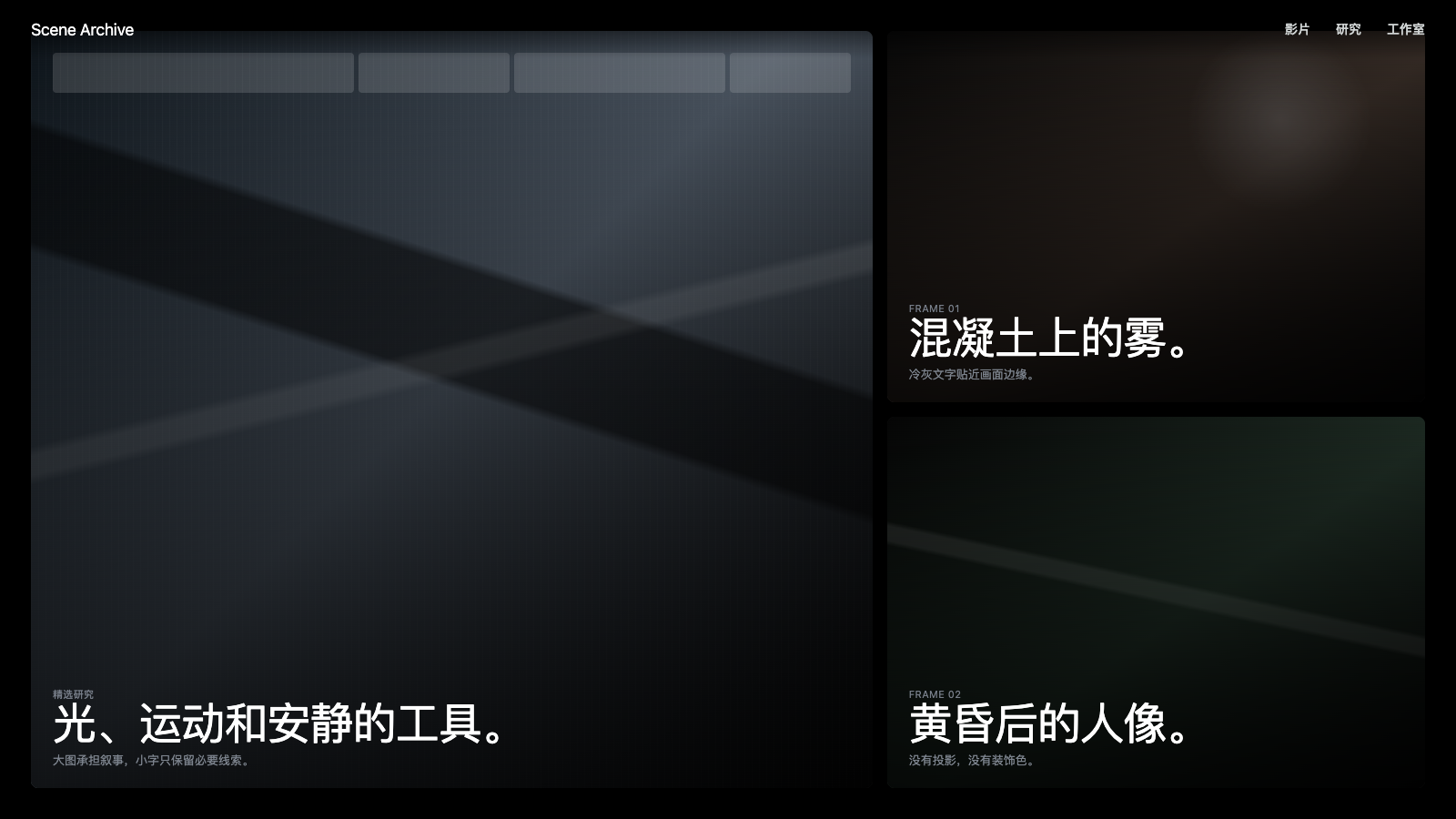
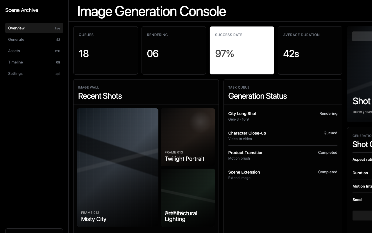

适合影像作品集、创作工具和视觉研究页,暗色电影感、全幅影像区和紧排单字体让内容成为主角。
设计语言样张
---
version: alpha
name: "Runwayml"
description: "Runwayml 的 DESIGN.md 中文参考模板,保留原始 design token 与专业术语,覆盖 color system、typography、layout、components、motion 与 interaction states。"
language: zh-CN
sourceLanguage: en
---

# Runway 启发的设计系统

## 1. 视觉主题与氛围

Runway 的界面像一卷被带到网页上的 cinematic reel:dark、editorial、film-production-grade 的设计,其中 full-bleed photography 和 video 本身就是 primary UI element。这不是典型 tech product page,而是 AI-powered creativity 的视觉宣言。每个 section 都像电影中的一帧:戏剧性光线、广阔风景、亲密的人物瞬间,都由高质量图像捕捉,并主导 viewport。

设计语言建立在单一字体 **abcNormal** 上,这是一套干净的 geometric sans-serif,覆盖从 48px display headline 到 11px uppercase label 的所有角色。这种单字体承诺创造了极强的 typographic uniformity,让视觉内容比文字更响亮。Headline 使用紧凑 line-height(1.0)和 negative letter-spacing(-0.9px 到 -1.2px),形成压缩文本块,更像 film title,而不是 marketing copy。

Runway 的独特之处在于它彻底把 visual content 当作 design。它不使用 icon 或 diagram 说明功能,而是展示真实 AI-generated 和 AI-enhanced imagery:穿越电影感景观的汽车、艺术肖像、建筑渲染。界面本身退到近乎不可见:minimal border、zero shadow、subtle cool-gray text,以及将注意力最大程度放到摄影上的 dark palette。

**Key Characteristics:**
- Cinematic full-bleed photography 和 video 作为 primary UI element
- 单一字体系统:abcNormal 覆盖从 display 到 micro label 的所有文字
- Dark-dominant palette,搭配 cool-toned neutral(#767d88, #7d848e)
- Zero shadow、minimal border;界面被有意设计为不可见
- Tight display typography(line-height 1.0),带 negative tracking(-0.9px 到 -1.2px)
- Uppercase label 使用 positive letter-spacing,形成导航结构
- 小型 uppercase text 使用不常见的中间 weight 450,体现 precision craft
- Editorial magazine layout,使用 mixed-size image grid

## 2. 色彩 palette 与角色

### Primary
- **Runway Black** (`#000000`): Primary page background 和 maximum-emphasis text。
- **Deep Black** (`#030303`): 几乎不可察觉的 variant,用于 layered dark surface。
- **Dark Surface** (`#1a1a1a`): Card background 和 elevated dark container。
- **Pure White** (`#ffffff`): Dark surface 上的 primary text,以及 light-section background。

### Surface & Background
- **Near White** (`#fefefe`): 最浅 surface,几乎与 pure white 无法区分。
- **Cool Cloud** (`#e9ecf2`): 带 cool blue-gray tint 的 light section background。
- **Border Dark** (`#27272a`): 唯一 dark-mode border color,提供几乎不可见的 containment。

### Neutrals & Text
- **Charcoal** (`#404040`): Light surface 上的 primary body text 和 secondary text。
- **Near Charcoal** (`#3f3f3f`): 略浅 variant,用于 dark-section secondary text。
- **Cool Slate** (`#767d88`): Secondary body text,明显偏 blue-gray 的 cool neutral。
- **Mid Slate** (`#7d848e`): Tertiary text、metadata description。
- **Muted Gray** (`#a7a7a7`): De-emphasized content、timestamp。
- **Cool Silver** (`#c9ccd1`): Light border 和 divider。
- **Light Silver** (`#d0d4d4`): 最浅 border/divider variant。
- **Tailwind Gray** (`#6b7280`): 用于 supplementary text 的标准 Tailwind neutral。
- **Dark Link** (`#0c0c0c`): 最深 link text,接近黑色。
- **Footer Gray** (`#999999`): Footer link 和深度 muted content。

### Gradient System
- **Interface 中没有 gradient system。** 视觉丰富度完全来自 photographic content;AI-generated 和 enhanced imagery 提供设计所需的所有 color 和 gradient。界面本身刻意保持无色。

## 3. Typography 规则

### Font Family
- **Universal**: `abcNormal`,fallback 为 `abcNormal Fallback`

*Note: abcNormal 是定制 geometric sans-serif。外部实现可用 Inter 或 DM Sans 作为接近替代。*

### Hierarchy

| 角色 | Font | Size | Weight | Line Height | Letter Spacing | 说明 |
|------|------|------|--------|-------------|----------------|-------|
| Display / Hero | abcNormal | 48px (3rem) | 400 | 1.00 (tight) | -1.2px | 最大尺寸,具备 film-title presence |
| Section Heading | abcNormal | 40px (2.5rem) | 400 | 1.00–1.10 | -1px to 0px | Feature section title |
| Sub-heading | abcNormal | 36px (2.25rem) | 400 | 1.00 (tight) | -0.9px | Secondary section marker |
| Card Title | abcNormal | 24px (1.5rem) | 400 | 1.00 (tight) | normal | Article 和 card heading |
| Feature Title | abcNormal | 20px (1.25rem) | 400 | 1.00 (tight) | normal | Small heading |
| Body / Button | abcNormal | 16px (1rem) | 400–600 | 1.30–1.50 | -0.16px to normal | Standard body、nav link |
| Caption / Label | abcNormal | 14px (0.88rem) | 500–600 | 1.25–1.43 | 0.35px (uppercase) | Metadata、section label |
| Small | abcNormal | 13px (0.81rem) | 400 | 1.30 (tight) | -0.16px to -0.26px | Compact description |
| Micro / Tag | abcNormal | 11px (0.69rem) | 450 | 1.30 (tight) | normal | Uppercase tag、tiny label |

### Principles
- **一套字体,完整表达**:abcNormal 处理每个文本角色。设计通过 size、weight、case 和 letter-spacing 获得变化,而不是切换 font-family。
- **处处紧凑**:几乎每个尺寸都使用 line-height 1.0–1.30;即使 body text 也相对压缩。这创造了 dense、editorial feel。
- **Weight 450 是精度细节**:部分小型 uppercase label 使用 weight 450,这是 regular (400) 与 medium (500) 之间少见的中间值。这种 micro-craft 传达 typographic sophistication。
- **Negative tracking 作为默认**:即使 body text 也使用 -0.16px 到 -0.26px letter-spacing,让所有内容比默认略紧。
- **Uppercase 作为结构**:14px 和 11px 的 label 使用 `text-transform: uppercase` 和 positive letter-spacing(0.35px),形成与紧凑 lowercase text 对比的导航路标。

## 4. Component 样式

### Buttons
- Text: 14px abcNormal,weight 600
- Background: 通常 transparent 或 dark,搭配 minimal border
- Radius: button-like link 使用小圆角(4px)
- Button design 极度克制;未发现 heavy fill 或 border
- Interactive element 融入 editorial flow

### Cards & Containers
- Background: transparent 或 Dark Surface (`#1a1a1a`)
- Border: `1px solid #27272a`(dark mode),几乎不可见的 containment
- Radius: 功能元素使用小圆角(4–8px);alert-style container 使用 16px
- Shadow: zero;任何元素都没有 shadow
- Card 主要是 photographic;image 本身就是 card

### Navigation
- Minimal horizontal nav,覆盖在 hero content 上时透明
- Logo: white/black 的 Runway wordmark
- Links: 16px abcNormal,weight 400–600
- Hover: text 切换为 white 或更高 opacity
- 极其 subtle,设计目标是不与 visual content 竞争

### Image Treatment
- Full-bleed cinematic photography 和 video 占据主导
- AI-generated content 以大尺度作为 primary visual element 展示
- Mixed-size image grid 创造 editorial magazine layout
- Hero image 上使用 dark overlay,保证文本可读性
- Product screenshot 使用 subtle rounded corner(8px)

### Distinctive Components

**Cinematic Hero**
- Full-viewport image 或 video,叠加 text overlay
- Headline 使用 48px abcNormal,white on dark imagery
- Image 始终具备 cinematic quality,即 film-grade composition

**Research Article Cards**
- Photographic thumbnail 搭配 article title
- Mixed-size grid layout(large feature + smaller supporting)
- 干净的 text overlay 或 below-image caption style

**Trust Bar**
- Company logo(跨行业领先组织)
- 干净的 monochrome treatment
- Horizontal layout,spacing 宽松

**Mission Statement**
- "We are building AI to simulate the world through imagination, art and aesthetics"
- Dark background 上使用 white text
- 情绪化收束:artistic and philosophical

## 5. Layout 原则

### Spacing System
- Base unit: 8px
- Scale: 4px, 6px, 8px, 12px, 16px, 20px, 24px, 28px, 32px, 48px, 64px, 78px
- Section vertical spacing: generous(48–78px)
- Component gaps: 16–24px

### Grid & Container
- Max container width: 最高 1600px(cinema-wide)
- Hero: full-viewport、edge-to-edge
- Content section: 居中,带宽松 margin
- Image grid: asymmetric、magazine-style mixed sizes
- Footer: full-width dark section

### Whitespace Philosophy
- **Cinema-grade breathing**:section 之间的大垂直间距创造类似观看场景切换的滚动体验。
- **Images replace whitespace**:其它站点使用空白的地方,Runway 用摄影填充。Visual content 本身就是呼吸空间。
- **Editorial grid asymmetry**:image grid 有意使用不同尺寸;large hero image 配合 smaller supporting image,创造视觉节奏。

### Border Radius Scale
- Sharp (4px): Button、小型 interactive element
- Subtle (6px): Link、小 container
- Comfortable (8px): Standard container、image card
- Generous (16px): Alert-style container、featured element

## 6. Depth 与 Elevation

| Level | Treatment | 用途 |
|-------|-----------|-----|
| Flat (Level 0) | 无 shadow、无 border | 几乎所有内容,主导状态 |
| Bordered (Level 1) | `1px solid #27272a` | 仅 alert container |
| Dark Section (Level 2) | Dark bg (#000000 / #1a1a1a) with light text | Hero、feature、footer |
| Light Section (Level 3) | White/Cool Cloud bg with dark text | Content section、research |

**Shadow Philosophy**: Runway 使用 **zero shadows**。这是 film-production 设计决策;在电影中,depth 来自 lighting、focus 和 composition,而不是 drop shadow。界面也复现这一哲学:depth 通过 dark/light section alternation、photographic depth-of-field 和 overlay transparency 传达,绝不通过 CSS box-shadow。

## 7. Do's and Don'ts

### Do
- 使用 full-bleed cinematic photography 作为 primary visual element
- 所有文本使用 abcNormal,维持 single-typeface commitment
- Display line-height 保持 1.0,并使用 negative letter-spacing 形成 film-title density
- Secondary text 使用 cool-gray neutral palette(#767d88, #7d848e)
- 保持 zero shadows;depth 来自 photography 和 section background
- Navigational label 使用 uppercase + letter-spacing(14px,0.35px spacing)
- 应用小 border-radius(4–8px);设计不是 pill-shaped
- 让 visual content(photo、video)主导;UI 应该不可见
- Micro label 使用 weight 450;这种精度很重要

### Don't
- 不要给 interface 添加 decorative color;唯一颜色来自 photography
- 不要使用 heavy border 或 shadow;interface 必须近乎不可见
- 不要使用 pill-shaped radius;Runway 的几何是 subtle rounded,不是 circular
- 不要使用 bold (700+) weight;400–600 是完整范围,450 是 precision tool
- 不要与 visual content 竞争;text overlay 应该 minimal 且 restrained
- 不要在 interface 中使用 gradient background;gradient 只存在于 photography 中
- 不要使用超过一套 typeface;abcNormal 处理一切
- Body line-height 不要超过 1.50;紧凑 editorial feel 是核心
- 不要降低图像质量;cinematic photography 就是设计

## 8. Responsive Behavior

### Breakpoints
| Name | Width | Key Changes |
|------|-------|-------------|
| Mobile | <640px | Single column、stacked images、hero text 缩小 |
| Tablet | 640–768px | 开始使用 2-column image grid |
| Small Desktop | 768–1024px | 标准 layout |
| Desktop | 1024–1280px | Full layout、expanded hero |
| Large Desktop | 1280–1600px | Maximum cinema-width container |

### Touch Targets
- Navigation link 保持舒适的 16px
- Article card 作为大型 touch target
- Button 为 14px weight 600,并有足够 padding

### Collapsing Strategy
- **Navigation**: Mobile 上折叠为 hamburger
- **Hero**: 保持 full-bleed,文本缩小
- **Image grids**: Multi-column → 2-column → single column
- **Research articles**: Feature-size card → stacked full-width
- **Trust logos**: Horizontal scroll 或 reduced grid

### Image Behavior
- Cinematic image 按比例缩放
- Full-bleed hero 在所有尺寸下保持
- Image grid reflow 为更少列
- Video content 保持 aspect ratio

## 9. Agent Prompt Guide

### Quick Color Reference
- Background Dark: "Runway Black (#000000)"
- Background Light: "Pure White (#ffffff)"
- Primary Text Dark: "Charcoal (#404040)"
- Secondary Text: "Cool Slate (#767d88)"
- Muted Text: "Muted Gray (#a7a7a7)"
- Light Border: "Cool Silver (#c9ccd1)"
- Dark Border: "Border Dark (#27272a)"
- Card Surface: "Dark Surface (#1a1a1a)"

### Example Component Prompts
- "Create a cinematic hero section: full-bleed dark background with a cinematic image overlay. Headline at 48px abcNormal weight 400, line-height 1.0, letter-spacing -1.2px in white. Minimal text below in Cool Slate (#767d88) at 16px."
- "Design a research article grid: one large card (50% width) with a cinematic image and 24px title, next to two smaller cards stacked. All images with 8px border-radius. Titles in white (dark bg) or Charcoal (#404040, light bg)."
- "Build a section label: 14px abcNormal weight 500, uppercase, letter-spacing 0.35px in Cool Slate (#767d88). No border, no background."
- "Create a trust bar: company logos in monochrome, horizontal layout with generous spacing. On dark background with white/gray logo treatments."
- "Design a mission statement section: Runway Black background, white text at 36px abcNormal, line-height 1.0, letter-spacing -0.9px. Centered, with generous vertical padding."

### Iteration Guide
1. Visual content first;始终包含 cinematic photography。
2. 所有内容使用 abcNormal;指定 size 和 weight,不要更换字体。
3. 保持 interface invisible;不要 heavy border、shadow 或 bright color。
4. Secondary text 使用 cool slate gray(#767d88, #7d848e),不要用 warm gray。
5. Uppercase label 需要 letter-spacing(0.35px);不要 tight uppercase。
6. Dark section 应真正黑暗(#000000 或 #1a1a1a);不要用 medium gray 作为 surface。


