

01 / 03
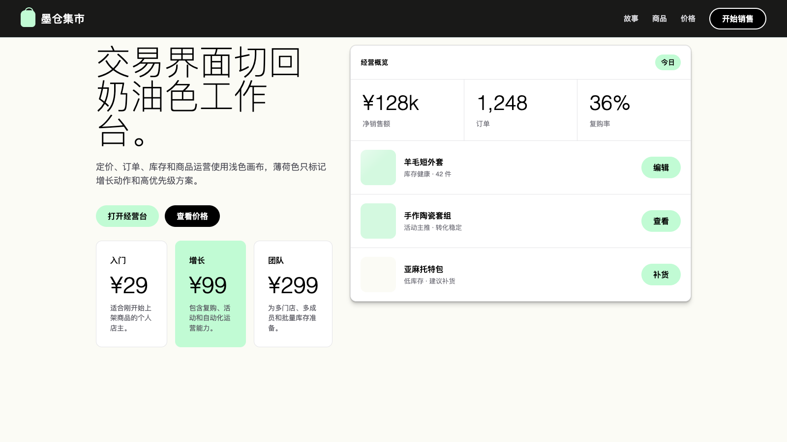
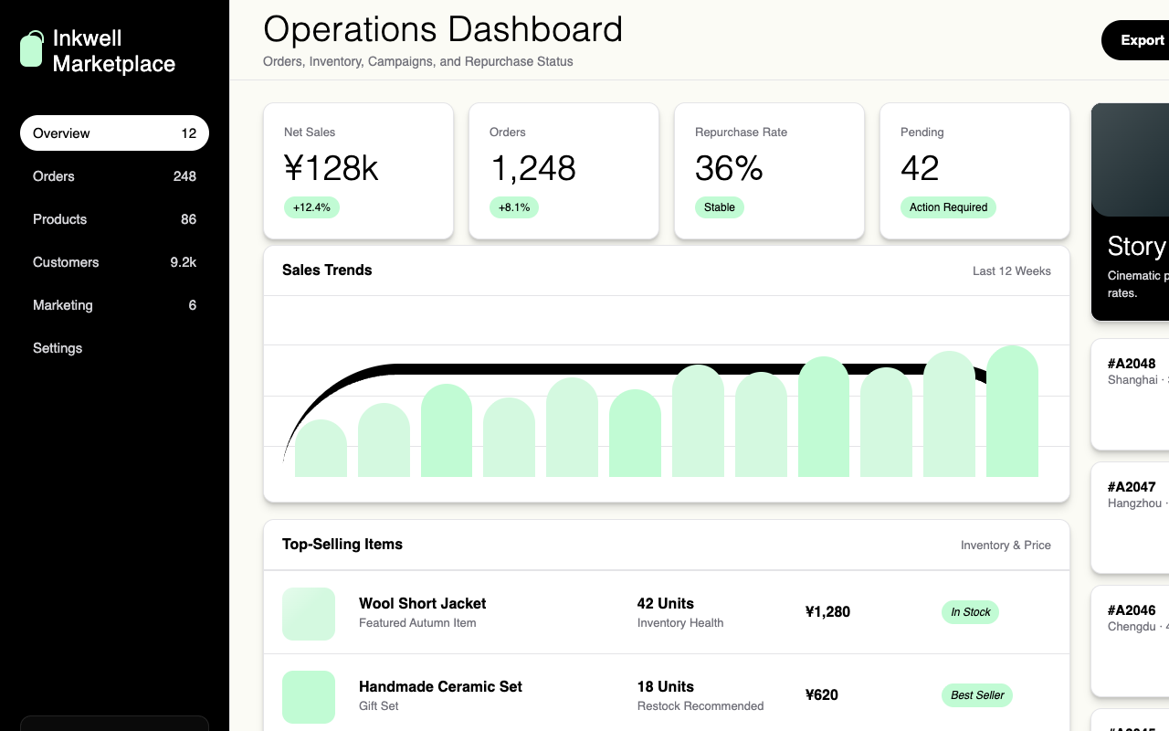

适合电商、商家增长和交易后台,用黑色电影感营销页搭配奶油薄荷交易界面。
设计语言样张
纯黑画布、全出血摄影、330 细字重巨型标题和白描边 pill 构成高端杂志感。
---
version: alpha
name: "Shopify"
description: "Shopify 的 DESIGN.md 中文参考模板,保留原始 design token 与专业术语,覆盖 color system、typography、layout、components、motion 与 interaction states。"
language: zh-CN
sourceLanguage: en
---

## 概览
Shopify 运行两条平行的 design track:它们共享 typographic DNA 和同一套 button vocabulary,但 canvas polarity 不同。Marketing track 位于 `{colors.canvas-night}` (`#000000`) 上:full-bleed cinematic photography 展示商家,巨大的 `{typography.display-xxl}` headline 使用 Neue Haas Grotesk Display、weight 330(一种 thin、近乎 editorial 的 cut),并且每个 band 只有一个 CTA:white-stroked black pill,形式为 `button-outline-on-dark`。页面读起来像高端 print magazine 的跨页:大量 black、大量 negative space、不与文字竞争的 photography,以及每个 band 只有一个 action。

Transactional track 切换到 `{colors.canvas-light}` 和 `{colors.canvas-cream}`(比 pure white 只暖一点的 off-white)。Pricing tier、comparison table 和 signup flow 位于更浅 canvas 上,使用同一 pill button system,但 polarity 反转(solid black pill + white text,或者 featured / "Start free trial" tier 使用 `{colors.aloe-10}` mint pill)。Accent:`{colors.aloe-10}` mint 和 `{colors.pistachio-10}` pistachio 只出现在 light track,绝不出现在 cinematic dark hero page。

Typography 分为三套 family。**Neue Haas Grotesk Display** 以 thin weight(330–500)处理所有 display、headline 和 editorial moment;品牌 identity 就是这套 thin display cut。**Inter Variable** 以 420–550 weight 处理所有 UI body、button label、caption 和 form field;utility text 不与 display 竞争。**ui-monospace** 只出现在 code block 和少见的 technical eyebrow 中。三套 family 都启用 OpenType `ss03` stylistic set;这是品牌的 character-level signature,并被全局应用。

**Key Characteristics:**
- Two-canvas system:`{colors.canvas-night}` 用于 cinematic marketing,`{colors.canvas-light}` / `{colors.canvas-cream}` 用于 transactional surface;二者绝不混用。
- Pill-shape(`{rounded.pill}`)是两条 track 中唯一 button shape;button 不存在 rounded rectangle。
- Thin-weight (330) display typography 是 signature;96px / weight 330 的 `{typography.display-xxl}` 是品牌最响亮的视觉。
- Aloe 和 pistachio greens(`{colors.aloe-10}`、`{colors.pistachio-10}`)只留给 light track,用来表示 commerce、growth、transactional success。
- Cinematic track 上 photography 是 full-bleed、edge-to-edge,绝不 inset 到 card 中;merchant 和 storefront imagery 承担其它系统里 gradient 和 illustration 的视觉工作。
- OpenType `ss03` stylistic set 在每个 text role 中启用,是贯穿两条 track 的 character-level unifier。
- Display size 上的 tight letter-spacing(96px display 使用 2.4px positive tracking)为 thin weight 提供额外 optical air。

## Colors

> **Source pages:** home (`/`), `/start`, `/website/builder`, `/pricing`.

### Brand & Accent
- **Aloe** (`{colors.aloe-10}` — `#c1fbd4`): Featured-tier 和 "growth" accent。用于 light surface 上的 pill button background,也用于 pricing comparison band 中的 feature-card fill。
- **Pistachio** (`{colors.pistachio-10}` — `#d4f9e0`): 比 aloe 更柔和;在 light track 中作为 wide section band fill,用来表示另一类 feature,但不离开 green family。
- **Cool Link Tones** (`{colors.link-cool-1}` `#9dabad`, `{colors.link-cool-2}` `#9797a2`, `{colors.link-cool-3}` `#bdbdca`, `{colors.link-mint}` `#99b3ad`): Dark surface 上的 muted footer / tertiary link color,用来在 primary white type 之下创建安静层级。

### Surface
- **Canvas Night** (`{colors.canvas-night}` — `#000000`): Pure black hero、cinematic feature page、footer。
- **Canvas Night Elevated** (`{colors.canvas-night-elevated}` — `#0a0a0a`): Cinematic surface 上的 card、video frame。
- **Surface Elevated Dark** (`{colors.surface-elevated-dark}` — `#1e2c31`): 带 dark teal 偏移的 surface,用于少量 dark card,在不破坏 black 的前提下引入 subtle depth。
- **Canvas Light** (`{colors.canvas-light}` — `#ffffff`): Pricing、signup、comparison table。
- **Canvas Cream** (`{colors.canvas-cream}` — `#fbfbf5`): 略暖的 off-white,用于 pricing-page background canvas;与 `#ffffff` 几乎不可见地不同,但增加 editorial warmth。
- **Hairline Light** (`{colors.hairline-light}` — `#e4e4e7`): Light card 和 table divider 上的 1px border。
- **Hairline Dark** (`{colors.hairline-dark}` — `#1e2c31`): 少数具有 visible chrome 的 dark card 上的 1px border。

### Shade Ladder
- **Shade-30** (`{colors.shade-30}` — `#d4d4d8`): Tag / chip background on light, footer hairline on dark.
- **Shade-40** (`{colors.shade-40}` — `#a1a1aa`): Tertiary text on light, secondary text on dark.
- **Shade-50** (`{colors.shade-50}` — `#71717a`): Secondary text on light.
- **Shade-60** (`{colors.shade-60}` — `#52525b`): Tertiary text on light, deep on dark.
- **Shade-70** (`{colors.shade-70}` — `#3f3f46`): Pressed-state of the primary pill button; deep dark surface accent.

### Text
- **Ink** (`{colors.ink}` — `#000000`): Light canvas 上的所有 text。
- **On Primary** (`{colors.on-primary}` — `#ffffff`): Dark canvas 上的所有 text,以及 filled-pill label。

## Typography

### Font Family

Display tier 是 thin weight(330–500)的 **Neue Haas Grotesk Display**。不可用时 fallback 到 light weight 的 **Helvetica**,再到 Arial。Thin-weight cut 就是品牌;任何 substitute 都不应默认使用 weight 400+。

UI tier 是 420–550 的 **Inter Variable**,这是一套具备 sub-weight precision 的 variable font,让系统能覆盖 body (420)、strong (550) 和 caption (500),而无需跳到更重 tier。Inter 可通过 Google Fonts 获取,是 open-source。

Code tier 是 **ui-monospace**,也就是 system mono;优先于 webfont mono,以避免不必要下载。

OpenType `ss03` stylistic set 在每个 role 中启用。它会改变特定 glyph form(lowercase `a`、`g`、single-story numeral),带来略更 geometric 的性格。通过 body element 或 root 上的 `font-feature-settings: "ss03"` 应用。

### Hierarchy

| Token | Size | Weight | Line Height | Letter Spacing | 用途 |
|---|---|---|---|---|---|
| `{typography.display-xxl}` | 96px | 330 | 1.0 | 2.4px | Cinematic hero headline |
| `{typography.display-xl}` | 70px | 330 | 1.0 | 0 | Cinematic page 上的 section opener |
| `{typography.display-lg}` | 55px | 330 | 1.16 | 0 | Pricing-page page title |
| `{typography.display-md}` | 48px | 330 | 1.14 | 0 | Light track 上的 sub-section headline |
| `{typography.heading-xl}` | 28px | 500 | 1.28 | 0.42px | Card title / pricing tier name |
| `{typography.heading-lg}` | 24px | 400 | 1.14 | 0.36px | Compact card title |
| `{typography.heading-md}` | 20px | 500 | 1.4 | 0.3px | Section sub-heading |
| `{typography.heading-sm}` | 18px | 500 | 1.25 | 0.72px | Eyebrow / mini-section label |
| `{typography.body-lg}` | 18px | 550 | 1.56 | 0 | Marketing body lead、large body |
| `{typography.body-md}` | 16px | 420 | 1.5 | 0 | Default UI body、pill-button label |
| `{typography.body-strong}` | 16px | 550 | 1.5 | 0 | Emphasized body run |
| `{typography.caption}` | 14px | 500 | 1.49 | 0.28px | Helper copy、footnote |
| `{typography.micro}` | 13px | 500 | 1.5 | -0.13px | Pricing fine print |
| `{typography.eyebrow-cap}` | 12px | 400 | 1.2 | 0.72px | Large headline 上方的 all-caps eyebrow |
| `{typography.code}` | 16px | 400 | 1.5 | 0 | Code block |

### Principles
- **Display thinness 是品牌。** Display size 始终以 weight 330 渲染,绝不使用 400+。Thinness 是刻意的 editorial choice,让巨大字号依然显得安静。
- **Display 使用 NHGD,body 使用 Inter。** 不要把 body role 推到 NHGD,也不要把 display role 降到 Inter。
- **Display 上用 tracking lift。** 96px hero 使用 +2.4px positive tracking;thin glyph 需要空气。70px 及以下 tracking 回到 0。

### Font Substitutes
Neue Haas Grotesk Display 的替代:**Helvetica Now Display**(proprietary)或 light weight 的 **Inter Display**(open-source)最接近。避免使用默认 weight 的 Helvetica Neue,它对品牌 thin tier 来说太重。**Inter Variable** 可通过 Google Fonts 获取,是 canonical body face,不需要替代。

## Layout

### Spacing System
- **Base unit**: 8px(带 1、2、3、4 等更密 sub-unit,用于精细处理)。
- **Tokens**: `{spacing.xxs}` 2px · `{spacing.xs}` 4px · `{spacing.sm}` 8px · `{spacing.md}` 12px · `{spacing.lg}` 16px · `{spacing.xl}` 24px · `{spacing.xxl}` 32px · `{spacing.huge}` 64px.
- **Section padding**: Cinematic marketing page 上为 `{spacing.huge}` 64–128px(extreme negative space 是重点);transactional page 上收缩到约 48px,因为 density 优先。
- **Card internal padding**: Pricing card 使用 `{spacing.xxl}` 32px;compact tag row 使用 `{spacing.xl}` 24px。

### Grid & Container
- Cinematic hero page 使用宽 max-width container(约 1440–1600px),并让 edge-bleeding photography 逃出 container。
- Pricing 根据 viewport 从 4-up → 2-up → 1-up 折叠。
- Long-form page 上的 body content 居中在约 720–840px reading column。

### Whitespace Philosophy
Cinematic track 将 whitespace 视为品牌最重要的资产;content block 之间常有 128–192px vertical air,其余空间由 photography 填充。Transactional track 在 band 之间收紧到约 48–64px,因为用户在扫描、比较和操作。两种 whitespace philosophy 之间的反差本身就是 brand voice 的一部分。

## Elevation & Depth

| Level | Treatment | 用途 |
|---|---|---|
| 0 | Flat, no shadow | Default surface |
| 1 | `0 1px 2px rgba(255,255,255,0.05), inset 0 1px 0 rgba(255,255,255,0.04)` | Dark card 上的 subtle inset highlight(top-edge sheen) |
| 2 | `0 0 0 1px rgba(255,255,255,0.08), 0 1px 3px rgba(0,0,0,0.3), 0 5px 10px rgba(0,0,0,0.2)` | 带 hairline + drop shadow stack 的 dark elevated card |
| 3 | `0 8px 8px rgba(0,0,0,0.1), 0 4px 4px rgba(0,0,0,0.1), 0 2px 2px rgba(0,0,0,0.1), 0 0 0 1px rgba(0,0,0,0.1)` | Light surface 上的 stacked-shadow card;layered tiny shadow 形成 soft halo |
| 4 | `0 25px 50px -12px rgba(0,0,0,0.25)` | Light 上的 modal / floating panel |

### Decorative Depth
Cinematic track 上的 depth 来自 photography:full-bleed merchant imagery 层叠在 card 后方,subtle inset top-edge highlight 创造光线落在 glass surface 上的错觉。Light track 上,layered tiny-shadow stack(Level 3)在 pricing card 周围产生 soft、paper-like halo,实现不刺眼的 depth。

## Shapes

### Border Radius Scale

| Token | Value | 用途 |
|---|---|---|
| `{rounded.xs}` | 4px | Input、hairline tag |
| `{rounded.sm}` | 5px | Image container(small) |
| `{rounded.md}` | 8px | Form input、video frame、smaller card |
| `{rounded.lg}` | 12px | Pricing card、feature card |
| `{rounded.xl}` | 20px (top-only on some asymmetric cards) | Hero photo frame、cinematic card chrome |
| `{rounded.pill}` | 9999px | 所有 button、pill tag、mint chip |

### Photography Geometry
Photography 是 full-bleed 且无 border。Cinematic page 上它完全逃出 container;transactional page 上它位于 `{rounded.lg}` container 内,且无 shadow。Customer-logo strip 中的 avatar treatment 是统一高度(约 24–32px)的 simple greyscale wordmark,排成单行 horizontal strip。

## Components

### Buttons

**`button-primary-pill`** — the dominant CTA across the system.
- Background `{colors.primary}` (black)、text `{colors.on-primary}`、type `{typography.body-md}`、padding `{spacing.md} {spacing.xl}` (12px 24px)、rounded `{rounded.pill}` 9999px。
- Pressed state `button-primary-pill-pressed`: background 提升为 `{colors.shade-70}`。

**`button-outline-on-dark`** — the cinematic hero CTA.
- Background `{colors.canvas-night}`(在 canvas 上呈 transparent)、2px solid `{colors.on-primary}` border、text `{colors.on-primary}`,同样 pill geometry。

**`button-outline-on-light`** — the light-track equivalent.
- Background `{colors.canvas-light}`、1px solid `{colors.ink}` border、text `{colors.ink}`,同样 pill geometry。

**`button-aloe-pill`** — the featured CTA on pricing pages.
- Background `{colors.aloe-10}`、text `{colors.ink}`,同样 pill geometry。用于 "Start free trial" tier。

### Cards & Containers

**`card-pricing`** — the standard tier card on the pricing page.
- Background `{colors.canvas-light}`、padding `{spacing.xxl}`、rounded `{rounded.lg}` 12px、1px `{colors.hairline-light}` border。Title 使用 `{typography.heading-xl}`,price 使用 `{typography.display-md}`,body 使用 `{typography.body-md}`,CTA 以 `button-primary-pill` 固定到底部。

**`card-pricing-featured`** — the highlighted pricing tier.
- Background `{colors.aloe-10}`,其它与 `card-pricing` 相同。Mint fill(而不是 brand-color border)是品牌独特的 featured-tier choice。

**`card-feature-cinematic`** — feature card on the cinematic track.
- Background `{colors.canvas-night-elevated}`、text `{colors.on-primary}`、rounded `{rounded.lg}`,常带 top-edge inset highlight(Level 1 elevation)。承载 full-bleed photography 或单个 large statement。

**`card-pistachio-band`** — wide horizontal band card used to highlight a category of features on the light track.
- Background `{colors.pistachio-10}`、text `{colors.ink}`、rounded `{rounded.lg}` 12px、padding `{spacing.xxl}`。

**`card-photo-frame`** — full-bleed photography container on cinematic pages.
- Background `{colors.canvas-night}`、padding 0、rounded `{rounded.xl}` 20px(常常 only top)。Photo 本身就是 content;没有 inner padding,card 内也没有 overlay text。

### Inputs & Forms

**`text-input`** — standard text input on light surfaces.
- Background `{colors.canvas-light}`、text `{colors.ink}`、type `{typography.body-md}`、padding `{spacing.sm}+ {spacing.md}` (10px 12px)、rounded `{rounded.md}` 8px、1px `{colors.hairline-light}` border。

### Navigation

**`nav-bar-light`** — top nav on light pages.
- Background `{colors.canvas-light}`、text `{colors.ink}`、padding `{spacing.lg} {spacing.xl}`。Logo wordmark 在左,nav item 居中,右侧两个 pill button("Log in" 使用 `button-outline-on-light`,"Start free trial" 使用 `button-primary-pill`)。

**`nav-bar-dark`** — top nav on cinematic pages.
- Background `{colors.canvas-night}`、text `{colors.on-primary}`,其它结构相同。右侧两个 pill button(两个都用 `button-outline-on-dark`,最右侧通过 type weight 略微更突出)。

### Pills, Tags, and Chips

**`pill-tag-mint`** — small tag on light surfaces, signaling a feature category.
- Background `{colors.aloe-10}`, text `{colors.ink}`, type `{typography.eyebrow-cap}`, padding `{spacing.xs} {spacing.md}`, rounded `{rounded.pill}`.

**`pill-tag-shade`** — neutral tag on light surfaces.
- Background `{colors.shade-30}`, text `{colors.ink}`, otherwise same shape as `pill-tag-mint`.

### Signature Components

**Cinematic Photography Layer** — full-bleed merchant photos on the hero. No overlay scrim, no text-on-image; instead, the type sits in clean negative space above or below the photo. The brand treats photography as an editorial spread, not as decoration.

**Stacked Tiny Shadows (Level 3 Elevation)** — pricing cards on the light track use 4 stacked tiny drop shadows (each 1–8px Y offset, 10% black) to produce a soft, layered paper halo. This is the brand's distinctive depth on light.

**`link-on-dark`** — inline link on cinematic pages.
- Color `{colors.on-primary}`, no underline by default (links rely on context); for tertiary footer links, color shifts to one of the cool muted tones (`{colors.link-cool-1}` etc.) with a persistent underline.

**`footer-dark`** — full-page-width footer on the cinematic track.
- Background `{colors.canvas-night}`, text `{colors.on-primary}`, type `{typography.caption}`, padding `{spacing.huge} {spacing.xl}`. Contains 4–5 columns of muted-tone link groups, social icons, and a small legal row.

**`footer-light`** — equivalent on the transactional track.
- Background `{colors.canvas-light}`, text `{colors.ink}`, otherwise same structure.

## Do's and Don'ts

### Do
- `{colors.aloe-10}` 和 `{colors.pistachio-10}` 只保留给 light track;它们不出现在 cinematic black page。
- Button 始终使用 `{rounded.pill}`;不要用 `{rounded.md}` 或 `{rounded.lg}`。
- Display tier 以 weight 330 渲染;提升到 400 或 500 会破坏品牌的 thin-display signature。
- Cinematic page 使用 full-bleed photography,让它逃出 container。
- 全局应用 `font-feature-settings: "ss03"`;这个 stylistic set 是品牌的 typographic signature。
- Black canvas 搭配 white type 和 white-stroked outline pill;light canvas 搭配 black type 和 filled-black pill。

### Don't
- 不要引入第三种 canvas color;坚持 black 或 light/cream。Grey、beige 和 blue 不属于系统。
- Cinematic dark card 上不要添加超出 subtle inset top-highlight 的 drop shadow;cinematic track 需要 flat blackness。
- Hero surface 上不要把 display tier 缩到 `{typography.display-md}` (48px) 以下;低于它就会读成 section head,而不是 display。
- 不要把 aloe / pistachio green 放在文字后方;它们是 surface fill,不是 text color。
- 任何地方都不要用 rounded-rectangle button 替代 pill shape。

## Responsive Behavior

### Breakpoints

| Name | Width | 关键变化 |
|---|---|---|
| Wide | ≥ 1440px | Full cinematic hero,带 edge-bleeding photography;pricing 4-up |
| Desktop | 1024–1440px | 默认 content max-width;pricing 4-up 收紧 |
| Tablet | 768–1023px | Pricing 2-up;cinematic hero photography 裁切 |
| Mobile | < 768px | Pricing 1-up;hamburger nav;display-xxl 降到约 56–64px |

### Touch Targets
- Pill button 在 mobile 上通过 12px vertical padding × 16px line-height 达到 ≥ 44×44px,符合 WCAG AAA。
- Form field 在所有 breakpoint 下保持 44px 最小高度。

### Collapsing Strategy
- Display size 通过 breakpoint stair 缩放:mobile 上为 96 → 70 → 55 → 48 → 36px。
- Cinematic photography 在较小宽度下积极裁切,优先保留 focal subject,而不是 edge-bleed。
- Pricing tier 按 4-up → 2-up → 1-up 阶梯折叠;featured aloe tier 在每一步都保持视觉区分。
- Top nav 在 768px 以下折叠为 hamburger;menu 继承 canvas polarity。

### Image Behavior
Photography 使用 responsive `srcset`,并在主要 breakpoint 使用 art-direction crop。Mobile crop 偏向 close subject;wide crop 偏向 environmental / storefront context。

## Iteration Guide

1. 每次只聚焦一个 component。
2. 直接引用 component name 和 token(`{colors.aloe-10}`、`{button-primary-pill}-pressed`、`{rounded.pill}`)。
3. 编辑后运行 `npx @google/design.md lint DESIGN.md`。
4. 新 variant 作为独立条目添加。
5. 默认 body 使用 `{typography.body-md}`;`{typography.body-lg}` 只留给 marketing lead。
6. 保持两条 canvas track 分离;设计新页面时选择 cinematic 或 transactional,不要两者混用。
7. Pill shape 不可谈判;新的 button variant 只能改变 fill / border / canvas,不能改变 shape。


