

01 / 03
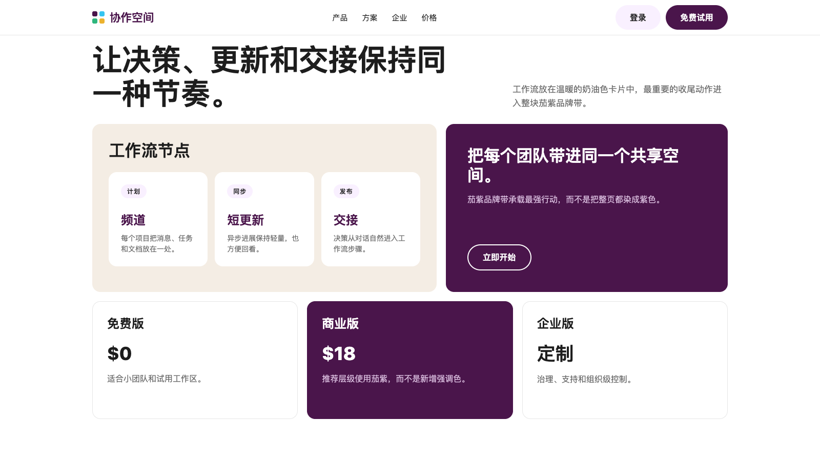
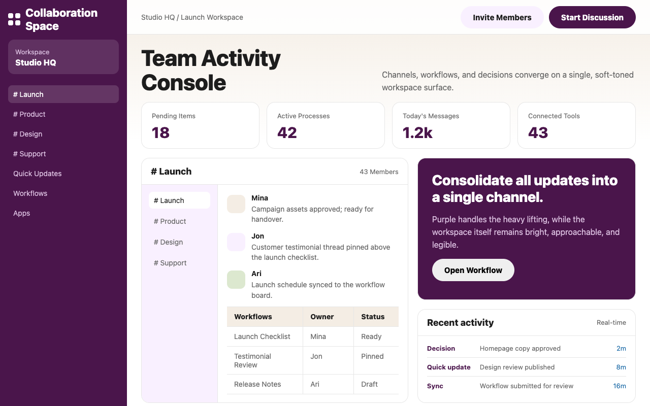

适合协作工具、团队门户和工作空间产品,奶油薰衣草渐变配茄紫 pill,让复杂沟通显得轻松亲和。
设计语言样张
活动素材已确认上线清单同步到流程面板。
客户反馈已置顶关键引用放入当前讨论串。
发布计划已同步团队可以继续下一步交接。
---
version: alpha
name: "Slack"
description: "Slack 的 DESIGN.md 中文参考模板,保留原始 design token 与专业术语,覆盖 color system、typography、layout、components、motion 与 interaction states。"
language: zh-CN
sourceLanguage: en
---

## 概览
Slack 的设计语言围绕 deep aubergine primary (`{colors.primary}`) 展开,这是品牌最持久的视觉资产;它作为主导 button color、footer band、featured pricing tier 和 brand wordmark 使用。围绕 aubergine,系统搭建出一个异常细腻的生态:cream-lavender hero canvas 上叠加 soft pastel-mesh gradient(peachy orange、lavender、dusty green),在 floating product UI mockup 后方轻微脉动,而真实 interface chrome 以 3:2 aspect 精细渲染。

Typography 分成两套专有 humanist sans family。Display tier 在 32–64px 尺寸使用 700 weight,并以 negative letter-spacing 让 hero headline 具备紧凑 optical density。UI tier 使用第二套 family,字重 400–700,leading 略放松(1.55);品牌 body copy 安静可读,不与 aubergine moment 竞争。

Button 使用 90px radius 的 pill shape,并带不寻常的大水平 padding(28–30px),因此呈现出明显舒适、几乎 over-padded 的感觉。Primary aubergine pill 是大多数场景中唯一 filled button;secondary action 使用 soft lavender pill (`{colors.canvas-lavender}`),读起来像 primary surface 的柔和回声。Inline link 切换为 saturated blue (`{colors.link-blue}`),这是品牌从 aubergine-and-cream 世界中唯一的色彩偏离。

**Key Characteristics:**
- 单一 aubergine primary (`{colors.primary}`) 复用于 CTA、featured pricing tier、footer band 和 wordmark;这是品牌 chromatic monotheism。
- Cream-lavender hero canvas(`{colors.canvas-cream}` / `{colors.canvas-lavender}`),搭配 diffused pastel-mesh atmospheric gradient,并在上方 composited floating UI mockup。
- Pill button 使用 `{rounded.pill}` (90px radius),并带宽松 28–30px horizontal padding;按 SaaS 默认标准看是 over-padded,而且这是有意为之。
- Display size 使用紧凑 negative letter-spacing(64px hero 上 -0.768px),形成 editorial-density headline。
- Blue inline link(`{colors.link-blue}`)是 body type 中唯一非 aubergine 的 chromatic accent。
- Pastel-mesh gradient atmospherics:每个 hero band 后方都有 subtle peach-lavender-dusty-green wash;product UI 位于 gradient 上方,从不放在内部。
- Statistics card 在 white 上使用巨大 aubergine display type(90% / 43 / 87%);只通过 scale 形成量化强调。

## Colors

> **Source pages:** home (`/`), `/features/channels`, `/pricing`, `/contact-sales`.

### Brand & Accent
- **Aubergine** (`{colors.primary}` — `#4a154b`): 品牌 primary surface 和 CTA color。Deep、warm purple,带一丝 ruby;用于 filled button、featured pricing tier、footer band 和 brand wordmark。
- **Aubergine Deep** (`{colors.primary-deep}` — `#481a54`): 从不同 surface 提取的 `{colors.primary}` 近似 sibling;可视为功能等价。
- **Aubergine Press** (`{colors.primary-press}` — `#611f69`): Primary 的 pressed-state lift,略浅且更暖。
- **Aubergine Tint** (`{colors.primary-tint}` — `#592466`): Aubergine-on-aubergine surface 上的 border accent。
- **Link Blue** (`{colors.link-blue}` — `#1264a3`): Inline link color;saturated、略暖的 blue。Body type 中唯一替代 aubergine 的色彩。
- **Link Hover** (`{colors.link-hover}` — `#3860be`): 更 saturated 的 blue,用于 link hover state。

### Surface
- **Canvas White** (`{colors.canvas}` — `#ffffff`): 默认 content surface。
- **Canvas Cream** (`{colors.canvas-cream}` — `#f4ede4`): Warm off-white,用于 hero gradient 和 feature band,增加 editorial warmth。
- **Canvas Lavender** (`{colors.canvas-lavender}` — `#f9f0ff`): Pale lavender tint,用作 secondary-button surface 和 soft section band。
- **Surface Aubergine** (`{colors.surface-aubergine}` — `#4a154b`): Primary aubergine 作为 surface 复用;featured pricing tier、footer、dark feature band。
- **Hairline** (`{colors.hairline}` — `#e6e6e6`): Card 和 table divider 上的 1px border。

### Text
- **Ink** (`{colors.ink}` — `#1d1d1d`): Light surface 上的 primary body text,接近但不是 pure black。
- **Ink Mute** (`{colors.ink-mute}` — `#696969`): Secondary text、caption、helper copy。
- **On Primary** (`{colors.on-primary}` — `#ffffff`): Aubergine surface 和 filled CTA 上的文本。
- **On Aubergine Mute** (`{colors.on-aubergine-mute}` — `#d9bdde`): Aubergine surface 上的 secondary text;一种 desaturated mauve,读起来像 muted-light。

### Semantic Colors
- **Error** (`{colors.semantic-error}` — `#cc4117`): Form error 和 destructive-action color。
- **Success** (`{colors.semantic-success}` — `#007a5a`): Inline success indicator。

## Typography

### Font Family

Display tier 是 **Salesforce Avant Garde**,一套专有 humanist sans,具有宽阔 aperture 和略 geometric 的性格。不可用时 fallback 到系统字体栈(`system-ui, -apple-system, BlinkMacSystemFont`)。

UI tier 是 **Salesforce Sans**,另一套专有字体,用于 body、caption 和 button label。Fallback chain 相同。

两套字体都是专有字体,无法免费获取。可使用 **Inter**(Google Fonts 开源)并匹配相应 weight 来替代 display 和 body;Inter 是两层级中最接近的开源类比。

### Hierarchy

| Token | Size | Weight | Line Height | Letter Spacing | 用途 |
|---|---|---|---|---|---|
| `{typography.display-xxl}` | 64px | 700 | 1.12 | -0.768px | Marketing hero headline |
| `{typography.display-xl}` | 58px | 600 | 1.25 | -0.464px | Section opener |
| `{typography.display-lg}` | 50px | 700 | 1.12 | -0.6px | Statistics callout |
| `{typography.display-md}` | 32px | 700 | 1.25 | -0.256px | Card / feature title |
| `{typography.heading-lg}` | 24px | 700 | 1.33 | -0.096px | Pricing tier name |
| `{typography.heading-md}` | 22px | 600 | 1.4 | 0 | Sub-section heading |
| `{typography.heading-sm}` | 18px | 600 | 1.56 | -0.0216px | Compact card title |
| `{typography.body-lg}` | 18px | 400 | 1.55 | -0.0216px | Marketing body lead |
| `{typography.body-md}` | 16px | 400 | 1.55 | 0 | Default UI body |
| `{typography.body-strong}` | 16px | 700 | 1.5 | 0.16px | Emphasized body |
| `{typography.button-lg}` | 18px | 700 | 1.0 | 0 | Hero pill button label |
| `{typography.button-md}` | 16px | 700 | 1.38 | 0.2px | Standard pill button label |
| `{typography.button-cap}` | 14.4px | 700 | 1.0 | 0.144px | Compact pill label |
| `{typography.caption}` | 14px | 400 | 1.43 | 0.1px | Helper、footnote |
| `{typography.micro-cap}` | 12px | 700 | 1.0 | 0.96px | All-caps eyebrow |

### Principles
- **Display 使用 tight tracking。** 32–64px 尺寸使用 negative letter-spacing;专有字体默认较宽,negative tracking 将它拉入 editorial density。
- **Body 使用 1.55 leading。** 为 marketing readability 略放松,但不会进入 airy / 1.7+ 区域。
- **Eyebrow 使用 caps。** 所有 eyebrow 都渲染为 uppercase,并根据尺寸使用 positive 0.96–0.144px tracking。

### Font Substitutes
Display 和 UI tier 都可使用 **Inter**(Google Fonts 开源)替代;Inter 700 weight 搭配 `-0.768px` letter-spacing 能接近品牌 display behavior。为了更高品牌忠实度,**Lato** 是更柔和的 humanist alternative,适合 body size。避免在 body 上使用 System UI;默认字重会让品牌的 subtle warmth 消失。

## Layout

### Spacing System
- **Base unit**: 8px(带 4 / 12 / 16 / 20 / 24 / 28 sub-token,用于精细 vertical rhythm)。
- **Tokens**: `{spacing.xs}` 4px · `{spacing.sm}` 8px · `{spacing.md}` 12px · `{spacing.lg}` 16px · `{spacing.xl}` 20px · `{spacing.xxl}` 24px · `{spacing.huge}` 28px。
- **Section padding**: Marketing surface 上为 64–96px;transactional page 收紧到 48px。
- **Card internal padding**: Pricing card 为 32px;aubergine band card 为 48px。

### Grid & Container
- Marketing page 居中在约 1240px container 中,edge-bleeding pastel-mesh gradient 从 container 中溢出。
- Pricing 在 992 / 768 breakpoint 从 4-up → 2-up → 1-up 折叠。
- Statistics row:3-column grid,搭配巨大的 50px aubergine display numeral。

### Whitespace Philosophy
Pastel-mesh gradient 填充 marketing page 上大部分 negative space;section 感觉宽阔,但不是字面空白。Transactional page 上 gradient 消失,whitespace 回到传统 48px-section breathing room。

## Elevation & Depth

| Level | Treatment | 用途 |
|---|---|---|
| 0 | Flat | 默认 surface |
| 1 | `box-shadow: rgba(0,0,0,0.1) 0 5px 20px 0` | Hero 上的 floating button |
| 2 | `box-shadow: rgba(0,0,0,0.1) 0 0 32px 0` | Product UI mockup composite |
| 3 | `box-shadow: rgba(0,0,0,0.2) 0 1px 10px 0` | Toast / notification chrome |
| 4 | `box-shadow: rgb(97,31,105) 0 0 0 1px inset` | Aubergine inset border(button focus、special chrome) |

### Decorative Depth
品牌的 depth language 是 **pastel-mesh gradient**:peach、lavender、dusty green stop 以大半径模糊在一起,在 product UI screenshot 后方创造 soft atmospheric backdrop。Gradient 是品牌版本的“depth without shadows”:眼睛会感知 product mockup 漂浮在发光背景上,即使没有任何字面 lift。

## Shapes

### Border Radius Scale

| Token | Value | 用途 |
|---|---|---|
| `{rounded.xs}` | 2px | Hairline tag、status pill(少见) |
| `{rounded.sm}` | 4px | Form input |
| `{rounded.md}` | 8px | Compact card chrome、video frame |
| `{rounded.lg}` | 12px | Mid-size card、secondary surface |
| `{rounded.xl}` | 16px | Pricing card、feature card |
| `{rounded.xxl}` | 48px | Stat badge backdrop |
| `{rounded.pill}` | 90px | 所有 button |

### Photography Geometry
品牌使用 **product UI screenshot** 多于摄影。UI mockup 以约 4:3 aspect 位于 pastel-mesh gradient 上方,没有 shadow,但 gradient 提供眼睛预期的 "lift"。真实摄影出现在 customer-logo strip 和偶发 case-study card 中,并在 `{rounded.xl}` container 内以 full-bleed 处理。

## Components

### Buttons

**`button-primary-pill`** — 全系统主导 CTA。
- Background `{colors.primary}`、text `{colors.on-primary}`、type `{typography.button-md}`、padding `14px 28px`、rounded `{rounded.pill}` 90px。
- Pressed state `button-primary-pill-pressed` 将 background 切换为 `{colors.primary-press}`。

**`button-secondary-pill`** — soft lavender alternative。
- Background `{colors.canvas-lavender}`、text `{colors.ink}`、padding `10px 30px`,同样 pill geometry。作为 primary aubergine pill 旁的第二 action。

**`button-outline-aubergine`** — white surface 上的 outline variant。
- Background `{colors.canvas}`、text `{colors.primary}`、2px solid `{colors.primary}` border,同样 pill shape。

**`button-outline-on-aubergine`** — aubergine canvas 上的 outline。
- Background `{colors.surface-aubergine}`(在 surface 上呈 transparent)、text `{colors.on-primary}`、2px solid `{colors.on-primary}` border,同样 pill shape。

### Cards & Containers

**`card-pricing`** — 标准 pricing tier card。
- Background `{colors.canvas}`、padding `{spacing.xxl}+` (32px)、rounded `{rounded.xl}` 16px、1px `{colors.hairline}` border。Title 使用 `{typography.heading-lg}`,price 使用 `{typography.display-md}`,body 使用 `{typography.body-md}`,CTA 以 `button-primary-pill` 固定到底部。

**`card-pricing-featured`** — inverted aubergine featured tier。
- Background `{colors.surface-aubergine}`、text `{colors.on-primary}`,其它与 `card-pricing` 相同。Aubergine fill 是品牌 signature featured-tier choice。

**`card-feature-cream`** — cream track 上的 feature explanation card。
- Background `{colors.canvas-cream}`、text `{colors.ink}`、rounded `{rounded.xl}`、padding 32px。

**`card-aubergine-band`** — 带 aubergine fill 的大型 horizontal band card,常包含 marketing page 的 closing CTA。
- Background `{colors.surface-aubergine}`、text `{colors.on-primary}`、padding 48px、rounded `{rounded.xl}` 16px。

**`card-stat`** — statistics callout card。
- Background `{colors.canvas}`,text `{colors.primary}` 以 `{typography.display-lg}` 渲染(50px aubergine numeral)。承载单个 percentage/number,下方有小 caption。

### Inputs & Forms

**`text-input`** — 标准 form field。
- Background `{colors.canvas}`、text `{colors.ink}`、type `{typography.body-md}`、padding `10px 12px`、rounded `{rounded.sm}` 4px、1px `{colors.hairline}` border。

### Navigation

**`nav-bar-light`** — 所有 marketing page 上的 top nav。
- Background `{colors.canvas}`、text `{colors.ink}`、padding `{spacing.lg} {spacing.xxl}`。Logo wordmark 在左,nav item 居中,右侧两个 pill button("Sign In" 使用 `button-secondary-pill`,"Try For Free" 使用 `button-primary-pill`)。

### Pills, Tags, and Chips

**`pill-cap-shade`** — 小型 all-caps pill,用作 pricing-tier title 上方的 eyebrow。
- Background `{colors.canvas-cream}`、text `{colors.ink}`、type `{typography.micro-cap}`、padding `4px 12px`、rounded `{rounded.pill}`。

### Signature Components

**Pastel-Mesh Gradient Backdrop** — peach(近似 `#fff0e6`)+ lavender (`#e9d8ff`) + dusty green stop 在 hero band 后方模糊混合。实现为 CSS radial-gradient stack,而不是单张图片。在没有 literal shadow 的情况下提供品牌 depth/luminosity。

**Floating Product UI Mockup** — Product screenshot 放在 `{rounded.lg}` (12px) container 中,位于 pastel-mesh gradient 上方,没有 border 或 shadow。由 gradient 提供 lift。

**Aubergine Footer Band** — 每个 marketing page 都以 full-bleed `card-aubergine-band` 收尾,其中包含 white type 的 closing CTA。Band 高度宽松(desktop 约 480–600px),读起来是页面 signature。

**`link-on-light`** — inline links in body copy on light surfaces.
- Text `{colors.link-blue}` 以 `{typography.body-md}` 渲染。默认无 underline;hover 时通过 link-hover behavior 显示 underline。

**`link-on-aubergine`** — links inside aubergine surfaces.
- Text `{colors.on-primary}`,带 persistent underline。

**`footer-aubergine`** — site-wide footer.
- Background `{colors.surface-aubergine}`、text `{colors.on-primary}`,以 `{typography.caption}` 渲染,padding `{spacing.huge}+ {spacing.xxl}` (32px 24px)。包含 4–5 列 `{colors.on-aubergine-mute}` link group、social icon,以及底部小型 legal/copyright row。

## Do's and Don'ts

### Do
- 将 `{colors.primary}` aubergine 只留给 filled CTA、featured pricing tier 和 closing aubergine band;这是品牌的 chromatic monotheism。
- 全系统每个 button 都使用 `{rounded.pill}` (90px);不要使用 rounded-rectangle button。
- Display tier 要搭配 negative letter-spacing(64px 时为 `-0.768px`);专有字体需要这一下 tracking pull。
- Hero band 使用 pastel-mesh gradient backdrop + floating product UI mockup 组合;gradient 本身就是 depth。
- Inline link 使用 `{colors.link-blue}`;这是 aubergine 之外唯一的色彩偏离,也是 brand voice 的一部分。

### Don't
- 不要给系统加入第三种 accent color;aubergine + blue link 的组合已经完整。
- 不要把 button padding 缩到 `14px 28px` 以下;over-padded pill 是品牌手感的一部分。
- 不要用默认 tracking (0) 渲染 display tier;没有 negative letter-spacing 时,headline 会显得松散且未经编辑。
- 不要把 product UI screenshot 放进 card 内部;它们位于 pastel-mesh gradient 上方,而不是 chrome 里面。
- 不要把 aubergine 用作 body text;它是 surface 和 CTA color,不是 body size 的文字颜色。
- 任何地方都不要用 square button 替代 pill shape。

## Responsive Behavior

### Breakpoints

| Name | Width | 关键变化 |
|---|---|---|
| Wide | ≥ 1440px | Full-bleed pastel-mesh hero;pricing 4-up |
| Desktop | 1024–1440px | 默认 content max-width;pricing 4-up |
| Tablet | 768–1023px | Pricing 2-up;product UI mockup 裁切到 focal panel |
| Mobile | < 768px | Pricing 1-up;hamburger nav;display-xxl 从 64 降到 40px |

### Touch Targets
- 由于 over-padded geometry,pill button 的命中区域达到 ≥ 48×48px,符合 WCAG AAA。
- Form field 保持 44px 最小高度。

### Collapsing Strategy
- Display tier 在 breakpoint 间按 64 → 50 → 32 → 28 → 24 阶梯收缩。
- Pastel-mesh gradient 在 mobile 上重新铺排,避免 wash 完全消失。
- Floating product UI mockup 在 mobile 上裁切到最可操作的 inner panel。
- Pricing tier 按 4 → 2 → 1 阶梯折叠;aubergine featured tier 仍保持差异化。
- Top nav 在 768px 以下折叠为 hamburger;menu 继承 canvas color。

### Image Behavior
Product UI mockup 使用 `srcset` 提供 desktop / tablet / mobile crop;mobile crop 聚焦最可操作的 inner panel,而不是把整个 composite 等比缩小。

## Iteration Guide

1. 每次只聚焦一个 component。
2. 直接引用 component name 和 token(`{colors.primary}`、`{button-primary-pill}-pressed`、`{rounded.pill}`)。
3. 编辑后运行 `npx @google/design.md lint DESIGN.md`。
4. 新 variant 作为独立条目添加。
5. 默认 body 使用 `{typography.body-md}`;`{typography.body-lg}` 只留给 marketing lead。
6. 克制使用 aubergine;每个 viewport 只保留一个 filled aubergine button。
7. 每个 hero band 都要搭配 pastel-mesh gradient backdrop;bare-canvas hero 会显得偏离品牌。


