

01 / 03
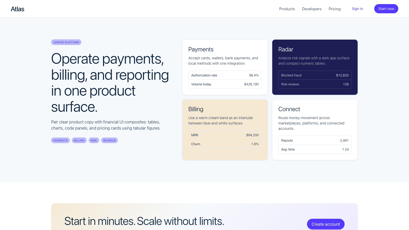
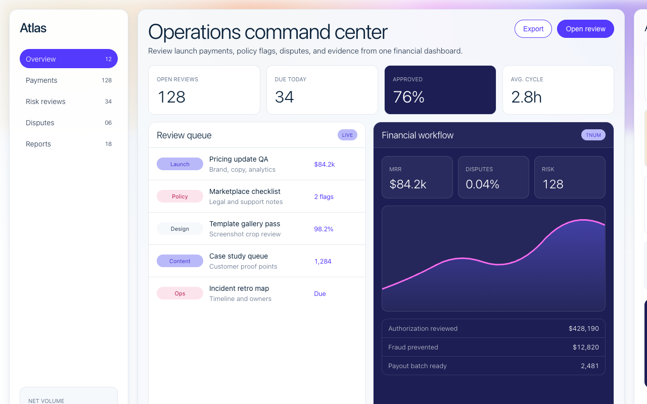

适合支付、金融基础设施和 B2B 平台,渐变科技感配合高密度模块,适合复杂能力说明。
设计语言样张
正文使用深海军蓝和细字重,保持轻、准、可读,不把 indigo 当正文色。
$128,430.76
2,841 txns
每个 marketing hero 都要有有机渐变 mesh,占据页面上三分之一。
显示标题使用 300 细字重和负字距,保留编辑感和空气感。
Indigo filled pill 每个区块只放一个,其他动作使用链接或白底 pill。
所有金额、交易量和数字表格使用 tabular figures。
功能说明要搭配真实产品 UI mockup 或 dashboard composite。
不要把 display 字重加到 400 以上。
不要新增渐变停靠点之外的强调色。
不要把 indigo 当成正文颜色使用,它只服务 CTA 和链接。
不要把按钮改成圆角矩形;按钮必须是 pill。
不要省略数字的 tabular figure 处理。
---
version: alpha
name: "Stripe"
description: "Stripe 的 DESIGN.md 中文参考模板,保留原始 design token 与专业术语,覆盖 color system、typography、layout、components、motion 与 interaction states。"
language: zh-CN
sourceLanguage: en
---

## 概览
Stripe 的设计语言以 gradient mesh 开场。Pastel cream、sherbet orange、lavender、electric indigo 和 ruby pink 组成一条宽阔的横向色带,占据几乎每个 marketing page 的上三分之一;这是品牌一眼可识别的 atmospheric backdrop。Type 和 product UI mockup 漂浮在 `{colors.canvas}`(white)之上,gradient 同时作为装饰和视觉锚点。页面下半部分回到 white,feature explanation 位于 `{colors.canvas-soft}`(几乎只有轻微 tint 的 cool off-white)上,dashboard product mockup 则以 deep navy 的 faux IDE/console panel 组合呈现。

Color system 有两个 primary role。**Indigo** (`{colors.primary}` — `#533afd`) 是品牌 signature CTA color,使用非常克制:每个 band 一个 filled pill。**Deep navy** (`{colors.ink}` — `#0d253d`) 是通用 body text color,也作为 dashboard mockup、featured pricing tier 以及 dashboard track 上 dark-app surface 的 fill。Ruby (`{colors.ruby}`) 和 magenta (`{colors.magenta}`) 出现在 gradient mesh 内,也作为 product UI mockup 中的 accent dot;它们不用于 button color。

Typography 围绕 **Sohne** 构建,使用 weight 300 和 negative letter-spacing,这是品牌 editorial-density display signature。Display size(32–56px)使用 -1.4px 到 -0.64px tracking;body size 使用 0;tabular caption size(涉及金额和数字的位置)使用 OpenType `tnum` feature,并额外收紧 -0.36 到 -0.42px tracking。所有角色都启用 `ss01` stylistic set。

**Key Characteristics:**
- 每个 marketing hero 都有 gradient-mesh backdrop;cream/orange/lavender/indigo/ruby 横向铺满页面上三分之一。
- Single-indigo CTA hierarchy:filled `{colors.primary}` pill 是 marketing surface 上唯一 filled button。
- Sohne thin(weight 300)display tier,根据尺寸使用 -1.4px 到 -0.2px 的 negative tracking。
- 任何包含金额或数字的 cell 都使用 tabular-figure body type(`tnum`),这是品牌安静的 financial-data signal。
- Dark-app dashboard track:deep navy product UI mockup 组合在 white canvas 上方,内部常包含 rendered code 或 dashboard table。
- Pill-shaped button(`{rounded.pill}` 9999px)配合紧凑 `8px 16px` padding;短促、明确、交易感。
- Cream-band feature card(`{colors.canvas-cream}`)在 blue/white section 之间引入温暖插曲,同时不破坏品牌色彩逻辑。

## Colors

> **Source pages:** home (`/`), `/payments`, `/pricing`, `dashboard.stripe.com/register/payments`.

### Brand & Accent
- **Indigo** (`{colors.primary}` — `#533afd`): 品牌 signature CTA color。用于 filled-pill button、link emphasis、gradient anchor。
- **Indigo Deep** (`{colors.primary-deep}` — `#4434d4`): 更深的 indigo,用于 gradient mid-stop,也作为 press-state 的更暖替代。
- **Indigo Press** (`{colors.primary-press}` — `#2e2b8c`): Primary 的 pressed-state lift。
- **Indigo Soft** (`{colors.primary-soft}` — `#665efd`): 更浅的 indigo,用于 product-UI accent 和 chart highlight。
- **Indigo Subdued** (`{colors.primary-bg-subdued-hover}` — `#b9b9f9`): Pale indigo fill,用作 soft tag background。
- **Brand Dark 900** (`{colors.brand-dark-900}` — `#1c1e54`): Deep navy,用于 featured pricing tier 和 dashboard chrome。
- **Ruby** (`{colors.ruby}` — `#ea2261`): Gradient accent 和 chart highlight;从不用作 button。
- **Magenta** (`{colors.magenta}` — `#f96bee`): Gradient mesh 中更亮的 pink stop。
- **Lemon** (`{colors.lemon}` — `#9b6829`): Gradient backdrop 中的 warm sherbet stop。

### Surface
- **Canvas** (`{colors.canvas}` — `#ffffff`): 默认 page background。
- **Canvas Soft** (`{colors.canvas-soft}` — `#f6f9fc`): Cool-tinted off-white,用于 gradient hero 下方的 feature band。
- **Canvas Cream** (`{colors.canvas-cream}` — `#f5e9d4`): Warm cream,用作 feature-band fill;这是品牌的 chromatic interlude。
- **Hairline** (`{colors.hairline}` — `#e3e8ee`): Card 和 table 上的 1px border。
- **Hairline Input** (`{colors.hairline-input}` — `#a8c3de`): 略冷的 hairline,用于 form input。

### Text
- **Ink** (`{colors.ink}` — `#0d253d`): 品牌通用默认 body text color。Deep navy,从不是 pure black。
- **Ink Secondary** (`{colors.ink-secondary}` — `#273951`): White 上的 secondary text。
- **Ink Mute** (`{colors.ink-mute}` — `#64748d`): Helper text、caption、table label。
- **Ink Mute 2** (`{colors.ink-mute-2}` — `#61718a`): 与 ink-mute 接近,用于 nav。
- **On Primary** (`{colors.on-primary}` — `#ffffff`): Indigo / dark-navy surface 上的文本。

### Semantic Colors
品牌在 marketing system 中不使用独立 semantic color palette;error / success state 专属于 dashboard-product UI。

## Typography

### Font Family

Display 和 UI tier 使用 **Sohne**(专有字体,授权自 Klim Type Foundry),字重为 300 (thin) 和 400 (regular)。Variable font(`sohne-var`)加载时全局启用 `font-feature-settings: "ss01"`;该 stylistic set 会替换 single-story `a` 和其它字符变体,这是品牌 typographic signature 的一部分。

当 Sohne 不可用时,fallback 到 thin weight 的 **SF Pro Display**,再到 system-ui。为了最大化品牌忠实度,可使用 **Inter**(开源)weight 300,并在 display size 上设置 `font-feature-settings: "ss01"` 和 `letter-spacing: -1.4px`,可接近其节奏。

### Hierarchy

| Token | Size | Weight | Line Height | Letter Spacing | 用途 |
|---|---|---|---|---|---|
| `{typography.display-xxl}` | 56px | 300 | 1.03 | -1.4px | Hero headline |
| `{typography.display-xl}` | 48px | 300 | 1.15 | -0.96px | Section opener |
| `{typography.display-lg}` | 32px | 300 | 1.1 | -0.64px | Card title / sub-section |
| `{typography.display-md}` | 26px | 300 | 1.12 | -0.26px | Compact card title |
| `{typography.heading-lg}` | 22px | 300 | 1.1 | -0.22px | Pricing tier name |
| `{typography.heading-md}` | 20px | 300 | 1.4 | -0.2px | Section sub-heading |
| `{typography.heading-sm}` | 18px | 300 | 1.4 | 0 | Mini-section label |
| `{typography.body-lg}` | 16px | 300 | 1.4 | 0 | Marketing body lead |
| `{typography.body-md}` | 15px | 300 | 1.4 | 0 | Default UI body |
| `{typography.body-tabular}` | 14px | 300 | 1.4 | -0.42px | Money / numeric table(使用 `tnum`) |
| `{typography.button-md}` | 16px | 400 | 1.0 | 0 | Pill button label |
| `{typography.button-sm}` | 14px | 400 | 1.0 | 0 | Compact pill label |
| `{typography.caption}` | 13px | 400 | 1.4 | -0.39px | Helper、table label |
| `{typography.micro}` | 11px | 300 | 1.4 | 0 | Fine print |
| `{typography.micro-cap}` | 10px | 400 | 1.15 | 0.1px | All-caps eyebrow |

### Principles
- **Thin weight 就是品牌。** Display tier 始终渲染为 weight 300。提升到 400+ 会移除品牌的 editorial air。
- **Display 使用 negative tracking。** 56px 时 -1.4px,并按比例降到 20px 时 -0.2px。Negative tracking 是品牌 typographic signature。
- **金额使用 tabular figure。** 任何渲染货币、交易金额或数字计数的 cell 都使用 `font-feature-settings: "tnum"`,并配合收紧 tracking。品牌通过这个微细节安静地传达 financial DNA。
- **全局 `ss01`。** 将 `font-feature-settings: "ss01"` 应用到 body element,让每个文本角色都启用 stylistic-set substitution。

### Font Substitutes
Sohne 是专有字体。Display tier 可使用 **Inter**(Google Fonts 开源)weight 300,配合 `letter-spacing: -1.4px` 和 `font-feature-settings: "ss01"`;Inter 是最接近的开源替代。Body size 使用 Inter 300 weight,并在适用位置设置 `font-feature-settings: "tnum"`,是规范替代方案。避免 Helvetica 或 system-ui 默认值;它们比品牌需要的更重。

## Layout

### Spacing System
- **Base unit**: 8px(带 2 / 4 / 12 sub-token,用于精细处理)。
- **Tokens**: `{spacing.xxs}` 2px · `{spacing.xs}` 4px · `{spacing.sm}` 8px · `{spacing.md}` 12px · `{spacing.lg}` 16px · `{spacing.xl}` 24px · `{spacing.xxl}` 32px · `{spacing.huge}` 64px。
- **Section padding**: Marketing surface 上为 64–96px;dashboard / product surface 上为 32–48px。
- **Card internal padding**: Feature card 为 32px;dashboard mockup 为 24px。

### Grid & Container
- Marketing page 居中在约 1200px container 中,gradient mesh 在上方 edge-to-edge 延展。
- Pricing 在 1024 / 768 breakpoint 从 4-up → 2-up → 1-up 折叠。
- Dashboard product mockup 使用自己的 internal grid(12-col table、3-col card grid),并渲染为 static composite。

### Whitespace Philosophy
Gradient mesh 占据页面上三分之一;下方 white canvas 使用宽松 padding。Section gap 通常接近 96px;在用户需要比较和操作的 dashboard / pricing page 上,content 会收紧到 32px。

## Elevation & Depth

| Level | Treatment | 用途 |
|---|---|---|
| 0 | Flat | 默认 surface |
| 1 | `box-shadow: rgba(0,55,112,0.08) 0 1px 3px` | White 上的 card lift |
| 2 | `box-shadow: rgba(0,55,112,0.08) 0 8px 24px, rgba(0,55,112,0.04) 0 2px 6px` | Floating panel、dashboard mockup chrome |
| 3 | Gradient mesh backdrop | 品牌 primary depth medium;是 atmospheric color,而不是字面 shadow |

### Decorative Depth
Gradient mesh 本身就是 depth system。它应实现为 layered SVG 或大背景图,而不是 CSS gradient(真实 mesh 有 organic blob shape,无法用 CSS 直接复现)。Mesh 提供品牌 signature lift;字面意义上的 shadow 保留给 product-UI mockup,并保持 subtle。

## Shapes

### Border Radius Scale

| Token | Value | 用途 |
|---|---|---|
| `{rounded.xs}` | 4px | Hairline tag、table chrome |
| `{rounded.sm}` | 6px | Form input |
| `{rounded.md}` | 8px | Compact card、alert |
| `{rounded.lg}` | 12px | Pricing card、feature card |
| `{rounded.xl}` | 16px | Dashboard product mockup chrome |
| `{rounded.pill}` | 9999px | 所有 button、tag pill |

### Photography Geometry
品牌使用 **product UI mockup** 多于摄影。Dashboard composite 以 faux IDE/terminal/dashboard chrome 形式渲染在 `{rounded.lg}` 12px container 中,并带 subtle `box-shadow`。真实摄影只出现在 customer logo strip 和少见的 case-study card 中;处理为 inset 4:3,无 shadow。

## Components

### Buttons

**`button-primary-pill`** — 全系统主导 CTA。
- Background `{colors.primary}`、text `{colors.on-primary}`、type `{typography.button-md}`、padding `{spacing.sm} {spacing.lg}`(8px 16px)、rounded `{rounded.pill}` 9999px。
- Pressed state `button-primary-pill-pressed` 将 background 切换为 `{colors.primary-press}`。

**`button-secondary`** — outline-style alternative。
- Background `{colors.canvas}`、text `{colors.primary}`、1px solid `{colors.primary}` border,同样 pill geometry。

**`button-on-dark`** — 用于 dashboard / dark surface。
- Background `{colors.brand-dark-900}`、text `{colors.on-primary}`,同样 pill geometry。

### Cards & Containers

**`card-feature-light`** — white 上的 feature explanation card。
- Background `{colors.canvas}`、padding `{spacing.xxl}`、rounded `{rounded.lg}` 12px、1px `{colors.hairline}` border,可选 Level 1 shadow。

**`card-pricing`** — 标准 pricing tier。
- Background `{colors.canvas}`、padding `{spacing.xxl}`、rounded `{rounded.lg}`、1px `{colors.hairline}` border。Title 使用 `{typography.heading-lg}`,price 使用 `{typography.display-md}`,body 使用 `{typography.body-md}`,CTA 以 `button-primary-pill` 固定在底部。

**`card-pricing-featured`** — inverted dark featured tier。
- Background `{colors.brand-dark-900}`、text `{colors.on-primary}`,其它结构与 `card-pricing` 相同。Deep-navy fill 是品牌独特的 featured-tier 选择。

**`card-cream-band`** — warm interlude card。
- Background `{colors.canvas-cream}`、text `{colors.ink}`、padding `{spacing.xxl}`、rounded `{rounded.lg}`。用于以温暖感打断 indigo / white rhythm。

**`card-dashboard-mockup`** — composited dashboard / product UI screenshot。
- Background `{colors.canvas}`、type `{typography.body-tabular}`(带 `tnum`)、padding `{spacing.xl}` 24px、rounded `{rounded.lg}` 12px、Level 2 shadow。常包含 nested mini-mockup:code preview + dashboard table + chart card。

### Inputs & Forms

**`text-input`** — 标准 form field。
- Background `{colors.canvas}`、text `{colors.ink}`、type `{typography.body-md}`、padding `{spacing.sm} {spacing.md}`(8px 12px)、rounded `{rounded.sm}` 6px、1px `{colors.hairline-input}` border。
- Focus state `text-input-focused`: border 切换为 `{colors.primary}`。

### Navigation

**`nav-bar-on-mesh`** — 漂浮在 gradient hero 上的 top nav。
- Background `{colors.canvas}`(或根据 scroll 变为 transparent)、text `{colors.ink}`、padding `{spacing.lg} {spacing.xl}`。Logo wordmark 在左,primary nav 居中,右侧是 sign-in + filled `button-primary-pill`。

### Pills, Tags, and Chips

**`pill-tag-soft`** — subdued indigo tag。
- Background `{colors.primary-bg-subdued-hover}`、text `{colors.primary-deep}`、type `{typography.micro-cap}`、padding `4px 8px`、rounded `{rounded.pill}`。

### Signature Components

**Gradient Mesh Backdrop** — pastel cream → sherbet orange → lavender → indigo → ruby pink stop 横向模糊铺在页面上三分之一。实现方式应是 SVG 或大背景图,而不是 flat CSS gradient(真实 mesh 有 organic blob shape)。

**Composited Dashboard Mockup** — 多层 faux-product-UI composition:左侧 IDE panel,中间 dashboard table,右侧 chart card,全部以小比例渲染在 `{rounded.lg}` container 内,并带 subtle Level 2 shadow。Composite 是品牌最常被拍摄的 feature。

**Tabular-Figure Money Type** — 每个渲染 money、count 或 transaction value 的数字都使用 `font-feature-settings: "tnum"`。这是品牌作为 financial-infrastructure platform 的安静信号。

**`link-on-light`** — inline links on light surfaces.
- Text `{colors.primary}` 以 `{typography.body-md}` 渲染,默认无 underline。

**`footer-light`** — site-wide footer.
- Background `{colors.canvas}`、text `{colors.ink-mute}`、type `{typography.caption}`、padding `{spacing.huge} {spacing.xl}`(64px 24px)。包含 4–6 列 link group、social icon 和小型 legal row。

## Do's and Don'ts

### Do
- 将 `{colors.primary}` 保留给 filled CTA 和 inline link emphasis;它应少量出现,每个 band 一个 filled button。
- 每个 marketing hero 都应用 gradient mesh;bare-canvas hero 会显得不符合品牌。
- Display tier 使用 weight 300 和 negative letter-spacing;thin tracking 是 typographic signature。
- 每个 money / numeric cell 都使用 `font-feature-settings: "tnum"`。
- 在 body element 上全局应用 `font-feature-settings: "ss01"`。
- 每个 feature explanation 都搭配 composited product UI mockup;品牌论点是“看实际产品”。

### Don't
- 不要把 display weight 提到 300 以上;到 400 时品牌的 editorial air 会坍塌。
- 不要添加已记录 gradient stop(cream / orange / lavender / indigo / ruby / magenta)之外的新 accent color。
- 不要把 indigo `{colors.primary}` 用作 body-text color;它是 CTA 和 link color,不是 body size 的 type color。
- 不要把 button padding 缩到 `8px 16px` 以下;紧凑 pill 是品牌 transactional feel 的一部分。
- 不要在未启用 `tnum` 的情况下渲染 money cell;这会破坏安静的 financial-data signature。
- 不要把 button 的 pill shape 换成 rounded-rectangle。

## Responsive Behavior

### Breakpoints

| Name | Width | 关键变化 |
|---|---|---|
| Wide | ≥ 1440px | Full gradient mesh edge-to-edge;dashboard composite 全尺寸 |
| Desktop | 1024–1440px | 默认 content max-width;pricing 4-up |
| Tablet | 768–1023px | Pricing 2-up;dashboard composite 简化为 2 个 panel |
| Mobile | < 768px | Pricing 1-up;hamburger nav;display 从 56 降到 36px |

### Touch Targets
- Pill button 在 mobile 上通过 padding scaling 达到 ≥ 40×40px。更小屏幕上,button 放大到 44×44px,以保持 WCAG AAA。
- Form field 保持 40px minimum height。

### Collapsing Strategy
- Display tier 随 breakpoint 阶梯变化为 56 → 48 → 32 → 26 → 22px。
- Gradient mesh 在 mobile 上重新平铺,以保留 wash 而不消失。
- Dashboard composite 在 mobile 上简化为 single-panel mockup;multi-layer composition 只在 desktop+ 渲染。
- Pricing tier 阶梯变化为 4-up → 2-up → 1-up。

### Image Behavior
Product UI composite 使用 `srcset`,并在主要 breakpoint 做 art-direction crop。Mobile crop 聚焦最具操作性的内部 panel;desktop crop 展示完整 multi-layer composition。

## Iteration Guide

1. 一次只聚焦一个 component。
2. 直接引用 component name 和 token(`{colors.primary}`、`{button-primary-pill}-pressed`、`{rounded.pill}`)。
3. 编辑后运行 `npx @google/design.md lint DESIGN.md`。
4. 新 variant 作为独立条目添加。
5. Default body 使用 `{typography.body-md}` (15px);任何 money / numeric cell 使用 `{typography.body-tabular}`。
6. 在 body 上全局应用 `ss01`;对 numeric content 按元素应用 `tnum`。
7. Marketing hero 上的 gradient mesh 不可妥协;bare-canvas hero 会破坏品牌。


