

01 / 03
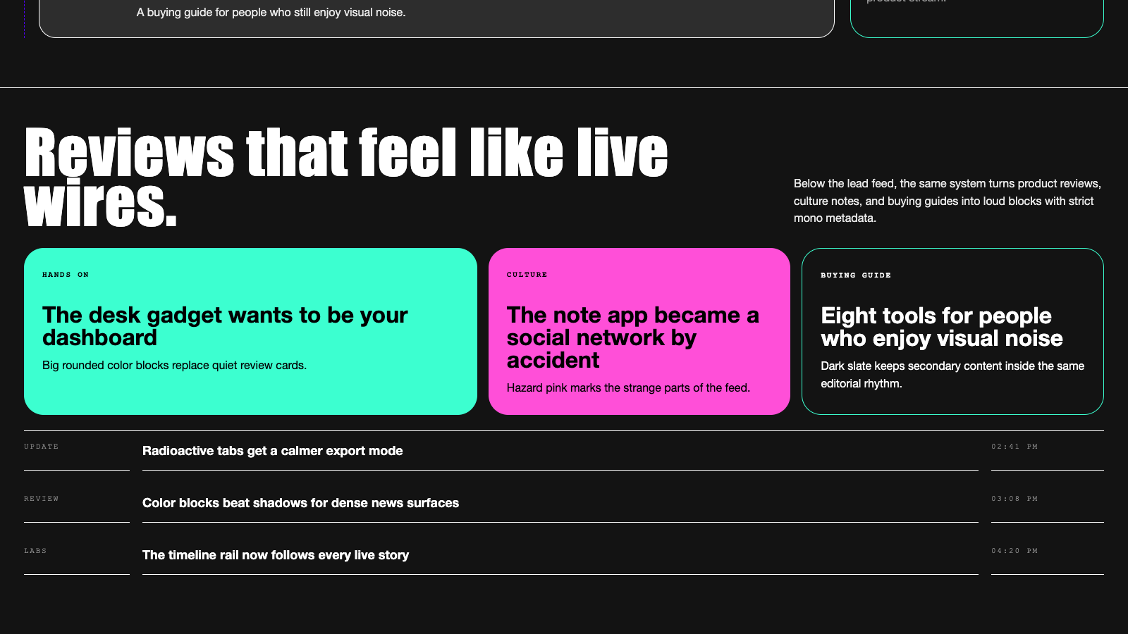
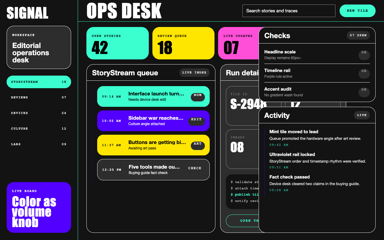

适合专题索引、趋势资讯和观点型内容页,黑底、巨型标题、霓虹色块和时间线卡片带来强烈编辑节奏。
设计语言样张
故事标题紧凑、直接、像高能新闻 feed 一样持续推进。
09:14 AM · LIVE INDEX · REVIEW BOARD
少量用于评论、摘录和杂志感正文,不进入 UI。
使用 #131313 作为主画布,mint 和 ultraviolet 只做 hazard accent。
Manuka 风格 display 只用于 60px 以上的大标题和品牌声量。
StoryStream 使用左侧时间线、mono 大写时间戳和饱和色块卡片。
用 1px 边框、active underline 和纯色色块制造层级,不用投影。
不要使用浅色背景或柔和渐变。
不要把 mint / purple 做成背景氛围光,它们应该是实色 hazard 块。
不要用 Manuka 风格字体做按钮、正文或普通 UI。
不要使用方角卡片;内容容器应落在 20px、24px、30px 或 40px 圆角体系。
---
version: alpha
name: "The Verge"
description: "The Verge 的 DESIGN.md 中文参考模板,保留原始 design token 与专业术语,覆盖 color system、typography、layout、components、motion 与 interaction states。"
language: zh-CN
sourceLanguage: en
---

# 受 The Verge 启发的设计系统

## 1. 视觉主题与氛围

The Verge 的 2024 改版像是把一本 Condé Nast 杂志接进了 chiptune 音板。画布接近纯黑 (`#131313`),标题使用极重的展示字体 Manuka,最大到 107px;页面中穿插酸性薄荷绿 `#3cffd0` 与紫外线紫 `#5200ff`,它们不像安静的品牌色,更像警示胶带。故事卡片不是低调灰卡,而是高饱和、满版的色块(黄、粉、橙、蓝、紫),像贴在时间线上的 rave 海报。整体气质是“开发者控制台 × 俱乐部夜场 × 科技小报”:严肃到能报道国会听证会,也足够喧闹到能评测一台合成器。

这个系统最不可错认的是 **StoryStream** 时间线:垂直 feed 中每条内容都是圆角矩形,常见 20–40px radius,色彩铺满边缘,外侧用细边框框住,左侧轨道标记 mono-uppercase 时间戳。故事不会漂浮在传统网格上,而是像 git log 的 commit 一样沿虚线竖向堆叠。其上方,巨大的 **"The Verge" wordmark** 以 hero 级 Manuka 占据 masthead,在任何标题加载前就告诉读者:这里是编辑场域,不是通用模板。

首页没有“light mode”——深色画布本身就是产品。只有当某个故事卡片使用薄荷绿或黄色填充时,局部配色才会反转。深度几乎完全扁平:**hairline 1px borders**(`#ffffff`、`#3cffd0` 或 `#5200ff`)承担了 Material 风格网站中阴影的工作。每个容器要么是带 1px 描边的 `#131313`,要么是全饱和 accent 色块,要么是 slate-gray `#2d2d2d` 次级表面。

**关键特征:**
- 默认表面是近黑编辑画布 (`#131313`);首页没有 light mode
- 酸性薄荷绿 `#3cffd0` + 紫外线紫 `#5200ff` 作为警示胶带式 accent,不做安静背景 wash
- 巨大的 Manuka display 标题最高到 107px,是主流科技媒体里最响亮的字体动作
- 几乎所有东西都是圆角 pill-card:20/24/30/40px corner radii,避免直角
- 深色页面上使用全饱和色块故事卡片(mint、purple、yellow、pink、orange、electric blue)
- 时间线式 "StoryStream" feed 使用 mono uppercase 时间戳,而不是传统杂志网格
- 扁平深度:white、mint、purple 的 1px border 承担其他系统中 shadow 的层级作用

## 2. 色彩调色板与角色

### Primary (Brand Hazards)
- **Jelly Mint** (`#3cffd0`): The Verge's signature acid-mint accent. Used as CTA button fill, link underlines, active tab borders, and high-attention story-tile backgrounds. Treat it as the visual equivalent of neon safety paint — applied sparingly to the most important element on screen.
- **Verge Ultraviolet** (`#5200ff`): The complementary brand hazard. Used for secondary color-block tiles, promotional spans, and the occasional outlined button. Often applied at 0.9 alpha to soften its cathode intensity.

### Secondary & Accent
- **Console Mint Border** (`#309875`): A darker variant of the jelly mint used on card outlines and button borders where pure mint would over-saturate.
- **Deep Link Blue** (`#3860be`): The link *hover* color — the one moment blue appears on the site. It replaces mint/white/black on hover across every link style.
- **Focus Cyan** (`#1eaedb`): Reserved for button focus rings. Never shown outside a keyboard-focus state.
- **Purple Rule** (`#3d00bf`): A darker ultraviolet variant used as the vertical border on StoryStream `<li>` items.

### Surface & Background
- **Canvas Black** (`#131313`): The default dark surface for the entire homepage. Almost-but-not-quite pure black — has just enough warmth to feel like a printed newsprint negative rather than an OLED void.
- **Surface Slate** (`#2d2d2d`): Secondary card background, used when a story tile doesn't need to be a saturated color block.
- **Image Frame** (`#313131`): The 1px border that wraps inline imagery.
- **Hazard White** (`#ffffff`): Used as story-tile fill, button border, and primary text. When white appears as a large block, it's an editorial decision — a "spotlight" on that tile.
- **Absolute Black** (`#000000`): Reserved for text on the mint/yellow/white tiles — the only place it appears.

### Neutrals & Text
- **Primary Text** (`#ffffff`): Headlines and display text on the canvas.
- **Secondary Text** (`#949494`): Bylines, timestamps, photo credits. The mid-gray that anchors the metadata layer.
- **Muted Text** (`#e9e9e9`): Button text on dark slate buttons. Slightly off-white to reduce screen glare.
- **Inverted Text** (`#131313`): Used only on accent tiles (mint, yellow, white) to keep contrast legible.

### Semantic & Accent
- **Focus Ring** (`#1eaedb`): Keyboard focus only.
- **Overlay Black** (`rgba(0, 0, 0, 0.33)`): Subtle 1px ring used as the quiet shadow alternative on stacked cards.
- **Dim Gray** (`#8c8c8c`): Active/pressed button background — the "pressed down" state.

### Gradient System
The Verge uses **zero decorative gradients**. The only gradient-like treatment is the transition from a saturated accent story tile (mint/purple/yellow) back to the `#131313` canvas between rows. Color is applied in solid blocks, not as washes. This is a deliberate choice — the site's hazard-tape visual identity would dissolve if anything faded.

## 3. 字体规则

### Font Family
- **Manuka** (Klim Type Foundry) — fallback: Impact, Helvetica. The signature display face for The Verge wordmark and feature headlines. A heavy-weight (900) industrial sans-serif with a condensed, almost-athletic stance. Runs at 60–107px on the homepage, never smaller.
- **PolySans** (PanGram Pangram / Nikolas Wrobel) — fallback: Helvetica, Arial. The UI and secondary headline workhorse. Covers weights 300 / 500 / 700 across the system — everything from kicker captions to body decks.
- **PolySans Mono** — fallback: Courier New, Courier. The monospaced sibling, used exclusively for ALL-CAPS labels: kickers, timestamps, category tags, button labels. This mono-uppercase usage is the second-most-identifiable Verge detail after Manuka.
- **FK Roman Standard** (Florian Karsten) — fallback: Georgia. A serif used sparingly for specific body/caption treatments (article excerpts, certain review pulls). Adds a "print-magazine" counterpoint to the PolySans stack.
- **Roboto** — fallback: `-apple-system`, `system-ui`. Utility UI font for widgets and legacy modules.

### Hierarchy

| Role | Font | Size | Weight | Line Height | Letter Spacing | Notes |
|---|---|---|---|---|---|---|
| Hero Wordmark / Display | Manuka | 107px / 6.69rem | 900 | 0.80 | 1.07px | The top-of-page "The Verge" logo and feature headlines |
| Secondary Display | Manuka | 90px / 5.63rem | 900 | 0.80 | — | Section-level feature headlines |
| Tertiary Display | Manuka | 60px / 3.75rem | 900 | 0.80 | — | Inline feature callouts |
| Large Headline | PolySans | 34px / 2.13rem | 700 | 1.00 | — | Section and module headlines |
| Heading Wide | PolySans | 32px / 2.00rem | 400 | 1.10 | 0.32px | Sub-heroes, promotional units |
| Heading Medium | PolySans | 24px / 1.50rem | 700 | 1.00 | — | Story tile headlines in the main feed |
| Heading Small | PolySans | 20px / 1.25rem | 700 | 1.00 | — | Compact tile headlines |
| Light Capitalized Label | PolySans | 19px / 1.19rem | 300 | 1.20 | 1.9px | Thin-weight capitalized eyebrows — a distinctive Verge move |
| All-Caps Label XL | PolySans | 18px / 1.13rem | 400 | 1.10 | 1.8px | UPPERCASE section kickers |
| Bold Body | PolySans | 16px / 1.00rem | 700 | 1.00 | — | Emphasis within decks |
| Body Relaxed | PolySans | 16px / 1.00rem | 500 | 1.60 | — | Long-form reading body |
| Inline Label | PolySans | 15px / 0.94rem | 400 | 1.20 | 0.15px | UI labels and secondary headlines |
| Body Compact | PolySans | 13px / 0.81rem | 400 | 1.60 | — | Secondary captions and decks |
| Eyebrow All-Caps | PolySans | 12px / 0.75rem | 400 | 1.30 | 1.8px | UPPERCASE kicker above tile headlines |
| Tag Label | PolySans | 12px / 0.75rem | 400 | 1.20 | 0.72px | UPPERCASE category tag |
| Caption Micro | PolySans | 11px / 0.69rem | 400 | 1.20 | 1.1px | UPPERCASE bylines |
| Meta Nano | PolySans | 10px / 0.63rem | 500 | 1.40 | 1.5px | UPPERCASE timestamp microtext |
| Mono Button Label | PolySans Mono | 12px / 0.75rem | 600 | 2.00 | 1.5px | UPPERCASE button text, very open leading |
| Mono Timestamp | PolySans Mono | 11px / 0.69rem | 500/600 | 1.20 | 1.1–1.8px | UPPERCASE StoryStream timestamps |
| Serif Body | FK Roman Standard | 16px / 1.00rem | 400 | 1.30 | -0.16px | Review decks, print-voice excerpts |
| Serif Caption | FK Roman Standard | 20px / 1.25rem | 400 | 1.20 | — | Magazine-style pull quotes |

### 原则
- **Manuka 永远属于 hero,不属于 UI。** 如果 Manuka 小于 60px,基本就是错误用法。它的职责是*喊出品牌*,不是标注按钮。
- **PolySans 是主力,PolySans Mono 是穿制服的同伴。** Mono 只用于 UPPERCASE labels、timestamps、tags 和部分 buttons。这个系统里不存在 lowercase mono。
- **Thin-weight (300) 首字母大写标题** 是 Verge 的标志性动作。19–20px、weight-300、1.9px tracking 形成“时尚杂志式低语”,与上方 107px Manuka 的呐喊形成对比。这种 whisper-vs-shout 就是字体指纹。
- **Letter-spacing 有两个档位**:ALL-CAPS mono 与 sans labels 使用正 tracking (0.72–1.9px);少量 serif 使用负 tracking (`-0.16px`);超大 display 使用轻微正值 (0.32px, 1.07px)。纯 0 letter-spacing 很少见。
- **FK Roman Standard 是编辑例外**,不是默认规则。只留给长文的印刷语气时刻,例如 reviews、critic pulls、masthead essays。不要在 UI 中使用。
- **Line height 对 display 和 label 都很紧** (0.80–1.30),只有阅读正文和 mono button labels 放松到 (1.60–2.00)。这种 leading 跳变是有意的,会让页面产生“电报 ticker”节奏。

### Font Substitutes
The 0.80 line-height on Manuka display (107px, 90px, 60px) assumes the **proprietary Manuka face from Klim Type Foundry**, which has aggressively tight vertical metrics designed for athletic stance at large sizes. If you substitute with wide-metric open-source condensed displays like **Anton**, **Oswald**, **Bebas Neue**, or **Archivo Black**, loosen display line-heights by approximately **+0.10 to +0.15** to prevent ascender/descender collisions (e.g., 0.80 → 0.95). PolySans substitutes (Space Grotesk, DM Sans, Hanken Grotesk) work at the token values without adjustment — their metrics are close enough. PolySans Mono substitutes (Space Mono, JetBrains Mono) and FK Roman substitutes (Newsreader, Literata) also work without adjustment.

## 4. 组件样式

### Buttons

**Primary — Jelly Mint Pill**
- Background: `#3cffd0` (Jelly Mint)
- Text: `#000000` (Absolute Black), PolySans 16px / 700 or PolySans Mono 12px / 600 UPPERCASE
- Border: none (pure fill)
- Border radius: `24px` — fully rounded pill
- Padding: `10px 24px`
- Outline: `none` at rest
- Hover: background shifts to `rgba(255, 255, 255, 0.2)` (translucent white), text stays black, adds a 1px `#c2c2c2` ring shadow
- Active: background `rgba(140, 140, 140, 0.87)`, opacity `0.5`, ring shadow `#8c8c8c`
- Focus: background `#1eaedb`, white text, 1px solid `#0500ff` border, translucent white focus ring
- Transition: ~180ms ease on background and shadow

**Secondary — Dark Slate Pill**
- Background: `#2d2d2d` (Surface Slate)
- Text: `#e9e9e9` (Muted Text), PolySans 16px / 400
- Border: none
- Border radius: `24px`
- Padding: `10px 24px`
- Outline: `rgb(233, 233, 233) none 0px`
- Hover: same translucent white invert as primary — `rgba(255, 255, 255, 0.2)` bg, black text, 1px `#c2c2c2` ring
- Focus: same cyan focus treatment as primary

**Tertiary — Outlined Mint**
- Background: transparent
- Text: `#3cffd0`, PolySans Mono 12px / 600 UPPERCASE, 1.5px tracking
- Border: `1px solid #3cffd0`
- Border radius: `40px` — larger pill for secondary outline style
- Padding: ~`10px 20px`
- Hover: inverts to mint fill, black text
- Transition: 150ms ease

**Outlined Ultraviolet (Promotional)**
- Background: transparent
- Text: `#5200ff` or `#ffffff`
- Border: `1px solid #5200ff`
- Border radius: `30px`
- Used for "Subscribe" or "Join the Stream" style promotional callouts

**Pill Tag (Non-interactive)**
- Background: saturated accent (`#3cffd0`, `#5200ff`, yellow, etc.)
- Text: black or white depending on background luminance
- Border radius: `20px` (tighter radius than buttons — this is the *text pill*)
- Font: PolySans Mono 11px / 600 UPPERCASE, 1.8px tracking
- Padding: ~`4px 10px`

### Cards & Containers

**StoryStream Tile**
- Background: either `#131313` + 1px white border, OR a saturated accent fill (mint, purple, yellow, pink, orange, white)
- Border radius: `20px` (standard) or `24px` (feature)
- Border: `1px solid #ffffff` (on dark) or `0px 0px 1px solid #3cffd0` (on mint) or nothing (on saturated fill)
- Padding: ~24–32px interior
- Hover: no lift, no scale — the headline text color transitions from white to `#3860be` (deep link blue)
- Transition: 150ms ease on color only

**Feature Card (Top Story)**
- Background: `#131313` with 1px hairline border, OR full-bleed color accent
- Border radius: `24px`
- Padding: 32px+
- Image inside: clipped to match the outer radius (`3px` or `4px` inner radius when nested)
- Hover: text color shift only; the image remains static

**StoryStream Rail (Timeline)**
- A vertical dashed or solid rule (1px `#3d00bf` or `#ffffff`) runs along the left edge of each item, marking the timeline spine
- Timestamps sit on the left rail in PolySans Mono 11px / 500 / UPPERCASE / 1.1px tracking
- Each entry is a pill-cornered rectangle separated from its neighbors by 12–16px vertical gap

### Inputs & Forms
- **Default**: `#131313` background, 1px solid `#ffffff` or `#949494` border, `2px` border radius (tight, newspaper-form feel), PolySans 15px text in `#ffffff`, placeholder in `#949494`.
- **Focus**: border transitions to `#3cffd0` (jelly mint) with optional `1px solid #5200ff` inner ring on deep focus. No glow.
- **Error**: border turns `#5200ff` (ultraviolet — used as error/alert accent here, not the usual red).
- **Transition**: ~150ms ease on border-color.

### Navigation

- **Top nav**: thin `#131313` bar with the Verge wordmark (Manuka) left-aligned, a search icon and a few UPPERCASE mono category links (12–14px, PolySans Mono, 1.5–1.8px tracking), and a single mint-pill CTA (usually "Subscribe") pinned right.
- **Wordmark**: massive on first scroll — the homepage treats the "The Verge" logo as a hero element, not a 32px corner logo.
- **Hover**: every link transitions from `#ffffff` to `#3860be` (deep link blue). No underline — it's a color-only response.
- **Active section**: marked by a 1px mint underline (inset box-shadow `0px -1px 0px 0px inset #3cffd0`)
- **Mobile**: the wordmark shrinks, category nav collapses into a hamburger drawer. Inside the drawer, links are mono-uppercase and stack with 16–20px gaps.

### Image Treatment

- **Aspect ratios**: 16:9 dominates for hero and feature images, 4:3 for mid-feed, 1:1 for thumbnails and author avatars.
- **Corners**: always rounded to match the parent card — `3px`, `4px`, or inherit `20px` / `24px` from the tile.
- **Frame**: 1px `#313131` or `#ffffff` hairline around photography, giving a "contained Polaroid" feel.
- **Full-bleed**: only within the color-block tiles, where the image runs to the padded edge of the accent fill.
- **Hover**: static — no zoom, no scale, no opacity shift. The headline below is the only interactive response.
- **Lazy loading**: `loading="lazy"` on everything below the first fold; eager on the masthead hero only.

### StoryStream Timeline Item (Distinctive)

- Vertical rail line (1px `#3d00bf` or `#ffffff` on `#131313`)
- Mono timestamp on the left in PolySans Mono 11px / UPPERCASE
- Pill-cornered body card (20px radius) with kicker, headline, and optional deck
- Stacked vertically with 12–16px gap, the rail continuing between them
- Often interleaved with full-bleed accent tiles that "break" the timeline rhythm for emphasis

## 5. 布局原则

### Spacing System
- **Base unit**: 8px.
- **Scale**: 1, 2, 4, 5, 6, 8, 9, 10, 12, 14, 15, 16, 20, 24, 25px.
- **Section padding**: 32–64px vertical between major feed sections. StoryStream items themselves are tighter — 12–16px gaps.
- **Card padding**: 20–32px interior. Feature cards expand to 40–48px.
- **Inline spacing**: kickers sit ~6–10px above headlines; headlines sit ~10–14px above decks; timestamps sit ~6–8px below decks.
- **Micro-scale**: The 2/4/5/6/9/10px values are used inside buttons, pills, and tight label clusters, not in the editorial grid.

### Grid & Container
- **Max width**: ~1280–1300px (dembrandt detected breakpoints at 1200/1280/1300).
- **Column patterns**: a 12-column underlying grid that resolves into 3-column hero + 1-column StoryStream rail + feature panels. The homepage feels freeform because color-block tiles frequently span 2–3 columns on a whim.
- **Container padding**: 24px mobile / 48px desktop on the outer edges.
- **Gutters**: 16–24px between columns, tighter (8–12px) inside StoryStream items.

### 留白哲学
The Verge 对待留白就像 club DJ 对待静默:它是喧闹段落之间的戏剧性重置。画布足够深、accent 足够饱和,因此两个 tile 之间哪怕只有 32px 的空 `#131313`,也能像色彩清洁剂一样让视觉重新归零。页面并不像 Apple 或 Stripe 那样空气感十足;它更强调**节奏**,用高声量警示色块打断近黑区域。留白承载的是 rhythm,而不是优雅感。

### Border Radius Scale
- **2px** — inputs, small badges (feels like a typewriter tag)
- **3px** — inline images (just enough to soften against the canvas)
- **4px** — nested card images and small button variants
- **20px** — standard pill cards and color-block tiles
- **24px** — feature tile radius and primary button pill
- **30px** — large promotional buttons
- **40px** — outlined CTA pills (the loudest pill in the system)
- **50%** — avatar circles, icon buttons, and certain round badges

Eight discrete radius values — a **lot** for a single site. This is deliberate: the rhythm between 2px typewriter tags, 20px pill cards, and 40px outlined buttons creates a "nested scale" feel where every component announces its hierarchy through its corners.

## 6. 深度与层级

| Level | Treatment | Use |
|---|---|---|
| 0 | No border, no shadow | Default `#131313` canvas text |
| 1 | `rgba(0,0,0,0) 0px 0px 0px 0px inset` (placeholder) | Reset state for interactive elements |
| 2 | `1px solid #ffffff` or `#313131` hairline | Image frames and quiet card outlines |
| 3 | `1px solid #3cffd0` hairline | Active button outlines, focused story tiles |
| 4 | `1px solid #5200ff` hairline | Promotional/alternate state outlines |
| 5 | `rgba(0, 0, 0, 0.33) 0px 0px 0px 1px` | The single "atmospheric" ring — applied to layered cards |
| 6 | `0px -1px 0px 0px inset` (mint/black/white) | Active tab underline — a signature Verge move |
| 7 | Saturated accent fill (`#3cffd0`, `#5200ff`, white, yellow, pink) | Story-tile elevation via color, not shadow |

The Verge 的深度哲学是 **color-as-elevation**。当某个元素需要突出时,它不会获得 shadow,而是获得 mint fill 或 1px hazard-color border。提取出的 token 中有 14 个 shadow 条目,但它们要么是 inset underline (`0px -1px inset`),要么是近透明 1px ring;没有一个是传统 elevation shadow。`#131313` 画布始终保持完全扁平,层级由色彩饱和度承载。

### Decorative Depth
- **1px inset underline** on active tabs/nav links (mint, black, or white depending on context)
- **Subtle `rgba(0, 0, 0, 0.33)` 1px ring** on stacked cards — the only effect that faintly resembles a shadow
- **No gradients, no glows, no atmospheric blurs** anywhere. The hazard-tape aesthetic would break if anything faded softly.

## 7. Do's and Don'ts

### Do
- **Do** 在每个视图中使用 `#131313` 作为 canvas。没有 light mode。
- **Do** 将 Jelly Mint (`#3cffd0`) 与 Verge Ultraviolet (`#5200ff`) 用作 hazard accents:buttons、borders、active states 和饱和色块 tile。
- **Do** 只在 60px+ hero headlines 中使用 Manuka。任何更小尺寸都应视为 bug。
- **Do** 让所有容器圆角化:cards 用 20px,feature cards 用 24px,pill buttons 用 30–40px。
- **Do** 用 PolySans Mono 处理 UPPERCASE labels、timestamps、kickers 和 button text。这里不存在 lowercase mono。
- **Do** 为每个 ALL-CAPS label 应用 1.5–1.9px letter-spacing,这是 Verge 的签名。
- **Do** 使用饱和 color-block tiles(mint、purple、yellow、pink、orange、white)提升故事层级,不要用 drop shadow。
- **Do** 所有链接 hover 都使用 `#3860be` (deep link blue),无论基础颜色是什么。
- **Do** 在 feed views 中使用 StoryStream timeline rail(1px dashed/solid `#3d00bf` 或 white)。
- **Do** 使用 19–20px、weight 300、1.9px tracking 的 PolySans 做“fashion-whisper” capitalized eyebrows;它与 107px Manuka shout 的对比就是整个语气。

### Don't
- **Don't** 使用浅色背景。深色 canvas 本身就是产品。
- **Don't** 为 elevation 添加 `box-shadow`。改用 1px borders 或饱和 accent fills。
- **Don't** 使用直角。每个 interactive 与 content container 都应带圆角。
- **Don't** 将 Manuka 用于 UI、buttons 或 body copy。它严格属于 display。
- **Don't** 使用 lowercase mono。PolySans Mono 始终是 UPPERCASE。
- **Don't** 让 mint 和 ultraviolet 作为 background washes 出现;它们是 hazard accents,不是 canvas tints。
- **Don't** 在任何地方使用 gradients。系统只使用 solid color blocks。
- **Don't** 在声明的 mint / purple / yellow / pink / orange tile palette 之外引入新 accent colors。
- **Don't** 在同一 headline cluster 中混用 Manuka 与 FK Roman Standard;Manuka 是唯一 display shout,serif pulls 只保留给正文时刻。
- **Don't** 在小于 16px 时把 `#3cffd0` 文本放在 `#131313` 背景上;小字号会产生视觉振动。

## 8. 响应式行为

### Breakpoints

| Name | Width | Key Changes |
|---|---|---|
| Small Mobile | <400px | Single column, Manuka hero scales down to ~48–54px, StoryStream rail collapses to inline timestamps |
| Mobile | 400–549px | Single column, color-block tiles stack full-width, nav is a hamburger drawer |
| Large Mobile | 550–767px | Still single column but padding opens up, tile radii stay at 20px |
| Tablet | 768–1023px | 2-column StoryStream with feature card spanning, wordmark shrinks ~50% |
| Small Desktop | 1024–1179px | Full 3–4 column editorial grid, mint pill CTA restored to nav |
| Desktop | 1180–1299px | Max padding, Manuka wordmark at full hero scale |
| Large Desktop | ≥1300px | Container caps at ~1280–1300px, whitespace expands at the margins, no further scaling |

The dembrandt sweep detected 26 intermediate breakpoints (1300 → 1280 → 1200 → 1181 → 1180 → 1179 → 1024 → 1023 → 901 → 900 → 897 → 896 → 890 → 769 → 768 → 620 → 605 → 600 → 550 → 549 → 530 → 426 → 425 → 400 → 320). The Verge tunes its grid at virtually every major device boundary — an unusually aggressive responsive strategy.

### Touch Targets
- Primary pill buttons are ~44px minimum height (10px vertical padding + 16px text + 2px border) — meets WCAG AA.
- Mono uppercase nav links are smaller (~28–32px tall) — for derivative work, pad to 44px on mobile.
- Circle icon buttons are 40–44px circles, touch-friendly.

### Collapsing Strategy
- **Nav**: wordmark scales from hero (Manuka 60–107px) to ~24–32px on mobile. Category links collapse to a hamburger drawer below 900px.
- **Grid**: 4-col → 3-col → 2-col → 1-col. Feature cards that span 2 columns on desktop reflow to full-width single-column on mobile.
- **Spacing**: section padding tightens from 64px → 32px → 20px. Tile interior padding tightens from 32px → 20px.
- **Type**: Manuka hero scales from 107px to ~48–54px on mobile. PolySans headlines scale from 34px → 24px. Mono labels stay pinned at 11–12px (they don't shrink further or they become unreadable).
- **Color tiles**: accent story blocks never lose saturation on mobile — they just reflow to full width.

### Image Behavior
- Responsive raster via `srcset`, aspect ratios preserved.
- No art-direction swaps — same crop scales across all viewports.
- `loading="lazy"` on everything below the fold, `eager` on the masthead hero.
- Images inside color-block tiles inherit the tile's inner radius (4px or 20px nested).

## 9. Agent Prompt Guide

### Quick Color Reference
- **Primary CTA**: "Jelly Mint (`#3cffd0`)"
- **Background (Canvas)**: "Canvas Black (`#131313`)"
- **Accent (Secondary Hazard)**: "Verge Ultraviolet (`#5200ff`)"
- **Heading Text**: "Hazard White (`#ffffff`)"
- **Body Text**: "Hazard White (`#ffffff`)" (primary) or "Muted Text (`#e9e9e9`)"
- **Secondary Text / Metadata**: "Secondary Text (`#949494`)"
- **Card Border**: "Hazard White (`#ffffff`)" hairline on dark, "Console Mint Border (`#309875`)" on mint variants
- **Link Hover**: "Deep Link Blue (`#3860be`)"

### Example Component Prompts
1. *"在 `#131313` canvas 上创建 StoryStream timeline item:20px-radius rectangle,1px solid `#ffffff` border;左侧 rail 放置 PolySans Mono 11px / 600 / UPPERCASE / 1.1px tracking timestamp;上方使用 mint (`#3cffd0`) 的 12px PolySans UPPERCASE kicker,下方放白色 24px / 700 PolySans headline。不要 shadow,不要 lift;hover 只把 headline color 切到 `#3860be`。"*
2. *"设计 primary subscribe button:Jelly Mint (`#3cffd0`) fill,black text,PolySans Mono 12px / 600 / UPPERCASE / 1.5px tracking,24px border radius,10px × 24px padding。Hover state 切到 `rgba(255, 255, 255, 0.2)` background,并添加 1px `#c2c2c2` ring shadow,180ms ease。"*
3. *"构建 feature hero:107px Manuka 900 headline,白色,1.07px letter-spacing,0.80 line-height;上方放 thin-weight 300 PolySans 20px capitalized kicker,并设置 1.9px tracking;整体位于 `#131313` canvas,使用 64px vertical padding。"*
4. *"创建 color-block accent tile:以 Verge Ultraviolet (`#5200ff`) 0.9 alpha 填充,24px border radius,white text;顶部放 PolySans Mono 11px UPPERCASE category label,1.5px tracking;下方放 32px PolySans 400 capitalized headline,0.32px tracking。"*
5. *"设计 dark slate secondary button:`#2d2d2d` background,`#e9e9e9` PolySans 16px text,24px radius pill shape,10px × 24px padding。Hover 与 primary button 一致,使用 translucent white `rgba(255, 255, 255, 0.2)` bg 与 black text。"*

### Iteration Guide
使用这个设计系统细化已生成界面时:
1. **检查 canvas。** 如果 homepage 任意位置出现浅色背景,把它压回 `#131313`。这里没有 light mode。
2. **检查 corners。** 每个 rectangle 都应落在 2/3/4/20/24/30/40px 或 50%。Square corners 会破坏语气。
3. **检查 shadows。** 移除所有不是 1px inset underline 或 1px hazard-color border 的 `box-shadow`。The Verge 用 color 表达 elevation,而不是 shadow。
4. **检查 type roles。** Manuka 只用于 ≥60px。PolySans Mono 只用 UPPERCASE。19–20px 的 PolySans 300 应该有 1.9px tracking。FK Roman 只用于 body/magazine moments,不用于 UI。
5. **检查 accent usage。** Mint 与 ultraviolet 应作为 hazard accents 出现:buttons、1px borders、active underlines、saturated tile fills。如果它们表现为 background washes 或 gradient fades,应修正为 solid blocks。
6. **检查 labels。** 每个 kicker、timestamp、category tag 和 button label 都应是 ALL CAPS,并带 1.1–1.9px letter-spacing。缺 tracking 就缺少品牌声音。
7. **检查 link hover。** 每个 link 无论基础色如何,hover 都应变为 `#3860be` deep link blue,且没有 underline。其他 hover color 都是偏移。


