

01 / 03
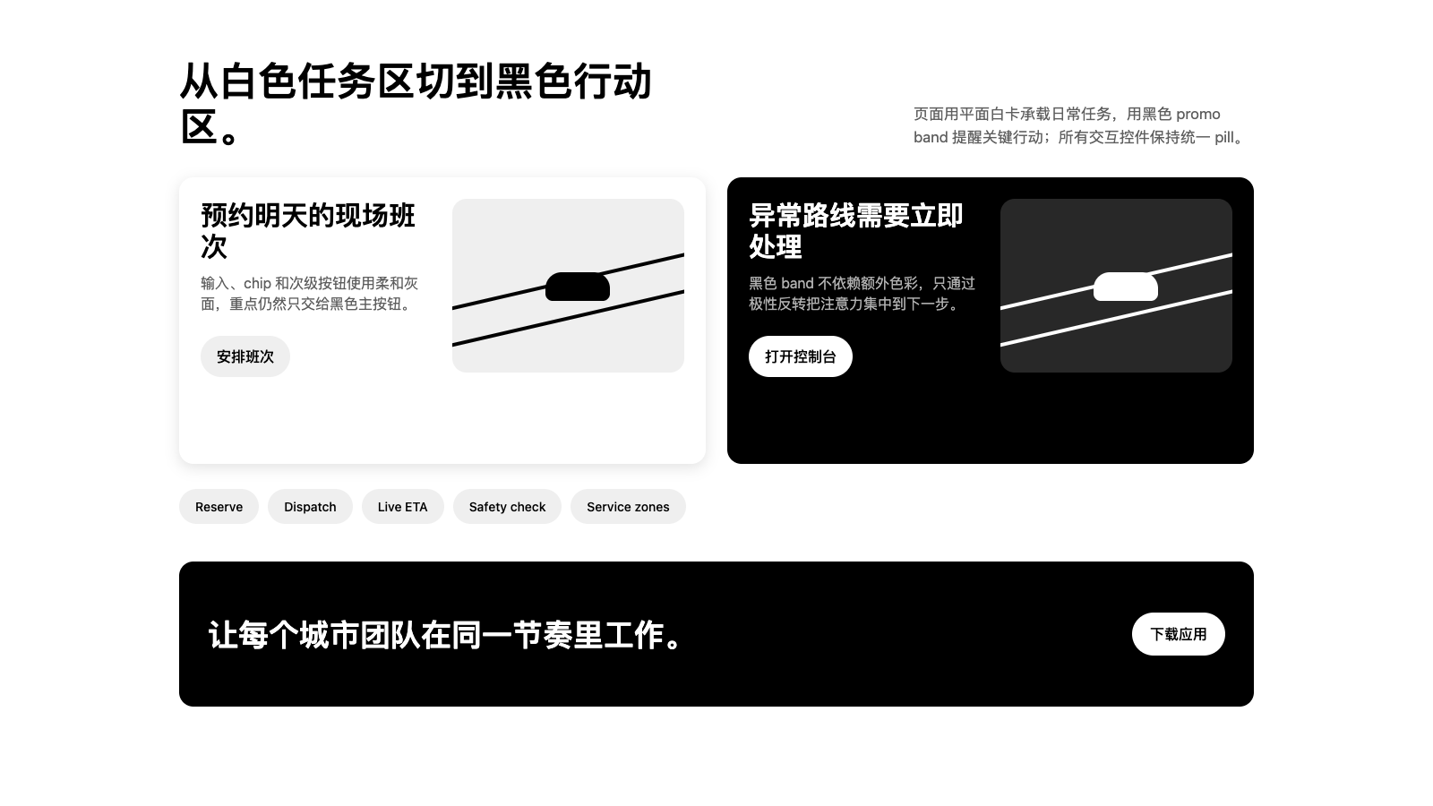
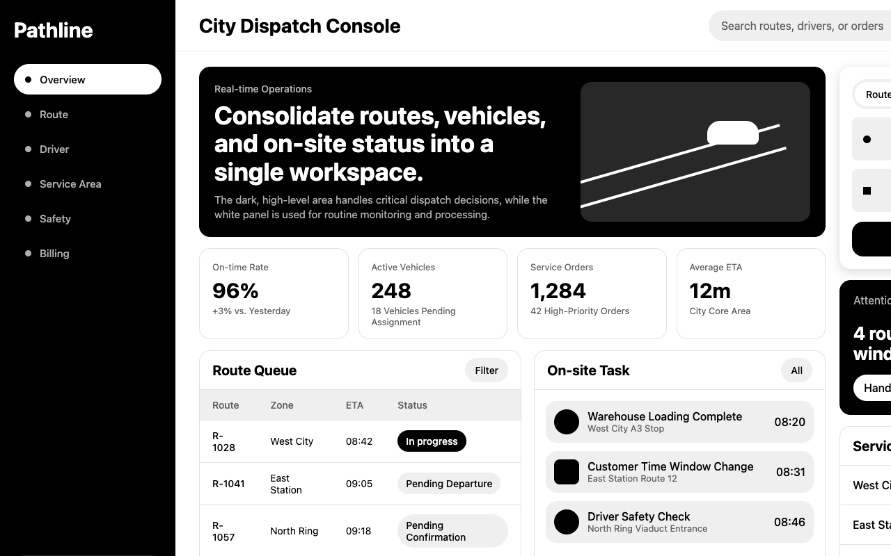

适合调度系统、本地服务和运营工具,黑白高对比、pill 操作和抽象路径图让任务流清晰直接。
设计语言样张
---
version: alpha
name: "Uber"
description: "Uber 的 DESIGN.md 中文参考模板,保留原始 design token 与专业术语,覆盖 color system、typography、layout、components、motion 与 interaction states。"
language: zh-CN
sourceLanguage: en
---

## 概览
Uber 是覆盖出行与配送的 super-app:ride、eats、freight,以及完整的 urban logistics layer。品牌 web surface 通过克制来表达规模感:没有第三种主色,没有 accent palette,也没有会抢 headline 的插画。页面结构上是黑白二重奏:黑色 `{colors.primary}` 是 conversion anchor(所有 CTA pill、nav login button、footer fill),白色 `{colors.canvas}` 承载其余内容。唯一稳定的装饰系统是一组 editorial 4:3 illustrations:riders、drivers、parking lots、cars-on-highway,用真实城市场景支撑 marketing,但不把 accent colour 泄露进系统。

Type 是第二个决定性声音。两个 custom faces 支撑所有页面:`UberMove` weight 700 用于 headlines(32–52 px display sizes,紧凑 1.22–1.25 line-height,绝不 letter-spaced),`UberMoveText` weight 400 / 500 用于 body、button、link。这个组合呈现 engineering-grade 的气质:没有 italic、没有 decorative weight、没有 tracking flourish。Headlines 使用 sentence-case;eyebrows 只有作为 section eyebrow(如 “WHY BECOME”)时才 uppercase;buttons 也使用 sentence-case。

唯一的 shape signature 是 pill。每个 interactive element 都圆到 `{rounded.pill}` 999 px:primary CTA、secondary CTA、subtle gray pill、white floating pill、category chip、app-download badge。Cards 与 surfaces 使用 `{rounded.xl}` 16 px;更大的 “Go Get 2026” annual-showcase card 也使用同样的 16 px,只是放大。Hero ride-request form 的 tab-toggle 使用 off-shape `{rounded.pill-tab}` 36 px:接近 pill,但刻意比 canonical 999 px pill 更紧。

**关键特征:**
- Two-colour CTA hierarchy:黑色 `{colors.primary}` pill 用于 primary conversion targets;白色 `{colors.canvas}` pill(有时带 soft drop shadow)用于 secondary;subtle gray `{colors.canvas-soft}` pill 用于 tertiary 或 chip variants。
- Pill 是唯一 signature shape:除 tab-toggle(`{rounded.pill-tab}` 36 px)和 larger product cards(`{rounded.xl}` 16 px)外,所有 interactive element 都使用 `{rounded.pill}` 999 px。
- 每个 headline 都是 sentence-case,使用 `{typography.display-xl}` / `{typography.display-xxl}` weight 700;不使用 all-caps display。
- riders / drivers / cars 的 editorial 4:3 illustrations 是唯一稳定的 decorative system;没有 gradients、没有 atmospheric backdrops,也没有非 card-elevation hint 的 shadows。
- 标志性的 alternating-band rhythm:white feature card → black promo card(white text 与 white CTA)→ white feature card → black footer。Black bands 不只用于 hero,也作为 mid-page promo callouts 出现。
- Hero 上有 signature ride-request form card:pickup pin input + destination input + date/time chip + black “See prices” pill,全部堆叠在 `{rounded.xl}` shadowed card 内。

## Colors

### Brand & Accent
- **Ink Black**(`{colors.primary}` — `#000000`):品牌唯一 conversion colour。用于每个 primary CTA pill、footer fill、每个 dark promo band、每个 nav login button。系统没有 secondary accent。
- **Surface Pressed**(`{colors.surface-pressed}` — `#e2e2e2`):white pills 的 pressed-state fill;只在 active / pressed states 使用的 soft grey。
- **Black Elevated**(`{colors.black-elevated}` — `#282828`):translucent white tab-toggle pill hover 时使用的 near-black。因为它出现在 recurring brand control 中,所以作为 system colour 记录。

### Surface
- **Canvas**(`{colors.canvas}` — `#ffffff`):默认 page background。
- **Canvas Soft**(`{colors.canvas-soft}` — `#efefef`):category chips、ride-request card 内 form-input rows、subtle pill buttons 使用的 soft gray fill。
- **Canvas Softer**(`{colors.canvas-softer}` — `#f3f3f3`):稍浅的 gray,用作 white surfaces 上的 nested-input fill。

### Text
- **Ink**(`{colors.ink}` — `#000000`):light surfaces 上的所有 heading 与 body paragraph。
- **Body**(`{colors.body}` — `#5e5e5e`):secondary text,包括 captions、sub-headings、supporting copy。
- **Hairline Mid**(`{colors.hairline-mid}` — `#4b4b4b`):footer columns 与 breadcrumb-style nav 内 muted link text 使用的 mid-gray。
- **Mute**(`{colors.mute}` — `#afafaf`):最轻的 text role,用于 placeholder text、fine print、low-priority metadata。
- **On Dark**(`{colors.on-dark}` — `#ffffff`):`{colors.ink}` surfaces(footer、dark promo bands)上的所有文字。

### Semantic Colors
品牌在 public marketing surface 中没有独立的 error / success / warning palette。Validation cues 来自 primary black 或品牌 editorial illustrations。`#0000ee` link colour 是系统唯一的 chromatic:它是 browser-default link blue,出现在 legal / footer text 的 body-copy inline links 中。

## Typography

### Font Family
两个 custom faces 承载整个系统:

1. **Custom geometric display sans**(提取为 `UberMove`)用于每个 headline。仅用 weight 700;无 italic;无 tracking variation。尺寸从 `display-sm` 20 px 到 hero 上的 `display-xxl` 52 px。Display sizes 的 line-heights 收紧到 1.22–1.25,形成 poured-on-the-page 的观感。
2. **Custom text sans**(提取为 `UberMoveText`)用于 body、button、link 与 small headings。Weights 400 和 500 是工作组合。使用在 12–18 px;ride-request form labels 最大 24 px。Tracking 始终 neutral。

两套字体共享 family DNA,但角色绝不重叠:display face 不承载 body paragraph;text face 不承载 hero headline。

### Hierarchy

| Token | Size | Weight | Line Height | 用途 |
|---|---|---|---|---|
| `{typography.display-xxl}` | 52px | 700 | 64px | Hero headline(“Go anywhere with Uber”、“Drive when you want”)。 |
| `{typography.display-xl}` | 36px | 700 | 44px | Page section headlines(“Plan for later”、“Safety, simplified”)。 |
| `{typography.display-lg}` | 32px | 700 | 40px | Promo-card headlines。 |
| `{typography.display-md}` | 24px | 700 | 32px | Card titles、illustrated-promo headlines。 |
| `{typography.display-sm}` | 20px | 700 | 28px | Sub-card headings。 |
| `{typography.body-lg}` | 18px | 500 | 24px | Lead paragraphs 与 larger body。 |
| `{typography.body-md}` | 16px | 400 | 24px | 默认 paragraph body。 |
| `{typography.body-md-strong}` | 16px | 500 | 20px | Bolded inline body 与多数 button labels。 |
| `{typography.body-sm}` | 14px | 400 | 20px | Captions、secondary metadata。 |
| `{typography.body-sm-strong}` | 14px | 500 | 16px | Bold caption / chip labels。 |
| `{typography.caption}` | 12px | 400 | 20px | Fine print、footer secondary lines。 |
| `{typography.button-large}` | 18px | 500 | 24px | Ride-request form 内 large rounded buttons。 |
| `{typography.button-md}` | 16px | 500 | 20px | 默认 button label。 |

### Principles
- **Sentence-case 是语气。** 不使用 all-caps headlines。Eyebrow tags(“WHY BECOME”)是少数例外。
- **Weight 700 给 headlines;weight 500 给 buttons 与 emphasis。** 不要把 button labels 提升到 700。
- **没有 tracking flourish。** Display face 从不做正向或负向 letter-spacing。
- **Two faces, two roles。** UberMove 用于 display;UberMoveText 用于其他所有内容。不要交叉使用。

### Font Substitutes
这两套字体是 proprietary。Open-source substitutes:
- **Display sans**:*Inter* weight 700 并启用 `font-feature-settings: "ss01"` 最接近。*Geist* weight 700 是第二选择。
- **Text sans**:*Inter* weights 400 / 500 匹配 geometric width 与 x-height。如果品牌想要更柔和、少一点 neutral feel,可用 *Plus Jakarta Sans*。

## Layout

### Spacing System
- **Base unit**:4 px。大多数捕获值都是 4 的倍数;button padding 内有少量 6-px sub-multiples(10、14)。
- **Tokens**:`{spacing.xxs}` 4 px · `{spacing.xs}` 6 px · `{spacing.sm}` 8 px · `{spacing.md}` 12 px · `{spacing.lg}` 16 px · `{spacing.xl}` 20 px · `{spacing.2xl}` 24 px · `{spacing.3xl}` 32 px。
- **Section padding**:紧凑页面上的 marketing bands 使用 `{spacing.3xl}` 32 px top/bottom;hero bands 使用 `{spacing.3xl} {spacing.3xl}`;promo cards inset 为 `{spacing.2xl}` 24 px。
- **Card interior padding**:content cards 使用 `{spacing.2xl}` 24 px;ride-request form 使用 `{spacing.lg}` 16 px,让表单保持紧凑。
- **Inline gap**:button rows、category chip rows、app-store pill rows 的 siblings 间距为 `{spacing.md}` 12 px。

### Grid & Container
- **Max width**:约 1200 px container;desktop 使用 `{spacing.3xl}` 32 px horizontal gutters 居中,mobile 使用 `{spacing.lg}` 16 px。
- **Column patterns**:
  - Promo-card rows:desktop 为 2-up(image left + content right,并交替侧边),mobile 为 1-up。
  - Category chips:horizontal flex with wrap。
  - FAQ rows:full-width single-column。
  - App-download pills:desktop 为 2-up(Rider + Driver),mobile 为 1-up。

### Whitespace Philosophy
Card-to-card spacing 承载节奏:两个 stacked promo cards 之间大约有完整 `{spacing.3xl}` 32 px gutter;card 内 headline / paragraph / CTA stack 更紧(siblings 间 `{spacing.sm}` 8 px)。Black promo bands 与 footer 没有 internal hairlines;内容直接落在 flat ink 上并使用 white text。

### Responsive Strategy

#### Breakpoints

| 名称 | 宽度 | 关键变化 |
|---|---|---|
| Mobile | < 600px | Nav 折叠为 hamburger;promo cards 堆叠;ride-request form 变为 full-width。 |
| Mobile-Large | 600–767px | 同 Mobile;chip rows 启用 horizontal scroll。 |
| Tablet | 768–1119px | 较宽时使用 2-up promo grid;nav 到 ≥ 1120 px 才保持 horizontal。 |
| Desktop | 1120–1135px | Full nav row 可见;promo cards 2-up。 |
| Desktop-Large | ≥ 1136px | Container 封顶约 1200 px;bands edge-to-edge,content 居中。 |

#### Touch Targets
Pill `button-primary` 渲染高度约 44 px(10 px vertical padding + 24 px label line-height);更大的 `button-large-rounded` 约 56 px。两者在所有 breakpoint 都满足 WCAG AAA。Category chips 在 touch viewports 通过额外 padding 增至 ≥ 44 px。

#### Collapsing Strategy
- **Nav**:desktop 为 full link row + Help / Log in / Sign up pills。Mobile 折叠为 logo + hamburger;menu 以 full-screen overlay 堆叠同一组 link list。
- **Ride-request form card**:desktop 中,form 位于 max-490-px `{rounded.xl}` shadow card 内。Mobile 为 full-width,并接近 edge-to-edge。
- **Promo cards**:desktop 为 image-left + content-right(或 alternating)。Mobile 始终 image above content。
- **Annual showcase card**:从 2:3 desktop frame 缩放到 4:3 mobile frame;date text 按比例缩放。

#### Image Behavior
- **Editorial illustrations**:4:3 或 16:9 hard-edge rectangles;绝不裁成圆形,也不倾斜。保持 aspect。
- **Photography**:同样处理,square 或 landscape;置于 `{rounded.xl}` card chrome 内。
- **Maps in ride-request flow**:card 内 full-bleed;rounded corners 跟随 parent card。
- **Logo bar**:SVG vector,monochrome,height 一致。

## Elevation & Depth

| Level | Treatment | 用途 |
|---|---|---|
| Level 0 — Flat | No shadow, no border. | 默认层级;多数 cards 与 surfaces 依靠 hairline-of-canvas contrast。 |
| Level 1 — Subtle Drop | `rgba(0, 0, 0, 0.12) 0px 4px 16px 0px` | Light bands 上 promo cards 周围的 card-elevated frames。 |
| Level 2 — Card Drop | `rgba(0, 0, 0, 0.16) 0px 4px 16px 0px` | Hero 上的 ride-request form card;带 embedded forms 的 large content cards。 |
| Level 3 — Pill Float | `rgba(0, 0, 0, 0.16) 0px 2px 8px 0px` | Floating white pill button(浮在 hero photography 上的那一个)。 |

### Decorative Depth
- **Black bands as polarity-flip depth**:品牌使用 pure black `{colors.primary}` mid-page bands 打破 white-on-white rhythm。Polarity shift 本身就是 depth cue。
- **Editorial illustrations as in-card depth**:每个 promo card 都有一个 4:3 illustration 作为 left 或 right column。插画的 visual weight 是 card elevation 感知的一部分。
- **Pill geometry as micro-depth**:`{rounded.pill}` 999 px 应用在不同 button heights 上,形成 nested pills 的层级感。

## Shapes

### Border Radius Scale

| Token | Value | 用途 |
|---|---|---|
| `{rounded.none}` | 0px | Full-bleed hero bands、footer fill、raw image edges。 |
| `{rounded.md}` | 8px | Ride-request card 内的 form-input fields。 |
| `{rounded.lg}` | 12px | Smaller secondary card chrome。 |
| `{rounded.xl}` | 16px | Canonical card radius:promo cards、content cards、ride-request form card、annual-showcase card、large rounded buttons。 |
| `{rounded.pill}` | 999px | 品牌 signature interactive shape:每个 pill button、category chip、app-download pill、icon button。 |
| `{rounded.pill-tab}` | 36px | Hero 上 translucent-white tab-toggle pill(Ride / Drive)。 |
| `{rounded.full}` | 9999px | 用于 circular icon containers,效果等同 `{rounded.pill}`。 |

### Photography Geometry
- **Editorial illustrations**:promo cards 内为 4:3 landscape;full-width showcase frames 为 16:9。
- **Driver / rider portraits**:4:5 portrait crop;由 `{rounded.xl}` 16 px card chrome framed。
- **Annual showcase image**:desktop 为 2:3 portrait,mobile 缩放到 4:3。Image 填满 card;headline overlay 在底部。
- **Logo bar**:monochrome SVG vectors,约 24 px height 且一致。
- **Avatars**(如使用):square 或 `{rounded.full}` circle,绝不使用 `{rounded.lg}` rounded-square。

## Components

### Buttons

**`button-primary`** — canonical black pill,品牌 conversion target。
- Background `{colors.primary}`、text `{colors.on-primary}`、label 使用 `{typography.button-md}`、padding `{spacing.md} {spacing.md}`、shape `{rounded.pill}` 999 px。

**`button-secondary`** — 与 black primary 配对的 white pill。
- Background `{colors.canvas}`、text `{colors.ink}`、label 与 padding 同 `button-primary`、shape `{rounded.pill}`。

**`button-subtle`** — cards 内 tertiary actions 使用的 gray secondary pill(例如 “Learn more” / “Use Reserve”)。
- Background `{colors.canvas-soft}`(`#efefef`)、text `{colors.ink}`、label 使用 `{typography.button-md}`、padding `{spacing.md} {spacing.lg}`、shape `{rounded.pill}`。

**`button-floating`** — 带 subtle drop-shadow 的 white pill,浮在 dark 或 photographic surface 上。
- Background `{colors.canvas}`、text `{colors.ink}`、padding `{spacing.md}`、shape `{rounded.pill}`。带 Level 3 pill-float shadow。

**`button-large-rounded`** — ride-request flow 内使用的更大 black call-to-action(“Yes, help me”)。
- Background `{colors.primary}`、text `{colors.on-primary}`、label 使用 `{typography.button-large}`、padding `{spacing.lg} {spacing.xl}`、shape `{rounded.xl}` 16 px(不是 pill;这是唯一打破 pill rule 的 black CTA,用于 larger form context)。

**`button-tab-translucent`** — hero ride-request form 上的 tab-toggle(Ride / Drive)。
- Background `{colors.canvas}`、text `{colors.ink}`、label 使用 `{typography.body-md-strong}`、shape `{rounded.pill-tab}` 36 px(off-shape,刻意比 canonical 999 px pill 更紧)。

### Cards & Containers

**`card-content`** — canonical content card。
- Background `{colors.canvas}`、text `{colors.ink}`、padding `{spacing.2xl}`、shape `{rounded.xl}` 16 px。Default state 无 shadow。

**`card-elevated`** — 带 Level 1 subtle drop 的 content card。
- Background `{colors.canvas}`、text `{colors.ink}`、padding + shape 同 `card-content`。Shadow 使用 Level 1。

**`card-soft-tinted`** — 页面 sub-region 使用的 gray-tinted card(例如 “Plan for later” callout)。
- Background `{colors.canvas-soft}`、text `{colors.ink}`、padding `{spacing.2xl}`、shape `{rounded.xl}`。

**`promo-card-illustrated`** — 一侧 illustration、另一侧 copy 的 2-column promo card。
- Background `{colors.canvas}`、text `{colors.ink}`、padding `{spacing.2xl}`、shape `{rounded.xl}`。Headline 使用 `{typography.display-md}` 或更大。

**`promo-card-on-dark`** — black 中的 polarity-flipped promo card。
- Background `{colors.ink}`、text `{colors.on-dark}`、padding `{spacing.2xl}`、shape `{rounded.xl}`。用于 “Drive with Uber” mid-page band。

**`request-form-card`** — hero ride-request form chrome。
- Background `{colors.canvas}`、text `{colors.ink}`、padding `{spacing.lg}`、shape `{rounded.xl}`。带 Level 2 card drop shadow。

**`request-form-input-row`** — request-form card 内的 per-field row。
- Background `{colors.canvas-soft}`、text `{colors.ink}`、padding `{spacing.lg}`、shape `{rounded.md}` 8 px。承载 icon + label + value。

**`showcase-image-card`** — 巨大的 “GO•GET 2026” annual showcase card。
- Background `{colors.ink}`、text `{colors.on-dark}` overlay、padding `{spacing.3xl}`、shape `{rounded.xl}`。Display-xxl headline overlay 在 image 底部。

### Inputs & Forms

**`text-input`** — canonical text input。
- Background `{colors.canvas-soft}`、text `{colors.ink}`、body 使用 `{typography.body-md}`、padding `{spacing.lg}`、shape `{rounded.md}` 8 px。

**`text-input-on-soft`** — white card 上的 nested input(fill 稍浅)。
- Background `{colors.canvas-softer}`,其余与 `text-input` 相同。

### Navigation

**`nav-bar`** — sticky top nav。
- Light pages 上 background `{colors.canvas}`,少数 dark page(如 Uber Eats hero)切换为 `{colors.ink}`。Padding `{spacing.lg} {spacing.3xl}`。

**`nav-link`** — `nav-bar` 内的 link row。
- Text `{colors.ink}`,使用 `{typography.body-md-strong}` 500 weight。

**`footer`** — deep-black footer band。
- Background `{colors.primary}`(品牌唯一 true black surface)、text `{colors.on-dark}`、padding `{spacing.3xl} {spacing.3xl}`。Body 使用 `{typography.body-sm}`;column eyebrows 使用 `{typography.body-md-strong}`。

### Signature Components

**`hero-band-light`** — 带 ride-request card 的 white hero。
- Background `{colors.canvas}`、text `{colors.ink}`、padding `{spacing.3xl} {spacing.3xl}`。左侧 headline 使用 `{typography.display-xxl}`(52 px / 700);右侧为 `request-form-card`。

**`hero-band-dark`** — 少见的 black hero(用于 Uber Eats 与 Drive landing)。
- Background `{colors.ink}`、text `{colors.on-dark}`、padding `{spacing.3xl} {spacing.3xl}`。沿用 display-xxl headline scale;CTA invert 为 `button-secondary` white pill。

**`category-button`** — horizontal-scroll category row(“Reserve / Rentals / Teens / Group rides”)。
- Background `{colors.canvas-soft}`、text `{colors.ink}`、label 使用 `{typography.body-sm-strong}`、padding `{spacing.sm} {spacing.lg}`、shape `{rounded.pill}`。Label 前有 icon。

**`faq-row`** — FAQ accordion item。
- Background `{colors.canvas}`、text `{colors.ink}`、question 使用 `{typography.body-md-strong}`、padding `{spacing.lg}` 0。无 card chrome;rows 之间使用 hairline dividers。

**`app-download-pill`** — “Download the Rider app” / “Download the Driver app” pill。
- Background `{colors.ink}`、text `{colors.on-dark}`、label 使用 `{typography.body-md-strong}`、padding `{spacing.md} {spacing.xl}`、shape `{rounded.pill}`。

**`icon-button-circular`** — nav 与 ride-request card 内使用的 round icon container。
- Background `{colors.canvas-soft}`、dark icon、shape `{rounded.full}`。无 label。

### Links

**`link-blue`** — legal / footer fine print 内的 system-default browser-blue link。
- Text `{colors.link}`(`#0000ee`),body 使用 `{typography.body-md}`。

**`link-on-dark`** — dark bands 内的 white link。
- Text `{colors.on-dark}`,body 使用 `{typography.body-md}`。

**`link-mute`** — footer columns 内的 muted gray link。
- Text `{colors.hairline-mid}`,body 使用 `{typography.body-md}`。

**`link-mute-soft`** — 最浅的 gray link,用于 dark surfaces 上的 low-priority secondary text。
- Text `{colors.mute}`,body 使用 `{typography.body-md}`。

### Examples (illustrative)

> Auto-derived kit-mirror demonstration surfaces(`scripts/derive-examples-block.mjs`)。每个 `ex-*` entry 都引用 brand-native primitives,让 downstream consumers(`/preview-design`、`/generate-kit`)能一致地 re-skin 同一组 10 个 surfaces。`TO_FILL` markers 表示缺失 primitives,需要在 LLM judgment pass 中处理。

**`ex-pricing-tier`** — 默认 Pricing tier card。复用 feature-card chrome 与 brand canvas-soft surface。
- Properties:`backgroundColor`, `textColor`, `borderColor`, `rounded`, `padding`

**`ex-pricing-tier-featured`** — Featured/highlighted tier;polarity-flipped surface(light mode 为 dark fill + light text,dark mode 为 light fill + dark text)。
- Properties:`backgroundColor`, `textColor`, `rounded`, `padding`

**`ex-product-selector`** — What's Included summary card;为 SaaS / B2B verticals 重新定位(不是 literal product gallery)。
- Properties:`backgroundColor`, `rounded`, `padding`

**`ex-cart-drawer`** — Subscription summary;为 SaaS / B2B 重新定位(每个 add-on 一行,不是 literal cart)。
- Properties:`backgroundColor`, `rounded`, `padding`, `item-divider`

**`ex-app-shell-row`** — App Shell example 内的 Sidebar nav row。Active state 使用 brand primary 作为 indicator。
- Properties:`backgroundColor`, `activeIndicator`, `rounded`, `padding`

**`ex-data-table-cell`** — 默认 data-table th + td chrome。Header 使用 mono-caps eyebrow typography;body 使用 body-sm。
- Properties:`headerBackground`, `headerTypography`, `bodyTypography`, `cellPadding`, `rowBorder`

**`ex-auth-form-card`** — Sign-in / sign-up card。复用 feature-card chrome,并在内部使用 text-input primitives。
- Properties:`backgroundColor`, `rounded`, `padding`

**`ex-modal-card`** — Modal dialog surface;与 feature-card 使用相同 chrome,并带 elevated shadow。
- Properties:`backgroundColor`, `rounded`, `padding`

**`ex-empty-state-card`** — Empty-state illustration frame。
- Properties:`backgroundColor`, `rounded`, `padding`, `captionTypography`

**`ex-toast`** — Toast notification surface;feature-card shape + medium shadow。
- Properties:`backgroundColor`, `rounded`, `padding`, `typography`

## Do's and Don'ts

### Do
- 将 `{colors.primary}`(`#000000`)保留给每个 primary CTA pill。每个 visible viewport 一个 black pill,就是品牌完整的 conversion story。
- 在每个 interactive element(buttons、chips、app pills)上使用 `{rounded.pill}` 999 px。Pill 就是品牌 geometric signature。
- Cards 使用 `{rounded.xl}` 16 px:promo cards、content cards、ride-request form card、annual-showcase card 都共享这一 radius。
- 每个 headline 都用 `{typography.display-*}` weight 700 且 sentence-case。Display face 永不承载 body copy。
- 在 mid-page 使用 polarity-flipped black promo bands 打破 white-on-white rhythm。Polarity shift 本身就是 depth cue。
- 每个 promo card 都用 4:3 editorial illustration 锚定;不要使用 generic stock imagery。

### Don't
- 不要引入第二个 brand accent colour(orange、blue、green)。品牌整个 UI 是 black-and-white 加 grayscale;新 accent 会压平系统。
- 除 larger ride-request flow(`button-large-rounded` 是已记录例外)外,不要把 primary CTA 渲染成 `{rounded.xl}` rectangle。
- 不要使用 all-caps display headlines。Sentence-case 是语气;uppercase 只限少数 eyebrow tags。
- 不要给每张 card 都加 soft drop-shadow。品牌默认使用 Level 0 flat;shadow 只保留给 floating pill 与 ride-request form。
- 不要把品牌简化成 illustration system。即使没有插画,pill geometry + black/white duet 也能承载品牌。
- 不要收紧或放松 display face 的 letter-spacing。品牌从不 letter-space;default tracking 是语气的一部分。
- 不要把 `{rounded.full}` 9999 px 用在 square cards 上;对于 interactive elements,pill 999 px 与 full 9999 px 效果相同,但 cards 保持 `{rounded.xl}` 16 px。


