

01 / 03
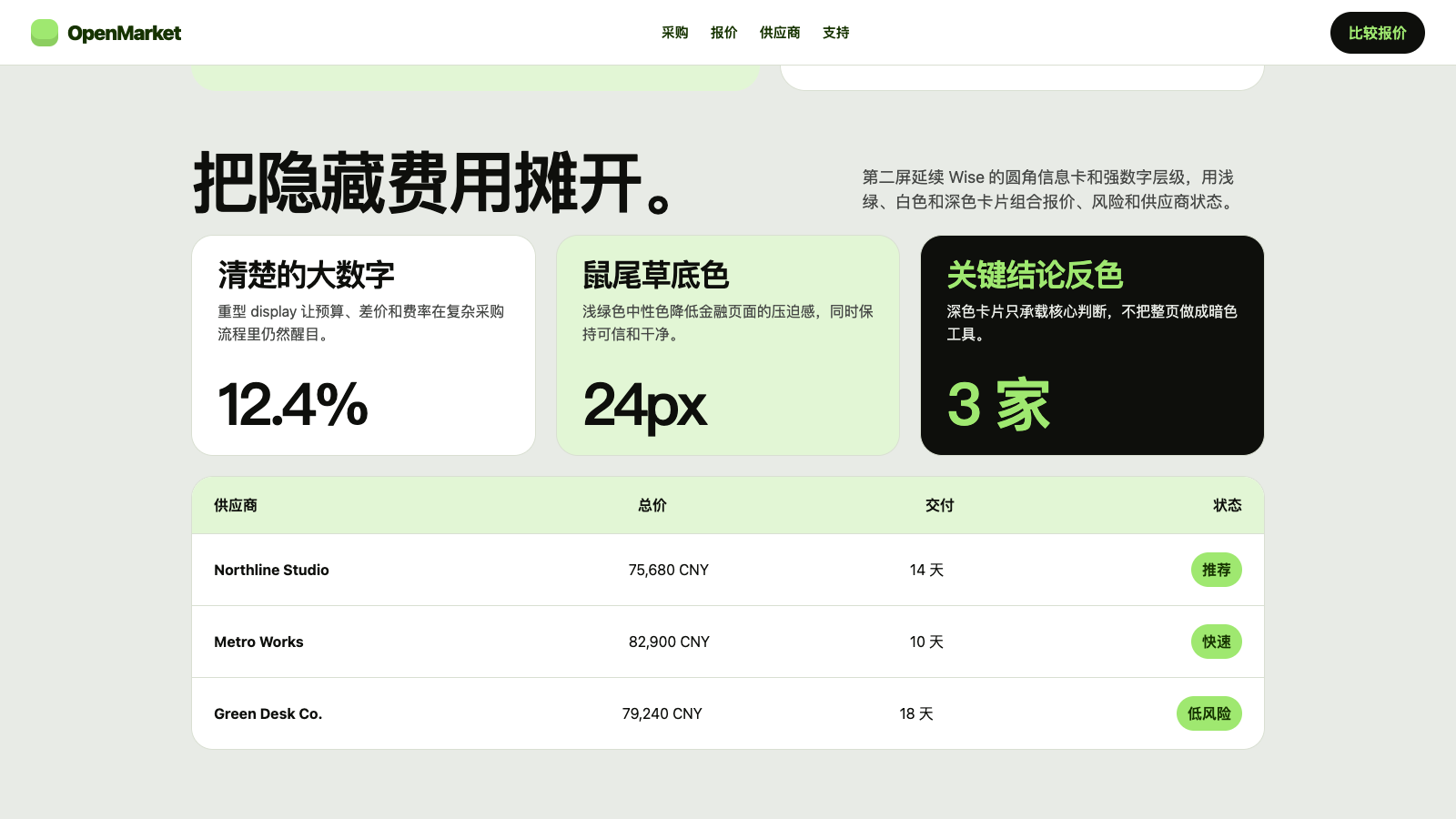
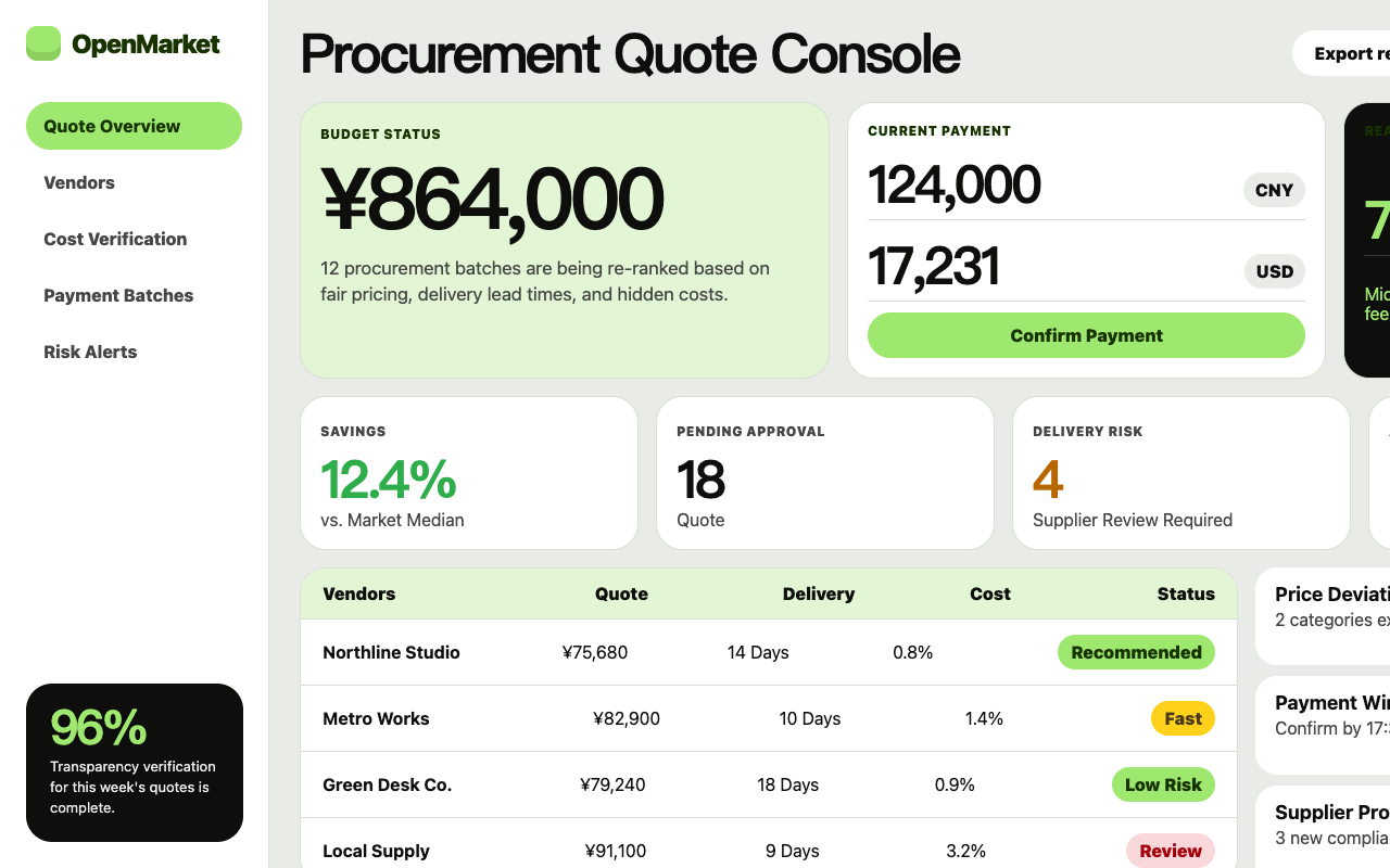

适合报价比较、采购决策和透明型服务页,超重标题、青柠行动色和鼠尾草色卡片让复杂选择变得轻松直接。
设计语言样张
浅鼠尾草画布、900 字重标题和 lime pill 主按钮,让金融信息看起来清楚、亲和、直接。
---
version: alpha
name: "Wise"
description: "Wise 的 DESIGN.md 中文参考模板,保留原始 design token 与专业术语,覆盖 color system、typography、layout、components、motion 与 interaction states。"
language: zh-CN
sourceLanguage: en
---

## 概览
Wise 这个 global money-transfer brand 用一组 signature pairing 承载 identity:鲜亮的 lime-green `{colors.primary}` (`#9fe870`) 作为 CTA pill 和 brand accent,放在贯穿 hero band 的 pale sage-tinted canvas `{colors.canvas-soft}` (`#e8ebe6`) 上,并搭配带有 olive warmth 的 near-black ink `{colors.ink}` (`#0e0f0c`)。品牌读起来更像一本平静的 Scandinavian magazine,而不是银行:宽松 whitespace、大型 rounded card,以及 weight 900 的异常厚重 display sans 承载每个 hero headline。

Display typography 是第二个决定性声音。专有 `Wise Sans` family 以 weight 900 承载 hero display,尺寸从 64 px 到最大 hero 的 126 px。品牌将 Wise Sans 900 与 weight 600 的 Inter sub-display 配对;chunky proprietary face 与 Inter neutrality 的对比建立了独特层级:Wise Sans 用于 brand moment,Inter 用于其它一切。

Card 全部是 pill-rounded;`{rounded.xl}` 24 px 是品牌 signature card radius。Button 使用同样的 24 px pill-rectangle shape。品牌从不在 UI element 上使用 sharp corner;这种视觉 softness 是 friendly fintech voice 的一部分。

**Key Characteristics:**
- 单一 lime-green CTA accent `{colors.primary}` (`#9fe870`) 是品牌 universal primary action color。没有第二 accent。
- Two-face display typography:Wise Sans(proprietary、weight 900、hero scale)+ Inter(weight 600、sub-display scale)。两者对比就是品牌的 typographic story。
- `{rounded.xl}` 24 px 是 canonical card 和 button radius,宽松且友好。
- Sage-tinted canvas `{colors.canvas-soft}` (`#e8ebe6`) 是品牌 hero surface;white `{colors.canvas}` 留给 sage band 内部的 card。
- 完整 semantic palette:positive green family、warning yellow family、negative red family;每组都记录 content / hover / active variant,用于 in-product。
- Hero 上的 currency-converter card 是品牌 signature interactive component,承载 from/to amount input。

## Colors

### Brand & Accent
- **Wise Green** (`{colors.primary}` — `#9fe870`): 品牌 universal CTA color。用于每个 primary button、每个 "Send money" pill 和品牌 logo accent。
- **Wise Green Hover** (`{colors.primary-active}` — `#cdffad`): Active state 的更浅 green。
- **Wise Green Neutral** (`{colors.primary-neutral}` — `#c5edab`): Mid-saturation green,用作 neutral active fill。
- **Wise Green Pale** (`{colors.primary-pale}` — `#e2f6d5`): 最浅 green,用于 soft surface tint / badge background。

### Surface
- **Canvas** (`{colors.canvas}` — `#ffffff`): Card interior 使用的 pure white。
- **Canvas Soft** (`{colors.canvas-soft}` — `#e8ebe6`): Sage-tinted page background,定义品牌 mood。

### Text
- **Ink** (`{colors.ink}` — `#0e0f0c`): 带一点 olive warmth 的 near-black,是品牌默认 text 和 heading color。
- **Ink Deep** (`{colors.ink-deep}` — `#163300`): Deep forest-green ink,用于 positive-state surface。
- **Body** (`{colors.body}` — `#454745`): Secondary body text。
- **Mute** (`{colors.mute}` — `#868685`): 最低优先级 text,用于 caption、placeholder、fine print。

### Semantic Colors
- **Positive** (`{colors.positive}` — `#2ead4b`): Success indicator。
- **Positive Deep** (`{colors.positive-deep}` — `#054d28`): Pressed positive state。
- **Warning** (`{colors.warning}` — `#ffd11a`): Caution indicator。
- **Warning Deep** (`{colors.warning-deep}` — `#b86700`): Pressed warning。
- **Warning Content** (`{colors.warning-content}` — `#4a3b1c`): Warning surface 上的 text。
- **Negative** (`{colors.negative}` — `#d03238`): Destructive / error red。
- **Negative Deep** (`{colors.negative-deep}` — `#a72027`): Pressed destructive。
- **Negative Darkest** (`{colors.negative-darkest}` — `#a7000d`): 最高强调 destructive text。
- **Negative Bg** (`{colors.negative-bg}` — `#320707`): Destructive callout background 使用的 dark maroon。

### Brand Accent — Tertiary
- **Accent Orange** (`{colors.accent-orange}` — `#ffc091`): Bright peach,用于 illustrative content / pricing card 内部。
- **Accent Cyan** (`{colors.accent-cyan}` — `#38c8ff`): Bright sky-blue,用作 tertiary illustration accent。

## Typography

### Font Family
系统由两套字体分层:
1. **Wise Sans**:专有 geometric sans,以异常厚重的 weight 900 用于所有 hero display。这套字体是品牌 typographic signature。Marketing surface 上始终为 weight 900,绝不更轻。
2. **Inter**:用于 sub-display(weight 600)、所有 body 和 form label。通过 `font-feature-settings: "calt"` 启用 contextual alternate。

### Hierarchy

| Token | Size | Weight | Line Height | Letter Spacing | 用途 |
|---|---|---|---|---|---|
| `{typography.display-mega}` | 126px | 900 | 107.1px | 0 | 最大 scale 的 hero stencil。 |
| `{typography.display-xxl}` | 96px | 900 | 81.6px | 0 | Sub-hero scale。 |
| `{typography.display-xl}` | 64px | 900 | 54.4px | 0 | Standard hero headline。 |
| `{typography.display-lg}` | 47px | 400 | 70.5px | -0.108px | 更轻的 sub-display。 |
| `{typography.display-md}` | 40px | 900 | 34px | 0 | Section / card headline。 |
| `{typography.display-sm}` | 32px | 600 | 38.4px | -0.96px | Inter 渲染的 section heading。 |
| `{typography.display-xs}` | 24px | 600 | 31.2px | -0.48px | Sub-section display。 |
| `{typography.body-lg}` | 20px | 400 | 30px | 0 | Lead paragraph。 |
| `{typography.body-md}` | 16px | 400 | 24px | 0 | Default body。 |
| `{typography.body-md-strong}` | 16px | 600 | 24px | 0 | Bold inline body。 |
| `{typography.body-sm}` | 14px | 400 | 20px | 0 | Secondary body。 |
| `{typography.body-sm-strong}` | 14px | 600 | 20px | 0 | Bold caption / nav-link。 |
| `{typography.caption}` | 12px | 400 | 16px | 0 | Fine print。 |
| `{typography.button-md}` | 16px | 600 | 24px | 0 | Button label。 |

### Principles
- **Hero 使用 weight 900,其它使用 weight 600。** 品牌 display ceiling 是 full-black weight;其下全部是 semibold。
- **Wise Sans 承载 brand voice,Inter 承载 utility。** 两者严格分工。

### Font Substitutes
Wise Sans 是专有字体。Open-source substitute:
- **Display**:weight 900 的 *Inter* 或 weight 800 / 900 的 *Manrope* 可以捕捉 geometric heaviness。*Geist* weight 800 是可接受的第二选择。
- **Sub-display + body**:*Inter* 是品牌实际使用的第二套 face。

## Layout

### Spacing System
- **Base unit**: 4 px.
- **Tokens**: `{spacing.xxs}` 2 px · `{spacing.xs}` 4 px · `{spacing.sm}` 8 px · `{spacing.md}` 12 px · `{spacing.lg}` 16 px · `{spacing.xl}` 24 px · `{spacing.2xl}` 32 px · `{spacing.3xl}` 48 px.
- **Section padding**: desktop 上 band 使用 `{spacing.3xl}` 48 px top/bottom。
- **Card interior**: card 使用 `{spacing.xl}` 24 px。

### Grid & Container
- Marketing container 居中在约 1200 px。
- Hero: desktop 为 split layout(headline left、currency-converter card right);mobile 堆叠。
- Feature grid: desktop 为 2-up / 3-up。

### Responsive Strategy

#### Breakpoints

| Name | Width | 关键变化 |
|---|---|---|
| Mobile | < 768px | Hero 堆叠;converter card 在 headline 下方 full-width;grid 1-up。 |
| Tablet | 768–1023px | Grid 2-up。 |
| Desktop | ≥ 1024px | Hero split;完整 grid。 |

#### Touch Targets
Button 渲染高度约 48 px(12 vertical padding + 24 line),所有宽度下符合 WCAG AAA。

#### Image Behavior
Photography 使用很少;品牌更偏好 card 内的 illustrative SVG 和 product mockup。Country flag thumbnail 出现在 currency row 内。

## Elevation & Depth

| Level | Treatment | 用途 |
|---|---|---|
| Level 0 — Flat | 无 shadow,无 border。 | Default。 |
| Level 1 — Hairline on Dark | 1 px solid `{colors.ink}` border。 | Tertiary outline button、form input。 |
| Level 2 — Soft Card | Sage canvas 上的隐式 Level 0 white card;surface contrast 就是 elevation。 | Sage hero band 上的 card。 |

品牌使用 surface contrast(`{colors.canvas-soft}` background vs `{colors.canvas}` card)作为主要 elevation cue。

## Shapes

### Border Radius Scale

| Token | Value | 用途 |
|---|---|---|
| `{rounded.none}` | 0px | Full-bleed band。 |
| `{rounded.sm}` | 8px | Inline pill、small badge。 |
| `{rounded.md}` | 12px | Form input、smaller chrome。 |
| `{rounded.lg}` | 16px | Mid-size card。 |
| `{rounded.xl}` | 24px | 品牌 canonical button + card radius。 |
| `{rounded.pill}` | 9999px | Status pill 和 full-radius accent。 |
| `{rounded.full}` | 9999px | Circular icon container。 |

## Components

### Buttons

**`button-primary`** — the lime-green CTA pill.
- Background `{colors.primary}`、text `{colors.on-primary}`、label `{typography.button-md}`、padding `{spacing.md} {spacing.xl}`、shape `{rounded.xl}` 24 px。

**`button-secondary`** — the sage-tinted secondary.
- Background `{colors.canvas-soft}`、text `{colors.ink}`,使用相同 typography / padding / shape。

**`button-tertiary`** — the white outline tertiary.
- Background `{colors.canvas}`、text `{colors.ink}`、1 px solid `{colors.ink}` border,使用相同 typography / padding / shape。

**`button-icon-circular`** — the circular icon button.
- Background `{colors.canvas}`、ink icon、shape `{rounded.full}`。

### Cards & Containers

**`card-content`** — the default white card.
- Background `{colors.canvas}`、text `{colors.ink}`、padding `{spacing.xl}`、shape `{rounded.xl}`。无 border,位于 sage canvas 上。它依靠白色与 sage 背景的差异形成轻量层级。

**`card-feature-sage`** — the sage-tinted feature card.
- Background `{colors.canvas-soft}`、text `{colors.ink}`、padding `{spacing.xl}`、shape `{rounded.xl}`。

**`card-feature-green`** — the soft-green feature card.
- Background `{colors.primary-pale}`、text `{colors.ink}`、padding `{spacing.xl}`、shape `{rounded.xl}`。适合强调低风险、低压力的功能收益。

**`card-feature-dark`** — the polarity-flipped dark card with green text.
- Background `{colors.ink}`、text `{colors.primary}`(Wise green!)、padding `{spacing.xl}`、shape `{rounded.xl}`。用于 promotional moment。

**`currency-converter-card`** — the brand's signature interactive widget.
- Background `{colors.canvas}`、text `{colors.ink}`、1 px solid `{colors.ink}` border、padding `{spacing.xl}`、shape `{rounded.xl}`。承载 from/to amount input + currency selector,是首页最能说明业务价值的交互组件。

### Inputs & Forms

**`text-input`** — the canonical text input.
- Background `{colors.canvas}`、text `{colors.ink}`、1 px solid `{colors.ink}` border、body 使用 `{typography.body-md}`、padding `{spacing.md} {spacing.lg}`、shape `{rounded.md}`。

### Navigation

**`nav-bar`** — the sticky top nav.
- Background `{colors.canvas}`、text `{colors.ink}`、padding `{spacing.md} {spacing.xl}`。

**`nav-link`** — link items inside nav.
- Text `{colors.ink}`,使用 `{typography.body-sm-strong}`。

**`footer`** — the dark footer band.
- Background `{colors.ink}`、text `{colors.canvas-soft}`、padding `{spacing.3xl} {spacing.xl}`。Body 使用 `{typography.body-sm}`。

### Signature Components

**`hero-band`** — the sage-canvas hero band.
- Background `{colors.canvas-soft}`、text `{colors.ink}`、padding `{spacing.3xl} {spacing.xl}`。Headline 使用 `{typography.display-mega}`(Wise Sans weight 900)。

**`hero-band-dark`** — the polarity-flipped dark hero.
- Background `{colors.ink}`、text `{colors.primary}`(near-black 上的 Wise green headline!),使用相同 padding / scale。

**`content-band`** — the white content band that follows hero.
- Background `{colors.canvas}`、text `{colors.ink}`、padding `{spacing.3xl} {spacing.xl}`。Section headline 使用 `{typography.display-md}`。

**`badge-positive`** — the positive status pill.
- Background `{colors.primary-pale}`、text `{colors.positive-deep}`、body 使用 `{typography.body-sm-strong}`、padding `{spacing.xs} {spacing.md}`、shape `{rounded.pill}`。

**`badge-negative`** — the negative status pill.
- Background `{colors.negative-bg}`、text white、body 使用 `{typography.body-sm-strong}`、padding `{spacing.xs} {spacing.md}`、shape `{rounded.pill}`。

### Examples (illustrative)

> 自动派生的 kit-mirror demonstration surface(`scripts/derive-examples-block.mjs`)。每个 `ex-*` 条目引用 brand-native primitive,使下游消费者(`/preview-design`、`/generate-kit`)能一致地重新套用这 10 个 surface。`TO_FILL` marker 表示缺失 primitive,需要在 LLM judgment pass 中解决。

**`ex-pricing-tier`** — Default pricing tier card。复用 feature-card chrome,并使用品牌 canvas-soft surface。
- Properties: `backgroundColor`, `textColor`, `borderColor`, `rounded`, `padding`

**`ex-pricing-tier-featured`** — Featured / highlighted tier,使用 polarity-flipped surface(light mode 中 dark fill + light text,dark mode 中 light fill + dark text)。
- Properties: `backgroundColor`, `textColor`, `rounded`, `padding`

**`ex-product-selector`** — What's Included summary card,重用于 SaaS / B2B vertical(不是字面 product gallery)。
- Properties: `backgroundColor`, `rounded`, `padding`

**`ex-cart-drawer`** — Subscription summary,重用于 SaaS / B2B(每个 add-on 一行,不是字面 cart)。
- Properties: `backgroundColor`, `rounded`, `padding`, `item-divider`

**`ex-app-shell-row`** — App Shell example 内的 sidebar nav row。Active state 使用 brand primary 作为 indicator。
- Properties: `backgroundColor`, `activeIndicator`, `rounded`, `padding`

**`ex-data-table-cell`** — Default data-table th + td chrome。Header 使用 mono-caps eyebrow typography;body 使用 body-sm。
- Properties: `headerBackground`, `headerTypography`, `bodyTypography`, `cellPadding`, `rowBorder`

**`ex-auth-form-card`** — Sign-in / sign-up card。复用 feature-card chrome,内部使用 text-input primitive。
- Properties: `backgroundColor`, `rounded`, `padding`

**`ex-modal-card`** — Modal dialog surface,与 feature-card 使用相同 chrome,并带 elevated shadow。
- Properties: `backgroundColor`, `rounded`, `padding`

**`ex-empty-state-card`** — Empty-state illustration frame,用于空状态插图和简短说明。
- Properties: `backgroundColor`, `rounded`, `padding`, `captionTypography`

**`ex-toast`** — Toast notification surface,使用 feature-card shape + medium shadow。
- Properties: `backgroundColor`, `rounded`, `padding`, `typography`

## Do's and Don'ts

### Do
- 将 `{colors.primary}` Wise green 保留给每个 primary CTA。Lime-green pill 就是品牌 conversion signature。
- Hero headline 使用 `{typography.display-mega}` / `{typography.display-xl}` Wise Sans weight 900。绝不更轻。
- Button 和 card 使用 `{rounded.xl}` 24 px。宽松 radius 是品牌 friendliness signature。
- Page surface 按 `{colors.canvas-soft}` sage canvas → `{colors.canvas}` white card 循环。Surface contrast 承担 elevation。
- In-product status 使用完整 semantic palette(positive / warning / negative);不要把 Wise green 重新用作 success indicator,因为它就是品牌 CTA。

### Don't
- 不要引入第二个 brand accent。Wise green 是唯一 identity color。
- 不要用 weight 700 或更轻渲染 hero。品牌 display weight 是 900。
- 不要把 CTA 渲染成 sharp rectangle。24 px pill geometry 不可谈判。
- 不要把 green CTA 和 green background 配在一起。Wise green 总是放在 neutral surface(sage / white / ink)上。
- 不要用通用 geometric sans 替代 hero typography 中的 Wise Sans;这套 proprietary face 就是品牌声音。


