01 / 03

适合项目管理、缺陷追踪和团队工作流,暗色精密、动效克制,强调效率和秩序。
设计语言样张
正文保持轻、准、低噪音,适合解释工程流程、项目进度和产品细节。
ENG-142
api.deploy.ready
把 #010102 作为锚点画布,用四级 charcoal surface 建立层级。
紫蓝色只放在品牌标记、主按钮、焦点环和少量链接上。
显示标题使用 500-600 字重和明显负字距,正文保持 400。
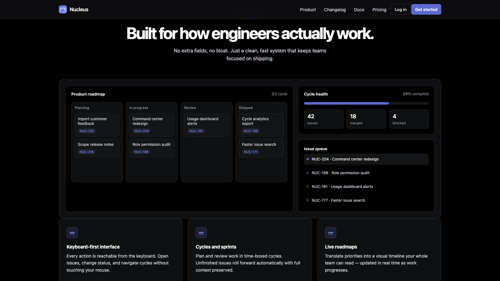
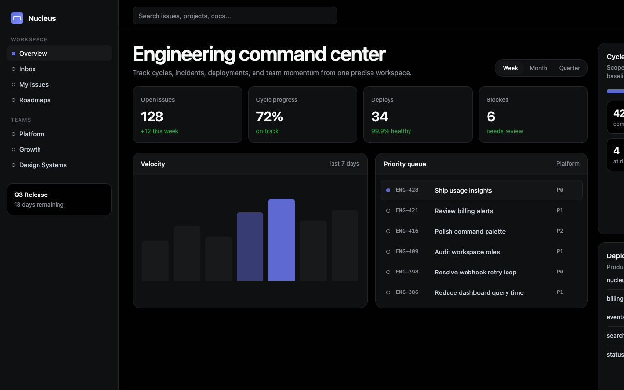
产品 UI 截图或真实应用面板要成为每个核心区块的主角。
卡片靠 1px hairline 和 surface lift 区分,不依赖大投影。
不要把页面改成浅色模式。
不要把紫蓝色铺成大面积背景或多个装饰块。
不要引入第二套高饱和强调色。
不要做氛围渐变、聚光灯卡片或花哨插画。
不要把 CTA 改成胶囊按钮;保持 8px 圆角。
---
version: alpha
name: "Linear"
description: "Linear 的 DESIGN.md 中文参考模板,保留原始 design token 与专业术语,覆盖 color system、typography、layout、components、motion 与 interaction states。"
language: zh-CN
sourceLanguage: en
---

## 概览
Linear 的 marketing canvas 是本集合中最深的 dark surface:`{colors.canvas}` 是 #010102,基本接近 pure black,但带一点 faint blue tint。其上是一组 four-step surface ladder(`{colors.surface-1}` 到 `{colors.surface-4}`),用于 card、panel 与 lifted tile;hairline border 从 `{colors.hairline}`(#23252a)延伸到 `{colors.hairline-strong}` 与 `{colors.hairline-tertiary}`。Light gray text(`{colors.ink}` #f7f8f8)承载 body 与 headline。

唯一 chromatic accent 是 **Linear lavender-blue** `{colors.primary}`(#5e6ad2),用于 brand mark、focus ring 与 primary CTA button。更浅的 hover state(`{colors.primary-hover}` #828fff)与 focus-tinted variant(`{colors.primary-focus}` #5e69d1)延展同一 hue。Linear 在 marketing canvas 上避免 saturated green、orange、red 等颜色;唯一 semantic color 是 `{colors.semantic-success}`(#27a644),用于 status pill 与少见的 success indicator。

Display type 使用 Linear custom sans(fallback 为 `SF Pro Display`),weight 500–700,negative letter-spacing 从 80px 时的 -3.0px 逐步缩到 body 的 0。Body family 是 Linear 的 text cut,而 Linear Mono 只保留给 product screenshot 中的 code snippet。

Page rhythm 是 **dense product screenshot**:Linear marketing 以高保真的 product UI capture(issue list、project view、dashboard)为主角,并把它们放在 `{colors.surface-1}` panel 中,使用 `{rounded.xl}` 16px corner。Chrome 有意保持 minimal,让 app screenshot 承担主要表达。

**Key Characteristics:**
- **Dark-canvas marketing system**:`{colors.canvas}`(#010102)是本集合里最深的 dark。
- **Lavender-blue brand accent**(`{colors.primary}` #5e6ad2):谨慎用于 brand mark、focus 与 primary CTA。
- Four-step surface ladder(canvas → surface-1 → surface-2 → surface-3 → surface-4)不用 shadow 也能承载 hierarchy。
- Display tracking 强烈负向收紧(80px 时 -3.0px);body 保持 -0.05px。
- Card 使用 `{rounded.lg}` 12px corner 与 1px hairline border;不使用 pill,16px 也很少。
- **Product UI screenshot** 主导页面。Marketing chrome 是 app 的 dark frame。
- 没有第二个 chromatic color。没有 atmospheric gradient。没有 spotlight card。

## Colors

> Source pages: linear.app (home), /intake, /pricing, /contact/sales, /build.

### Brand & Accent
- **Lavender-Blue** ({colors.primary}): Signature Linear accent,用于 primary CTA、brand mark、link emphasis。
- **Lavender Hover** ({colors.primary-hover}): 更浅的 lavender(#828fff),是 primary CTA 的 hovered state。
- **Lavender Focus** ({colors.primary-focus}): Focus-ring tint(#5e69d1),用于 focused input 与 focused button。
- **Brand Secure** ({colors.brand-secure}): Muted lavender-gray(#7a7fad),用于 “Linear Security” surface。

### Surface
- **Canvas** ({colors.canvas}): 默认 page background,#010102,近似 pure black 并带 faint blue tint。
- **Surface 1** ({colors.surface-1}): Canvas 上一层,用于 feature card、pricing card、product screenshot panel。
- **Surface 2** ({colors.surface-2}): Canvas 上两层,用于 featured pricing card 与 hovered card。
- **Surface 3** ({colors.surface-3}): Canvas 上三层,用于 line-tertiary background、sub-nav。
- **Surface 4** ({colors.surface-4}): Canvas 上四层,用于 bg-level-3,是最深的 lifted surface。
- **Hairline** ({colors.hairline}): Card 与 divider 上的 1px border。
- **Hairline Strong** ({colors.hairline-strong}): 更强的 1px border,用于 input focus ring。
- **Hairline Tertiary** ({colors.hairline-tertiary}): Nested surface 的 tertiary border。
- **Inverse Canvas** ({colors.inverse-canvas}): Pure white,用于少量 section opener 上的 inverse pill CTA surface。
- **Inverse Surface 1** ({colors.inverse-surface-1}): Inverse canvas 上一层。
- **Inverse Surface 2** ({colors.inverse-surface-2}): Inverse canvas 上两层。

### Text
- **Ink** ({colors.ink}): 所有 headline 与 emphasized body type,light gray #f7f8f8。
- **Ink Muted** ({colors.ink-muted}): #d0d6e0 的 secondary type,用于 hero panel 上的 meta info。
- **Ink Subtle** ({colors.ink-subtle}): #8a8f98 的 tertiary type,用于 deselected pricing tab、footer column。
- **Ink Tertiary** ({colors.ink-tertiary}): #62666d 的 quaternary type,用于 disabled、footnote。

### Semantic Colors
- **Success Green** ({colors.semantic-success}): Status pill、success indicator。Marketing 上唯一 semantic color。
- **Overlay** ({colors.semantic-overlay}): Modal 的 pure black overlay scrim。

## Typography

### Font Family

- **Linear Display** — Linear custom display sans;fallback 为 `SF Pro Display, -apple-system, system-ui, Segoe UI, Roboto`。承载 display-xl 到 subhead。
- **Linear Text** — Linear custom text sans(针对 body size 调整的略不同 cut);使用同一 fallback stack。承载 body size、button label、caption。
- **Linear Mono** — Linear custom mono;fallback 为 `ui-monospace, SF Mono, Menlo`。用于 product screenshot 中的 code snippet,以及 status / ID token。

Marketing surface 把 Display 与 Text 当作连续的同一种声音;family change 是安静的。

### Hierarchy

| Token | Size | Weight | Line Height | Letter Spacing | 用途 |
|---|---|---|---|---|---|
| `{typography.display-xl}` | 80px | 600 | 1.05 | -3.0px | 最大 hero headline |
| `{typography.display-lg}` | 56px | 600 | 1.10 | -1.8px | Section opener headline |
| `{typography.display-md}` | 40px | 600 | 1.15 | -1.0px | Sub-section headline |
| `{typography.headline}` | 28px | 600 | 1.20 | -0.6px | Pricing tier title、CTA banner heading |
| `{typography.card-title}` | 22px | 500 | 1.25 | -0.4px | Feature card title |
| `{typography.subhead}` | 20px | 400 | 1.40 | -0.2px | Lead body、intro paragraph |
| `{typography.body-lg}` | 18px | 400 | 1.50 | -0.1px | Hero subhead、lead paragraph |
| `{typography.body}` | 16px | 400 | 1.50 | -0.05px | Default body |
| `{typography.body-sm}` | 14px | 400 | 1.50 | 0 | Card body、footer column |
| `{typography.caption}` | 12px | 400 | 1.40 | 0 | Caption、meta、status |
| `{typography.button}` | 14px | 500 | 1.20 | 0 | 所有 button label |
| `{typography.eyebrow}` | 13px | 500 | 1.30 | 0.4px | Section eyebrow(slight positive tracking) |
| `{typography.mono}` | 13px | 400 | 1.50 | 0 | Product screenshot 中 code 使用的 Linear Mono |

### Principles

- **Display 使用 aggressive negative tracking**(80px 时 -3.0px,约等于 size 的 4%)。
- **从 display 到 body 是同一种声音。** Display-xl 为 600 → body 为 400,同一 family,只是 weight 更窄。
- **Eyebrow 使用 positive tracking**(+0.4px),与 negative-tracked display 形成对比,把 eyebrow 标记为 taxonomy。
- **Mono 只用于 code context。** Linear Mono 存在于 product screenshot 内,而不是 marketing chrome 上。

### Font Substitutes

Linear custom typeface 没有公开分发;文档中的 fallback `SF Pro Display, -apple-system, system-ui` 是 macOS 上推荐替代。跨平台实现时,weight 500 / 600 / 700 的 **Inter** 是最接近的免费替代。**Geist Sans** 也可行。Mono 可用 weight 400 的 **JetBrains Mono** 或 **Geist Mono** 近似 Linear Mono。

## Layout

### Spacing System

- **Base unit**:4px。
- **Tokens (front matter)**:`{spacing.xxs}` 4px · `{spacing.xs}` 8px · `{spacing.sm}` 12px · `{spacing.md}` 16px · `{spacing.lg}` 24px · `{spacing.xl}` 32px · `{spacing.xxl}` 48px · `{spacing.section}` 96px。
- Card interior padding:feature / pricing card 使用 `{spacing.lg}` 24px;testimonial card 使用 `{spacing.xl}` 32px;CTA banner 使用 `{spacing.xxl}` 48px。
- Pill button padding:8px vertical · 14px horizontal,是 Linear compact button spec。
- Form input padding:8px vertical · 12px horizontal。

### Grid & Container

- Max content width 约 1280px。
- Card grid 在 desktop 为 3-up,tablet 为 2-up,mobile 为 1-up。
- Pricing tier grid 为 3-up;下方 comparison strip 按 tier 显示 checkmark。
- Product screenshot panel 横跨 full content width,它们是 protagonist。

### Whitespace Philosophy

Dark canvas 本身就是 whitespace。Section 通过提升到 surface-1 panel 来分隔,而不是靠 white gap。在 panel 内,content block 之间使用 generous `{spacing.lg}` 24px gap;section 之间使用 `{spacing.section}` 96px。

## Elevation & Depth

| Level | Treatment | 用途 |
|---|---|---|
| 0 (flat) | 无 shadow,无 border | Body type、hero text、footer 的默认层级 |
| 1 (charcoal lift) | Canvas 上 `{colors.surface-1}` background,1px `{colors.hairline}` | Default card、product panel |
| 2 (surface-2 lift) | `{colors.surface-2}` background,1px `{colors.hairline-strong}` | Featured pricing card、hovered card |
| 3 (surface-3 lift) | `{colors.surface-3}` background | Sub-nav、dropdown menu |
| 4 (focus ring) | 50% opacity 的 2px `{colors.primary-focus}` outline | Focused input、focused button |

Linear 的 depth 由 surface ladder + hairline border 承担。品牌几乎完全抵制 dark surface 上的 drop shadow。

### Decorative Depth

- **Product UI screenshot** 主导 decorative depth。
- **没有 atmospheric gradient,没有 spotlight card。**
- Lifted panel 顶边有 **subtle white edge highlight**,让 dark surface 带一点 “pixel rendered” 感。

## Shapes

### Border Radius Scale

| Token | Value | 用途 |
|---|---|---|
| `{rounded.xs}` | 4px | Small chip、status badge |
| `{rounded.sm}` | 6px | Inline tag |
| `{rounded.md}` | 8px | 所有 button、form input |
| `{rounded.lg}` | 12px | Pricing card、feature card、testimonial card |
| `{rounded.xl}` | 16px | Product screenshot panel |
| `{rounded.xxl}` | 24px | Oversized CTA banner(少见) |
| `{rounded.pill}` | 9999px | Pricing tab toggle、status pill |
| `{rounded.full}` | 9999px | Avatar circle |

### Photography & Illustration Geometry

- Product UI screenshot 主导;它们位于 `{rounded.xl}` 16px tile 中,并带 `{spacing.lg}` 24px outer padding。
- Customer logo tile 在 `{colors.canvas}` 上以小尺寸渲染(logo height 约 24px),没有 border。
- Testimonial card 中的 avatar circle 使用 `{rounded.full}`,尺寸 32–40px。

## Components

### Buttons

**`button-primary`** — Lavender CTA。所有页面的默认 primary CTA。
- Background `{colors.primary}`、text `{colors.on-primary}`、type `{typography.button}`、padding 8px 14px、rounded `{rounded.md}`。
- Pressed state 位于 `button-primary-pressed`(background 切换为 `{colors.primary-focus}`)。
- Hover state 位于 `button-primary-hover`(background 切换为更浅的 `{colors.primary-hover}` lavender)。

**`button-secondary`** — Charcoal button。用于 secondary CTA(“Sign in”、“Read changelog”)。
- Background `{colors.surface-1}`、text `{colors.ink}`、type `{typography.button}`、padding 8px 14px、rounded `{rounded.md}`。带 1px `{colors.hairline}` border。

**`button-tertiary`** — Plain text button。
- Background `{colors.canvas}`、text `{colors.ink}`、type `{typography.button}`、rounded `{rounded.md}`、padding 8px 14px。

**`button-inverse`** — White-on-dark inverse CTA。
- Background `{colors.inverse-canvas}`、text `{colors.inverse-ink}`、type `{typography.button}`、rounded `{rounded.md}`、padding 8px 14px。

### Pricing Tabs

**`pricing-tab-default`** + **`pricing-tab-selected`** — `/pricing` 上的 pill-toggle。
- Default:`{colors.canvas}` background、`{colors.ink-subtle}` text、rounded `{rounded.pill}`、padding 6px 14px。
- Selected:`{colors.surface-2}` background、`{colors.ink}` text;selected = surface lift。

### Cards & Containers

**`pricing-card`** — `/pricing` 上的每个 tier。
- Background `{colors.surface-1}`、text `{colors.ink}`、type `{typography.body}`、rounded `{rounded.lg}`、padding 24px。带 1px `{colors.hairline}` border。

**`pricing-card-featured`** — Recommended tier,surface lift 到 surface-2。
- Background `{colors.surface-2}`,其他结构相同。

**`feature-card`** — 通用 feature highlight tile。
- Background `{colors.surface-1}`、text `{colors.ink}`、type `{typography.body}`、rounded `{rounded.lg}`、padding 24px。

**`product-screenshot-card`** — 主导性 card type,用来 framing 高保真的 Linear app UI screenshot。
- Background `{colors.surface-1}`、text `{colors.ink}`、type `{typography.body}`、rounded `{rounded.xl}`、padding 24px。

**`testimonial-card`** — 带 avatar + name + role 的 customer quote。
- Background `{colors.surface-1}`、text `{colors.ink}`、type `{typography.body-lg}`、rounded `{rounded.lg}`、padding 32px。

**`customer-logo-tile`** — Customer marquee 中的小 tile。
- Background `{colors.canvas}`、text `{colors.ink-subtle}`、type `{typography.caption}`、rounded `{rounded.xs}`、padding 16px。

**`cta-banner`** — Page bottom 附近的 closing CTA panel。
- Background `{colors.surface-1}`、text `{colors.ink}`、type `{typography.headline}`、rounded `{rounded.lg}`、padding 48px。

### Inputs & Forms

**`text-input`** + **`text-input-focused`** — `/contact/sales` 与 signup overlay 上的 form field。
- Background `{colors.surface-1}`、text `{colors.ink}`、type `{typography.body}`、rounded `{rounded.md}`、padding 8px 12px。
- Focused state 保持同一 surface;focus ring 是 50% opacity 的 2px `{colors.primary-focus}` outline。

### Status & Build Page

**`changelog-row`** — `/build`(changelog page)中列出 version、date 与 changes 的每一行。
- Background `{colors.canvas}`、text `{colors.ink}`、type `{typography.body}`、rounded `{rounded.xs}`、padding 24px 0。底部 1px `{colors.hairline}` rule。

**`status-badge`** — Small status pill。
- Background `{colors.surface-2}`、text `{colors.ink-muted}`、type `{typography.caption}`、rounded `{rounded.pill}`、padding 2px 8px。

### Navigation

**`top-nav`** — Sticky dark bar:左侧 Linear wordmark,中间 primary nav links,右侧 `button-secondary`(“Sign in”)+ `button-primary`(“Get started”)。
- Background `{colors.canvas}`、text `{colors.ink}`、type `{typography.body-sm}`、height 56px。

### Footer

**`footer`** — `{colors.canvas}` 上的 dense link grid,左侧 Linear wordmark。
- Background `{colors.canvas}`、text `{colors.ink-subtle}`、type `{typography.caption}`、padding 64px 32px。

## Do's and Don'ts

### Do

- 将 `{colors.canvas}`(#010102)作为 system anchor surface;faint blue tint 是有意的。
- `{colors.primary}` lavender 只用于:brand mark、primary CTA、focus ring、link emphasis。
- 使用 four-step surface ladder 建立 hierarchy。避免跳级。
- Display weight 600 搭配 body weight 400;Linear 抵制 700+ display weight。
- 在 display 上积极应用 negative letter-spacing。
- 让 product UI screenshot 成为每个 section 的 protagonist。
- CTA 使用 `{rounded.md}` 8px corner。

### Don't

- 不要交付 light-mode marketing page。
- 不要把 lavender 用作 section background 或 card fill。
- 不要引入第二个 chromatic accent(marketing 中的 orange、pink、green)。
- 不要添加 atmospheric gradient 或 spotlight card。
- 不要把 CTA 做成 pill-round。
- 不要用 `#000000` true black 作为 canvas。
- 不要在 product screenshot mockup 中组合多个 bright accent。

## Responsive Behavior

### Breakpoints

| Name | Width | 关键变化 |
|---|---|---|
| Desktop-XL | 1440px | 默认 desktop layout |
| Desktop | 1280px | 保持 card grid 3-up |
| Tablet | 1024px | Card grid 3-up → 2-up |
| Mobile-Lg | 768px | Pricing comparison 变为 accordion;nav hamburger |
| Mobile | 480px | Single-column;display-xl 从 80px 缩放到约 36px |

### Touch Targets

- CTA 在所有 viewport 保持 ≥40px tap height。
- Pricing tab pill 保持 ≥36px tap height;touch viewport 增长到 ≥44px。
- Form input 在 touch 上保持 ≥44px tap target。

### Collapsing Strategy

- **Top nav**:768px 以下 link 折叠为 hamburger。
- **Card grids**:1024px 处 3-up → 2-up,768px 以下 → 1-up。
- **Pricing comparison**:768px 以下变为 per-tier accordion。
- **Display type**:`{typography.display-xl}` 80px 在 mobile 上向 `{typography.display-md}` 40px 缩放。

### Image Behavior

- Product UI screenshot 保持 aspect ratio,绝不裁切。
- Marquee 中的 customer logo 可在 768px 以下从 6-up 折叠为 3-up。

## Iteration Guide

1. 一次只聚焦一个 component,并通过其 `components:` token name 引用。
2. 引入 section 时,先决定它位于哪个 surface lift。
3. 默认 body 使用 `{typography.body}`、weight 400。
4. 编辑后运行 `npx @google/design.md lint DESIGN.md`。
5. 将新 variant 作为独立 component entry 添加。
6. 把 lavender 当作稀缺资源:brand mark、primary CTA、focus、link emphasis。
7. 每个 section 都以 product UI screenshot 作为主导。

## Known Gaps

- Four-step surface ladder value 直接从 Linear 的 `--color-bg-level-3`、`--color-line-tint` 等 CSS variables 提取;它们是 Linear canonical surface spec。
- Form-field error 与 validation styling 在已检查页面中不可见。
- Light mode 未记录,因为 marketing site 没有交付 light theme。
- Linear 实际 product UI 会为 issue priority 与 project label 使用更丰富的 color-tag palette(red、orange、yellow、green、blue、purple);这些颜色存在于 mockup 展示的 in-product surface 中。
- Custom display、text 与 mono family 是 proprietary;可以接受 open-source substitute。